
TL;DR: Missing data can ruin your chart’s accuracy and aesthetics, but Syncfusion Blazor Charts has you covered. This blog shows how to handle missing data using Gap, Drop, Average, and Zero modes to maintain visual integrity and clarity. Learn which strategy works best based on your data scenario and deliver clean, accurate insights every time.
Nothing breaks user trust faster than a misleading chart; missing data is often the culprit. When null values sneak into your datasets, they can distort trends, confuse users, or hide critical insights. Whether you’re building dashboards, reports, or real-time monitors, handling incomplete data gracefully is a must.
That’s where Syncfusion Blazor Charts shines. It offers built-in, flexible strategies for handling missing or null values, so your visualizations remain reliable and visually clean. Whether you want to skip gaps, drop points, average them out, or replace them with zeroes, Syncfusion controls how incomplete data appears. In this blog, we’ll explore these missing data handling modes in detail.
Let’s dive in!
Understanding missing data in Charts
Missing data can appear in various forms, such as:
- Null values: Data points with no recorded value
- Gaps in data: Discontinuous sequences within the dataset
- Dropped data points: Values that are removed entirely before visualization
To effectively manage missing data, we can use four strategies:
- Displaying gaps for missing points
- Dropping null data points
- Interpolating missing values
- Setting missing data to zero
Each of these strategies serves a distinct purpose—whether simplifying the chart by removing gaps, smoothing trends through interpolation, maintaining continuity with zero values, or highlighting missing points by displaying gaps. The right approach depends on your dataset’s context and the story you want your chart to convey.
These strategies are fully supported by the Syncfusion Blazor Charts component. In the following sections, we’ll walk through how to implement each strategy using Blazor Charts.
Implementing the missing data in Syncfusion Blazor Charts
Let’s look at how to handle missing data using one of the strategies: displaying gaps in the chart with Syncfusion Blazor Charts.
Step 1: Gathering the data
To get started, we’ll use U.S. inflation expectations data from the Federal Reserve Economic Data (FRED).
After retrieving the dataset, we identify specific dates where data points are missing, such as U.S. holidays or weekends, resulting in null entries. These missing values are essential for demonstrating how Syncfusion Blazor Charts can visually manage gaps in time series data while maintaining overall readability and integrity. To get started with Syncfusion Blazor Charts, refer to our Getting Started documentation.
Step 2: Define and populate the data in the Chart
Define a data model to structure the chart data. The AreaEmptyChartData class includes two properties: Period, which represents the date, and US_InflationRate, which may contain null values. Here’s how the model is defined:
public class AreaEmptyChartData
{
    public DateTime Period             { get; set; }
    public double?  US_InflationRate   { get; set; }
}
We then create a list of AreaEmptyChartData objects, each containing an inflation rate value and its corresponding date. Some entries in this dataset are intentionally left null to simulate missing data, which we’ll handle later through chart configuration settings.
This dataset is now ready to be bound to a Syncfusion Blazor Chart.
public List<AreaEmptyChartData> ChartPoints { get; set; } = new List<AreaEmptyChartData>
{
    new AreaEmptyChartData { Period = new DateTime(2021, 05, 13), US_InflationRate = 2.65 },
    new AreaEmptyChartData { Period = new DateTime(2021, 05, 14), US_InflationRate = 2.68 },
    ...
    new AreaEmptyChartData { Period = new DateTime(2021, 07, 05), US_InflationRate = null },
    ...
    new AreaEmptyChartData { Period = new DateTime(2021, 07, 16), US_InflationRate = 2.52 },
};
Step 3: Configure the Chart component
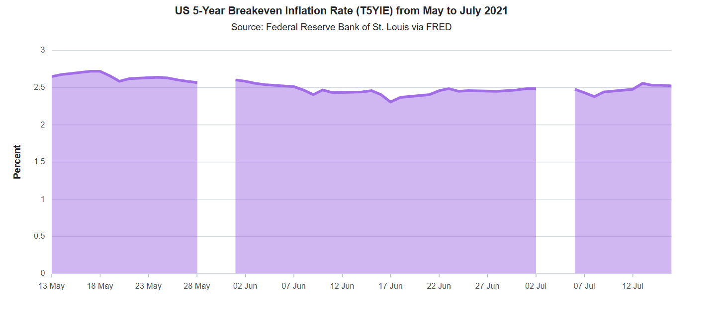
With the data in place, the next step is to configure the Syncfusion Blazor Area Chart to visualize the U.S. 5-Year Breakeven Inflation Rate.
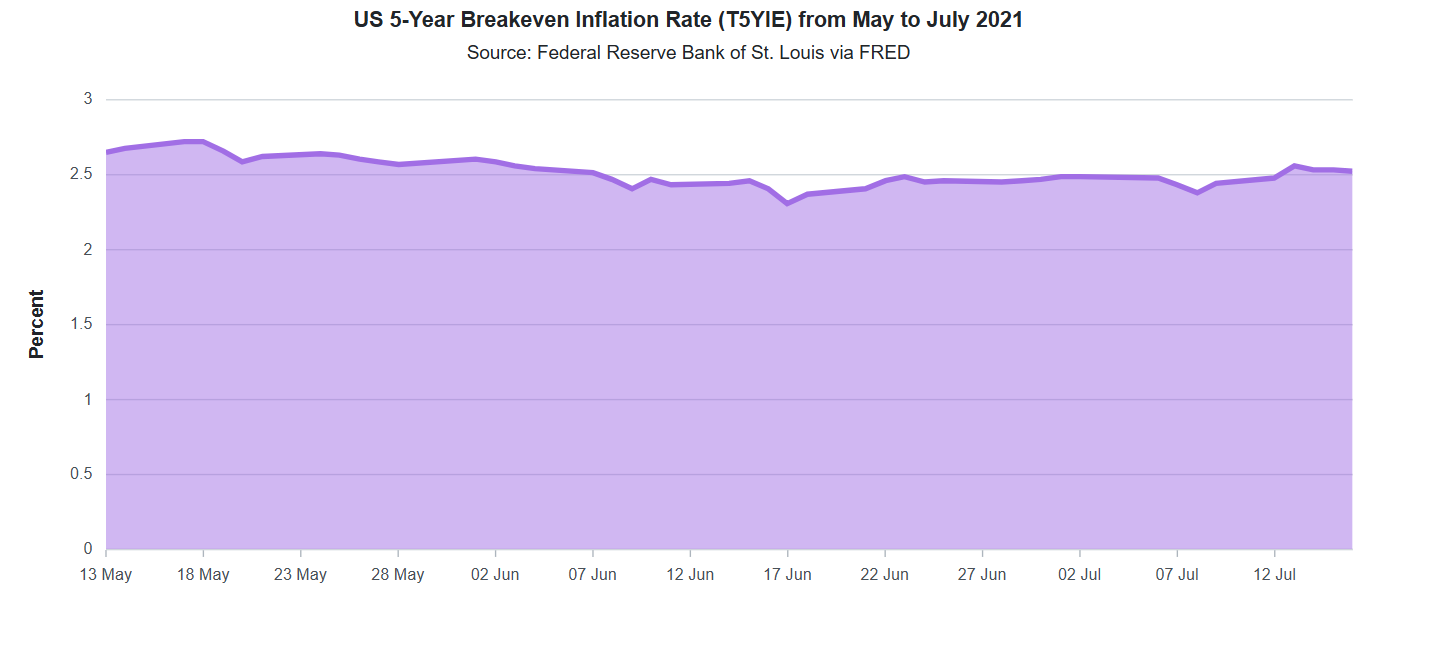
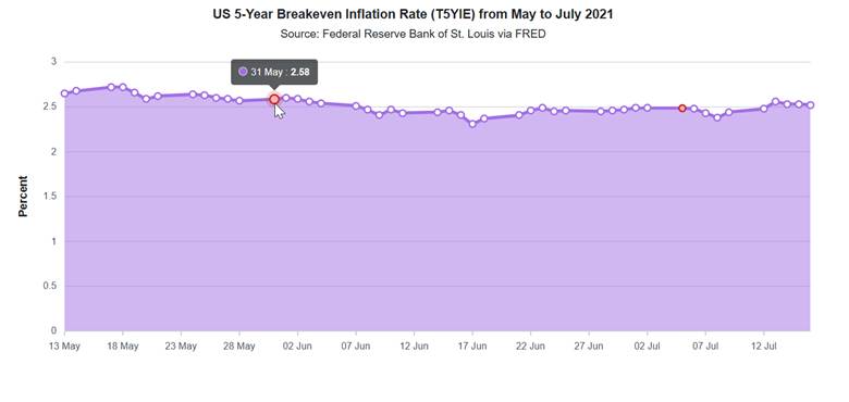
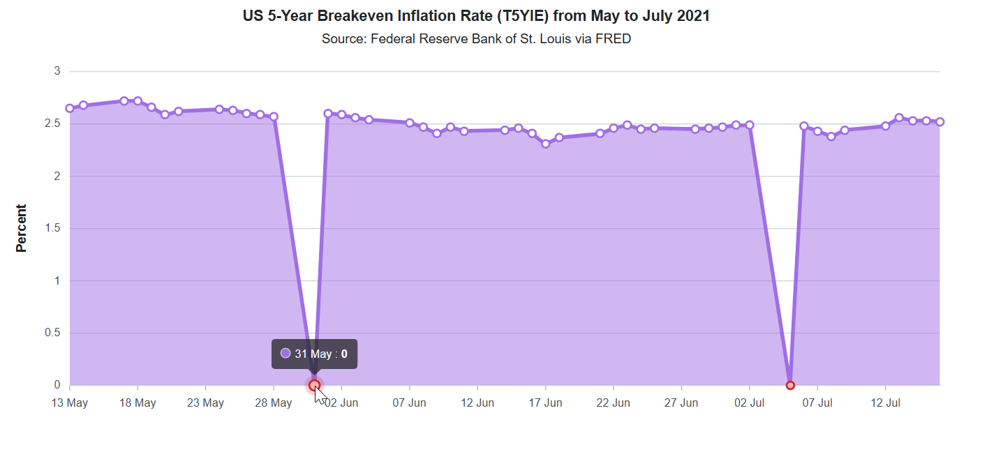
Syncfusion Blazor Charts handle missing (null) values with the Gap mode by default. This means that any null data points will result in visible gaps in the shaded area of the chart. These gaps make it easy for users to identify missing values at a glance, without suggesting continuity where none exists.
Below is the chart configuration using default gap handling:
<SfChart
    Title="US 5-Year Breakeven Inflation Rate (T5YIE) from May to July 2021"
    SubTitle="Source: Federal Reserve Bank of St. Louis via FRED">

    ….

    <ChartPrimaryXAxis
        Minimum="new DateTime(2021, 05, 13)"
        Maximum="new DateTime(2021, 07, 16)"
        ValueType="Syncfusion.Blazor.Charts.ValueType.DateTime">
        ….
    </ChartPrimaryXAxis>

    <ChartPrimaryYAxis
        Title="Percent"
        Minimum="@Minimum"
        Maximum="@Maximum"
        Interval="@Interval">
        ….
    </ChartPrimaryYAxis>

    <ChartSeriesCollection>
        <ChartSeries
            DataSource="@ChartPoints"
            XName="Period"
            YName="US_InflationRate"
            Type="ChartSeriesType.Area">
            ….
        </ChartSeries>
    </ChartSeriesCollection>

</SfChart>
In the next section, we’ll explore how to change these strategies to either Drop, Average, or Zero for handling missing values, depending on the analytical context.
Other strategies for handling missing data
1. Dropping null data points
If missing data should be excluded entirely from the visualization, you can use EmptyPointMode.Drop to remove those points from the chart. This ensures no gaps or placeholders appear in the chart, making the visualization more concise and focused.
In Syncfusion Blazor Charts, this can be done by setting the Mode property of the ChartEmptyPointSettings to Drop within the ChartSeries. Here’s how to apply it:
<ChartSeries
    DataSource="@ChartPoints"
    Name="US_InflationRate"
    XName="Period"
    YName="US_InflationRate"
    Type="ChartSeriesType.Area">

    <ChartEmptyPointSettings Mode="EmptyPointMode.Drop"></ChartEmptyPointSettings>
    …..

</ChartSeries>
This approach is useful when missing values are not represented at all in the chart, making the visualization appear more concise.
2. Interpolating missing values
For a smoother and more continuous visualization, interpolation can be used to estimate missing values. In Syncfusion Blazor Charts, EmptyPointMode.Average replaces null values with the average of adjacent data points, ensuring a seamless trend without abrupt gaps.
The Fill property sets the color of the empty (interpolated) points, while the Color and Width in ChartEmptyPointBorder define the border’s appearance. These settings help visualize the interpolated average values clearly in the chart.
Use the following configuration to enable this behavior:
<ChartSeries
    DataSource="@ChartPoints"
    Name="US_InflationRate"
    XName="Period"
    YName="US_InflationRate"
    Type="ChartSeriesType.Area">

    <ChartEmptyPointSettings
        Mode="EmptyPointMode.Average"
        Fill="#ffb3b3">

        <ChartEmptyPointBorder
            Color="#c62828"
            Width="2"></ChartEmptyPointBorder>

    </ChartEmptyPointSettings>

    ....

</ChartSeries>
This approach is particularly useful in scenarios where small gaps exist, and maintaining a continuous trendline is crucial for analysis. For example, missing values could distort trends in time-series data or financial charts, making interpolation a practical choice for preserving data continuity. However, it’s important to use this method cautiously, as interpolated values are estimates and may not always represent actual trends accurately.
3. Setting zero values for missing data
In certain cases, replacing missing values with zero might be appropriate. This ensures the dataset remains complete and displays a continuous chart without visual gaps. The EmptyPointMode.Zero option in Syncfusion Blazor Charts is designed exactly for this use case. It fills in the missing points with zeros and connects them within the chart.
However, this approach should be used only when zero accurately reflects the absence of data, not when the value is genuinely unknown. Misuse can lead to misrepresentation of trends and misleading interpretations.
Here’s how to apply this setting:
<ChartSeries
    DataSource="@ChartPoints"
    Name="US_InflationRate"
    XName="Period"
    YName="US_InflationRate"
    Type="ChartSeriesType.Area">

    <ChartEmptyPointSettings
        Mode="EmptyPointMode.Zero"
        Fill="#ffb3b3">

        <ChartEmptyPointBorder
            Color="#c62828"
            Width="2"></ChartEmptyPointBorder>

    </ChartEmptyPointSettings>

    …….

</ChartSeries>
This technique is useful in cases where missing data should be treated as zero, such as:
- Sales data: If a product had no sales on a given day, representing the value as zero rather than leaving it blank maintains accuracy.
- Sensor readings: In IoT applications, assuming zero may be more meaningful than leaving a gap if a sensor fails to record a value.
- Attendance records: In educational or workplace settings, a missing entry could be explicitly marked as zero to indicate absence.
While this method helps maintain a complete dataset, it’s essential to evaluate whether zero is the appropriate representation for missing values to avoid misleading analyses.
Choosing the right approach
Selecting the best strategy depends on the data context and the message you want to convey:
- Use EmptyPointMode.Gap to visually acknowledge missing data.
- Use EmptyPointMode.Drop to remove missing data from the chart.
- Use EmptyPointMode.Average to estimate missing values, which improves readability.
- Use EmptyPointMode.Zero when gaps must be avoided without misrepresenting trends.
GitHub reference
You can find the complete code example on GitHub.

Conclusion
Missing data doesn’t have to mean missing insights. With Syncfusion Blazor Chart’s versatile handling modes, you can confidently visualize incomplete datasets without compromising clarity or accuracy. Whether you want to display gaps, drop nulls, interpolate values, or fill missing points with zero, Syncfusion provides the tools to tailor your charts perfectly to your data’s story.
Try these strategies today using our comprehensive Blazor Chart Example, and see how easy it is to create stunning, reliable visualizations.
The latest version of the Blazor Chart component is available for current customers from the License and Downloads page. If you are not a Syncfusion customer, try our 30-day free trial.
You can also contact us through our support forums, support portal, or feedback portal. We’re always happy to assist you!


 No spam, just valuable updates.