
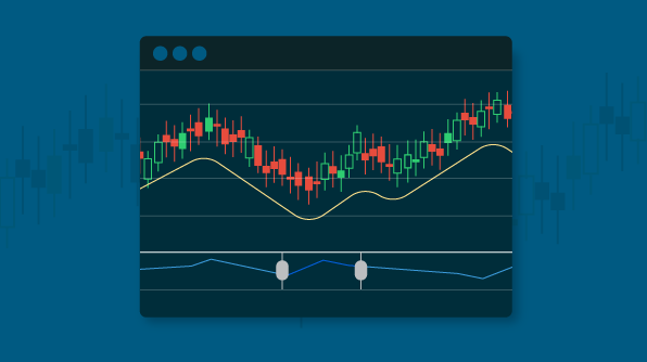
Overview
Stock charts are mostly used to track and visualize a stock’s price over a specific period of time using charting and ranging tools. In this blog, we are going to have a look at the elements of a stock chart and how to integrate the Syncfusion Stock Chart control in your JavaScript application.
What is Stock Chart?
There are a variety of elements used in a stock chart for different purposes. Let’s have a look at the individual elements and their purposes.
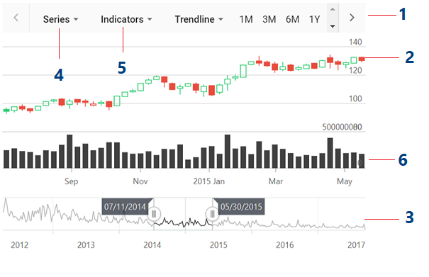
Elements of a Stock Chart
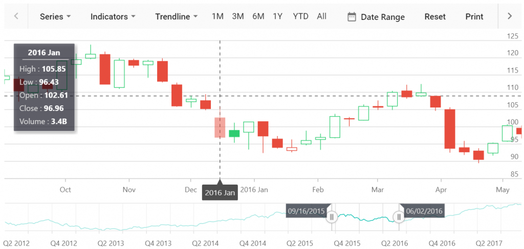
1. Period selector
The period selector allows you to choose predefined time periods, typically days, weeks, months, quarters, half year, and years, to check the trends for different time spans before investing.
2. Chart area
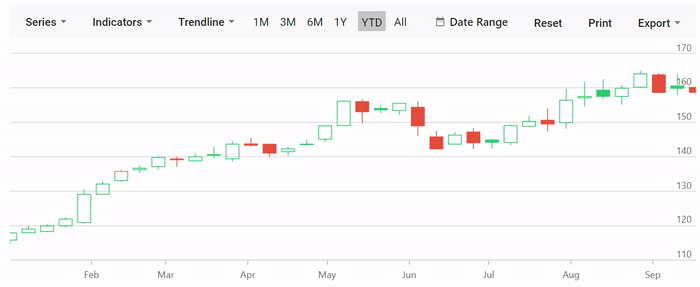
The chart area visualizes the data of the stock. Here, a candle chart is used to represent the open price of the stock at the start of the day, the highest and lowest prices during the day, and the closing price at the end of the day.
3. Range selector
The range selector allows you to select ranges from the larger collection to spot trends in the price within the selected range.
4. Series
The series allows you to select different types of charts to visualize the data. The Syncfusion Stock Chart supports the following types of charts:
- Line and spline—Help visualize the closing price of a stock.
- Hilo—Plots the high and low values of a stock during the specific time periods.
- OHLC and candle—Plot the open, close, high, and low values of a stock.
5. Indicators
Technical indicators are used to analyze past and predict future market trends based on historic price, volume, or open interest. Syncfusion’s Stock Chart supports 10 different types of indicators.
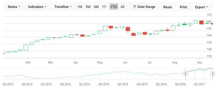
6. Volume
The volume of stock is usually associated with a bar chart. The higher the bar value, the more people involved in the stock in the specific time period.
How to integrate Syncfusion Stock Chart in a web application
Let’s create a stock chart to visualize and compare the stock prices of AAPL. The Stock Chart control can be configured in TypeScript as follows:
-
- Clone the Essential JS 2 quick-start seed repository and configure the necessary package in the config.js file.
"@syncfusion/ej2-base": "syncfusion:ej2-base/dist/ej2-base.umd.min.js",

"@syncfusion/ej2-data": "syncfusion:ej2-data/dist/ej2-data.umd.min.js",

"@syncfusion/ej2-charts": "syncfusion:ej2-charts/dist/ej2-charts.umd.min.js",

"@syncfusion/ej2-popups": "syncfusion:ej2-popups/dist/ej2-popups.umd.min.js",

"@syncfusion/ej2-buttons": "syncfusion:ej2-buttons/dist/ej2-buttons.umd.min.js",

"@syncfusion/ej2-pdf-export": "syncfusion:ej2-pdf-export/dist/ej2-pdf-export.umd.min.js",

"@syncfusion/ej2-file-utils": "syncfusion:ej2-file-utils/dist/ej2-file-utils.umd.min.js",

"@syncfusion/ej2-compression": "syncfusion:ej2-compression/dist/ej2-compression.umd.min.js",

"@syncfusion/ej2-navigations": "syncfusion:ej2-navigations/dist/ej2-navigations.umd.min.js",

"@syncfusion/ej2-calendars": "syncfusion:ej2-calendars/dist/ej2-calendars.umd.min.js",

"@syncfusion/ej2-lists": "syncfusion:ej2-lists/dist/ej2-lists.umd.min.js",

"@syncfusion/ej2-inputs": "syncfusion:ej2-inputs/dist/ej2-inputs.umd.min.js",

"@syncfusion/ej2-svg-base": "syncfusion:ej2-svg-base/dist/ej2-svg-base.umd.min.js",

"@syncfusion/ej2-splitbuttons": "syncfusion:ej2-splitbuttons/dist/ej2-splitbuttons.umd.min.js"
- Install the NPM packages by using the following command.
npm install
- Add the HTML input element that needs to be initialized as a component in the index.html file.
- Initialize the component in the ts file as shown in the following code.
import { StockChart } from '@syncfusion/ej2-charts';

// initialize stockchart component
let chart: StockChart = new StockChart();

// render initialized stock chart
chart.appendTo('#container');
- Clone the Essential JS 2 quick-start seed repository and configure the necessary package in the config.js file.
Populating stock chart with data
Now we need to populate the stock details of AAPL in the chart. We are going to visualize the data using a candle chart, so import and inject the CandleSeries into the Stock Chart component using the StockChart.Inject method.
 import { StockChart } from '@syncfusion/ej2-charts';
 import { StockChart, CandleSeries, DateTime } from '@syncfusion/ej2-charts';
 StockChart.Inject(CandleSeries, DateTime);
Then, add JSON data for the stock price to your application and assign it to the dataSource property in the series. Here, the data about the AAPL is used, and the complete set of data can be found in the sample.
  let stockchartData: any[] = [{
    x: new Date('2012-04-02'),
    open : 85.9757,
    high : 90.6657,
    low : 85.7685,
    close : 90.5257,
    volume : 660187068
  },
  {
    x: new Date('2012-04-09'),
    open : 89.4471,
    high : 92,
    low : 86.2157,
    close : 86.4614,
    volume : 912634864
  },
  {
    x: new Date('2012-04-16'),
    open : 87.1514,
    high : 88.6071,
    low : 81.4885,
    close : 81.8543,
    volume : 1221746066
  },
  {
    x: new Date('2012-04-23'),
    open : 81.5157,
    high : 88.2857,
    low : 79.2857,
    close : 86.1428,
    volume : 965935749
  },
  {
    x: new Date('2012-04-30'),
    open : 85.4,
    high : 85.4857,
    low : 80.7385,
    close : 80.75,
    volume : 615249365
  }];

let chart: StockChart = new StockChart({
    series:[{
        // dataSource for stockchart series
        dataSource: stockchartData,
        type: 'Candle'
    }]
}, '#container);
Note: In this example, we have exported the data from a service and used it in the sample. You can directly get the data from the services for a chart through the dataManager.
After adding the series, the chart will appear as shown in the following screenshot.
JavaScript Stock Chart
How to visualize data about volume with stock chart
You can analyze both the price action and volume with merely a glance using the Stock Chart. Since we are going to show the volume in a separate row, we need to customize the axes and rows of the chart as follows.
let chart: StockChart = new StockChart({
    rows : [{height : '30%'}, {height : '70%'}],
    axes : [{
      name: 'yaxis', opposedPosition: true, rowIndex: 1,
    }],
    series:[
    {
        // dataSource for stockchart series
        dataSource: stockchartData,
        type: 'Candle', yAxisName: 'yaxis'
    },{
        // dataSource for stockchart series
        dataSource: stockchartData,
        type: 'Column', yName: 'volume'
    }
  ]
}, '#container);
Import and inject the ColumnSeries module into the stock chart, as we are going to visualize the volume data with the column series.
import { StockChart, CandleSeries, ColumnSeries } from '@syncfusion/ej2-charts';
StockChart.Inject(CandleSeries, ColumnSeries);
A candlestick chart for volume will appear as shown in the following screenshot.
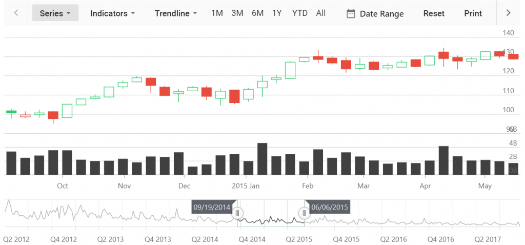
Candlestick chart for volume
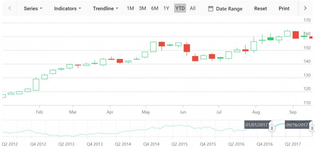
Period and range selector
Select and view data for specific periods of time using predefined time periods and custom ranges in the period selector. You can define your own time periods using the periods property in the stock chart. The period selector includes options to add indicators, trendlines, and different series types, and to export the stock chart. The visibility of the period selector can be toggled using the enablePeriodSelector property. By default, the period selector will be enabled.
let chart: StockChart = new StockChart({
     periods: [
            { intervalType: 'Month', interval: 1, text: '1M' },
            { intervalType: 'Month', interval: 3, text: '3M' },
            { intervalType: 'Month', interval: 6, text: '6M' },
            { intervalType: 'Years', interval: 1, text: '1Y', selected: true },
        ],
}, '#container);
You can filter a data range for data that needs to be visualized using the range selector. Toggle the visibility of the range selector using the enableSelector property. By default, the range selector will be enabled.
Tracking data on interaction with the chart
You can hover over any region in the chart to display the stock value of the company with the help of tooltips. You can also zoom in and out the chart using the mouse wheel to view the data.
let chart: StockChart = new StockChart({
    series:[
    {
        // dataSource for stockchart series
        dataSource: stockchartData,
        type: 'Candle'
    }
  ],
   tooltip: {
      enable: true
   },
   crosshair: {
      enable: true, lineType: 'Vertical'
   }

}, '#container);
Import and inject the tooltip and crosshair modules into the stock chart.
import { StockChart, CandleSeries, ColumnSeries, Tooltip, Crosshair } from '@syncfusion/ej2-charts';
StockChart.Inject(CandleSeries, ColumnSeries, Tooltip, Crosshair);
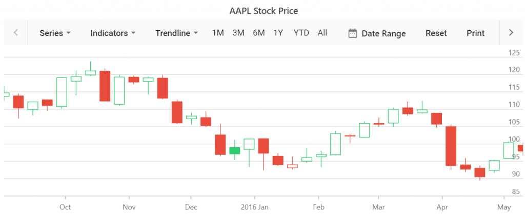
Add title
Specify the appropriate title in the chart to provide quick information about the data. This can be done using the title property.
let chart: StockChart = new StockChart({
 title: 'APPL Stock Price'
}, '#container);
Conclusion
We hope you will find the Stock Chart component user-friendly and look forward to you trying it out. You can find the Essential JS 2 install download link on our website. Also, you can check out the stock chart source on GitHub. Please take a look at our live demos in our sample browser, and customization features in our documentation.
The JavaScript Stock Chart component is also available for the React, Angular, ASP.NET Core, and MVC frameworks, built from their own TypeScript libraries.
If you wish to send us feedback or would like to ask any questions, please feel free to post in the comments section below, or contact us through our support forum, Direct-Trac, or feedback portal.
If you like this blog post, we think you’ll also like the following free ebooks!
 No spam, just valuable updates.
Comments (4)
Hello,
I want to reset the series. Can you please guide me how i can this.
HI Sanjay,
If you want to reset the zooming rate for data, you can use the reset options in the period selector or if you want to adjust the series data, use ‘dataSource’ property in series and refresh the control. Also, you can change the type of the series rendered through Series option in period selector.
Please let us know if you need any further assistance on this. Also, you can contact us by creating a support incident. (https://www.syncfusion.com/support/directtrac/incidents).
Hi,
Can you please tell the method name, how we can reset the series.
HI Sanjay,
Would you like to change the data for series or would like to switch the series type or want to zoom out the series, please let us know your exact requirement in detail. you can contact us by creating a support incident. (https://www.syncfusion.com/support/directtrac/incidents).
Regards,
Gowri