
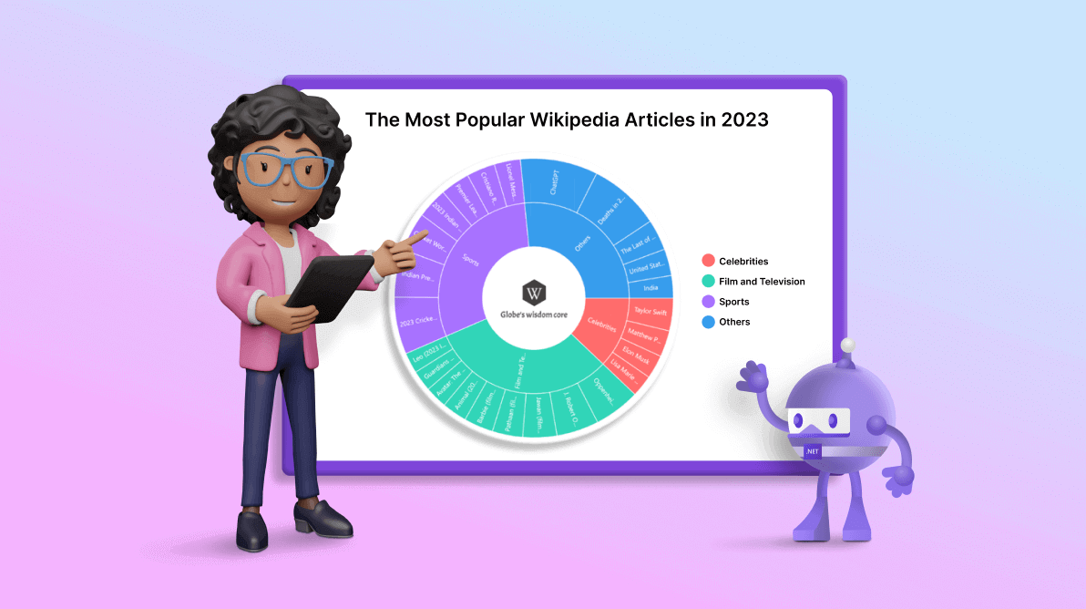
TL;DR: Let’s visualize the most popular Wikipedia articles of 2023 using Syncfusion .NET MAUI Sunburst Chart. Learn to gather, bind, and visualize data effectively while customizing chart elements to represent data trends.
Welcome to the Chart of the Week blog series! Today, we’ll visualize the data on the most-viewed Wikipedia articles of 2023 using the Syncfusion .NET MAUI Sunburst Chart.
People worldwide have numerous questions, and when seeking answers, they often turn to Wikipedia, the giant encyclopedia in the world, for enlightenment.
The most-viewed Wikipedia articles offer an intriguing insight into the collective curiosity of people globally. From exploring current events to delving into timeless topics, these articles reflect society’s ongoing quest for knowledge.
Whether unraveling the complexities of global politics, understanding scientific advancements, or uncovering cultural trends, these articles reveal a society keen to comprehend the constantly evolving dynamics of our world.
Syncfusion .NET MAUI Sunburst Chart, a radial treemap, is a component that visualizes hierarchical data using a concentric circle layout. The innermost circle represents the root level of the hierarchy. The control’s rich feature set includes functionalities like data binding, data labels, legends, tooltips, animations, and a center view.
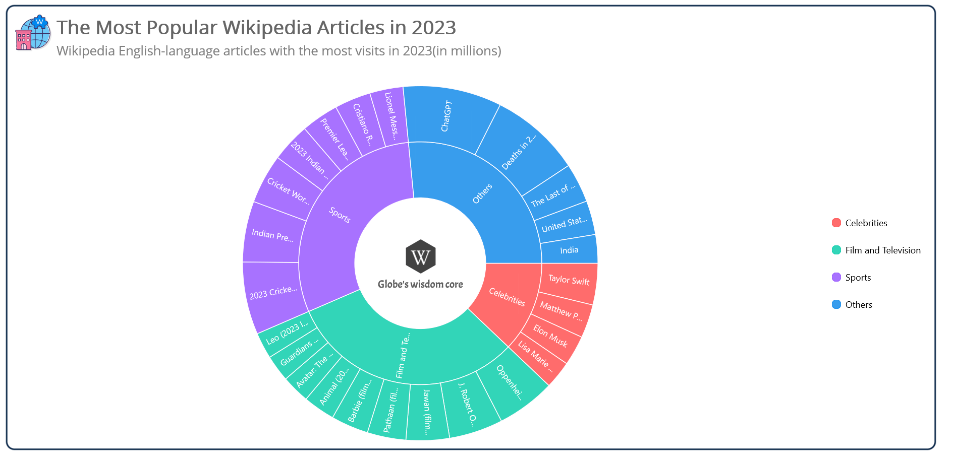
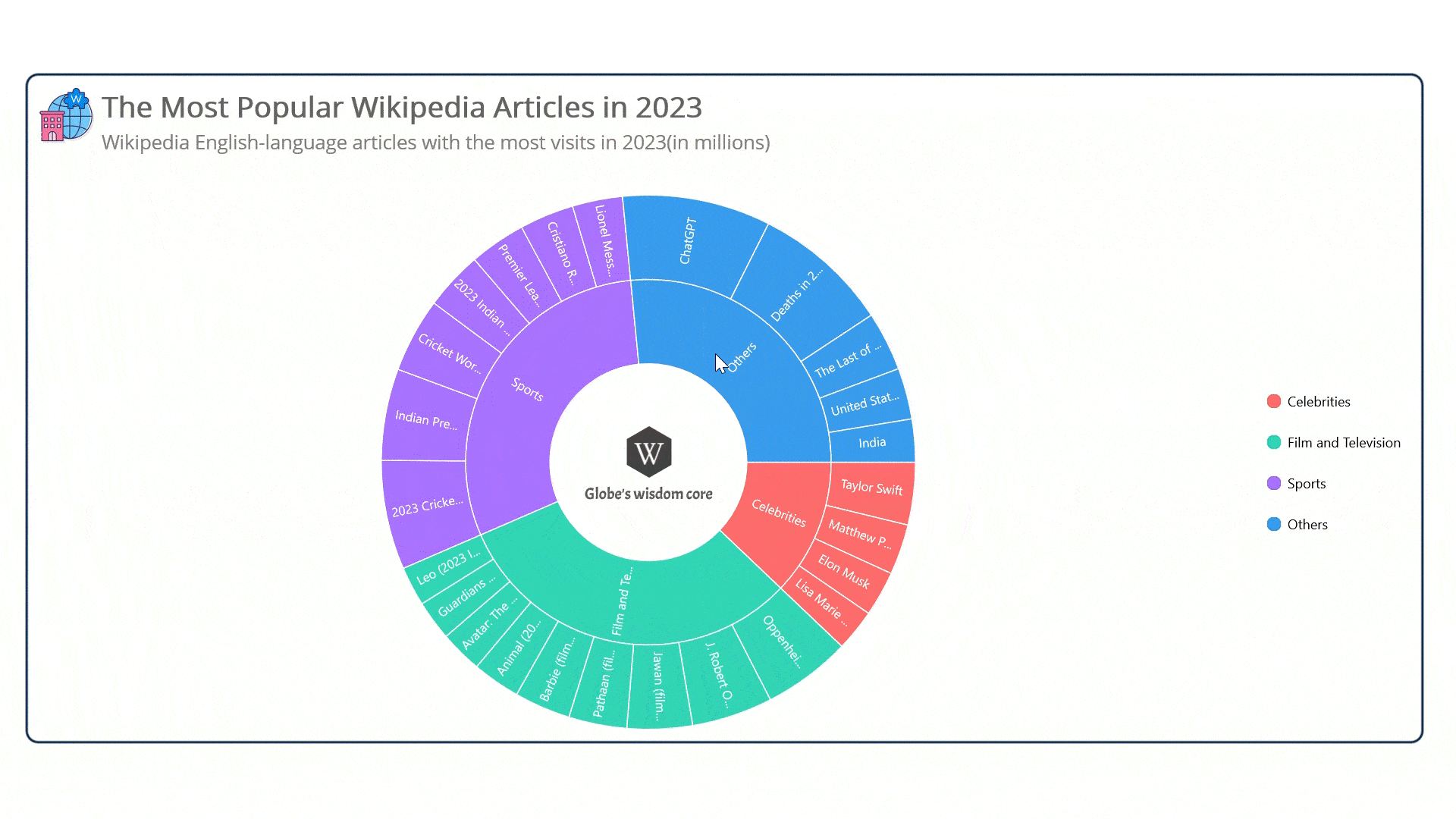
The chart that we plan to create is shown in the picture below.
Let’s visualize the data on the most-viewed Wikipedia articles in 2023 using the Syncfusion .NET MAUI Sunburst Chart.
Step 1: Gather the data
First, let’s collect data on the most viewed Wikipedia articles in 2023 from the Wikimedia Foundation.
Step 2: Populate the data for the chart
Now, define the WikipediaModel class with the following properties:
- Category – Represents the types of article genres for the most visited Wikipedia pages in 2023.
- Value – Indicates the number of visits for each article.
- Article – Represents the name of the article published in the year 2023.
public class WikipediaModel
{
    public string Category { get; set; }
    public double Value { get; set; }
    public string Article { get; set; }

   public WikipediaModel(string category, double value, string article)
    {
        Category = category;
        Value = value;
        Article = article;
    }
}
Now, generate the data collection that illustrates the most popular articles in 2023 using the WikipediaData class with the Data property.
Refer to the following code example.
public class WikipediaData
{
    public ObservableCollection<WikipediaModel> Data { get; set; }

    public WikipediaData()
    {
        Data = new ObservableCollection<WikipediaModel>
        {
            new WikipediaModel("Celebrities",22179656, "Taylor Swift"),
            new WikipediaModel("Celebrities",17882508, "Matthew Perry"),
            new WikipediaModel("Celebrities",16026256, "Elon Musk"),
            new WikipediaModel("Celebrities",14812928, "Lisa Marie Presley"),

            new WikipediaModel("Film and Television",31265503, "Oppenheimer (film)"),
            new WikipediaModel("Film and Television",28681943, "J. Robert Oppenheimer"),
            new WikipediaModel("Film and Television",23112884, "Jawan (film)"),
            new WikipediaModel("Film and Television",20614066, "Pathaan (film)"),
            new WikipediaModel("Film and Television",19930916, "Barbie (film)"),
            new WikipediaModel("Film and Television",16988676, "Animal (2023 film)"),
            new WikipediaModel("Film and Television",15062733, "Avatar: The Way of Water"),
            new WikipediaModel("Film and Television",14170970, "Guardians of the Galaxy Vol. 3"),
            new WikipediaModel("Film and Television",13994461, "Leo (2023 Indian film)"),

            new WikipediaModel("Sports",38723498, "2023 Cricket World Cup"),
            new WikipediaModel("Sports",32456338, "Indian Premier League"),
            new WikipediaModel("Sports",26390217, "Cricket World Cup"),
            new WikipediaModel("Sports",20813029, "2023 Indian Premier League"),
            new WikipediaModel("Sports",19968486, "Premier League"),
            new WikipediaModel("Sports",19287757, "Cristiano Ronaldo"),
            new WikipediaModel("Sports",17768818, "Lionel Messi"),

            new WikipediaModel("Others",52565681, "ChatGPT"),
            new WikipediaModel("Others",48549304, "Deaths in 2023"),
            new WikipediaModel("Others",21000722, "The Last of Us (TV series)"),
            new WikipediaModel("Others",18135421, "United States"),
            new WikipediaModel("Others",15200006, "India"),
        };
    }
}
Step 3: Configure the Syncfusion .NET MAUI Sunburst Chart
Let’s configure the Syncfusion .NET MAUI Sunburst Chart control by following the steps outlined in this documentation.
Refer to the following code example.
<chart:SfSunburstChart>
</chart:SfSunburstChart>
Step 4: Bind the Wikipedia data to the .NET MAUI Sunburst Chart
Next, we’ll bind the collected Wikipedia data to the Sunburst Chart.
<chart:SfSunburstChart ItemsSource="{Binding Data}" ValueMemberPath="Value">

 <chart:SfSunburstChart.Levels>
  <chart:SunburstHierarchicalLevel GroupMemberPath="Category"/>
  <chart:SunburstHierarchicalLevel GroupMemberPath="Article"/>
 </chart:SfSunburstChart.Levels>

</chart:SfSunburstChart>
Here, we’ve bound the Data to the Sunburst chart’s ItemsSource property from its BindingContext.
Then, added the SunburstHierarchicalLevel to the Levels collection. Each hierarchy level is formed based on the properties specified in the GroupMemberPath property, which includes Category and Article. The ValueMemberPath property is used to calculate the size of each arc segment.
Step 5: Customize the chart’s appearance
Let’s customize the appearance of the .NET MAUI Sunburst Chart for better visualization.
Adding the chart title
Incorporating a title into the chart enhances the clarity of the presented data. Refer to the following code example to add a chart title with an image.
<chart:SfSunburstChart.Title>
 <Grid>
  <Grid.RowDefinitions>
   <RowDefinition Height="Auto"/>
   <RowDefinition Height="Auto"/>
  </Grid.RowDefinitions>

  <Grid.ColumnDefinitions>
   <ColumnDefinition Width="50"/>
   <ColumnDefinition Width="*"/>
  </Grid.ColumnDefinitions>

  <Image Grid.Column="0" Grid.RowSpan="2" Source="wikipedia.png" Margin="0,-25,0,20" HeightRequest="100" WidthRequest="{OnPlatform Android=40,iOS=40, Default=50}"/>
  <StackLayout Grid.Column="1" Grid.Row="0" Margin="5,0,0,0">
   <Label Text="The Most Popular Wikipedia Articles in 2023" FontSize="{OnPlatform Android=20, iOS=20 ,Default=25}" FontAttributes="Bold" TextColor="#666666"/>
   <Label Text="Wikipedia English-language articles with the most visits in 2023(in millions)" FontSize="{OnPlatform Android=14,iOS=14, Default=17}" TextColor="Gray" Margin="0,2,0,0"/>
  </StackLayout>
 </Grid>
</chart:SfSunburstChart.Title>
Customizing the chart color and size
Here, we are going to enhance the chart’s appearance by adjusting its size, inner radius, and color scheme. This is achieved through the Radius, InnerRadius, and PaletteBrushes properties.
XAML
<chart:SfSunburstChart PaletteBrushes="{Binding CustomBrush}" Radius="1" InnerRadius="{OnPlatform MacCatalyst=0.21, Default=0.37}">

</chart:SfSunburstChart>
C#
public class WikipediaData
{
    public ObservableCollection<Brush> CustomBrush { get; set; }

    public WikipediaData()
    {
        CustomBrush = new ObservableCollection<Brush>()
        {
             new SolidColorBrush(Color.FromArgb("#D4FF4E4E")),
             new SolidColorBrush(Color.FromArgb("#D408CDAA")),
             new SolidColorBrush(Color.FromArgb("#D49656FF")),
             new SolidColorBrush(Color.FromArgb("#D41089E9")),
        };
    }
}
Adding chart legend
Refer to the following code example to enable and position the chart legend.
<chart:SfSunburstChart>

 <chart:SfSunburstChart.Legend>
  <chart:SunburstLegend Placement="Right"/>
 </chart:SfSunburstChart.Legend>

</chart:SfSunburstChart>
Enabling the data labels
We can make the data easier to read by enabling chart data labels.
<chart:SfSunburstChart ShowLabels="True">
</chart:SfSunburstChart>
Adding an interactive tooltip
We can enhance the interactivity of our .NET MAUI Sunburst Chart by adding tooltips. Tooltips provide additional information or metadata when a segment is tapped or hovered over. We can also customize the appearance of the tooltip using the TooltipTemplate property.
<chart:SfSunburstChart EnableTooltip="True">

 <chart:SfSunburstChart.TooltipTemplate>
  <DataTemplate>
   <StackLayout Orientation="Horizontal">
    <Rectangle HeightRequest="30" WidthRequest="8" Fill="{Binding Fill}"/>
    <StackLayout>
     <Label Text="{Binding Item[0]}" FontSize="12.5" Margin="5,0,0,0" FontAttributes="Bold" TextColor="White"/>
     <Label Text="{Binding Item[1], Converter={StaticResource millionsConverter}}" FontSize="11.5" Margin="5,2,0,0" TextColor="White"/>
    </StackLayout>
   </StackLayout>
  </DataTemplate>
 </chart:SfSunburstChart.TooltipTemplate>

</chart:SfSunburstChart>
Integrating center view
The SunburstChart’s CenterView property allows you to place a custom view at the center of the chart. This center view helps us to convey additional details about the sunburst chart.
Refer to the following code example.
<chart:SfSunburstChart.CenterView>

 <StackLayout VerticalOptions="Center" HeightRequest="{Binding CenterHoleSize}" WidthRequest="{Binding CenterHoleSize}">
  <Image Source="logo.png" HeightRequest="{OnPlatform Android=45,iOS=45,Default=55}" WidthRequest="{OnPlatform Android=30,iOS=30, Default=45}" Margin="{OnPlatform MacCatalyst='0,46,0,0'}"/>
  <Label LineBreakMode="WordWrap" MaxLines="2" Text="Globe's wisdom core" TextColor="#5d5d5d" FontFamily="AcmeRegular" FontSize="{OnPlatform Android=9.5,iOS=9, Default=14}" HorizontalTextAlignment="Center" Margin="{OnPlatform MacCatalyst='0,6,0,0'}"/>
 </StackLayout>

</chart:SfSunburstChart.CenterView>
After executing the previous code examples, the Sunburst Chart will look like the following image.
GitHub reference
Also, refer to Creating a .NET MAUI Sunburst Chart to Visualize the Most Popular Wikipedia Articles in the 2023 GitHub demo.
Conclusion
Thanks for reading! In this blog, we have explored how to visualize the data on the most popular Wikipedia articles in 2023 using the Syncfusion .NET MAUI Sunburst Chart. We strongly encourage you to follow the steps outlined in this blog and share your thoughts in the comments below.
The existing customers can download the latest version of Essential Studio from the License and Downloads page. If you are new, consider trying our 30-day free trial to explore our incredible features.
You can also contact us via our support forum, support portal, or feedback portal. We are always happy to help you!
 No spam, just valuable updates.
Comments (2)
Is it possible to set separate color for the outer layer segments?
Hi Shahadat Hossen Shakil,
Thank you for reaching out to us. We would want to inform you that currently, we do not have direct support for applying different colors to segments at various levels in the SfSunburstChart. We have created the feature request you requested.
FR – https://www.syncfusion.com/feedback/62158/level-based-custom-brushes-for-net-maui-sunburst-chart-segments
You can cast your vote in our feedback portal and follow up there.
Best regards,
Saiyath Ali Fathima M