

TL;DR: Comparing multiple hotel performance metrics across Europe in 2024, such as energy costs and staffing shortages, can quickly become overwhelming. This guide shows you how to create a compact, layered column chart using Syncfusion® .NET MAUI Charts to visualize complex operational challenges clearly and efficiently. Learn step-by-step techniques, explore real-world examples, and gain insights to support the smartest decision-making in the hospitality industry.
Welcome to our Chart of the Week blog series!
Layered Column Charts are ideal for comparing multiple metrics within a single category, especially in sectors like travel, hospitality, and operations.
What if you could turn complex operational data into a striking visual that instantly reveals regional business challenges? That’s the power of a well-crafted chart. In this blog, we’ll show you how to build a Layered Column Chart using the Syncfusion® .NET MAUI Toolkit to visualize key insights from the 2024 European Accommodation Barometer. You’ll learn how to structure real-world data, layer multiple metrics for comparison, and customize your chart for clarity and impact. Ready to turn data into decisions? Let’s dive in.
What is a Layered Column Chart?
A Layered Column Chart is a variation of the traditional column that stacks multiple data series with varying widths, creating an overlapping effect. Unlike side-by-side columns, Layered Column Charts:
- Compares multiple metrics (e.g., energy costs, staff shortages) within a single category, such as countries.
- Saves horizontal space for a clean, compact design.
- Highlights hierarchical data relationships.
This layout improves readability and makes it easier to spot patterns, outliers, and relationships between different data points.
Why use .NET MAUI Toolkit Charts for data visualization?
The Syncfusion® .NET MAUI Toolkit Charts offer a robust solution for data visualization:
- Cross-platform support: Build once for iOS, Android, Windows, and macOS.
- Interactivity: Features like tooltips, animations, and toggleable series enhance user engagement.
- Customization: Flexible styling for axes, legends, and colors.
- Open-source contributions: Community support for rapid development.
Data source and context
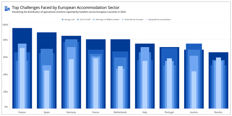
This visualization is grounded in the 2024 European Accommodation Barometer, a comprehensive survey conducted by Statista in collaboration with Booking.com. The report captures the evolving sentiment and operational challenges faced by hoteliers across Europe during the post-pandemic travel surge.
The chart focuses on the top five operational challenges identified in the report:
- Energy costs
- Cost of staff
- Shortage of skilled workers
- Potential tax increases
- Geopolitical uncertainties
Each challenge is visualized as a layered column, enabling clear cross-country comparisons and highlighting how different regions are impacted.
Note: For more insights and methodology, refer to the official report here.
To visualize how each challenge is layered for clarity and comparison, refer to the following image.
 Let’s explore how to achieve this step by step using the .NET MAUI Toolkit Charts.
Step 1: Configure the .NET MAUI Toolkit
Follow the Syncfusion® .NET MAUI Toolkit and documentation to configure the .NET MAUI Toolkit.
Step 2: Define the DataModel
To represent the 2024 European Accommodation Barometer data, create a DataModel class, a foundation for binding data to the chart class to organize each country’s operational challenges:
- Energy cost: Rising utility expenses
- Staff cost: Increasing labor costs
- Worker shortage: Difficulty in hiring skilled staff
- Tax: Anticipated tax burdens
- Geopolitical: Uncertainty due to global conflicts
Here’s the class definition:
public class DataModel
{
    public required string Country { get; set; }
    public double EnergyCost { get; set; }
    public double StaffCost { get; set; }
    public double WorkerShortage { get; set; }
    public double Tax { get; set; }
    public double Geopolitical { get; set; }
}
This model organizes metrics like energy costs and staff shortages for easy binding to the chart.
Step 3: Populate data in the ViewModel
In the ViewModel class, load the real-world data from the 2024 European Accommodation Barometer as shown in the code example below.
public class ViewModel
{
    public ObservableCollection<DataModel> DataSource { get; set; }

    public ViewModel()
    {
        DataSource = new ObservableCollection<DataModel>
        {
            new DataModel { Country = "Greece", EnergyCost = 93, StaffCost = 65, WorkerShortage = 55, Tax = 75, Geopolitical = 70 },
            .  .  .
            new DataModel { Country = "Nordics", EnergyCost = 65, StaffCost = 50, WorkerShortage = 56, Tax = 55, Geopolitical = 59 }
        };
    }
}
Bind this collection to your chart in XAML using the BindingContext.
Step 4: Configure the Layered Column Chart
With the data structured and bound, it’s time to visualize it using a Layered Column Chart. The .NET MAUI Toolkit Charts offer the flexibility to stack multiple column series with varying widths, creating a compact and insightful layered effect.
Key configuration
- Initialize the SfCartesianChart and set EnableSideBySideSeriesPlacement to false. By default, column series are placed side by side; this setting allows them to overlap, enabling the layered layout.
- Add individual ColumnSeries for each operational challenge. Assign progressively smaller width values to each series using the Width property to create a visual hierarchy, ensuring all layers remain visible and easy to compare.
Here’s how the chart is configured in the application:
<chart:SfCartesianChart EnableSideBySideSeriesPlacement="False" Grid.Row="1">

    <chart:ColumnSeries ItemsSource="{Binding DataSource}"
                        XBindingPath="Country"
                        YBindingPath="EnergyCost"
                        EnableTooltip="True"
                        EnableAnimation="True"
                        Label="Energy cost"
                        LegendIcon="SeriesType"
                        Fill="#003b95">
    </chart:ColumnSeries>

    <chart:ColumnSeries ItemsSource="{Binding DataSource}"
                        XBindingPath="Country"
                        YBindingPath="StaffCost"
                        Width="0.65"
                        EnableTooltip="True"
                        EnableAnimation="True"
                        Label="Cost of staff"
                        LegendIcon="SeriesType"
                        Fill="#1C5FC0" >
    </chart:ColumnSeries>

</chart:SfCartesianChart>
Step 5: Customize the chart appearance
The .NET MAUI Toolkit Charts offer a wide range of customization options to make the chart functional, visually appealing, and user-friendly.
- Legend: Initialize ChartLegend and enable ToggleSeriesVisibility to show/hide individual series.
- Axis labels: Customize chart axis labels for better readability.
- Grid lines: Apply dashed lines for major grid styling.
- Color palette: Each ColumnSeries is assigned a distinct color to visually separate the categories.
These enhancements ensure the chart is both functional and visually appealing.
<chart:SfCartesianChart EnableSideBySideSeriesPlacement="False" Grid.Row="1">

    <chart:SfCartesianChart.XAxes>
        <chart:CategoryAxis ShowMajorGridLines="False">
            <chart:CategoryAxis.LabelStyle>
                <chart:ChartAxisLabelStyle FontSize="{OnIdiom Desktop=16, Phone=12}" />
            </chart:CategoryAxis.LabelStyle>
        </chart:CategoryAxis>
    </chart:SfCartesianChart.XAxes>

    <chart:SfCartesianChart.YAxes>
        <chart:NumericalAxis Minimum="0" Maximum="100" Interval="{OnIdiom Desktop=20, Phone=25}">
            <chart:NumericalAxis.MajorGridLineStyle>
                <chart:ChartLineStyle StrokeDashArray="5,7" />
            </chart:NumericalAxis.MajorGridLineStyle>
            <chart:NumericalAxis.LabelStyle>
                <chart:ChartAxisLabelStyle LabelFormat="0'%'" FontSize="{OnIdiom Desktop=16, Phone=12}" />
            </chart:NumericalAxis.LabelStyle>
        </chart:NumericalAxis>
    </chart:SfCartesianChart.YAxes>

    <chart:SfCartesianChart.Legend>
        <chart:ChartLegend ToggleSeriesVisibility="True">
            <chart:ChartLegend.LabelStyle>
                <chart:ChartLegendLabelStyle FontSize="{OnIdiom Desktop=13, Phone=12}" />
            </chart:ChartLegend.LabelStyle>
        </chart:ChartLegend>
    </chart:SfCartesianChart.Legend>

</chart:SfCartesianChart>
Here’s the final output of the Layered Column Chart, fully customized to visualize the real-world data more effectively.
GitHub reference
For more details, refer to the GitHub demo.
FAQs
Q1: What is a layered column chart?
A layered column chart is a variation of a column chart where multiple series overlap slightly, allowing comparison of various metrics within the same category.
Q2: Why use layered column charts in .NET MAUI?
They help visualize complex data compactly and clearly, especially when comparing multiple metrics across categories like countries or time periods.
Q3: How do I enable layered columns in Syncfusion® MAUI Charts?
Set EnableSideBySideSeriesPlacement to false in SfCartesianChart and assign different widths to each ColumnSeries.
Q4: What real-world data is used in this example?
The chart visualizes operational challenges from the 2024 European Accommodation Barometer, including energy costs, staffing, and geopolitical risks.

Conclusion
Thanks for reading! In this blog, we explored how to build a Layered Column Chart using the .NET MAUI Toolkit Charts to visualize real-world survey data. This approach is ideal for comparing multiple metrics across categories and works beautifully across platforms. We strongly encourage you to follow the steps outlined and share your feedback in the comments section below.
Existing customers can download the new version of Essential Studio® on the license and downloads page. If you are not a Syncfusion® customer, try our 30-day free trial to check our incredible features.
If you require assistance, please don’t hesitate to contact us via our support forum, support portal, or feedback portal. We are always eager to help you! Stay tuned for next week’s featured Chart of the Week.


 No spam, just valuable updates.