
 Sheik Syed
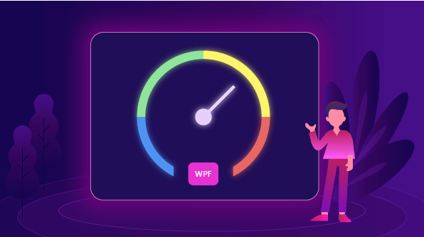
The Radial Gauge is a data visualization component that helps you visualize numerical values on a radial scale. It has highly customizable features, such as scales, pointers, ranges, and annotations, and allows you to design a dashboard, clock, temperature monitor, speedometer, etc.
In this blog, you will get a quick overview of our WPF Radial Gauge control and its features by designing a temperature monitor application.
To create a temperature monitor, you need the following features in the Radial Gauge control:
- Scales—To define the temperature scale values in numbers from start to end with tick marks.
- Ranges—To indicate multiple-colored temperature range indicators.
- Pointers—To point out the current temperature value.
- Annotations—To show the current temperature value and info about the design.
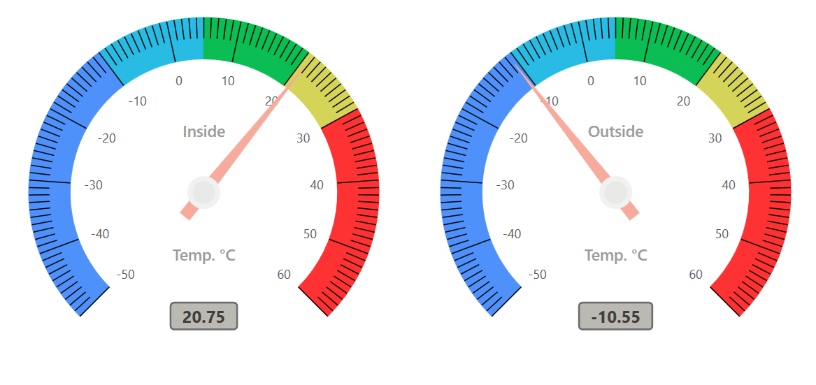
This section explains how to design a temperature monitor by customizing the appearance of the Radial Gauge as shown in the following screenshot.

Configuring Radial Gauge in WPF application
Refer to this article to learn how to add Syncfusion controls to Visual Studio projects in various ways. You can also refer to this link to learn about the assemblies required for adding Radial Gauge to your project.
Creating a radial gauge
The Radial Gauge control is entirely configurable in both XAML and in code-behind. The following steps describe the initialization of the Radial Gauge control in XAML:
- Import the following Radial Gauge control’s namespace in the XAML page.
xmlns:gauge=http://schemas.syncfusion.com/wpf
Or
xmlns:gauge ="clr-namespace:Syncfusion.UI.Xaml.Gauges;assembly=Syncfusion.SfGauge.Wpf"
- Create an instance of the radial gauge class and add it to the layout that suits your requirements.
<Grid>
  <gauge:SfCircularGauge>
  </gauge:SfCircularGauge>
</Grid>
The gauge elements, such as scales, ranges, pointers, and annotations are arranged relatively using the custom position option to make the gauge responsive in all window sizes.
Add the temperature scale
The first step in designing a temperature monitor is to add scale values as numbers from the minimum, -50, to the maximum, 60, with a specific interval. This is implemented using the scales in the Radial Gauge.
Scales contain a collection of scale elements, and you can add any number of radial scales inside the gauge. A scale contains labels and tick marks, the positions and values of which can be customized. In the Radial Gauge, you can display the temperature labels from -50 to 100 using the StartValue and EndValue properties.
Scales have two types of tick marks, major and minor.
Major ticks have labels and are used to specify the primary value intervals. Minor ticks do not have labels and are used to define the space inside the primary value interval. You can specify the tick’s appearance and position-related properties using the MajorTickSettings and MinorTickSettings properties for a scale.
The intervals of the labels and major ticks can be customized by using the Interval property. Minor ticks can be chosen per interval in a scale using the MinorTicksPerInterval property.
You can customize the position for the scale, ticks, and labels by using corresponding offset properties. Values for offset should be given from 0 to 1 (gauge center position to edge).
<gauge:SfCircularGauge >
            <gauge:SfCircularGauge.Scales>
                <gauge:CircularScale StartValue="-50" EndValue="60" Interval="10" MinorTicksPerInterval="9" LabelStroke="#5b5b5b"
                                     RangePosition="Custom" TickPosition="Custom" LabelPosition="Custom" ShowRim="False" LabelOffset="0.6" >
                    <gauge:CircularScale.MajorTickSettings>
                        <gauge:MajorTickSetting StartOffset="0.85" EndOffset="0.65" StrokeThickness="1" Stroke="Black" />
                    </gauge:CircularScale.MajorTickSettings>
                    <gauge:CircularScale.MinorTickSettings>
                        <gauge:MinorTickSetting StartOffset="0.85" EndOffset="0.75" StrokeThickness="1" Stroke="Black" />
                    </gauge:CircularScale.MinorTickSettings>
                   </gauge:CircularScale>
            </gauge:SfCircularGauge.Scales>
</gauge:SfCircularGauge>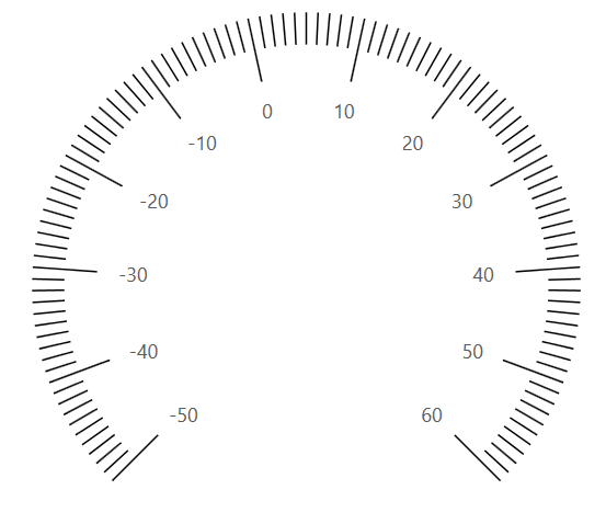
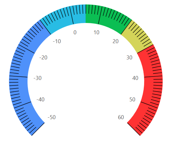
Add temperature range indicator
Once the temperature scale design is completed, you need to add the temperature range indicator to indicate the level of severity of the temperature.
Ranges contain a collection of range elements. You can add any number of ranges inside the scale. A range of the Radial Gauge is a visual element that helps you visualize where a value falls on a radial scale.
Ranges in a radial gauge are used to display a temperature range with different color indications. In this blog design, you can use five ranges for scale to indicate the various levels of temperature.
Every range has start and end values, and these can be specified using the StartValue and EndValue properties.
The length and position of a range can be customized using the outer and inner offset properties, as shown in the following code example. The outer offset properties are used where the range length starts in scale, and inner offset properties are used where the range length ends.
<gauge:CircularScale.Ranges>
          <gauge:CircularRange OuterStartOffset="0.85" OuterEndOffset="0.85"
                  InnerStartOffset="0.65" InnerEndOffset="0.65" StartValue="-50" EndValue="-10" Stroke="#4f91fa" />
          <gauge:CircularRange OuterStartOffset="0.85" OuterEndOffset="0.85"
InnerStartOffset="0.65" InnerEndOffset="0.65" StartValue="-10" EndValue="5" Stroke="#28bce4" />
          <gauge:CircularRange OuterStartOffset="0.85" OuterEndOffset="0.85"
                 InnerStartOffset="0.65" InnerEndOffset="0.65" StartValue="5" EndValue="20" Stroke="#0bbe53" />
         <gauge:CircularRange OuterStartOffset="0.85" OuterEndOffset="0.85"
                 InnerStartOffset="0.65" InnerEndOffset="0.65" StartValue="20" EndValue="30" Stroke="#d4d459" />
        <gauge:CircularRange OuterStartOffset="0.85" OuterEndOffset="0.85"
                 InnerStartOffset="0.65" InnerEndOffset="0.65" StartValue="30" EndValue="60" Stroke="#ff3233" />
</gauge:CircularScale.Ranges>
Add needle pointer
Next, we need to add a needle pointer to indicate the current temperature value. This can be achieved using the pointer support in the Radial Gauge.
Pointers contain a collection of pointer elements, and you can add any number of pointers inside the scale. There are three types of pointers available for gauges: range pointer, needle pointer, and marker pointer. The value of a pointer is set using the Value property.
A needle pointer that is used in a temperature monitor design to point out a value is a highly customizable needle-type element.
The knob (rounded ball on the arrow) and tail (rectangle at the end of the knob) elements of a needle pointer are used to enhance the pointer’s look. The length of a pointer can be customized using the NeedleLengthFactor property.
<gauge:CircularScale.Pointers>
     <gauge:CircularPointer EnableAnimation="True" Value="{Binding InsideValue}" NeedleLengthFactor="0.77" NeedlePointerStroke="#f7ab9c"
NeedlePointerStrokeThickness="12" TailLengthFactor="0.15" TailFill="#f7ab9c" KnobRadiusFactor="0.08" KnobStroke="#eff2f1" KnobStrokeThickness="5" KnobFill="#e8e8e8" NeedlePointerType="Triangle"/>
</gauge:CircularScale.Pointers>
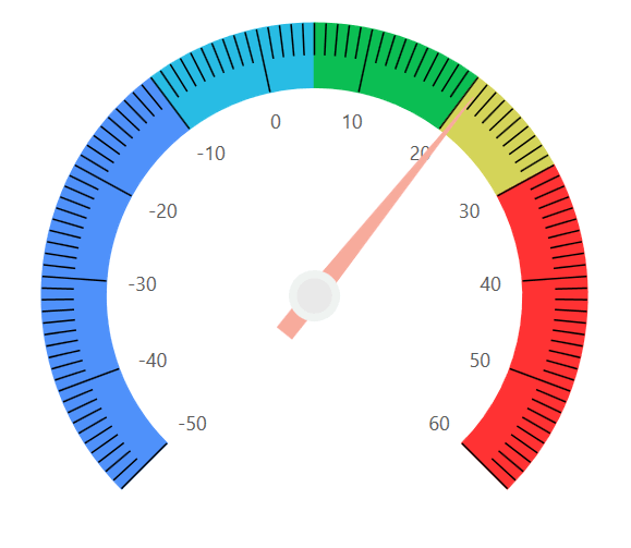
Annotate temperature unit and value
Finally, we need to display the current temperature value and info over the gauge. This can be achieved using the annotation support in the Radial Gauge.
Annotations contain a collection of annotation elements, and you can add any number of annotations inside the Radial Gauge. To display the current pointer value in the temperature monitor, use the TextBlock control to display the text value over the radial gauge. You can simply bind the current temperature point value to annotation content text.
The position of annotations can be customized using the Offset and Angle properties. The Offset property is used to move the annotation from the center to the required distance from it, whereas the Angle property places the annotation with an angle direction.
<gauge:SfCircularGauge.Annotations>
                <gauge:GaugeAnnotation Angle="90" Offset="0.6">
                    <gauge:GaugeAnnotation.Content>
                        <Border BorderBrush="#6f6d6d" BorderThickness="2" Background="#babab2" CornerRadius="3">
                            <TextBlock x:Name="text" Text="{Binding InsideValue }"  Foreground="#403f3d" FontSize="16" FontWeight="Bold"  Margin="10,1,10,1" />
                        </Border>
                    </gauge:GaugeAnnotation.Content>
                </gauge:GaugeAnnotation>
                <gauge:GaugeAnnotation Angle="90" Offset="0.3">
                    <gauge:GaugeAnnotation.Content>
                        <TextBlock FontSize="15" Text="Temp. °C" Foreground="#9b9b9b" FontWeight="SemiBold"/>
                    </gauge:GaugeAnnotation.Content>
                </gauge:GaugeAnnotation>
                <gauge:GaugeAnnotation Angle="270" Offset="0.3">
                    <gauge:GaugeAnnotation.Content>
                        <TextBlock FontSize="15" Text="Inside" Foreground="#9b9b9b" FontWeight="SemiBold"/>
                    </gauge:GaugeAnnotation.Content>
                </gauge:GaugeAnnotation>
</gauge:SfCircularGauge.Annotations>
Using the same temperature design, you can monitor the inside and outside temperature by splitting the grid into two columns and adding an “Outside” gauge annotation value.
You can check out the sample project on GitHub.
Conclusion
Syncfusion’s Radial Gauge control for WPF has been designed with flexible UI customization to adapt to your app easily. It includes developer-friendly APIs to increase developers’ productivity. We hope you now have a clear idea of these features.
Feel free to visit the Radial Gauge’s feature tour and documentation to learn more about its features and APIs.
If you aren’t a customer yet, you can try our 30-day free trial to check out these features. Also, try our other samples from this GitHub location.
If you have any questions about this control, please let us know in the comments section below. You can also contact us through our support forum, Direct-Trac, or feedback portal. We are happy to assist you!


 No spam, just valuable updates.