
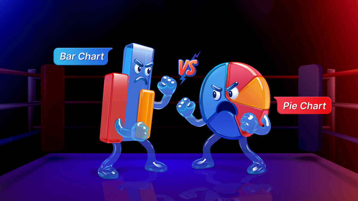
TL;DR: Bar charts and pie charts serve different purposes. Bar charts are best for comparisons, while pie charts are ideal for visualizing proportions. This blog post walks you through the decision-making process, complete with .NET MAUI code samples, tips for interactivity, and design enhancements using Syncfusion® Toolkit.
Welcome to our Chart of the Week blog series!
Choosing the right chart can make or break how your audience understands your data. In this blog, we’ll break down the key differences between bar charts and pie charts—and show you how to build them using the powerful Syncfusion .NET MAUI Toolkit.
Data visualization transforms complex numbers into clear, impactful insights. But selecting the wrong chart type can blur your message. Bar charts and pie charts are both popular yet serve different roles. We’ll explore when to use each, highlight their strengths and limitations, and walk you through practical examples to help you visualize smarter.
 Let’s get started!
Understanding the Basics
Bar chart
A bar chart represents data using rectangular bars, where the length of each bar corresponds to its value. It is ideal for comparing different categories or tracking changes over time.
Pie chart
A pie chart divides a circular area into proportional slices, each representing a percentage of the total. It is best suited for displaying data distributions and proportions.
When to Use a Bar Chart?
Bar charts are highly effective when dealing with:
- Comparing multiple categories (e.g., revenue across different regions)
- Tracking trends over time (using grouped or stacked bars)
- Handling large datasets with multiple values
- Visualizing negative and positive values side by side
Example use case
A company wants to compare its monthly sales across different regions. A bar chart clearly shows how each region performs, making it easy to analyze trends and disparities.
When to Use a Pie Chart?
Pie charts work best when:
- Showing the percentage distribution of a single dataset
- Visualizing a simple dataset with a limited number of categories (ideal for 3–6 segments)
- Emphasizing proportions rather than absolute values
Example use case
A household wants to analyze its monthly expenses. A pie chart effectively visualizes how much of the budget goes toward rent, groceries, entertainment, and savings.
Bar Chart vs. Pie Chart: Pros & Cons
|
Feature |
Bar Chart |
Pie Chart |
|
Best for |
Comparisons |
Proportions |
|
Handles large datasets |
Yes |
No |
|
Shows trends |
Yes |
No |
|
Easy to interpret |
Yes |
Yes |
|
Works with negative values |
Yes |
No |
|
Visually appealing |
Yes |
Yes (If limited segments) |
Here’s a step-by-step guide to implementing the Bar Chart and Pie Chart in the Syncfusion® .NET MAUI Toolkit using the SfCartesianChart and SfCircularChart controls.
Step 1: Create the Model
Define a model class to represent the data for both charts, as shown in the code example below.
public class ChartModel
{
    public string Source { get; set; }
    public string TrafficImage { get; set; }
    public double Visitors { get; set; }
    public double DailyActiveUsers { get; set; }
    public string AgeGroup { get; set; }
    public double Percentage { get; set; }
}
Step 2: Create the ViewModel
In the ViewModel, we will create sample data for the Bar Chart (Visualize traffic stats) and the Pie Chart (Age group distribution of users).
Refer to the following code example.
public class ViewModel
{
    public ObservableCollection TrafficStats { get; set; }
    public ObservableCollection ActiveUsers { get; set; }

    public ViewModel()
    {
        TrafficStats = new ObservableCollection
        {
            new ChartModel { Source = "Google",   Visitors = 1200 },
            new ChartModel { Source = "Facebook", Visitors = 950  },
            new ChartModel { Source = "Twitter",  Visitors = 700  },
            new ChartModel { Source = "LinkedIn", Visitors = 450  }
        };

        ActiveUsers = new ObservableCollection
        {
            new ChartModel { Category = "Rent",         Percentage = 40 },
            new ChartModel { Category = "Groceries",    Percentage = 20 },
            new ChartModel { Category = "Transport",    Percentage = 15 },
            new ChartModel { Category = "Entertainment",Percentage = 10 },
            new ChartModel { Category = "Savings",      Percentage = 15 }
        };
    }
}
Step 3: Bind data to the Bar Chart (Traffic stats)
Use the SfCartesianChart to visualize traffic stats as a Bar Chart, as shown in the code example below.
<chart:SfCartesianChart IsTransposed="True">
    <chart:SfCartesianChart.XAxes>
        <chart:CategoryAxis>
            <chart:CategoryAxis.Title>
                <chart:ChartAxisTitle Text="Social Media" />
            </chart:CategoryAxis.Title>
        </chart:CategoryAxis>
    </chart:SfCartesianChart.XAxes>

    <chart:SfCartesianChart.YAxes>
        <chart:NumericalAxis />
    </chart:SfCartesianChart.YAxes>

    <chart:ColumnSeries
        ItemsSource="{Binding TrafficStats}"
        XBindingPath="Source"
        YBindingPath="Visitors"
        ShowDataLabels="True" />

    <chart:ColumnSeries
        ItemsSource="{Binding TrafficStats}"
        XBindingPath="Source"
        YBindingPath="DailyActiveUsers"
        ShowDataLabels="True" />
</chart:SfCartesianChart>
Step 4: Bind Data to the Pie Chart
Use the SfCircularChart to visualize the age group distribution of users as a pie chart, as shown in the code example below.
<chart:SfCircularChart.Legend>
    <chart:ChartLegend Placement="Right" />
</chart:SfCircularChart.Legend>

<chart:PieSeries
    ItemsSource="{Binding ActiveUsers}"
    XBindingPath="AgeGroup"
    YBindingPath="Percentage">
</chart:PieSeries>
Step 5: Enhance the appearance and effectiveness of the chart.
Customizing the tooltip for better readability
Instead of default tooltips, you can create a custom tooltip template to show icons and values clearly. The tooltip will show the platform logo, name, and visitor count when hovering over a bar.
Refer to the following code example.
<chart:ColumnSeries.TooltipTemplate>
    <DataTemplate>
        <StackLayout BackgroundColor="Black" Padding="5" Orientation="Horizontal">
            <Image Source="{Binding TrafficImage}" WidthRequest="20" HeightRequest="20" />
            <Label Text="{Binding Source}" TextColor="White" FontSize="14" Margin="5,0,0,0" />
            <Label Text="Visitors: {Binding Visitors}" TextColor="White" FontSize="14" />
        </StackLayout>
    </DataTemplate>
</chart:ColumnSeries.TooltipTemplate>
Adding legends to improve clarity
Use a legend to differentiate visitors and daily active users. A legend at the bottom makes it easy to distinguish between the two datasets.
Refer to the following code example.
<chart:SfCartesianChart.Legend>
    <chart:ChartLegend Placement="Bottom" IsVisible="{OnPlatform Android='False',iOS='False',Default='True'}" />
</chart:SfCartesianChart.Legend>
Enhancing the Pie Chart with the Explode feature
The largest age group slice is pulled out, drawing focus to the most significant segment. To make certain slices more prominent, use the ExplodeIndex property, as shown in the code example below.
<chart:PieSeries
    ItemsSource="{Binding ActiveUsers}"
    XBindingPath="AgeGroup"
    YBindingPath="Percentage"
    ExplodeOnTouch="True"
    ExplodeIndex="3">
</chart:PieSeries>
Choosing the right chart: A quick guide
- If you need comparisons → Use a Bar Chart
- If you need proportions → Use a Pie Chart
- If you have many categories → Avoid Pie Charts
Choosing the right chart type ensures your data is easily interpretable and visually appealing. Use bar charts when comparing values and pie charts when showing percentage distributions.
By leveraging Syncfusion’s .NET MAUI Toolkit SfCartesianChart and SfCircularChart, you can build interactive and insightful visualizations for your applications.
After executing the previously outlined steps, the output will look like the following image.
GitHub reference
For more details, refer to the project on the GitHub demo.

Conclusion
We hope this guide helped you decide when to use a bar chart versus a pie chart. Using the Syncfusion® .NET MAUI Toolkit, you can easily bring your data to life with clean models, smooth data binding, interactive legends, custom tooltips, and stunning explode effects.
Ready to take your charts to the next level? Start implementing our shared examples and share your experience in the comments.
Existing customers can access the new version of Essential Studio® on the license and downloads page. If you aren’t a Syncfusion® customer, try our 30-day free trial to explore these new features along with over 1,900 other UI components.
For further help, reach out to us via our support forum, support portal, or feedback portal—we’re here to help you build beautiful, data-driven apps with ease.


 No spam, just valuable updates.