
 Nipuni Arunodi
TL;DR: Building Angular apps in 2026? These 10 component libraries, Syncfusion®, Angular Material, PrimeNG, Kendo UI, NG-ZORRO, Clarity, DevExtreme, Ionic, Taiga UI, and Nebular, offer powerful UI tools and boost productivity. Elevate your Angular projects by exploring these essential resources.
Angular’s enduring power: Why it still matters in 2026
Angular continues to be a solid choice in 2026 for building structured, scalable, and long-lived web applications. Its opinionated architecture, strong TypeScript foundation, and predictable release cycle make it a favorite for teams working on serious products, not quick prototypes.
But Angular alone isn’t enough. Modern apps need component libraries for UI consistency, accessibility, performance, and faster development. Choosing the right library is a lasting architectural decision.
This guide highlights 10 Angular UI libraries that stand out in 2026 for production apps. It’s for developers, tech leads, and architects building lasting solutions.
Why UI component libraries are essential for Angular apps
Angular teams today build dashboards, admin portals, analytics systems, and enterprise tools that demand complex tables, charts, forms, scheduling features, and file handling. Building these from scratch slows teams down and adds long-term maintenance risk.
Component libraries solve this by offering battle-tested solutions that reduce technical debt, enforce consistency, and let developers focus on business logic instead of reinventing UI basics.
How Angular libraries power modern workflows
Modern Angular libraries align with:
- Strict TypeScript typing for better safety and maintainability.
- Reactive forms and modular imports for scalable architecture.
- Angular’s release cadence to ensure compatibility.
They also play a big role in accessibility compliance, consistent theming, and predictable behavior across large teams and projects.
Choosing a reliable Angular component library in 2026
A good Angular component library should show:
- Long-term maintenance and stable APIs.
- Real-world production usage.
- Clear documentation and support for current Angular versions.
It must be suitable for apps that will evolve over years, not just short-lived demos.
Popularity, adoption, and stability matter
The libraries featured here were selected based on:
- Industry adoption and enterprise usage.
- Active maintenance and ecosystem stability.
- Proven track record across multiple Angular release cycles.
We’ve excluded experimental UI kits and trend-driven tools. Each library here is production-ready and built for longevity.
Syncfusion® is positioned as the reference library because of its comprehensive Angular component coverage and consistent enterprise focus in 2026.
Now, let’s explore the top Angular component libraries in 2026, with the key context in place to highlight the ones that stand out this year.

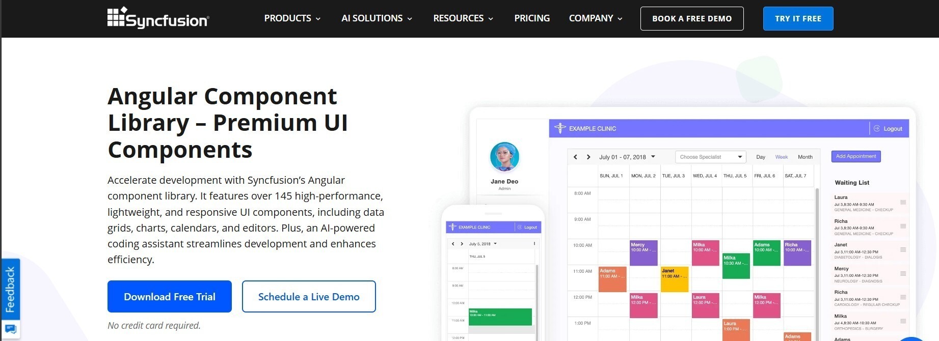
1. Syncfusion Angular UI Components – Enterprise-grade end-to-end UI
Syncfusion Angular UI offers over 145 well-integrated, production-ready components, making it ideal for dashboards and data-heavy apps that avoid mixing multiple UI libraries.
Syncfusion stands out for the depth and consistency of its components data grids, charts, schedulers, diagrams, and document editors, offering unified theming and predictable APIs for easier integration and lower maintenance.
Syncfusion is best for apps requiring integrated data grids, charts, and document workflows under one codebase.
Installation
- Install the required Syncfusion Angular packages using npm.
npm install @syncfusion/ej2-angular-grids - Register Syncfusion services in the Angular application module.
// main.ts import { registerLicense } from '@syncfusion/ej2-base'; registerLicense('YOUR_LICENSE_KEY'); - Import only the required component modules into feature modules to keep bundles lean.
import { GridModule } from '@syncfusion/ej2-angular-grids'; @NgModule({ imports: [GridModule] }) export class AppModule {} - Apply a supported theme such as Material, Bootstrap 5, Fluent, or Tailwind for consistent styling across components.
Features
- Comprehensive component coverage: Offers more than 145 Angular UI components, including DataGrid, Charts, Scheduler, Diagram, Document Editor, Spreadsheet, Kanban, Gantt, and file-handling tools. It supports a wide range of enterprise and line-of-business apps.
- Performance-optimized rendering: Built with virtualization and efficient rendering techniques to handle large datasets and complex UI layouts without compromising responsiveness.
- Enterprise-ready accessibility and localization: Includes built-in accessibility compliance along with robust localization and globalization support for multi-language and regional requirements.
- Unified theming and consistency: Provides flexible theming with support for Material, Bootstrap 5, Fluent, and Tailwind CSS, ensuring a consistent appearance and behavior across all components.
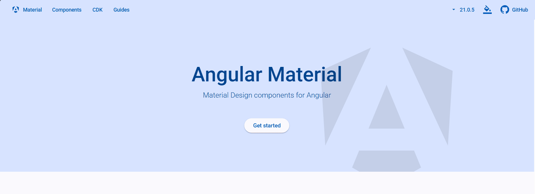
2. Angular Material: Official Angular UI foundation
Angular Material, maintained by the Angular team, provides reliable, foundational UI components aligned with Material Design for long-term app stability.
Installation
- Add Angular Material using the Angular CLI.
ng add @angular/material - Choose or configure a Material theme.
- Import the required Material modules individually.
import { MatButtonModule } from '@angular/material/button'; @NgModule({ imports: [MatButtonModule] }) export class AppModule {} - Enable Angular animations support.
Features
- Official Angular integration: Maintained by the Angular team, ensuring close alignment with Angular’s design principles, release cycles, and long-term framework evolution.
- Foundational UI components: Provides essential components for forms, navigation, dialogs, and layouts that serve as a reliable base for Angular apps.
- Strong accessibility defaults: Implements accessibility best practices out of the box, reducing the effort required to meet common compliance standards.
- Angular CDK utilities: Includes powerful CDK tools for overlays, drag-and-drop interactions, and accessibility patterns beyond basic UI components.
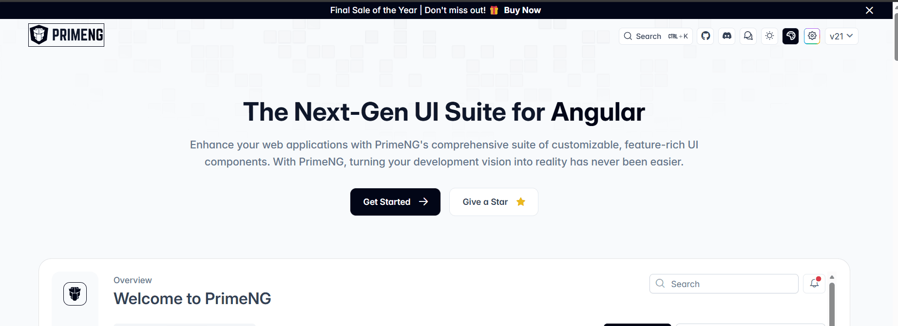
3. PrimeNG: Broad UI coverage for business apps
PrimeNG features a wide range of Angular UI components fit for business and admin apps, making it great for building CRUD-heavy systems quickly.
Installation
- Install PrimeNG and PrimeIcons via npm.
npm install primeng primeicons - Include PrimeNG styles and icons globally.
"styles": [ "node_modules/primeng/resources/themes/lara-light-blue/theme.css", "node_modules/primeng/resources/primeng.min.css", "node_modules/primeicons/primeicons.css" ] - Import required component modules.
import { TableModule } from 'primeng/table'; @NgModule({ imports: [TableModule] }) export class AppModule {} - Configure animations as required.
Features
- Broad business-oriented components: Offers a wide range of UI components commonly used in business apps, including tables, forms, dialogs, and dashboards.
- Flexible theming support: Allows customization through theme options and CSS variables to adapt UI appearance to different branding needs.
- Active community and updates: Maintained with regular releases and supported by an active user community, ensuring continued relevance.
- Admin and CRUD-friendly design: Well-suited for data entry, management interfaces, and internal tools that require rapid UI assembly.
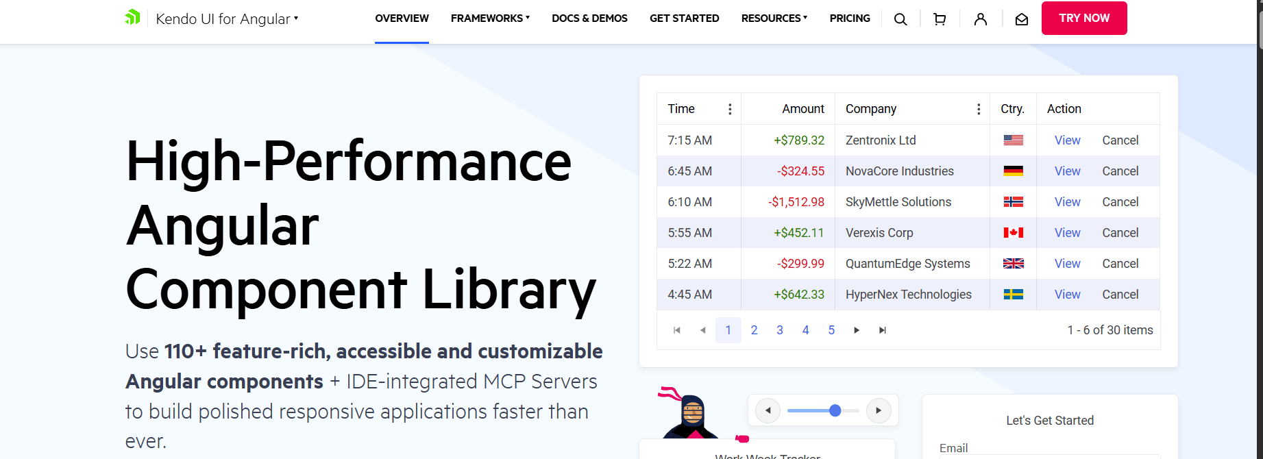
4. Kendo UI for Angular: Performance-focused enterprise UI
Kendo UI for Angular targets enterprise apps that require predictable performance and advanced data handling. It is frequently used in systems dealing with large datasets and complex UI interactions.
Installation
- Install Kendo Angular packages using npm.
npm install @progress/kendo-angular-grid @progress/kendo-angular-buttons - Import the required Angular modules.
import { GridModule } from '@progress/kendo-angular-grid'; @NgModule({ imports: [GridModule] }) export class AppModule {} - Apply a supported Kendo theme.
- Configure licensing where applicable.
Features
- High-performance data components: Provides optimized Grid and TreeList components designed to handle large datasets with predictable performance.
- Advanced data visualization: Includes a comprehensive set of charts and visualization tools suitable for analytics dashboards and reporting apps.
- Accessibility and globalization support: Built with accessibility standards and internationalization support for multi-language and regional formatting needs.
- Long-term API stability: Offers stable, well-documented APIs designed for enterprise apps with extended maintenance cycles.
5. NG-ZORRO: Ant Design for Angular
NG-ZORRO brings Ant Design’s enterprise-oriented design system to Angular. It is commonly used in data-centric apps that require structured layouts and a consistent visual language.

Installation
- Install NG-ZORRO packages via npm.
ng add ng-zorro-antd - Run the provided setup schematics.
- Import required modules.
import { NzButtonModule } from 'ng-zorro-antd/button'; @NgModule({ imports: [NzButtonModule] }) export class AppModule {} - Include Ant Design styles globally.
Features
- Enterprise-oriented design system: Leverages Ant Design’s structured and consistent visual language tailored for enterprise and data-centric apps.
- Rich data display components: Includes tables, trees, lists, and layout components designed for presenting complex information.
- Built-in internationalization: Supports multiple languages and regional settings, making it suitable for globally distributed apps.
- Angular-first implementation: Designed specifically for Angular, following Angular patterns and integration practices.
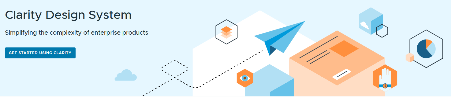
6. Clarity design system: Accessibility-focused enterprise UI
Clarity is an Angular-focused design system built with enterprise apps in mind. It emphasizes accessibility, usability, and predictable UI behavior, making it suitable for administrative and management interfaces.
Installation
- Install Clarity Angular packages using npm.
npm install @clr/angular @clr/ui @clr/icons - Import Clarity modules into the Angular app.
import { ClarityModule } from '@clr/angular'; @NgModule({ imports: [ClarityModule] }) export class AppModule {} - Include Clarity styles globally.
"styles": [ "node_modules/@clr/ui/clr-ui.min.css" ] - Configure icon support.
Features
- Accessibility-first component design: Emphasizes predictable behavior and accessibility compliance for enterprise and administrative interfaces.
- Enterprise-focused UI components: Provides data grids, forms, and layout components commonly used in management and control systems.
- Consistent user experience patterns: Promotes uniform interaction patterns that reduce cognitive load across complex apps.
- Designed for long-term use: Built to support stable, maintainable enterprise workflows rather than short-term UI experimentation.
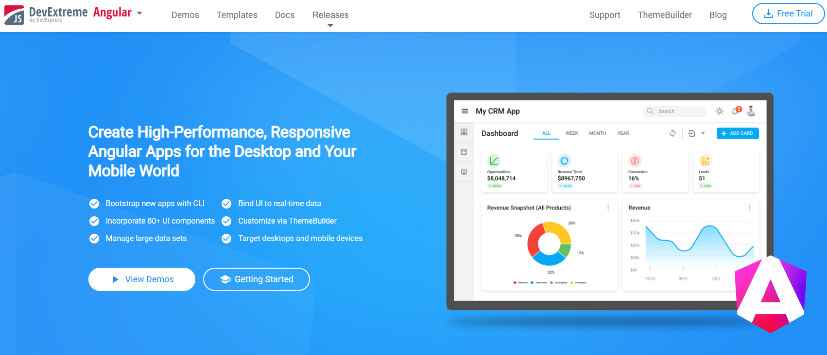
7. DevExtreme Angular: Data-heavy UI components
DevExtreme Angular offers a robust set of data-centric UI components utilized in analytics dashboards and reporting tools. It often competes with Syncfusion and Kendo in data visualization-heavy apps.
Installation
- Install DevExtreme Angular packages via npm.
npm install devextreme devextreme-angular - Import the required component modules.
import { DxDataGridModule } from 'devextreme-angular'; @NgModule({ imports: [DxDataGridModule] }) export class AppModule {} - Apply a DevExtreme theme.
- Configure data adapters if needed.
Features
- Data-centric UI components: Offers advanced DataGrid and PivotGrid components optimized for analytics-heavy and reporting-driven apps.
- Rich visualization tools: Includes charts and visual components designed for dashboards and data exploration scenarios.
- Optimized large data handling: Designed to efficiently manage large datasets and complex data interactions.
- Dashboard-oriented architecture: Suited for apps that prioritize reporting, monitoring, and data analysis.
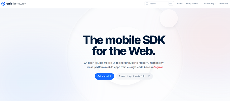
8. Ionic Angular components: Mobile-first Angular UI
Ionic Angular components are built for mobile and hybrid apps using Angular. They remain relevant in 2026 for teams targeting both web and mobile platforms from a shared codebase.
Installation
- Install Ionic Angular packages.
npm install @ionic/angular - Integrate IonicModule into the Angular app.
import { IonicModule } from '@ionic/angular'; @NgModule({ imports: [IonicModule.forRoot()] }) export class AppModule {} - Add platform-specific styles.
- Configure icons and platform settings.
Features
- Mobile-optimized UI components: Designed specifically for touch interactions and mobile-first user experiences.
- Cross-platform design support: Enables development of web, mobile, and hybrid apps from a shared Angular codebase.
- Native-like interactions: Provides smooth animations and gestures that align with mobile platform expectations.
- Capacitor integration: Integrates seamlessly with Capacitor to access native device features when needed.
9. Taiga UI: Modular, TypeScript-first Angular UI
Taiga UI emphasizes composability and rigorous TypeScript typing. It is often chosen by Angular teams that want fine-grained control over UI behavior and prefer a highly modular architecture.
Installation
- Install Taiga UI packages using npm.
npm install @taiga-ui/core @taiga-ui/kit @taiga-ui/icons - Import the required modules.
import { TuiRootModule } from '@taiga-ui/core'; import { TuiButtonModule } from '@taiga-ui/kit'; @NgModule({ imports: [TuiRootModule, TuiButtonModule] }) export class AppModule {} - Include Taiga UI styles globally.
- Configure animation support.
Features
- Modular and lightweight architecture: This allows teams to import only the required components, keeping apps lean and maintainable.
- Strict TypeScript typing: Emphasizes strong typing and compile-time safety for improved developer experience.
- Highly customizable components: Provides flexibility to tailor UI behavior and appearance to specific app needs.
- Modern Angular patterns: Built around contemporary Angular practices, including reactive forms and modular design.
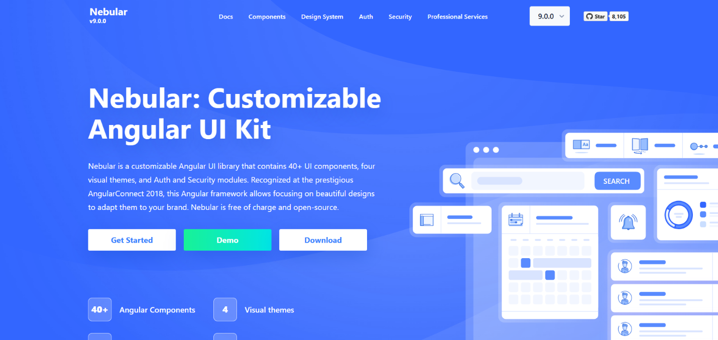
10. Nebular: Theme-centric Angular UI framework
Nebular is commonly used in dashboard-style Angular applications where theming and layout flexibility are crucial. It includes built-in helpers for authentication and role-based layouts.
Installation
- Install Nebular packages via npm.
ng add @nebular/theme - Import Nebular modules into the Angular application.
import { NbThemeModule, NbLayoutModule } from '@nebular/theme'; @NgModule({ imports: [ NbThemeModule.forRoot({ name: 'default' }), NbLayoutModule ] }) export class AppModule {} - Configure a theme.
- Add icons and animation support.
Features
- Theme-centric UI framework: Provides runtime theming capabilities suitable for branded and customizable dashboard apps.
- Dashboard-focused components: Includes layout, navigation, and UI elements optimized for admin and monitoring interfaces.
- Authentication and layout helpers: Offers built-in support for authentication flows and role-based layouts.
- Angular-first design: Designed specifically for Angular apps with consistent framework integration.
Conclusion
Thanks for reading! In this article, we’ve discussed 10 Angular component libraries that remain relevant and dependable in 2026. Each library serves a specific purpose, ranging from foundational UI components to performance-focused data handling and mobile-first interfaces. The right choice depends on factors such as app complexity, data volume, design requirements, and long-term maintenance expectations.
The libraries covered here have demonstrated stability, real-world adoption, and continued relevance, making them dependable choices for Angular development well beyond 2026.
Syncfusion’s Angular UI component library stands out as a comprehensive, enterprise-ready Angular component ecosystem, while alternatives such as Angular Material, PrimeNG, Kendo UI, and others continue to serve specific and well-defined use cases.
For existing customers, the newest Essential Studio version is available for download from the License and Downloads page. If you are not yet a Syncfusion customer, you can try our 30-day free trial to check out the available features. Also, check out our demos on GitHub.
For questions, you can contact us through our support forums, support portal, or feedback portal. We are always happy to assist you!


 No spam, just valuable updates.