
TL;DR: Learn how to forecast water consumption using Azure OpenAI and visualize it with Syncfusion® Blazor Spline Chart. This blog walks you through building an AI-powered dashboard featuring a dynamic water consumption chart that predicts future usage trends in New York City with interactive, real-time visualizations
Welcome to our Weekly Data Visualization blog series!
Water is our most vital resource, but it’s not unlimited. With growing populations and changing environmental conditions, managing water consumption efficiently has become a critical global challenge. Traditional water usage monitoring relies on historical data; however, accurate forecasting of future demand could revolutionize resource management. This foresight would be a game-changer for water authorities, enabling them to optimize supply, reduce waste, and proactively manage resources.
This is where modern technology steps in. By harnessing the capabilities of Artificial Intelligence alongside rich, interactive data visualization, historical data can be transformed into a powerful predictive tool.
This blog post outlines the process of building an intelligent water consumption forecasting application. A spline chart from Syncfusion® Blazor Chart is used to deliver a visually appealing and intuitive representation of the data. The intelligent aspect is powered by an AI model that analyzes historical trends to predict future water demand, showcasing how complex datasets can be transformed into actionable insights.
Prerequisites
Before getting started, ensure you have access to Azure OpenAI and have set up a deployment in the Azure portal. You will need the following credentials for the integration:
- Azure OpenAI API key.
- Model name (GPT-4 is utilized in this example).
- Endpoint URL.
Why choose Syncfusion® Blazor Charts?
When it comes to visualizing data in a Blazor application, you need a component that is not only powerful but also seamlessly integrates with the framework. Syncfusion® suite of Blazor components, especially its Charts library, stands out as an exceptional choice for several reasons:
- Wide variety of chart types: While a spline chart is used to illustrate the smooth trend of water consumption, Syncfusion® provides access to over 50 additional chart types. This versatility enables seamless expansion of the dashboard to include bar charts for monthly comparisons, pie charts for usage breakdowns, or other visualizations tailored to specific analytical needs.
- Rich interactivity: Data visualization is most effective when it’s interactive. Syncfusion® charts come with built-in features like zooming, panning, trackball support, and tooltips. This allows end-users to intuitively explore the data, compare the AI-powered forecast against historical trends, and drill down into specific time periods without any extra coding.
- Full Blazor integration: Syncfusion® components are built from the ground up for Blazor, not just JavaScript wrappers. This means they follow Blazor’s component lifecycle and data-binding patterns, leading to a more natural and efficient development experience. You can easily bind the chart directly to your C# data models.
- Stunning and customizable UI: A great application needs to look great. The Blazor Spline Chart offers a sleek, modern appearance out-of-the-box. More importantly, it provides an extensive set of APIs for customization. You can easily change colors, add markers, customize axes, and annotate the chart, for instance, to visually distinguish the forecasted data from the historical data.
By choosing Syncfusion®, you’re not just getting a chart; you’re equipping your application with a robust, feature-rich, and developer-friendly tool that turns complex data into beautiful and actionable insights.
Note: To get started with the Syncfusion® Blazor Chart, follow our getting started documentation.
Let’s get started!
Visualizing New York’s historical water consumption chart using Syncfusion® Blazor Spline Chart
Step 1: Preparing the data
The initial step involves collecting water consumption data for New York City spanning from 1979 to 2024, sourced from Data.Gov. Following this, a WaterConsumption class is defined to represent annual water usage and population figures, accommodating both historical records and predicted data points.
public class WaterConsumption
{
    public DateTime Year { get; set; }
    public double Population { get; set; }
    public double WaterConsumptionInGallons { get; set; }
}
The next step involves organizing the collected data into a list containing annual water consumption values, measured in million gallons per day, calculated based on population figures. This structured list serves as the data source for the chart visualization.
public List<WaterConsumption> WaterConsumptionData = new List<WaterConsumption>
{
    new WaterConsumption {
        Year = new DateTime(2010, 01, 01),
        Population = 8175133,
        WaterConsumptionInGallons = 1039
    },
    //….
    new WaterConsumption {
        Year = new DateTime(2024, 01, 01),
        Population = 8478000,
        WaterConsumptionInGallons = 1002
    }
};
Step 2: Configure the Blazor Spline Chart
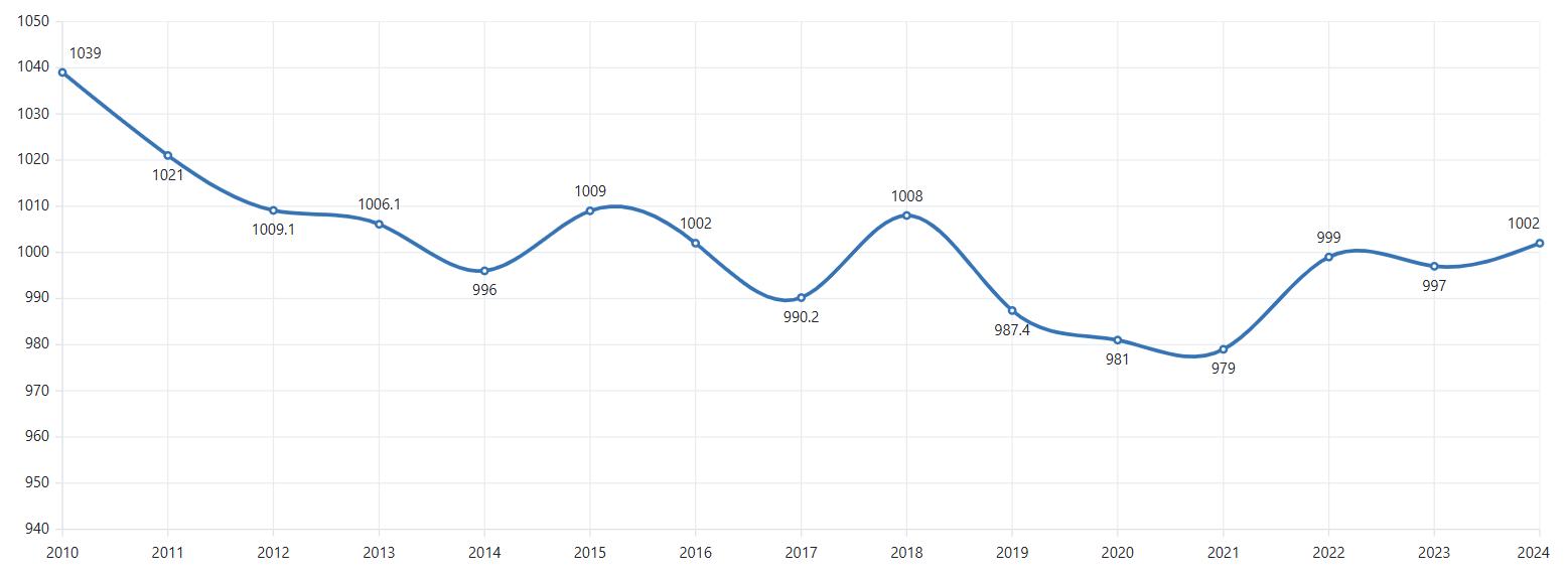
Let’s configure the Syncfusion® Blazor Chart to effectively visualize water consumption patterns over time. The Spline chart type is ideal for this scenario as it creates smooth curves between data points, providing a more natural representation of continuous data like water consumption trends.
The implementation configures the chart with two primary axes:
- X-axis: Using ChartPrimaryXAxis with type DateTime to represent years, with an Interval of 1 and IntervalType as Years to ensure appropriate time scaling.
- Y-axis: Using ChartPrimaryYAxis with the title NYC Consumption(Million gallons per day) to clearly indicate what the values represent.
For the chart series, the ChartSeries is configured with:
- Set the Type property to Spline, which renders the data as a smooth, curved line that is ideal for visualizing trends over time.
- The DataSource property is connected to the WaterConsumptionData list, making it the source for all the data points plotted on the chart.
- To map the data to the correct axes, the XName is bound to the Year field, and the YName is bound to the WaterConsumptionInGallons field.
- For better visibility, the line is styled with a Width of 3 pixels, and its Fill color is set to a distinct blue (#3674B5).
<SfChart>
    <ChartPrimaryXAxis Interval="1" IntervalType="IntervalType.Years" ValueType="Syncfusion.Blazor.Charts.ValueType.DateTime">
    </ChartPrimaryXAxis>
    <ChartSeriesCollection>
        <ChartSeries DataSource="@WaterConsumptionData" Width="3" Fill="#3674B5" XName="Year" YName="WaterConsumptionInGallons" Type="Syncfusion.Blazor.Charts.ChartSeriesType.Spline" >
        </ChartSeries>
    </ChartSeriesCollection>
</SfChart>
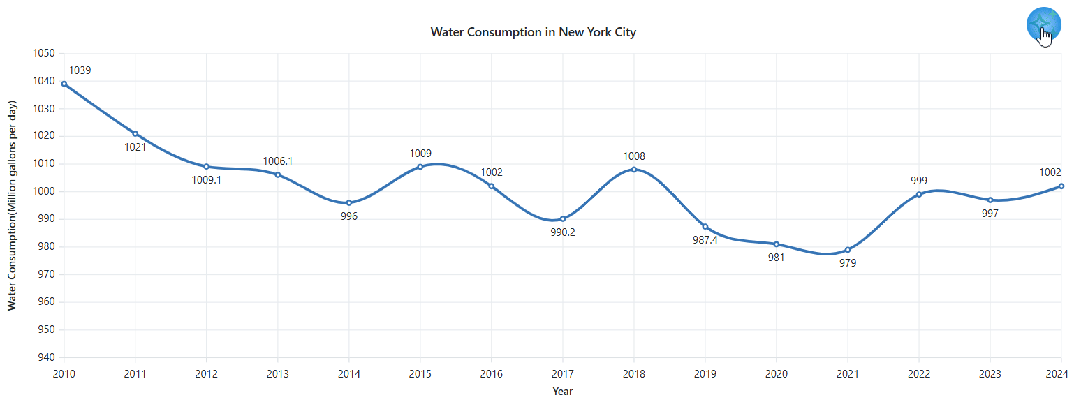
Refer to the following image,
Step 3: Enhance the Blazor Spline Chart with Visual Elements
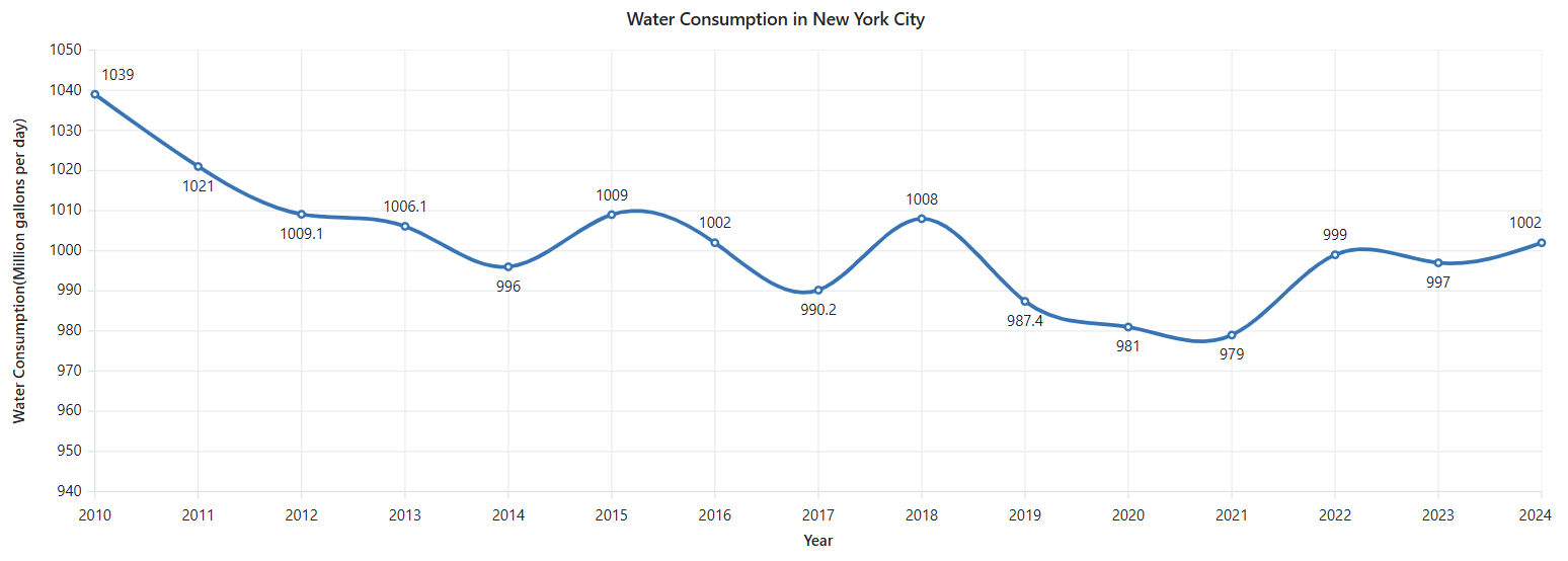
Once the Blazor Spline Chart is configured, customization can be applied to enhance its visual appeal and informational clarity. The chart is enriched with the following elements:
- Themed appearance: The Bootstrap5 theme is applied via the Theme property, providing the chart with a modern and professional appearance.
- Marker points: Markers are added using the ChartMarker feature, making each data point visible and effectively highlighting the water consumption value for individual years.
- Data labels: Data labels are enabled using the ChartDataLabel feature, allowing exact consumption values to be displayed directly on the chart for improved readability.
- Interactive tooltips: Tooltips are enabled to provide detailed information when hovering over individual data points, enhancing interactivity and user understanding.
- Flexible zooming: To enhance user experience, multiple zooming capabilities are enabled, including mouse wheel zoom, pinch-to-zoom, and selection-based zooming.
<SfChart Title="Water Consumption in New York City" Theme="Theme.Bootstrap5">
    <SfSpinner @bind-Visible="@SpinnerVisibility"></SfSpinner>
    <ChartPrimaryXAxis Interval="1" IntervalType="IntervalType.Years" Title="Year"
ValueType="Syncfusion.Blazor.Charts.ValueType.DateTime">
    </ChartPrimaryXAxis>
    <ChartPrimaryYAxis Title="Water Consumption(Million gallons per day)">
        <ChartAxisTitleStyle TextAlignment="Syncfusion.Blazor.Charts.Alignment.Center" />
    </ChartPrimaryYAxis>
    <ChartSeriesCollection>
        <ChartSeries DataSource="@WaterConsumptionData" Width="3" Fill="#3674B5" XName="Year" YName="WaterConsumptionInGallons" Type="Syncfusion.Blazor.Charts.ChartSeriesType.Spline" >
            <ChartMarker Visible="true" Height="5" Width="5">
                <ChartDataLabel Visible="true">
                </ChartDataLabel>
            </ChartMarker>
        </ChartSeries>
    </ChartSeriesCollection>
    <ChartTooltipSettings Enable="true" Format="${point.x} : <b>${point.y} MGD</b>"></ChartTooltipSettings>
    <ChartZoomSettings EnableMouseWheelZooming="true" EnablePinchZooming="true" EnableSelectionZooming="true"></ChartZoomSettings>
</SfChart>
Refer to the following image.
Forecast future data trends and update the Blazor Spline Chart
With the configuration and customization of the Blazor Spline Chart complete, the next step involves implementing logic to forecast future water consumption trends using historical data, powered by Azure OpenAI.
Step 1: Enhance the UI to support future trends
The next step involves preparing the user interface to display the water consumption forecast alongside historical data. To accomplish this, the following enhancements are introduced:
Add a button to initiate future trends
An AI-powered button is created using the Syncfusion® Blazor Button component to generate the forecast. Upon interaction, the button triggers a call to Azure OpenAI to retrieve predictive data and dynamically plots the new trendline on the chart.
For a seamless user experience, the button is styled with custom animations and a visually appealing design to initiate the forecasting process.
<SfButton  @onclick="AnimateButton" aria-label="AI Assistant" CssClass="@($"ai-button {animationClass}")"></SfButton>

<style>
    .button-container {
        position: absolute;
        top: -10px;
        right: 10px;
        z-index: 100;
    }

    .ai-button {
        background-image: url('../ai_assist_view.png'), radial-gradient(circle, #97d6e1 0%, #077391 90%);
        background-size: contain;
        background-repeat: no-repeat;
        width: 40px;
        height: 40px;
        border-radius: 50%;
        border: none;
        box-shadow: 0 0 10px rgba(33, 150, 243, 0.7);
    }

    .ai-button:hover {
        background-image: url('../ai_assist_view.png'), radial-gradient(circle, #7cd1f8 0%, #1480d7 90%);
        background-size: contain;
        background-repeat: no-repeat;
        background-position: center;
    }

    .ai-button:active, .ai-button:focus {
        background-image: url('../ai_assist_view.png'), radial-gradient(circle,  #b0dff4 0%, #0c4d82 90%);
        background-size: contain;
        background-repeat: no-repeat;
        background-position: center;
        outline: none;
    }

    .pulse-animation {
        animation: pulse 1.5s infinite;
    }

    @@keyframes pulse {
        0% {
            box-shadow: 0 0 0 0 rgba(33, 150, 243, 0.7);
        }
        70% {
            box-shadow: 0 0 0 10px rgba(33, 150, 243, 0);
        }
        100% {
            box-shadow: 0 0 0 0 rgba(33, 150, 243, 0);
        }
    }
</style>
Refer to the following image,
Adding a Spinner for chart update visualization
To enhance the user experience, the Syncfusion® Blazor Spinner component is incorporated. It provides clear visual feedback, indicating that the AI model is processing the request and the chart is being updated with newly forecasted data.
<SfSpinner @bind-Visible="@SpinnerVisibility"></SfSpinner>

@code{
    private bool SpinnerVisibility { get; set; } = false;
}
Refer to the following image,
Step 2: Configure Azure OpenAI
To begin with, when integrating Azure OpenAI, service credentials must be configured. This involves adding the unique endpoint and access key to the appsettings.json file, ensuring a secure and standardized approach to managing configuration settings.
Insert the following JSON structure into the appsettings.json file, substituting the placeholder values with your specific Azure OpenAI credentials:
"AzureOpenAI": {
    "Endpoint": "your_endpoint_url",
    "ApiKey": "your-api-key",
    "DeploymentId": "model_name"
},
Replace your-endpoint-url, your-api-key, and model_name with your actual Azure OpenAI endpoint URL, API key, and deployed model name.
Step 3: Create a service to connect Azure OpenAI
To establish a connection with Azure OpenAI and retrieve AI-generated responses based on user input, a dedicated service class named AISampleService is created. This service accepts user queries, internally constructs a detailed prompt, and sends it to the Azure OpenAI API.
Upon receiving the response, the service processes the data and returns it for dynamic chart updates with relevant forecast information.
using System.Text.Json;

public class AISampleService
{
    private readonly HttpClient _httpClient;
    private readonly IConfiguration _configuration;
    private readonly string? _endpoint;
    private readonly string? _apiKey;
    private readonly string? _deploymentId;

    public AISampleService(HttpClient httpClient, IConfiguration configuration)
    {
        _httpClient = httpClient;
        _configuration = configuration;
        _endpoint = _configuration["AzureOpenAI:Endpoint"];
        _apiKey = _configuration["AzureOpenAI:ApiKey"];
        _deploymentId = _configuration["AzureOpenAI:DeploymentId"];
    }

    public async Task<string> GetAIResponse(string prompt)
    {
        var requestBody = new
            {
                messages = new[]
                {
                    new { role = "user", content = prompt }
                },
                max_tokens = 2000
            };

            var request = new HttpRequestMessage(HttpMethod.Post, $"{_endpoint}/openai/deployments/{_deploymentId}/chat/completions?api-version=2023-07-01-preview")
            {
                Content = JsonContent.Create(requestBody)
            };

            request.Headers.Add("api-key", _apiKey);

            var response = await _httpClient.SendAsync(request);
            if (response.IsSuccessStatusCode)
            {
                var responseJson = await response.Content.ReadAsStringAsync();
                using var doc = JsonDocument.Parse(responseJson);
                return doc.RootElement.GetProperty("choices")[0].GetProperty("message").GetProperty("content").GetString() ?? string.Empty;
            }
            else
            {
                var errorContent = await response.Content.ReadAsStringAsync();
                return $"Error: {response.StatusCode} - {errorContent}";
            }
    }
}
Step 4: Create a prompt to request future predicted data points
To generate realistic water consumption forecasts, a precise prompt is crafted for Azure OpenAI. The prompt requests data for the next five years in a specific JSON format, incorporates the historical dataset for context, and instructs the AI to maintain realistic fluctuations rather than linear patterns.
var lastYear = WaterConsumptionData.Max(d => d.Year).Year;

string dataJson = JsonConvert.SerializeObject(WaterConsumptionData);

string prompt = $"Generate {value} data for the next 5 years after {lastYear} " +
                $"in JSON array format using this structure: " +
                $"[{{\"Year\": \"2025-01-01\", \"Population\": 8500000, \"WaterConsumptionInGallons\": 1000}}]. " +
                $"Base it on: {dataJson} and the data should avoid uniform increase or decrease " +
                $"and should realistically reflect past trends and fluctuations.";
Step 5: Fetch data from Azure OpenAI
The AnimateButton method creates a smooth user experience when requesting AI-generated forecasts. It prevents multiple simultaneous requests by using an isLoading flag that guards against parallel executions.
When activated, it immediately displays a spinner component and applies a pulsing animation to the button itself, providing users with clear visual feedback that the system is processing their request.
After a brief delay to ensure UI updates are visible, it calls the GetForecastData method to fetch the AI-generated predictions. Once forecasting is complete, it returns all UI elements to their normal state by removing animations and hiding the spinner.
private async Task AnimateButton()
{
    if (isLoading)
    {
        return;
    }
    isLoading = true;
    SpinnerVisibility = true;
    animationClass = "pulse-animation";
    await InvokeAsync(StateHasChanged);
    await Task.Delay(2000);
    await GetForecastData("water consumption forecast ");
    isLoading = false;
    animationClass = "";
    await InvokeAsync(StateHasChanged);
    SpinnerVisibility = false;
}
The GetForecastData method handles generating and integrating AI forecast data. It serializes existing data into JSON to provide context to the AI model, then constructs a detailed prompt requesting forecast data in a specific format.
After receiving the response, it deserializes the JSON back into WaterConsumption objects and animates the addition of each new data point with a delay.
The combination of these methods creates an engaging user experience with clear visual indicators of AI processing and seamless integration of predictions into the existing chart visualization.
public async Task GetForecastData(string value)
{
    var lastYear = WaterConsumptionData.Max(d => d.Year).Year;
    string dataJson = JsonConvert.SerializeObject(WaterConsumptionData);
    string prompt = $@"Generate {value} data for the next 5 years after {lastYear} in JSON array format using this structure:
        [{{""Year"": ""2025-01-01"", ""Population"": 8500000, ""WaterConsumptionInGallons"": 1000}}].
        Base it on: {dataJson} and the data should avoid uniform increase or decrease and should realistically reflect past trends and fluctuations.";

    string result = await OpenAIService.GetAIResponse(prompt);
    var jsonStart = result.IndexOf('[');
    var jsonEnd = result.LastIndexOf(']');

    if (jsonStart >= 0 && jsonEnd > jsonStart)
    {
        var jsonSubstring = result.Substring(jsonStart, jsonEnd - jsonStart + 1);
        try
        {
            var forecastData = JsonConvert.DeserializeObject<List<WaterConsumption>>(jsonSubstring);
            if (forecastData != null)
            {
                foreach (var item in forecastData)
                {
                    WaterConsumptionData.Add(item);
                    StateHasChanged();
                    await Task.Delay(500);
                }
            }
        }
        catch (Exception ex)
        {
            Console.WriteLine($"Error deserializing forecast data: {ex.Message}");
        }
    }
}
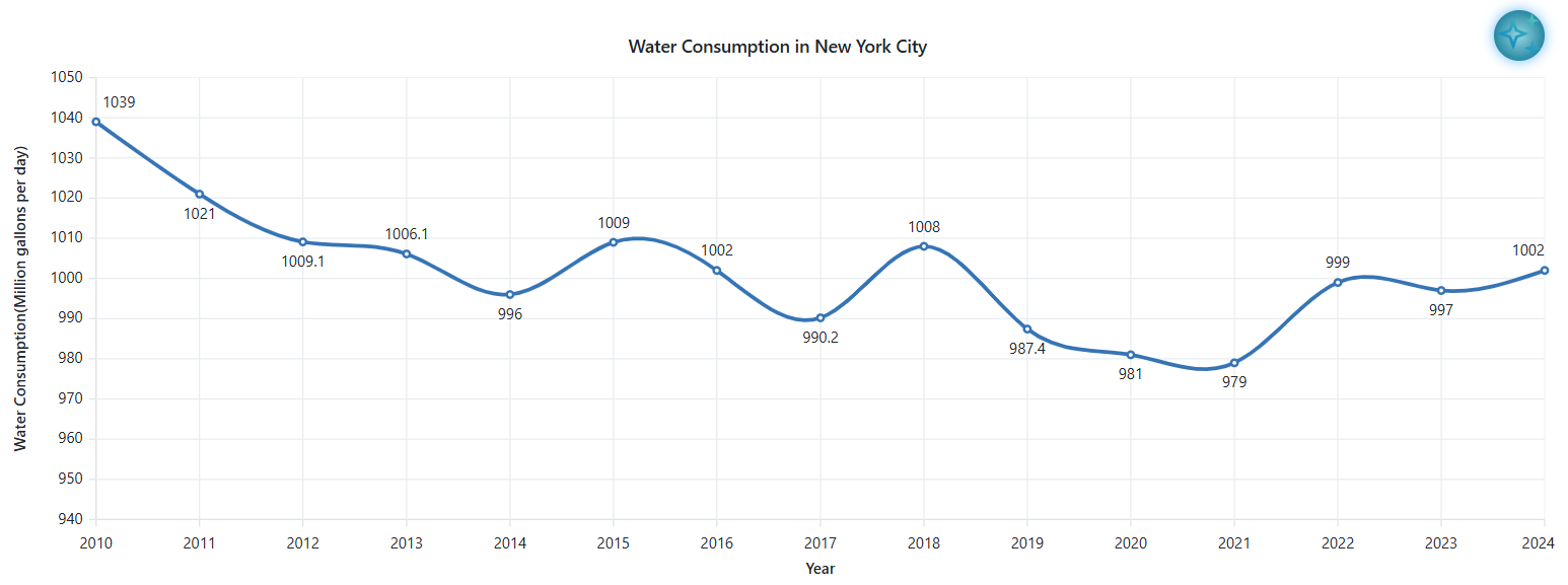
Step 6: Differentiating the AI-predicted data and predefined historical data using Striplines
To differentiate the historical data from the AI-predicted data, striplines are used in charts. The conditional rendering code below displays blue background strips in the chart that visually highlight the AI-generated forecast data.
When forecast data exists, semi-transparent blue strip lines appear behind the data points, starting from the first forecast date and extending across all predicted points.
@if (HasForecastData) {
    <ChartStriplines>
        @foreach(var strip in forecastStriplines) {
            <ChartStripline StartFromAxis="false" Start="@strip.Start" Size="@strip.Size" ZIndex="ZIndex.Behind" Opacity="0.2" Color="blue"/>
        }
    </ChartStriplines>
}
When forecast data is successfully generated, the GetForecastData method sets a flag indicating forecasts and creates a stripline entry that marks the starting point and span of the AI-generated data.
This allows users to visually distinguish between historical water consumption data and the AI-predicted future trends in the chart.
public async Task GetForecastData(string value)
{
    …
    …
    if (forecastData != null)
    {
        HasForecastData = true;
        var stripline = new StriplineInfo
        {
            Start = forecastData[0].Year,
            size = forecastData.Count
        };
        forecastStriplines.Add(stripline);
        …
        …
    }
}
Refer to the following image,

GitHub reference
For further details, check out the GitHub demo.

Conclusion
Thanks for reading! In this blog, we’ve learned how to forecast water consumption in New York City by collaborating with Azure OpenAI and Syncfusion® Blazor Spline Chart. Give it a try and leave your feedback in the comment section below.
If you’re already a Syncfusion® user, you can download the latest version of Essential Studio® from the license and downloads page. New to Syncfusion® Start your journey with a 30-day free trial and explore over 1,900 UI components, including powerful charting tools for Blazor.
If you need assistance, please do not hesitate to contact us via our support forum, support portal, or feedback portal. We are always eager to help you!


 No spam, just valuable updates.