

TL;DR: Learn to build a cross-platform AI-powered Sales Dashboard using Syncfusion® MAUI controls. This guide covers using real-time predictions, smart visualizations, and interactive UIs to create an executive dashboard. It includes integrating AI for sales forecasting and natural language insights, implementing reactive MVVM architecture, and visualizing metrics with charts, maps, gauges, and data grids. Discover how to combine AI with enterprise-grade performance for business-critical decision-making.
In today’s competitive business landscape, data visualization is just the beginning. This week, we’re showcasing an AI sales dashboard built with Syncfusion® MAUI controls that displays data beautifully and leverages AI to predict trends and provide actionable insights.
Why Syncfusion® MAUI Controls?
Syncfusion® offers a powerful suite of MAUI controls that work together to deliver a seamless, high-performance user experience across platforms. Developers benefit from:
- Rich visualizations: From area charts with gradient fills to dynamic gauges.
- Unified design: Consistent styling across all controls.
- Optimized rendering: Fast load times, even with complex data.
- Cross-platform support: Build once, and deploy on Windows, macOS, iOS, and Android.
Why Syncfusion® for AI dashboards?
When building intelligent dashboards, Syncfusion® goes beyond standard UI. Its MAUI controls are purposely built to meet the needs of AI-integrated applications:
- Complete control suite: Uniform components from a single vendor.
- AI-ready: Built to integrate easily with modern AI and ML services.
- High performance at scale: Handles large, complex datasets smoothly.
- Enterprise-grade: Backed by extensive documentation and support.
AI-Powered architecture
ViewModel integration
The dashboard uses a robust MVVM architecture with specialized ViewModels for each feature.
public class BaseViewModel : INotifyPropertyChanged
{
    public event PropertyChangedEventHandler? PropertyChanged;
    protected void OnPropertyChanged(string name) =>
        PropertyChanged?.Invoke(this, new PropertyChangedEventArgs(name));

    private bool _isBusy;
    public bool IsBusy
    {
        get => _isBusy;
        set { _isBusy = value; OnPropertyChanged(nameof(IsBusy)); }
    }
}

public class SalesTrendsViewModel : BaseViewModel
{
    public ObservableCollection<ProductInfo> ProductInfos { get; set; }
    public ObservableCollection<OrderInfo> OrderInfos { get; set; }

    public async Task LoadDashboardData()
    {
        var summary = await _salesDataService.GetSalesSummaryAsync(SelectedDateRange);
        TotalRevenue = summary["TotalRevenue"];
        ProfitMargin = (double)summary["AverageProfitMargin"];
        UpdateDashboardLabelCards();
    }
}

public class PredictionViewModel : BaseViewModel
{
    public ObservableCollection<SalesPrediction> Predictions { get; } = new();

    public async Task GeneratePredictions()
    {
        var predictions = await _predictionService.GetSalesPredictionsAsync(...);
        Predictions.Clear();
        foreach (var p in predictions)
            Predictions.Add(p);

        ConfidenceAverage = Predictions.Average(p => p.Confidence) * 100;
        PredictedTotalRevenue = Predictions.Sum(p => p.PredictedRevenue);
    }
}
Key features:
- Reactive property updates with INotifyPropertyChanged.
- Encapsulated business logic.
- Clear separation of concerns.
AI service layer
The application connects to AI services for predictions and natural language processing.
// base service class
public class AzureBaseService
  {
      internal const string Endpoint = "YOUR_END_POINT_NAME";
      internal const string DeploymentName = "DEPLOYMENT_NAME";
      internal const string ImageDeploymentName = "IMAGE_DEPOLYMENT_NAME";
      internal const string Key = "API_KEY";

      public AzureBaseService()
      {
          ValidateCredential();
      }

      public async Task<List<SalesPrediction>> PredictSalesTrend(
     List<SalesData> historicalData,
     DateRange predictionPeriod)
      {
          ..
      }
  }

// for sales data service
public class SalesDataService
{
    public SalesDataService()
    {
        LoadSampleData();
    }
}

// for prediction data service
public class PredictionService
  {
      public PredictionService(AzureBaseService baseAIService, SalesDataService salesDataService)
      {
          _baseAIService = baseAIService;
          _salesDataService = salesDataService;
      }

      public async Task<List<SalesPrediction>> GetSalesPredictionsAsync(
          DateRange historicalPeriod,
          DateRange futurePeriod)
      {
               …
      }
  }
Key features:
- Service abstraction for different AI providers.
- Asynchronous prediction generation.
- Natural language insight creation.
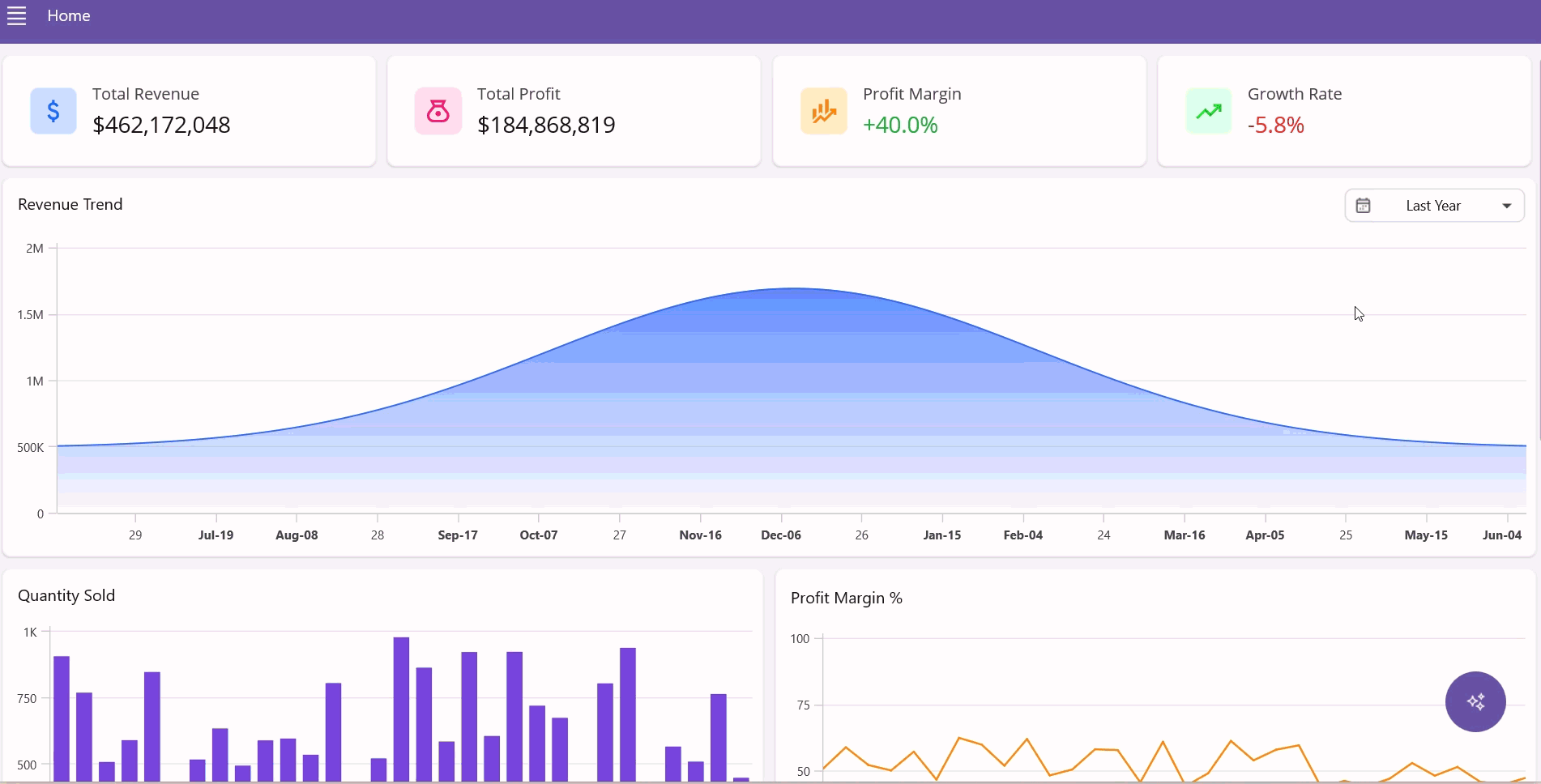
Page 1: Home dashboard
The home page gives executives a complete overview of sales performance.
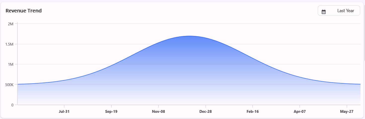
Revenue trend chart
Syncfusion® SfCartesianChart creates a beautiful revenue visualization that transforms complex sales data into a clear, visually appealing trend line. The chart uses a SplineAreaSeries for smooth curves that emphasize the overall revenue pattern while maintaining precise data representation. The gradient fill beneath the trend line adds visual depth, fading from solid at the top to transparent at the bottom, creating an elegant aesthetic that draws attention to high-revenue periods.
<chart:SfCartesianChart>

      <chart:SfCartesianChart.XAxes>
          <chart:DateTimeAxis />
      </chart:SfCartesianChart.XAxes>

      <chart:SfCartesianChart.YAxes>
          <chart:NumericalAxis/>
      </chart:SfCartesianChart.YAxes>

      <chart:SplineAreaSeries XBindingPath="Date" YBindingPath="Revenue"
ItemsSource="{Binding SalesData}">
      </chart:SplineAreaSeries>

</chart:SfCartesianChart>
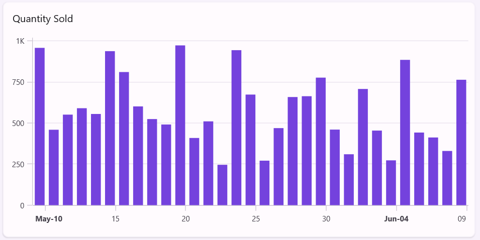
Quantity sold chart
The Column Chart visualization shows unit sales with a customizable appearance, clearly representing sales volume over time. Syncfusion® SfCartesianChart with ColumnSeries creates vertical bars that intuitively represent quantity, making it easy to identify periods of high and low sales activity at a glance. The uniform-width columns with consistent spacing help viewers quickly compare quantities across different periods.
<chart:SfCartesianChart>

    <chart:SfCartesianChart.XAxes>
        <chart:DateTimeAxis/>
    </chart:SfCartesianChart.XAxes>

    <chart:SfCartesianChart.YAxes>
        <chart:NumericalAxis />
    </chart:SfCartesianChart.YAxes>

    <chart:ColumnSeries XBindingPath="Date" YBindingPath="Quantity"
        ItemsSource="{Binding SalesData}"/>
</chart:SfCartesianChart>
Why use Syncfusion Cartesian Chart?
- Consistent styling across different chart types.
- Interactive tooltips for precise data reading.
- Cross-platform rendering with native performance.
- Beautiful gradients for a professional appearance.
- Smooth animations for data changes.
- Responsive zooming and panning with touch support.
- Real-time updates as data changes.
Page 2: Products dashboard
The products page helps managers understand product performance in detail.
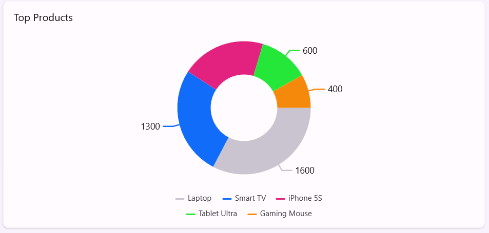
Top products chart
The SfCircularChart provides an immediate visualization of product revenue distribution, making it instantly clear which products drive the business. The chart’s interactive capabilities allow executives to isolate specific products by tapping segments or legend items, expanding them for emphasis during presentations.
The flexible legend layout adapts to available space, whether viewed on desktop or mobile, ensuring optimal readability across platforms. Custom color palettes maintain brand consistency while providing sufficient contrast for accessibility.
The tooltip support delivers precise figures on hover/tap, enabling quick access to exact revenue figures without requiring users to reference a separate data table.
<chart:SfCircularChart>

     <chart:SfCircularChart.Title>
         <Label Text="Top Products" FontSize="16" Style="{StaticResource labelStyle}" Margin="5,5,0,0"/>
     </chart:SfCircularChart.Title>

     <chart:DoughnutSeries ItemsSource="{Binding Products}"
     XBindingPath="Name" YBindingPath="BasePrice"/>

</chart:SfCircularChart>
Advantages of Syncfusion CircularChart
- Customizable inner radius: You can easily adjust the doughnut’s opening to create the perfect visual balance, from traditional pie (0) to ring-like doughnut (0.9).
- Segment explosion: When clicked/tapped, interactive segment separation highlights specific products for presentations or detailed analysis.
- Smart data labels: These automatically position data labels to avoid overlapping while displaying key metrics directly on the chart.
- Rich selection feedback: Visual highlighting when segments are selected with customizable colors.
- Dynamic legend interaction: Clicking/tapping legend items toggles visibility of corresponding segments, allowing focus on specific products.
- Center view customization: Display summary statistics (e.g., Total Revenue: $1.2M) in the doughnut’s center for added context.
- Gradient and pattern fills: Support for gradient fills, patterns, and textures to enhance visual differentiation between segments.
- Animation control: Customize loading animations with different easing functions.
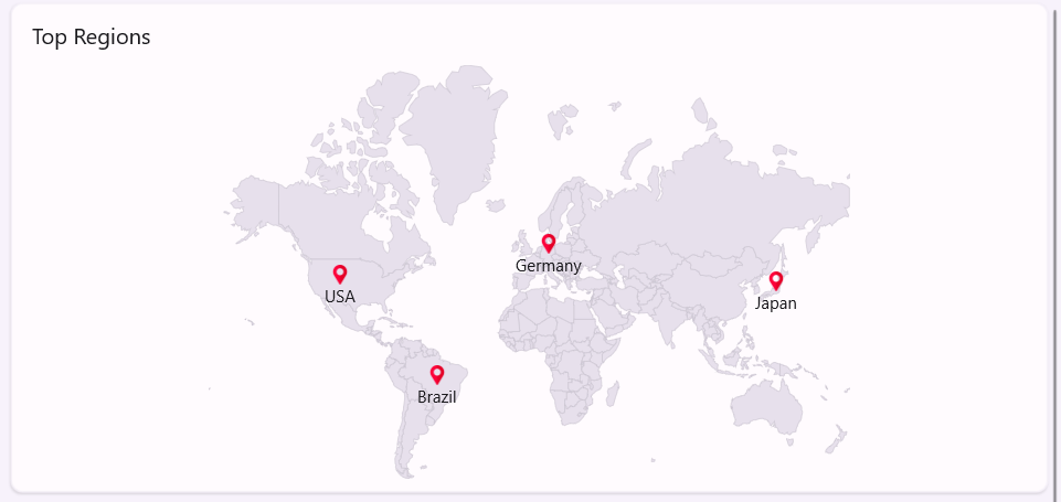
Regional sales map
In our dashboard, SfMaps visually correlates sales performance with geography, allowing executives to identify instantly:
- Top-performing sales territories.
- Untapped market opportunities.
- Regional trends requiring attention.
- Distribution coverage gaps.
The map’s custom markers dynamically reflect sales volume, with larger markers indicating higher revenue regions. This visualization makes it immediately apparent which global markets are driving business growth and which need additional focus, insights that would be difficult to discern from tabular data alone.
<map:SfMaps>

     <map:SfMaps.Layer>
         <map:MapShapeLayer ShapesSource="https://cdn.syncfusion.com/maps/map-data/world-map.json" Markers="{Binding MapMarkerCollection}"
  ShapeHoverFill="Transparent" ShapeHoverStroke="Transparent">
         </map:MapShapeLayer>
     </map:SfMaps.Layer>

</map:SfMaps>
Why SfMaps stands out
- Built-in shape data for countries and regions.
- Custom marker support with rich templating.
- Bubble visualization for quantitative data.
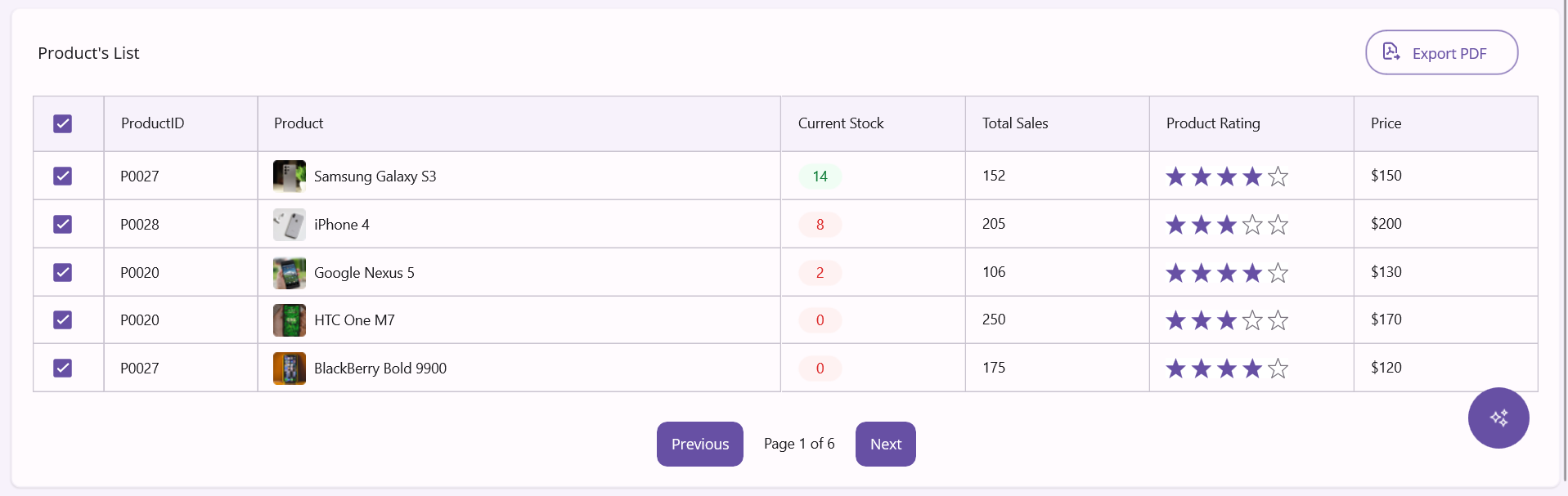
Product inventory grid
The products page features a comprehensive inventory grid powered by Syncfusion® SfDataGrid, delivering detailed product information with advanced visualization capabilities. The grid effectively showcases complex data types, combining product images for easy visual identification and an embedded rating control for quick quality assessment, all without navigating away from the main view.
Stock levels and availability are communicated through numeric values and intuitive icons. Optimized for performance, the grid supports smooth browsing of thousands of products using virtualization and efficient pagination, with platform-aware page sizes that scale appropriately for desktop and mobile experiences.
<dataGrid:SfDataGrid ItemsSource="{Binding ProductPagedItems}"
              HorizontalScrollBarVisibility="Always"
              VerticalScrollBarVisibility="Always"
              AutoGenerateColumnsMode="None" SortingMode="Single" HeaderGridLinesVisibility="Both" GridLinesVisibility="Both" ColumnWidthMode="Fill">

    <dataGrid:SfDataGrid.Columns>

        <dataGrid:DataGridTemplateColumn Width="70">
            <dataGrid:DataGridTemplateColumn.HeaderTemplate>
                <DataTemplate>
                    <buttons:SfCheckBox IsChecked="True" CheckedColor="#6750A4" Margin="7,0,0,0"/>
                </DataTemplate>
            </dataGrid:DataGridTemplateColumn.HeaderTemplate>
            <dataGrid:DataGridTemplateColumn.CellTemplate>
                <DataTemplate>
                    <buttons:SfCheckBox IsChecked="True" CheckedColor="#6750A4" Margin="7,0,0,0"/>
                </DataTemplate>
            </dataGrid:DataGridTemplateColumn.CellTemplate>
        </dataGrid:DataGridTemplateColumn>

         …..

    </dataGrid:SfDataGrid.Columns>

</dataGrid:SfDataGrid>
Page 3: Orders dashboard
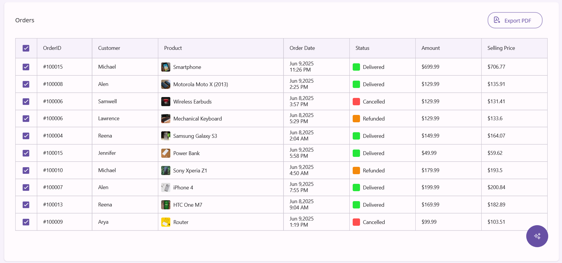
SfDataGrid presents order data with rich visual cues, including product images and color-coded status indicators. The column configuration provides a clean, organized view of critical order information with proper formatting for currency values.
The grid supports touch interaction on mobile devices while maintaining advanced features like sorting and filtering. Row virtualization ensures smooth performance even with thousands of orders, and the responsive layout adapts to different screen sizes for optimal viewing on any device.
With SfDataGrid’s paging support, users can navigate large order datasets using the intuitive paging controls at the bottom. The customizable page sizes are automatically adjusted based on device type for the best viewing experience.
      <dataGrid:SfDataGrid ItemsSource="{Binding OrderInfos}" HorizontalScrollBarVisibility="Always" VerticalScrollBarVisibility="Always AutoGenerateColumnsMode="None" SortingMode="Single" HeaderGridLinesVisibility="Both" GridLinesVisibility="Both" ColumnWidthMode="Fill">

          <dataGrid:SfDataGrid.Columns>

              <dataGrid:DataGridTemplateColumn Width="60">
                  <dataGrid:DataGridTemplateColumn.HeaderTemplate>
                      <DataTemplate>
                          <buttons:SfCheckBox IsChecked="True" CheckedColor="#6750A4" Margin="7,0,0,0"/>
                      </DataTemplate>
                  </dataGrid:DataGridTemplateColumn.HeaderTemplate>
                  <dataGrid:DataGridTemplateColumn.CellTemplate>
                      <DataTemplate>
                          <buttons:SfCheckBox IsChecked="True" CheckedColor="#6750A4" Margin="7,0,0,0"/>
                      </DataTemplate>
                  </dataGrid:DataGridTemplateColumn.CellTemplate>
              </dataGrid:DataGridTemplateColumn>

                        ……..

          </dataGrid:SfDataGrid.Columns>

      </dataGrid:SfDataGrid>
SfDataGrid’s advanced capabilities
- Virtualized rendering: Handles tens of thousands of records with smooth scrolling through UI virtualization, only visible cells are rendered.
- Excel-like filtering: A built-in filtering UI with advanced options (equals, contains, begins with, etc.) matching a familiar Excel experience.
- Multi-column sorting: End users can sort by multiple columns simultaneously by holding modifier keys during column header clicks.
- Freeze panes: Lock columns and rows for easier navigation of large datasets while keeping identifiers visible.
- Live data handling: Automatically updates as underlying data changes, perfect for real-time order tracking.
- Conditional Formatting: Apply styles based on cell values (e.g., red for canceled orders, green for delivered).
- Row grouping: Group orders by status, date, or customer with expandable headers and group summaries.
- Aggregate functions: Display totals, averages, and counts in group footers or grid summary rows.
- Export capabilities: One-click export to Excel or PDF for reporting and sharing.
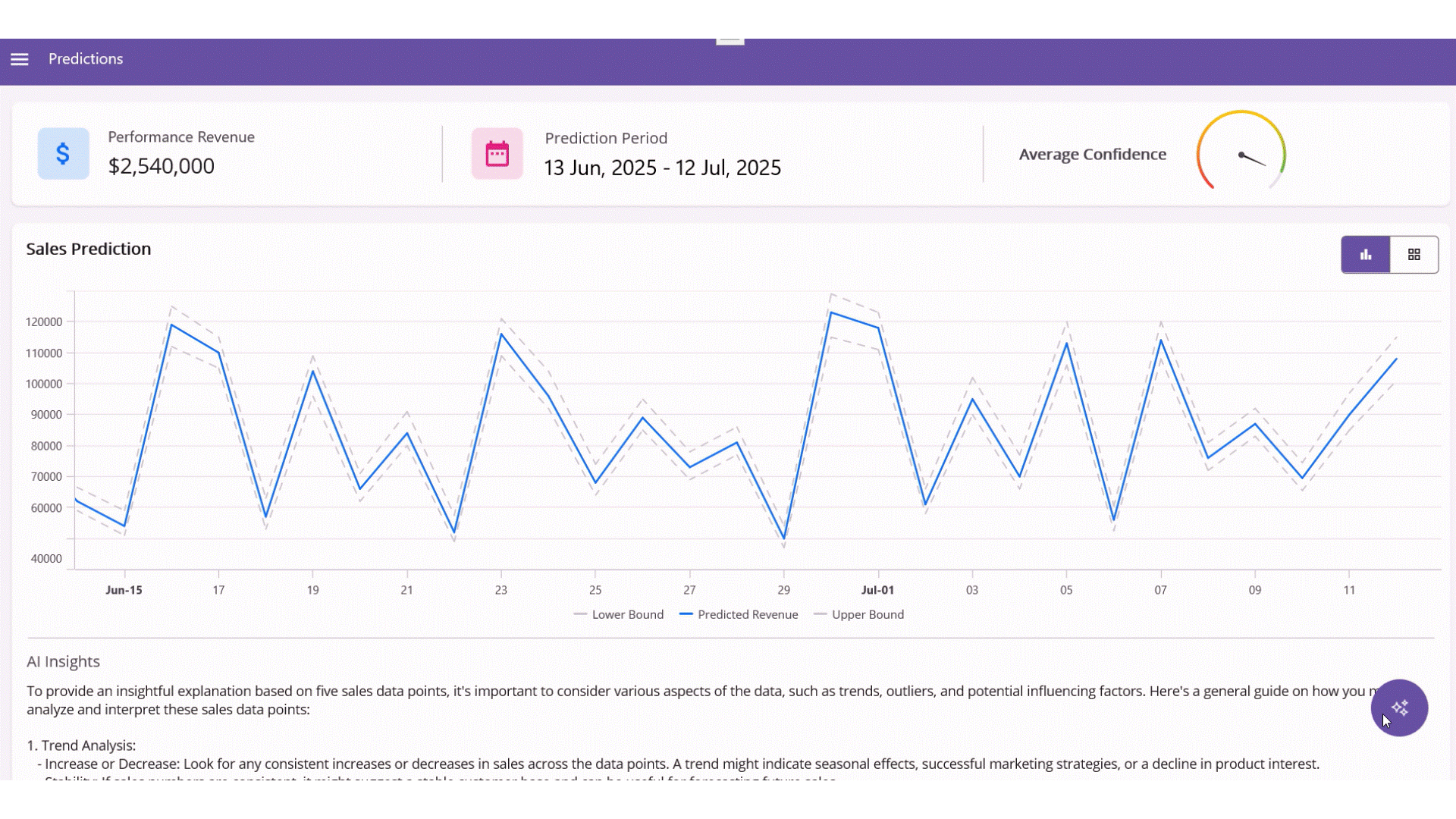
Page 4: Predictions dashboard
The Predictions page demonstrates how AI and visualization work together to forecast future performance.
Confidence meter
The SfRadialGauge transforms complex AI confidence scores into an easy-to-understand visual meter. Its color gradient provides instant feedback on prediction reliability, red for low confidence, yellow for moderate, and green for high. The animated needle points to the exact confidence percentage, making it simple for executives to assess how much trust to place in the AI’s forecasts.
<gauges:SfRadialGauge>

     <gauges:SfRadialGauge.Axes>
         <gauges:RadialAxis Minimum="0" Maximum="100" ShowLabels="False" ShowTicks="False">

             <gauges:RadialAxis.AxisLineStyle>
                 <gauges:RadialLineStyle Thickness="3"/>
             </gauges:RadialAxis.AxisLineStyle>

             <gauges:RadialAxis.Pointers>
                 <gauges:NeedlePointer Value="{Binding ConfidenceAverage}" NeedleLength="0.6" NeedleStartWidth="0.5" NeedleEndWidth="2" NeedleFill="Black" KnobRadius="0.07" KnobFill="Black"/>

                 <gauges:RangePointer Value="{Binding ConfidenceAverage}" PointerWidth="3" EnableAnimation="True" CornerStyle="BothCurve">
                     <gauges:RangePointer.GradientStops>
                         <gauges:GaugeGradientStop Value="0" Color="#F44336" />
                         <gauges:GaugeGradientStop Value="50" Color="#FFC107" />
                         <gauges:GaugeGradientStop Value="100" Color="#4CAF50" />
                     </gauges:RangePointer.GradientStops>
                 </gauges:RangePointer>

             </gauges:RadialAxis.Pointers>
         </gauges:RadialAxis>
     </gauges:SfRadialGauge.Axes>
 </gauges:SfRadialGauge>

Why Syncfusion® SfRadialGauge is Superior
- Multiple pointer types for different metrics.
- Gradient coloring for intuitive reading.
- Animation support for value changes.
- Highly customizable appearance for any design.
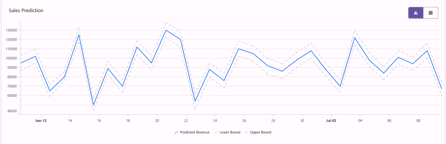
Sales prediction chart
The prediction chart visualizes AI forecasts with confidence intervals, providing a comprehensive view of projected revenue alongside statistical uncertainty. Syncfusion® SfCartesianChart excels at representing this complex predictive data through its multi-series capability, allowing decision makers to understand the expected outcomes and the range of possibilities.
The chart displays three critical components of AI forecasting: The primary prediction line (showing expected revenue) and two boundary lines representing the upper and lower confidence bounds. This visualization helps business leaders understand the prediction and its reliability over time. The dashed lines for boundaries create a visual “channel” of possibilities, instantly communicating where uncertainty is higher (wider bounds) or lower (narrower bounds).
       <chart:SfCartesianChart>

            <chart:SfCartesianChart.XAxes>
                <chart:DateTimeAxis/>
            </chart:SfCartesianChart.XAxes>

            <chart:SfCartesianChart.YAxes>
                <chart:NumericalAxis/>
            </chart:SfCartesianChart.YAxes>

            <chart:LineSeries ItemsSource="{Binding Predictions}"
                      XBindingPath="Date"
                      YBindingPath="PredictedRevenue"
                      Label="Predicted Revenue"/>

            <chart:LineSeries ItemsSource="{Binding Predictions}"
                      XBindingPath="Date"
                      YBindingPath="LowerBound"
                      Label="Lower Bound" />

            <chart:LineSeries ItemsSource="{Binding Predictions}"
                          XBindingPath="Date"
                          YBindingPath="UpperBound"
                          Label="Upper Bound"/>

       </chart:SfCartesianChart>
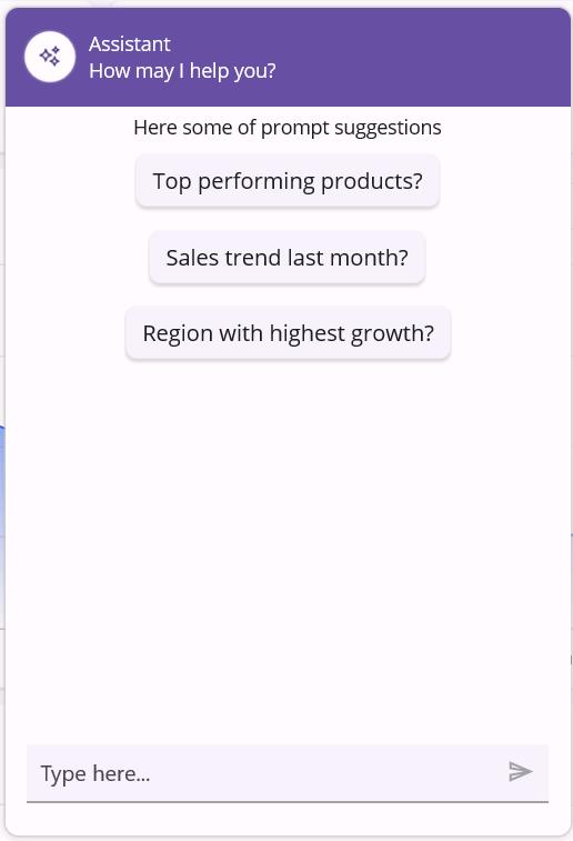
Interactive AI Assistant
The Syncfusion® SfAIAssistView creates a conversational interface to data, transforming the dashboard from a passive display into an interactive AI-powered analyst. This revolutionary control brings natural language capabilities to business intelligence, allowing users to ask questions about their data in plain English rather than learning complex query languages or chart interactions.
With SfAIAssistView, executives can type questions like “Which product had the highest sales growth last quarter?” or “Show me the trend for smartphone sales in Europe,” and receive instant, contextual responses. The assistant understands business terminology and can interpret vague requests, translating them into precise data queries behind the scenes.
<aiassistview:SfAIAssistView Request ="aiAssistView_Request"
    AssistItems="{Binding Messages}" Suggestions="{Binding Suggestions}">

            …..

</aiassistview:SfAIAssistView>
After executing the above code, the output will be as shown below.
GitHub reference
For more details, refer to the GitHub demo.

Conclusion
Thanks for reading! In this blog, we explored how to build an AI Sales Dashboard using the Syncfusion® .NET MAUI Toolkit. We encourage you to follow the steps outlined in this guide and share your feedback in the comments section below.
Existing customers can download the latest version of Essential Studio® from the license and downloads page. If you’re not a Syncfusion® customer, try our 30-day free trial to explore our powerful features.
If you’ve any questions, you can contact us through our support forum, support portal, or feedback portal. We are always happy to assist you!


 No spam, just valuable updates.