
 Saravanan G
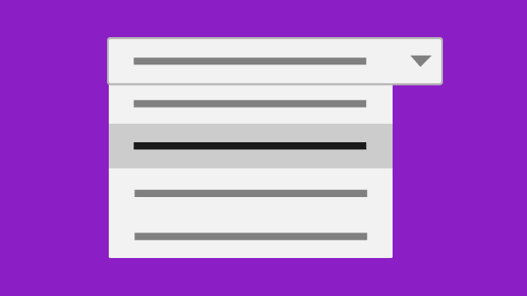
In this blog post, we will look at the Angular drop-down list component in Essential JS 2. You will learn how to get started with a simple drop-down list and move on to enabling several of its features by extending the sample with simple code snippets.
The drop-down list is a text box component that allows a single, non-editable value to be selected from a list of predefined values.
The Essential JS 2 Angular drop-down list component is typically used in an application when you have more than 5 to 10 options and you want to allow users to pick one of them. It has been implemented with features your end users expect, such as searching (including support for diacritical marks), item grouping, cascading selection, accessibility, templating.
Get started with the drop-down list component
The following steps will guide you through the necessary configuration for the drop-down list component in an Angular application.
-
- Clone the basic Angular sample using following commands.
git clone https://github.com/angular/quickstart.git quickstart
cd quickstart
npm install
-
- Install the drop-down list dependencies which are required to render the component in the Angular environment.
npm install @syncfusion/ej2-ng-dropdowns --save
-
- Map the Syncfusion ej2-ng-dropdowns dependency packages in the systemjs.config.js configuration file.
/**
 * System configuration for Angular samples.
 * Adjust as necessary for your application needs.
 */
(function (global) {
System.config({
    map: {
        // our app is within the app folder
        app: 'app',
        // angular bundles
        // syncfusion bundles
        '@syncfusion/ej2-base': 'syncfusion:ej2-base/dist/ej2-base.umd.min.js',
        '@syncfusion/ej2-data': 'syncfusion:ej2-data/dist/ej2-data.umd.min.js',
        '@syncfusion/ej2-inputs': 'syncfusion:ej2-inputs/dist/ej2-inputs.umd.min.js',
        '@syncfusion/ej2-popups': 'syncfusion:ej2-popups/dist/ej2-popups.umd.min.js',
        '@syncfusion/ej2-lists': 'syncfusion:ej2-lists/dist/ej2-lists.umd.min.js',
        '@syncfusion/ej2-buttons': 'syncfusion:ej2-buttons/dist/ej2-buttons.umd.min.js',
        '@syncfusion/ej2-dropdowns': 'syncfusion:ej2-dropdowns/dist/ej2-dropdowns.umd.min.js',
        '@syncfusion/ej2-ng-base': 'syncfusion:ej2-ng-base/dist/ej2-ng-base.umd.min.js',
        '@syncfusion/ej2-ng-dropdowns': 'syncfusion:ej2-ng-dropdowns/dist/ej2-ng-dropdowns.umd.min.js'
    }
  });
})(this);
-
- Import DropDownListModule into the Angular application (app.module.ts) from the package @syncfusion/ej2-ng-dropdowns.
import { NgModule }      from '@angular/core';
import { BrowserModule } from '@angular/platform-browser';
import { AppComponent }  from './app.component';
import { DropDownListModule } from '@syncfusion/ej2-ng-dropdowns';

@NgModule({
  imports:      [ BrowserModule, DropDownListModule ],
  declarations: [ AppComponent ],
  bootstrap:    [ AppComponent ]
})
-
- Modify the template in the app.component.ts file to render the ejs-dropdownlist component and also include the component theme from the corresponding base package @syncfusion/ej2-dropdowns component through styleUrls.
import { Component, ViewEncapsulation  } from '@angular/core';
@Component({
  selector: 'my-app',
   // specifies the template string for the drop-down list component
  template: ``,
})
export class AppComponent  { name = 'Angular'; }
-
- Import the drop-down list combined CSS files from the Syncfusion package root folder. This can be referenced in your src/styles/styles.css file.
@import '../../node_modules/@syncfusion/ej2-dropdowns/styles/material.css';
Populate data
After initializing, populate the data in the drop-down list using the dataSource property. Here, the retrieval of data from remote data services is performed with the help of the data manager component, so we need to import Query, DataManager, and ODataAdaptor from the ej2-data package.
import { Query, DataManager, ODataAdaptor } from '@syncfusion/ej2-data'
@Component({
  selector: 'my-app',
   // specifies the template string for the drop-down list component
  template: `<ejs-dropdownlist id='ddlelement' #samples [dataSource]='data' [fields]='fields' [placeholder]='text' [query]='query' [sortOrder]='sorting'></ejs-dropdownlist>`,

})
export class AppComponent  {
name = 'Angular';
     //bind the DataManager instance to dataSource property
    public data: DataManager = new DataManager({
        url: 'https://js.syncfusion.com/demos/ejServices/Wcf/Northwind.svc/',
        adaptor: new ODataAdaptor,
        crossDomain: true
    });
    // maps the appropriate column to fields property
    public fields: Object = { text: 'ContactName', value: 'CustomerID' };
    //bind the Query instance to query property
    public query: Query = new Query().from('Customers').select(['ContactName', 'CustomerID']).take(6);
    //set the placeholder text for drop-down list input
    public text: string = "Select a customer";
}
Note: The drop-down list loads data either from local data sources or remote data services using the dataSource property.
Group the drop-down list items
We can arrange logically related items as groups in the drop-down list. A group’s header can be displayed both inline and statically above groups of items. To display the grouping header, map the groupBy field on data binding.

Filter data
When you want to show more options in a drop-down list, users may encounter some difficulty in finding and selecting the option they want. The drop-down list has built-in filtering to solve this problem. It is enabled by setting allowFiltering as true.
@Component({
  selector: 'my-app',
   // specifies the template string for the drop-down list component
  template: `<ejs-dropdownlist id='ddlelement' #samples [dataSource]='data' [fields]='fields' [allowFiltering]='true' [placeholder]='text' [query]='query' [sortOrder]='sorting'></ejs-dropdownlist>`,
})
Note: You can also apply custom logic to filter items using the filtering event.
Sort data
Sorting allows users to select the correct item from the list of options by arranging the items in ascending or descending order. Use the sortOrder setting and the value Descending or Ascending to enable sorting.
@Component({
  selector: 'my-app',
   // specifies the template string for the DropDownList component
  template: `<ejs-dropdownlist id='ddlelement' #samples [dataSource]='data' [fields]='fields' sortOrder='Descending' [placeholder]='text' [query]='query'></ejs-dropdownlist>`
})

Customize appearance using templates
The Essential JS 2 drop-down list has template options for customizing the default UI based on your needs. You can customize all the elements in the drop-down list, such as items, values, headers, and footers.
Item template
The content of each list item within the drop-down list can be customized with the help of the itemTemplate property.
@Component({
  selector: 'my-app',
   // specifies the template string for the drop-down list component
  template: `<ejs-dropdownlist id='ddlelement' #samples [dataSource]='data' [fields]='fields' [allowFiltering]='true' [placeholder]='text' [query]='query'>
                <ng-template #itemTemplate="" let-data="">
                      <!--set the value to itemTemplate property-->
                      <span><span class='name'> {{data.ContactName}}</span>  <span class ='city'><i><sub> -- {{data.City}}</sub></i></span></span>
                </ng-template>
             </ejs-dropdownlist>`
})

Value template
The style of the selected value can be customized using the valueTemplate property.
@Component({
  selector: 'my-app',
   // specifies the template string for the drop-down list component
  template: `<ejs-dropdownlist id='ddlelement' #samples [dataSource]='data' [fields]='fields' [allowFiltering]='true' [placeholder]='text' [query]='query'>
                  <ng-template #valueTemplate="" let-data="">
                    <!--set the value to valueTemplate property-->
                    <span class='value'>{{data.ContactName}}  <i><sub> - {{data.City}}</sub></i></span>
                 </ng-template>
            </ejs-dropdownlist>`
})

Header template
The header element is shown statically at the top of the pop-up, and any custom element can be placed as a header element using the headerTemplate property.
@Component({
  selector: 'my-app',
   // specifies the template string for the drop-down list component
  template: `<ejs-dropdownlist id='ddlelement' #samples [dataSource]='data' [fields]='fields' [allowFiltering]='true' [placeholder]='text' [query]='query'>
                 <ng-template #headerTemplate="" let-data="">
                    <!--set the value to headerTemplate property-->
                    <span class='head'><span class='name'>Name</span><span class='city'>City</span></span>
                 </ng-template>
            </ejs-dropdownlist>`
})

Footer template
You can place any custom elment as a footer element of the drop-down list pop-up by using the footerTemplate property.

Note: The drop-down list also provides noRecordsTemplate, actionFailureTemplate, and groupTemplate. Refer to our documentation for more information.
Conclusion
We hope you found this a useful overview of the drop-down list and its important features. There are other advanced features you can explore in our documentation. If you would like to try the drop-down list component, you can download the free trial or play with our online demo. You can even check out the package on GitHub at https://github.com/syncfusion/ej2-angular-ui-components/tree/master/components/dropdowns. If you have any questions or feedback, please let us know in the comments below. You can also contact us through our support forum or Direct-Trac.
 No spam, just valuable updates.
Comments (2)
this is very difficult method please tell some easy way
Hi Harkirat,
Yes, you can find the easy steps in the below user guidance document link.
https://ej2.syncfusion.com/angular/documentation/drop-down-list/getting-started/
Kindly check the above steps and get back to us if you need any further assistance on this.
Regards,
Saravanan G