

TL;DR: Error bars in Blazor charts help developers display data uncertainty and improve visualization accuracy. This blog guides how to implement five types of error bars: Fixed, Percentage, Standard Deviation, Standard Error, and Custom, using Blazor Charts with practical code examples and real-world temperature data.
Welcome to our latest post in the Weekly Data Visualization blog series!
Data visualization is more than just showcasing values; it’s about telling a story that is both informative and accurate. While charts and graphs simplify complex datasets, they often fail to show the reliability or variability of the data. This is where error bars become indispensable. By incorporating error bars into your visualizations, you can provide deeper insights into data variability, fostering better interpretation and decision-making.
In this blog, we’ll explore the fundamentals of error bars, their practical applications, and how you can implement them effectively using the Syncfusion® Blazor charts component.
Let’s get started.
What are Error Bars?
Error bars are visual indicators used in charts to show the uncertainty or variability associated with each data point. They are typically represented as lines extending above and below a point or bar, reflecting the possible range of values.
For example:
- In scientific research, error bars can indicate the range of measurements across trials.
- In business analytics, they can represent uncertainty for sales or market trends.
Error bars provide a quick visual understanding of data reliability and are especially useful in scenarios where interpreting data accuracy is critical.
Importance of Error Bars in data visualization
Error bars play a vital role in improving data communication and enhancing the credibility of visualizations. Here’s why they matter:
- Transparency in data presentation: Error bars showcase the variability or uncertainty in data, making it clear how reliable the presented values are.
- Enhanced comparisons: They allow viewers to compare not just the data points but also their reliability, providing a more nuanced understanding of trends.
- Improved decision-making: Understanding data variability enables more informed decisions, as stakeholders can evaluate the potential risks and opportunities within a dataset.
- Revealing data insights: Error bars can highlight trends or anomalies that might not be visible when looking only at raw data values.
Real-world applications of Error Bars
Error bars find applications across various domains. Here are a few examples:
- Scientific research: Representing the margin of error in experiments or confidence intervals in statistical analysis.
- Finance: Showing the expected range of stock price movements or revenue forecasts.
- Marketing: Indicating variability in customer feedback scores or survey responses.
- Operations management: Visualizing fluctuations in production metrics or delivery times.
Types of Error Bars
Syncfusion® Charts support the following error bar types to accommodate different data visualization needs:
- Fixed: Renders a fixed error bar with a constant value applied to all data points.
- Percentage: Renders error bars that represent a percentage of the data point value.
- Standard deviation: Displays error bars based on the standard deviation of the dataset, showcasing data variability.
- Standard error: Represents the standard error of the mean, reflecting the precision of the sample mean.
- Custom: Renders error bars with user-defined values, offering maximum flexibility for specialized scenarios.
These options allow you to tailor error bars to your dataset’s context, ensuring clarity and accuracy in your visualizations.
Getting started with Syncfusion® Blazor charts
Syncfusion® Blazor Charts are a powerful data visualization component designed for modern Blazor applications. It supports over 30 chart types, including line, bar, pie, area, and more, with rich interactivity and customization. To get started with Syncfusion® Blazor Charts, refer to the documentation.
Adding Error Bars in Syncfusion® Blazor charts
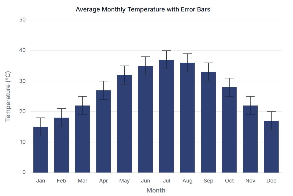
Error bars enhance the interpretability of data by highlighting variability or uncertainty in visualizations. Let’s walk through how you can implement error bars for visualizing global temperature anomalies for 2023 using Syncfusion® Blazor Charts.
Step 1: Gathering the data
For this example, we’re using real-world data from NASA’s GISS Surface Temperature Analysis (GISTEMP). This dataset provides monthly global temperature anomalies (in °C) for 2023 relative to the 1951–1980 baseline average. A standard uncertainty of ±0.10°C is applied to each data point to account for measurement variations.
Step 2: Define and populate the data in the chart
We define a data model to structure our temperature anomalies dataset. The TemperatureData class includes properties for the month and the temperature anomaly value.
public class TemperatureData
{
  public string Month { get; set; }
  public double Temperature { get; set; }
}
Next, we populate a list of TemperatureData objects with the dataset.
public List<TemperatureData> ChartPoints = new List<TemperatureData>
{
  new TemperatureData { Month = "Jan", Temperature = 15 },
  new TemperatureData { Month = "Feb", Temperature = 18 },
  ...
  new TemperatureData { Month = "Aug", Temperature = 36 },
  ...
  new TemperatureData { Month = "Dec", Temperature = 17 },
};
Step 3: Configure the Chart component
With the data ready, we configure the Syncfusion® Blazor Charts component to display global temperature anomalies with error bars.
The chart is configured as follows:
- Error bars: Represents a fixed uncertainty of ±0.10°C for each anomaly value.
- X-Axis: Represents months.
- Y-Axis: Displays temperature anomalies in degrees Celsius.
<SfChart Title="Global Temperature Anomalies with Error Bars (2023)" Width="100%" Theme="Syncfusion.Blazor.Theme.Tailwind3">

    <ChartPrimaryXAxis ValueType="Syncfusion.Blazor.Charts.ValueType.Category" Title="Month">
        <ChartAxisMajorTickLines Width="0"></ChartAxisMajorTickLines>
    </ChartPrimaryXAxis>

    <ChartPrimaryYAxis Title="Temperature Anomaly (°C)" Minimum="0" Interval="10">
        <ChartAxisMajorTickLines Width="0"></ChartAxisMajorTickLines>
    </ChartPrimaryYAxis>

    <ChartSeriesCollection>
        <ChartSeries DataSource="@ChartPoints" XName="Month" YName="Temperature" Type="ChartSeriesType.Column">
                       <ChartErrorBarSettings Visible="true" Type="ErrorBarType.Fixed" VerticalError="0.10"
                                   Direction="ErrorBarDirection.Both" Width="1" />
        </ChartSeries>
    </ChartSeriesCollection>

 </SfChart>
With a few lines of code, Syncfusion® Charts allow you to integrate error bars seamlessly into your visualizations. You can find the complete code example in the Syncfusion® Charts Error bar sample.
Tips for designing charts with Error Bars
Here are some practical tips for making your error bar visualizations more effective:
- Use intuitive formatting: Ensure error bars are easy to interpret by maintaining consistent sizes, colors, and directions.
- Choose the right type: Select an error bar type that aligns with the context of your data. For instance, use confidence intervals for survey data and standard deviation for experimental results.
- Highlight key insights: Combine error bars with annotations or tooltips to emphasize important patterns or anomalies.
- Avoid overcrowding: Limit the number of error bars to prevent charts from becoming cluttered or confusing.
- Provide context: Clearly explain the meaning of the error bars (e.g., in tooltips or chart legends) to ensure viewers understand their significance.

FAQs
Q1: When should I use error bars in my data visualizations?
Use error bars whenever you need to communicate data uncertainty or variability, especially in scientific, financial, or research-based visualizations where precision matters.
Q2: Can I customize the appearance of error bars in Syncfusion Blazor Charts?
Yes, Syncfusion allows comprehensive customization of error bars, including color, width, cap width, and direction to match your application’s design requirements.
Q3: Which error bar type should I choose for my dataset?
The choice depends on your data and objectives. Use Standard Deviation for naturally distributed data, Standard Error when showing confidence in the mean, Fixed for consistent margins, and Custom for specific known variances.
Q4: How do error bars improve decision-making?
Error bars provide visual cues about data reliability, helping stakeholders understand the confidence level of presented information and make more informed decisions based on the potential range of outcomes.
Q5: Are error bars only useful for scientific applications?
No, while common in scientific contexts, error bars are valuable in any scenario requiring communication of data uncertainty, including business forecasting, market analysis, quality control, and performance metrics.
Conclusion
Error bars are an essential feature for creating meaningful and reliable visualizations. They not only enhance the interpretability of data but also provide a deeper understanding of variability and uncertainty. With Syncfusion® charting components, you can effortlessly integrate error bars into your visualizations, offering both precision and clarity.
Whether you’re building dashboards, conducting research, or presenting business insights, the ability to include error bars elevates your charts, making them more informative and impactful. Syncfusion® Blazor chart components make this process intuitive, ensuring your charts not only convey data effectively but also stand out with advanced customization and aesthetic appeal.
Start leveraging these features today with the latest version of the Blazor chart Example. The latest version of the Blazor Chart component is available for current customers from the license and downloads page. If you are not a Syncfusion® customer, try our 30-day free trial to check it out.
Also, you can contact us through our support forums, support portal, or feedback portal. We are always happy to assist you!


 No spam, just valuable updates.