
TL;DR: By combining Syncfusion React Pivot Table with D3.js, developers can move beyond static charts and build interactive dashboards with real-time pivot synchronization, custom visualizations, and optimized performance for large datasets. This approach enables scalable, enterprise-ready analytics with richer UX and deeper data exploration.
In the world of web development, raw data is only the starting point. The real challenge, and where the true value lies, is in transforming massive datasets into clear, actionable insights. For enterprise applications, this means giving users the power to slice, dice, and visualize complex information on the fly. But how do you build a UI that’s both powerful enough for data analysts and intuitive enough for everyday users?
The answer often lies in combining two powerful tools: a high-performance pivot table and a flexible charting library.
This is where the Syncfusion® React Pivot Table becomes particularly useful. It’s an enterprise-grade component designed to summarize and aggregate tabular data efficiently. But what happens when you need to go beyond the grid and create custom, dynamic visualizations? You can pair it with a library like D3.js, a popular and flexible choice for custom data visualization.
In this comprehensive guide, we’ll walk you through a sample project that demonstrates how to integrate Syncfusion’s React Pivot Table with D3.js. You’ll learn how to build a dynamic analytics interface where users can manipulate a pivot table and see custom D3 charts update in real-time.

Combining the Syncfusion React Pivot Table with D3.js for custom visualizations
Individually, both the Syncfusion React Pivot Table and D3.js are powerful tools for web developers.
- Syncfusion React Pivot Table provides a robust engine for interactive data pivoting. It simplifies data aggregation, sorting, filtering, and summarization.
- D3.js offers extensive control over data visualization, enabling the creation of highly customized charts and diagrams tailored to specific application needs.
When these are used together, they deliver a streamlined approach to building analytics dashboards. The Pivot Table can function as a user-driven data source, while D3.js serves as the custom visualization layer. This combination allows us to build sophisticated BI dashboards more efficiently.
Syncfusion React Pivot Table: An overview
Before diving into the code, let’s quickly recap the key features of the React Pivot Table for enterprise data analytics.
Key features
- High performance: Optimized for large datasets, with virtualization and paging to ensure a smooth user experience even with millions of rows.
- Rich interactivity: Users can drag and drop fields to dynamically change rows, columns, and values. It supports drilling down, sorting, filtering, and grouping out of the box.
- Powerful data engine: The component includes a built-in pivot engine that can handle complex calculations, aggregations (Sum, Average, Count, Min, Max, Custom), and subtotals.
- Flexible data binding: It can bind to a wide variety of data sources, including local JSON arrays, remote OData services, and OLAP cubes.
- Exporting options: Easily export the pivoted data to Excel, CSV, and PDF formats, complete with formatting and styles.
- Framework support: While we’re using React today, Syncfusion provides components for Angular, Vue, Blazor, and vanilla JavaScript, designed to feel natural in each ecosystem.
When to use the built-in Pivot Chart
It’s important to note that the Syncfusion React Pivot Table comes with its own powerful, built-in charting capabilities. With just a few lines of configuration, you can enable a PivotChart that is seamlessly integrated with your data.
For most standard use cases, the built-in Pivot Chart is the ideal choice. We can use it when:
- Speed and convenience are key: You can add interactive charts (bar, line, pie, area, etc.) in minutes with minimal code.
- You need standard chart types: The built-in component covers all the essential chart types needed for typical business intelligence dashboards.
- Seamless integration is a priority: The Pivot Chart is designed to work perfectly with the Pivot Table. It automatically updates in response to UI interactions like filtering, sorting, or drilling down, with no extra event handling required on your part.
In short, if your goal is to quickly add standard, interactive visualizations to your pivot data, the built-in Syncfusion Pivot Chart is the most efficient and straightforward solution.
When to choose D3.js
This section focuses on D3.js for a specific reason: customization. We can choose D3.js when your requirements go beyond standard charts:
- Bespoke visualizations: We need to create unique chart types such as Sankey diagrams, sunbursts, chord diagrams, or entirely novel visualizations tailored to our specific data story.
- Pixel-perfect design control: Our app has strict design requirements that demand full control over every visual aspect of the chart, from custom animations to unique interactive elements.
- Complex, data-driven interactions: To build interactions that are deeply tied to the data points themselves, beyond simple filtering or drill-downs.
React app with Pivot Table and D3.js: An overview
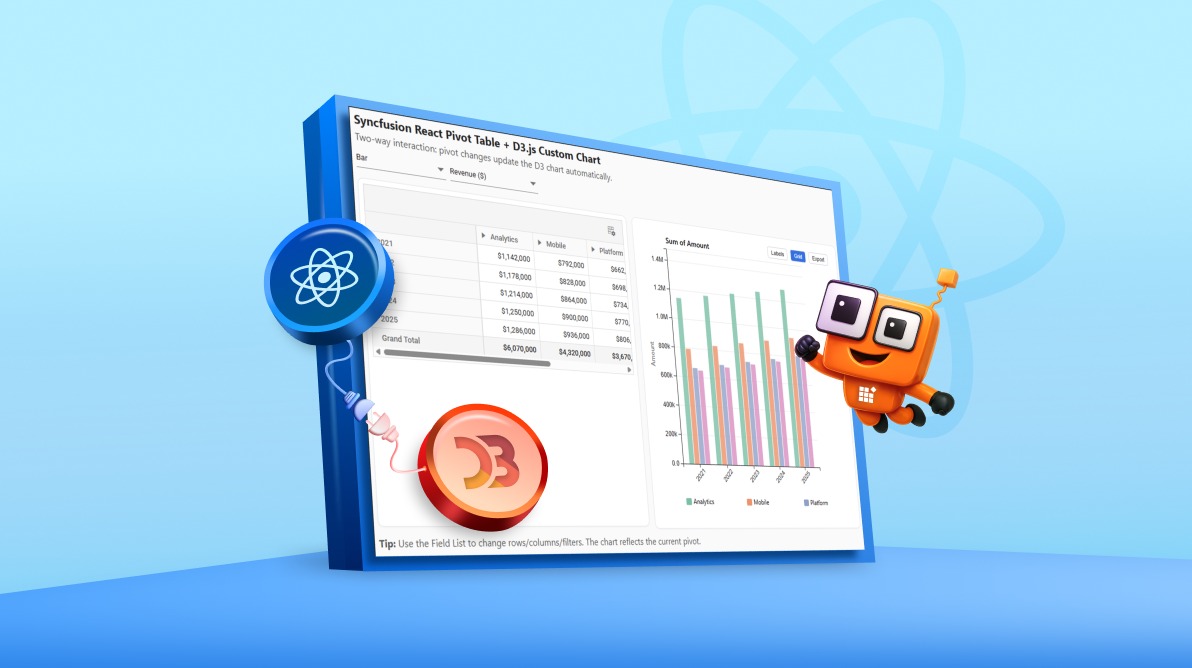
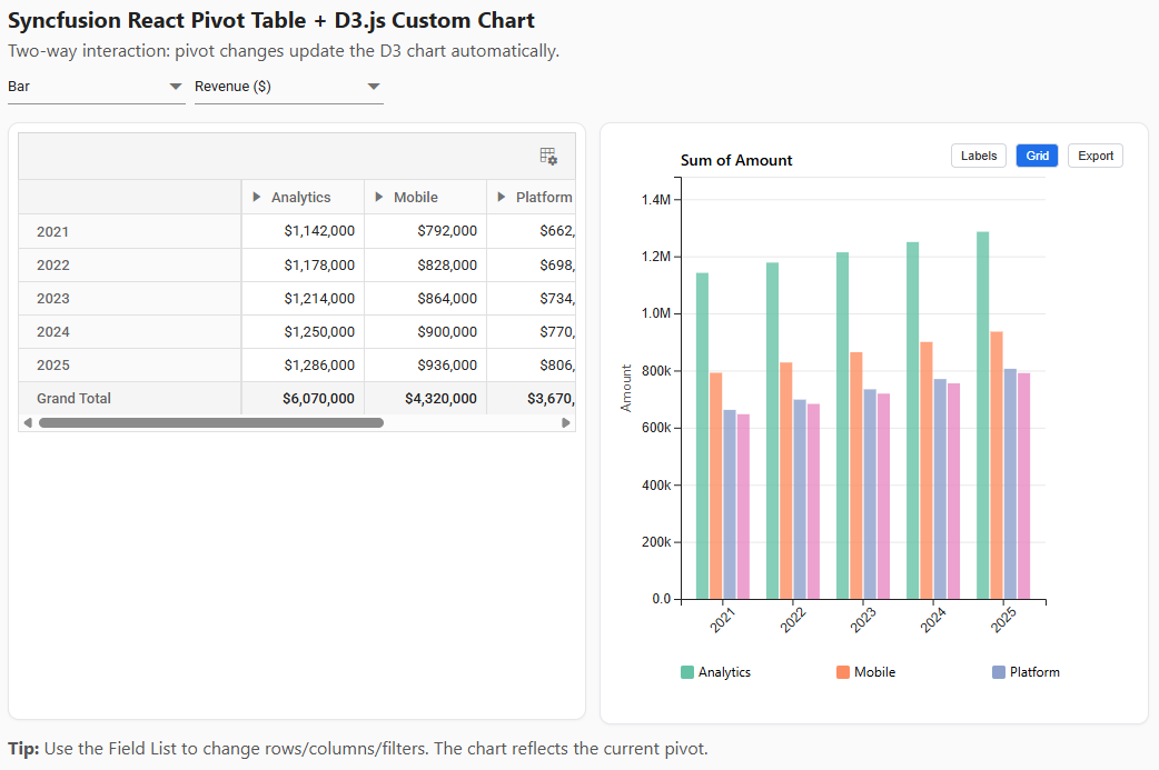
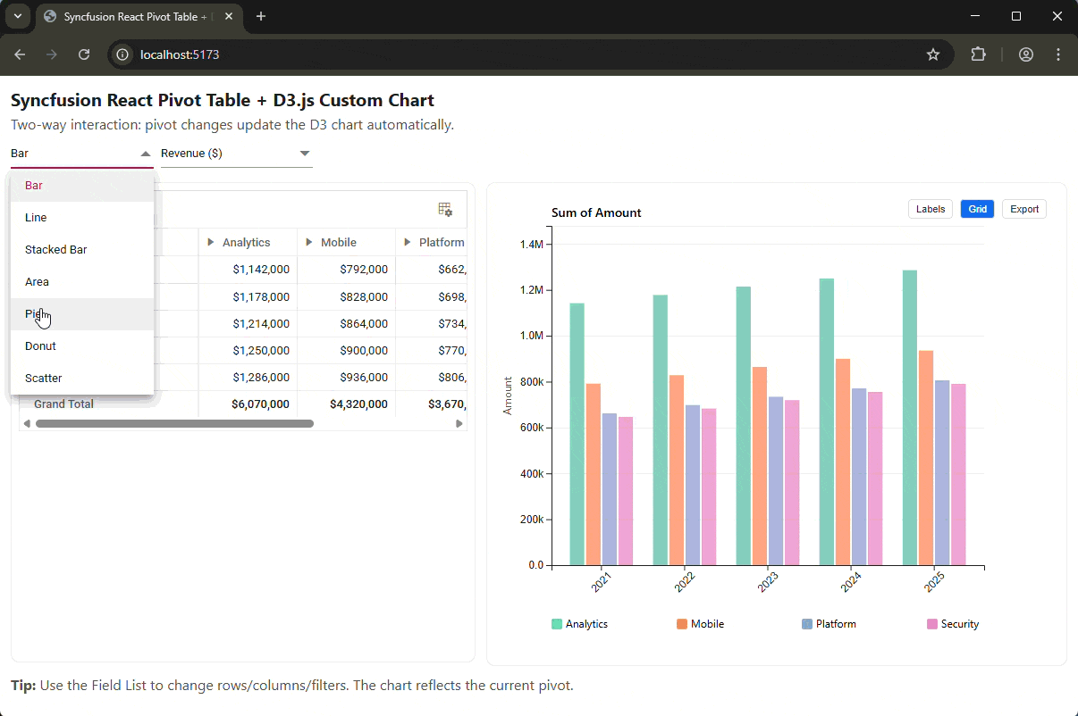
The example project is a React app that showcases a two-way interactive dashboard.
Here’s what the output looks like:
Technology stack
The project relies on a modern stack that combines UI development, data aggregation, and visualization:
- React: For building the user interface components.
- Syncfusion React Pivot Table (
@syncfusion/ej2-react-pivotview): The core component for data aggregation. - D3.js: For rendering custom, interactive charts based on the pivot data.
- Vite: As the build tool for a fast development experience.
Data flow
The sample project follows a clear data pipeline that connects the Pivot Table to D3.js, ensuring seamless synchronization between user interactions and visual output:
- Initially, a raw JSON dataset is generated in the browser.
- The Syncfusion React Pivot Table binds to this raw data and creates a summarized view based on user-defined settings (rows, columns, values).
- The user interacts with the Pivot Table (e.g., drags a field, applies a filter, or drills down).
- After each interaction, the component’s internal pivot engine recalculates the view.
- Then, we tap into an event (
enginePopulated) to capture the newly pivoted data directly from the engine. - This structured data is passed as a prop to the D3 chart components.
- Finally, the D3 components re-render to reflect the exact state of the Pivot Table.
Steps to building a dashboard app with Syncfusion
React Pivot Table+D3.js
Let’s break down the key parts of the code to understand how the integration works.
Step 1: Set up the Syncfusion React Pivot Table
First, we initialize the PivotViewComponent in our main App.jsx file.
Here’s the complete code block:
// src/App.jsx
import React, { useRef, useState, useCallback } from 'react';
import { PivotViewComponent, Inject, FieldList, Toolbar } from '@syncfusion/ej2-react-pivotview';

export default function App()
{
  const pivotRef = useRef(null);

  // ... state and handlers will go here
  return
  (
    <div className="layout">
      <div className="panel pivot">
        <PivotViewComponent
          id="PivotView"
          ref={pivotRef}
          width={'100%'}
          height={'520px'}
          dataSourceSettings={dataSourceSettings} // State-driven config
          showFieldList={true}
          showToolbar={true}
          toolbar={['FieldList']}
          enginePopulated={onEnginePopulated} // Key event for D3 sync
          dataBound={onEnginePopulated} // Fallback event
        >
          <Inject services={[FieldList, Toolbar]} />
        </PivotViewComponent>
      </div>
      <div className="panel chart">
        {/* D3 Chart Component will go here */}
      </div>
    </div>
  );
}
Here, we’ve set up the basic structure:
- ref={pivotRef} provides direct access to the component instance.
- showFieldList={true} enables the UI for dynamic report building.
- enginePopulated={onEnginePopulated} is the most important prop for this use case. It fires whenever the pivot engine finishes processing the data.
Step 2: Data binding and Pivot configuration
The heart of the Pivot Table’s configuration is the dataSourceSettings object. We manage this in our React component’s state to allow for dynamic updates.
Below is the code you need:
// src/App.jsx

// Mock data generation (replace with your actual data source)
function generateData() { /* ... returns an array of objects ... */ }
const rawData = generateData();

// ... inside the App component
const [dataSourceSettings, setDataSourceSettings] = useState
({
  dataSource: rawData,
  expandAll: false,
  enableSorting: true,
  rows: [{ name: 'Year' }],
  columns:
  [{ name: 'Product' },
    { name: 'Region' }
  ],
  values: [
    { name: 'Amount', caption: 'Revenue ($)', type: 'Sum' },
  ],
  formatSettings: [{ name: 'Amount', format: 'C0' }],
  filterSettings: [],
  drilledMembers: [],
});
Here’s a breakdown of the key properties:
- dataSource: The raw, unpivoted array of data.
- rows: An array of fields grouped as row headers. In this example, we group by Year.
- columns: Fields grouped as column headers. Here, we use a nested grouping: Product followed by Region.
- values: The numeric fields to be aggregated. We sum up the Amount field and assign it a custom caption.
- formatSettings: Applies currency formatting to the Amount values.
With just this configuration, the Pivot Table is already fully interactive. Users can drag a Region to be a row, add a filter, or sort by revenue, all without any extra code.
Step 3: Extracting Pivoted data for D3.js
This is the core logic that connects the two libraries. We need to extract the summarized data in a clean format that D3 can easily consume. The enginePopulated event gives us access to the component’s internal engineModule, which contains the final, calculated pivotValues.
The extractFromEngine function transforms this raw matrix into a structured model: { rowKeys, colKeys, valueOf }.
Refer to the following code example:
// src/App.jsx

function extractFromEngine(pivotView)
{
  const engine = pivotView?.engineModule;
  const pivotValues = engine?.pivotValues;
  if (!pivotValues) return { /* empty model */ };

  // 1. Find the column headers (the deepest level)
  const headerRow = /* ... logic to find the leaf column header row ... */;
  const colMap = []; // Stores { key: 'Analytics / NA', colIndex: 1 }
  for (let c = 0; c < headerRow.length; c++)
  {
    // ... logic to parse column headers and skip grand totals ...
  }
  const colKeys = colMap.map(m => m.key);

  // 2. Parse the data rows
  const rowKeys = [];
  const matrix = new Map(); // Stores "2021||Analytics / NA" -> 150000
  for (let r = /* start after headers */; r < pivotValues.length; r++)
  {
    // ... logic to build the row key (e.g., "2021") ...
    if (!rowKeys.includes(rk)) rowKeys.push(rk);

    // ... logic to read cell values using colMap indices ...
    matrix.set(`${rk}||${ck}`, Number(cell.value));
  }

  // 3. Create a simple value accessor function
  const valueOf = (rk, ck) => matrix.get(`${rk}||${ck}`) || 0;

  return { rowKeys, colKeys, valueOf, ... };
}
This function returns a clean data model:
- rowKeys: An array of unique row keys (e.g., [‘2021’, ‘2022’, ‘2023’]).
- colKeys: An array of unique column keys (e.g., [‘Analytics / NA’, ‘Analytics / EU’, …]).
- valueOf: A function (rowKey, colKey) that returns the aggregated value for the corresponding cell.
This abstract model is well-suited for D3 charts, as it separates the data structure from the rendering logic.
Step 4: Rendering a D3 Chart
Now, we can create a D3 chart component that accepts the above model as a prop.
Here’s a simplified example for a grouped bar chart (D3GroupedBar.jsx).
// src/D3GroupedBar.jsx
import React, { useEffect, useRef } from 'react';
import * as d3 from 'd3';

export default function D3GroupedBar({ data, width, height })
{
  const svgRef = useRef(null);
  const { rowKeys, colKeys, valueOf } = data;

  useEffect(() =>
  {
    if (!svgRef.current || !rowKeys.length || !colKeys.length) return;

    const svg = d3.select(svgRef.current);
    svg.selectAll('*').remove(); // Clear previous render

    // 1. Set up scales
    const x0 = d3.scaleBand().domain(rowKeys).range([0, width]).padding(0.2);
    const x1 = d3.scaleBand().domain(colKeys).range([0, x0.bandwidth()]);
    const y = d3.scaleLinear()
      .domain([0, d3.max(rowKeys, rk => d3.max(colKeys, ck => valueOf(rk, ck)))])
      .range([height, 0]);
    const color = d3.scaleOrdinal(d3.schemeTableau10).domain(colKeys);

    // 2. Render axes and bars (standard D3 logic)
    // ... d3.axisBottom, d3.axisLeft ...

    // 3. Create groups for each row key
    const group = svg.selectAll('.group')
      .data(rowKeys)
      .join('g')
      .attr('transform', rk => `translate(${x0(rk)}, 0)`);

    // 4. Render the bars for each column key within the group
    group.selectAll('rect')
      .data(ck => [{ key: ck, value: valueOf(group.datum(), ck) }])
      .join('rect')
        .attr('x', d => x1(d.key))
        .attr('y', d => y(d.value))
        .attr('width', x1.bandwidth())
        .attr('height', d => height - y(d.value))
        .attr('fill', d => color(d.key));

  }, [data, width, height]); // Re-render when data or size changes

  return <svg ref={svgRef} width={width} height={height} />;
}
Step 5: Handling updates and syncing interactions
The final piece is to connect everything. We use the onEnginePopulated callback to update our app state, which triggers a re-render of the D3 chart.
Code example for quick integration:
// src/App.jsx

const [chartModel, setChartModel] = useState({ /* empty model */ });

// Use enginePopulated to pull pivot values directly from engine
const onEnginePopulated = useCallback(() =>
{
  if (!pivotRef.current) return;
  const model = extractFromEngine(pivotRef.current);
  setChartModel({ ...model }); // Update state, causing D3 to re-render
}, []);

// In the JSX
<div className="panel chart">
  <D3GroupedBar data={chartModel} width={chartWidth} height={520} />
</div>
Now, whenever the user performs an action in the Pivot Table, such as filtering, sorting, or rearranging fields, the onEnginePopulated event fires, the chartModel is updated, and the D3 chart automatically syncs to reflect the new data view.
Performance and best practices for large datasets
When working with enterprise-scale data, performance is critical. Here’s how the Syncfusion React Pivot Table is designed to handle it:
- Virtualization: The pivot table renders only the rows and columns currently visible in the viewport, ensuring smooth scrolling even with hundreds of thousands of summarized rows.
- Paging: For reports with many rows or columns, paging allows users to view the data in smaller, more manageable chunks. This can significantly improve initial load times and reduce the amount of data transferred to the client.
- Lazy loading: For even larger datasets, you can configure the component to load data on demand as the user expands rows or columns.
- Server-side engine: For truly massive datasets (millions or billions of rows), you can move the pivot engine to the server. The client-side component sends aggregation queries to the server and only renders the final, summarized results. This is ideal for OLAP cubes or large database backends.
Accessibility and internationalization
To ensure the Pivot Table is usable across diverse audiences and global applications, the component includes built‑in support for accessibility and localization:
- Accessibility: The Syncfusion React Pivot Table is WCAG 2.1 compliant and supports ARIA attributes, making it accessible to users with disabilities who rely on screen readers. Keyboard navigation is fully supported.
- Internationalization (i18n): The component can be localized to any language by providing a JSON file with translations for static text elements (like “Drag a field here”). Number and date formatting can also be customized to match different locales.
Deployment and sample repository usage
To run the sample project yourself:
- Clone the repository:
git clone https://github.com/SyncfusionExamples/react-syncfusion-pivot-d3-visualization - Install dependencies:
npm install - Run the development server:
npm run dev
This launches a local server, and we can open the provided URL in the browser to interact with the live demo.
We can adapt the code for our own projects by replacing the mock data with our data source and customizing the D3 charts to fit our requirements.
Competitive differentiators: Why not just use a generic table?
You could try to build a similar experience by combining a standard data table with D3. However, you’d quickly find yourself rebuilding a Pivot engine from scratch. This involves:
- Complex aggregation logic: Implementing Sum, Average, Count, and custom aggregations.
- Dynamic grouping: Allowing users to change rows and columns via drag-and-drop.
- State management: Handling the complex state of filters, sorts, and drill-downs.
- Performance optimization: Manually implementing virtualization for large datasets.
The Syncfusion React Pivot Table provides all of this functionality out of the box, which can save significant development time. It allows us to focus more on creating custom visualizations with D3.
Frequently Asked Questions
Can I use a different charting library instead of D3.js?
Absolutely. The data extraction method shown here is library-agnostic. The extractFromEngine function produces a clean, structured data model ({ rowKeys, colKeys, valueOf }) that you can easily adapt to any other charting library, such as Chart.js, ECharts, or Highcharts.
How does the Pivot Table handle real-time data updates?
You can programmatically update the dataSource and call the component’s refresh() method. For real-time scenarios, it’s often best to batch updates and refresh the pivot view at a set interval (e.g., every few seconds) to avoid overwhelming the UI.
Can I connect the Syncfusion React Pivot Table to a server-side backend?
Yes. The Pivot Table has built-in support for remote data binding. You can connect it to OData services or build a custom API endpoint. For large-scale applications, Syncfusion provides a server-side Pivot Engine that can perform aggregations on your server and send only the summarized data to the client.
Are custom aggregations supported?
Yes. The Pivot Table supports custom calculations through its calculated fields feature. In the dataSourceSettings, you can define a calculatedFieldSettings property. This allows you to create new fields that are computed based on formulas involving other fields in your data source. This is the recommended approach for handling complex business calculations like weighted averages or custom ratios.
Can the user save their custom pivot layouts?
Yes. You can get the current pivot layout (including rows, columns, filters, etc.) by accessing the dataSourceSettings from the component instance. You can then serialize this JSON object and save it to a database. To restore a layout, you simply reapply the saved dataSourceSettings object to the component.
Does this integration work with other frameworks like Angular or Vue?
Yes, the core concepts are identical. Syncfusion provides Pivot Table components for Angular, Vue, and Blazor. These components are designed to integrate seamlessly into their respective ecosystems. The event names and API for accessing the pivot engine are consistent across frameworks, so you can apply the same data extraction pattern.
Conclusion
Thanks for reading! Integrating the Syncfusion React Pivot Table with D3.js combines a capable, user-driven aggregation engine with a highly customizable visualization layer. Together, they enable the creation of sophisticated, interactive data analytics dashboards that are both performant and tailored to business needs.
By tapping into the enginePopulated event, you gain direct access to the pivot engine’s output, creating a seamless and efficient data flow that keeps your custom charts perfectly in sync with the pivot table.
Ready to build your own interactive dashboards? Try out the Syncfusion Pivot Table today!
Existing customers can download the latest version directly from their license and downloads page. New users can explore everything with a free 30-day trial and experience the full capabilities firsthand.
If you ever need help getting started or want guidance on your workflow, our team is here for you through the support forum, support portal, or feedback portal. We’re always happy to assist!


 No spam, just valuable updates.