
 Parthipan R
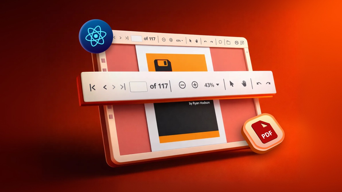
TL;DR: A custom toolbar in a React PDF Viewer lets developers replace default controls with tailored actions for navigation, zoom, search, annotations, and printing. Instead of relying on built-in UI, teams can design responsive, accessible toolbars with custom icons, toggle states, tooltips, and integrated search. This approach improves performance, ensures consistent branding, and gives developers full control over document workflows, especially in large-scale or enterprise apps built with Syncfusion solutions.
Delivering a seamless PDF experience in modern web applications requires more than just rendering documents. Developers often need toolbars that align with branding, improve usability, and provide advanced features beyond the defaults. Out‑of‑the‑box controls can feel limiting when apps demand tailored navigation, responsive layouts, or workflow‑specific tools.
The Syncfusion® React PDF Viewer provides developers with the flexibility to fully customize the toolbar, tailoring the interface to match app branding and improve user experience.
This guide walks you through implementing a custom toolbar in the React PDF Viewer. We’ll learn how to:
- Replace the default toolbar with a custom one.
- Implement essential tools like navigation, zoom, annotation, form designer, and search.
- Enhance usability with tooltips, toggle states, and responsive design.
Setting up a React project with PDF Viewer
Before implementing a custom toolbar, we need to prepare our React environment and configure the PDF Viewer. The steps below guide us through initializing the project, installing dependencies, importing styles, and enabling the core services required for navigation, magnification, search, and annotations.
Prerequisites
Just make sure we’re set up with:
- React version: ≥ 15.5.4+
- Node version: ≥ 14.0.0+
- Syncfusion React PDF Viewer: Installed and configured.
Creating a basic React PDF Viewer component
Let’s start by creating a basic PDF Viewer component without the built-in toolbar, as shown in the following code:
import React from 'react';
import {
    PdfViewerComponent,
    Toolbar,
    Magnification,
    Navigation,
    LinkAnnotation,
    BookmarkView,
    ThumbnailView,
    Print,
    TextSelection,
    TextSearch,
    Annotation,
    FormFields,
    FormDesigner,
    Inject
} from '@syncfusion/ej2-react-pdfviewer';

function BasicPdfViewer() {
    return (
        <div>
            <PdfViewerComponent
                id="pdfViewer"
                documentPath="https://cdn.syncfusion.com/content/pdf/pdf-succinctly.pdf"
                style={{ height: '640px' }}
                resourceUrl="https://cdn.syncfusion.com/ej2/30.1.37/dist/ej2-pdfviewer-lib"
                enableToolbar={false} // Hide the built-in toolbar
            >
                <Inject
                    services={[
                        Toolbar,
                        Magnification,
                        Navigation,
                        LinkAnnotation,
                        BookmarkView,
                        ThumbnailView,
                        Print,
                        TextSelection,
                        TextSearch,
                        Annotation,
                        FormFields,
                        FormDesigner
                    ]}
                />
            </PdfViewerComponent>
        </div>
    );
}

export default BasicPdfViewer;
Building a custom toolbar in React PDF Viewer
To create a fully customized toolbar, we’ll hide the built-in toolbar and implement our own tools using the Syncfusion React Toolbar component. The following steps are used to create the custom toolbar for the PDF Viewer.
This code block imports all necessary modules from our React PDF Viewer and Toolbar components.
Step 1: Import required modules
First, import the following modules to create a custom toolbar in React PDF Viewer.
import * as ReactDOM from 'react-dom';
import * as React from 'react';
import {
    PdfViewerComponent,
    Toolbar,
    Magnification,
    Navigation,
    LinkAnnotation,
    BookmarkView,
    ThumbnailView,
    Print,
    TextSelection,
    TextSearch,
    Inject
} from '@syncfusion/ej2-react-pdfviewer';
import {
    ToolbarComponent,
    ItemsDirective,
    ItemDirective,
    ClickEventArgs
} from '@syncfusion/ej2-react-navigations';
Step 2: Understanding individual toolbar tools
1. Open document tool (file_Open)
Let’s implement the code to upload and view PDF files from the local system. A toolbar button is declared using the ItemDirective with an open-document icon and a tooltip. When clicked, it programmatically triggers a hidden file input element to open the file selection dialog.
The selected file is then processed by the readFile function, which uses FileReader to convert the PDF into a data URL and load it into the PDF viewer. This provides a seamless way to integrate file upload into the viewer interface without exposing the native file input element.
Code example for quick integration:
<ItemDirective
    prefixIcon='e-pv-open-document-icon'
    id='file_open'
    tooltipText='open'
>
</ItemDirective>

<input
    type="file"
    id="fileUpload"
    accept=".pdf"
    onChange={readFile}
    style={{
        display: 'block',
        visibility: 'hidden',
        width: '0',
        height: '0'
    }}
/>case 'file_Open':
document.getElementById('fileUpload').click();
break;
// Handle the input click event
function readFile(evt) {
let uploadedFiles = evt.target.files;
let uploadedFile = uploadedFiles[0];
fileName = uploadedFile.name;
let reader = new FileReader();
reader.readAsDataURL(uploadedFile);
let uploadedFileName = fileName;
reader.onload = function () {
let uploadedFileUrl = this.result;
viewer.load(uploadedFileUrl, null);
viewer.fileName = uploadedFileName;
var pageCount = document.getElementById('totalPage');
pageCount.textContent = 'of ' + viewer.pageCount;
};
}2. Navigation tool
a) Previous page
This block enables navigation to the previous page of the PDF using the toolbar button with a customized icon. The goToPreviousPage() method is triggered when the button is clicked.
case 'previous_page':
    viewer.navigation.goToPreviousPage();
break;<ItemDirective
prefixIcon="e-icons e-chevron-left"
id="previous_page"
tooltipText="Previous Page"
align="Center"
>
</ItemDirective>b) Next page
This block allows users to move to the next page of the PDF. The customized icon triggers the goToNextPage() method on click.
<ItemDirective
    prefixIcon="e-icons e-chevron-right"
    id="next_page"
    tooltipText="Next Page"
    align="Center"
>
</ItemDirective>case 'next_page':
viewer.navigation.goToNextPage();
break;c) Page number input
This input field lets users jump to a specific page by entering a number. It handles both mouse clicks and keyboard events, such as Enter key validation.
<ItemDirective
template={inputTemplate}
tooltipText="Page Number"
type="Input"
align="Center"
/>
<ItemDirective
template={template}
align="Center"
tooltipText="Page Number"
/>function currentPageClicked() {
let currentPage = document.getElementById('currentPage');
currentPage.select();
}
function onCurrentPageBoxKeypress(event) {
let currentPageBox = document.getElementById('currentPage');
if (
(event.which < 48 || event.which > 57) &&
event.which !== 8 &&
event.which !== 13
) {
event.preventDefault();
return false;
} else {
var currentPageNumber = parseInt(currentPageBox.value);
if (event.which === 13) {
if (currentPageNumber > 0 && currentPageNumber <= viewer.pageCount) {
viewer.navigation.goToPage(currentPageNumber);
} else {
currentPageBox.value = viewer.currentPageNumber.toString();
}
}
return true;
}
}3. Magnification tool
a) Fit to page
We can use this tool to adjust the view to fit the entire page.
<ItemDirective
prefixIcon="e-pv-fit-page"
id="fit_to_page"
tooltipText="Fit to page"
/>case 'fit_to_page':
viewer.magnification.fitToPage();
break;b) Zoom in
Increases the zoom level of the PDF for a closer view of the content.
<ItemDirective
prefixIcon="e-pv-zoom-in-icon"
id="zoom_in"
tooltipText="Zoom in"
/>case 'zoom_in':
viewer.magnification.zoomIn();
break;c) Zoom out
Decreases the zoom level, allowing more content to be visible on the screen.
<ItemDirective
prefixIcon="e-pv-zoom-out-sample"
id="zoom_out"
tooltipText="Zoom out" case 'zoom_out':
viewer.magnification.zoomOut();
break;4. Print tool
This block adds a print button to the toolbar. When clicked, it opens the print dialog for the current PDF document.
<ItemDirective
prefixIcon="e-pv-print-document-icon"
tooltipText="Print"
id="print"
align="Right"
/>case 'print':
viewer.print.print();
break;5. Download tool
This code enables users to download the currently loaded PDF file to their local system.
<ItemDirective
prefixIcon="e-pv-download-document-icon"
tooltipText="Download"
id="download"
align="Right"
/>case 'download':
viewer.download();
break;Note: While customizing the toolbar, we can choose to display either icons or text labels. This flexibility allows us to tailor the interface to match your app’s design and user experience preferences.
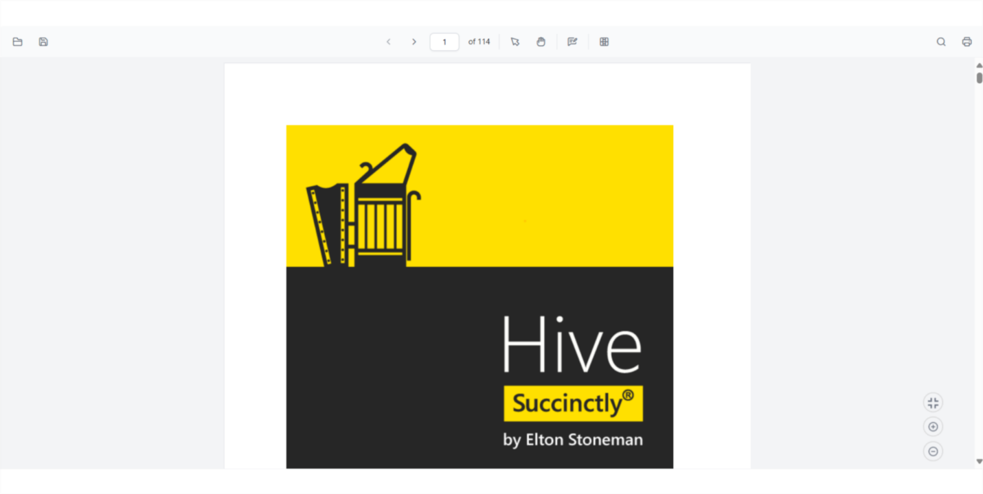
Step 3: Create the custom toolbar structure
The complete code block demonstrates how to implement a custom toolbar tailored to specific app needs using the React PDF Viewer and Toolbar components. It supports essential features such as file upload, page navigation, zooming, annotations, form designer integration, and print/download functionality. The toolbar is enhanced with input fields and templates for page control, while the viewer is configured with key services like magnification, navigation, and text selection. Event handlers ensure smooth user interaction and dynamic UI updates, delivering a robust and interactive PDF viewing experience.
Here’s how that looks in code:
function App() {
let viewer;
let toolbar;
let currentPageNumber = '1';
let fileName = '';
function template() {
return (
<div>
<span className='e-pv-total-page-number' id='totalPage'>of 0</span>
</div>
);
}
function inputTemplate() {
return (
<div>
<input
type='text'
className='e-input-group e-pv-current-page-number'
id='currentPage'
/>
</div>
);
}
function clickHandler(args) {
switch (args.item.id) {
case 'file_Open':
document.getElementById('fileUpload').click();
break;
case 'previous_page':
viewer.navigation.goToPreviousPage();
break;
case 'next_page':
    viewer.navigation.goToNextPage();
    break;
case 'print':
viewer.print.print();
break;
case 'download':
viewer.download();
break;
case 'fit_to_page':
viewer.magnification.fitToPage();
break;
case 'zoom_in':
viewer.magnification.zoomIn();
break;
case 'zoom_out':
viewer.magnification.zoomOut();
break;
}
}
function documentLoaded() {
var pageCount = document.getElementById('totalPage');
pageCount.textContent = 'of ' + viewer.pageCount;
updatePageNavigation();
}
function onPageChange() {
currentPageNumber = viewer.currentPageNumber.toString();
let inputElement = document.getElementById('currentPage');
inputElement.value = currentPageNumber;
updatePageNavigation();
}
function updatePageNavigation() {
if (viewer.currentPageNumber === 1) {
toolbar.enableItems(
document.getElementById('previous_page').parentElement,
false
);
toolbar.enableItems(
document.getElementById('next_page').parentElement,
true
);
} else if (viewer.currentPageNumber === viewer.pageCount) {
toolbar.enableItems(
document.getElementById('previous_page').parentElement,
true
);
toolbar.enableItems(
document.getElementById('next_page').parentElement,
false
);
} else {
toolbar.enableItems(
document.getElementById('previous_page').parentElement,
true
);
toolbar.enableItems(
document.getElementById('next_page').parentElement,
true
);
}
}
function currentPageClicked() {
let currentPage = document.getElementById('currentPage');
currentPage.select();
}
function onCurrentPageBoxKeypress(event) {
let currentPageBox = document.getElementById('currentPage');
if (
(event.which < 48 || event.which > 57) &&
event.which !== 8 &&
event.which !== 13
) {
event.preventDefault();
return false;
} else {
var currentPageNumber = parseInt(currentPageBox.value);
if (event.which === 13) {
if (currentPageNumber > 0 && currentPageNumber <= viewer.pageCount) {
viewer.navigation.goToPage(currentPageNumber);
} else {
currentPageBox.value = viewer.currentPageNumber.toString();
}
}
return true;
}
}
function readFile(evt) {
let uploadedFiles = evt.target.files;
let uploadedFile = uploadedFiles[0];
fileName = uploadedFile.name;
let reader = new FileReader();
reader.readAsDataURL(uploadedFile);
let uploadedFileName = fileName;
reader.onload = function () {
let uploadedFileUrl = this.result;
viewer.load(uploadedFileUrl, null);
viewer.fileName = uploadedFileName;
var pageCount = document.getElementById('totalPage');
pageCount.textContent = 'of ' + viewer.pageCount;
};
}
function wireEvent() {
let inputElement = document.getElementById('currentPage');
inputElement.addEventListener('click', currentPageClicked);
inputElement.addEventListener('keypress', onCurrentPageBoxKeypress);
inputElement.value = currentPageNumber;
}
return (
<div className='control-section'>
<div>
{/* Main toolbar */}
<div className='e-pdf-toolbar'>
<ToolbarComponent
ref={(scope) => {
toolbar = scope;
}}
clicked={clickHandler}
>
<ItemsDirective>
<ItemDirective
prefixIcon='e-pv-open-document-icon'
id='file_Open'
tooltipText='Open'
/>
<ItemDirective
prefixIcon="e-pv-previous-page-navigation-icon"
id='previous_page'
tooltipText="Previous Page"
align="Center"
/>
<ItemDirective
prefixIcon="e-pv-next-page-navigation-icon"
id='next_page'
tooltipText="Next Page"
align="Center"
/>
<ItemDirective
    template={inputTemplate}
    tooltipText="Page Number"
    type="Input"
    align="Center"
/>

<ItemDirective
    template={template}
    align="Center"
    tooltipText="Page Number"
/>
<ItemDirective
prefixIcon="e-pv-print-document-icon"
tooltipText="Print"
id='print'
align="Right"
/>
<ItemDirective
prefixIcon="e-pv-download-document-icon"
tooltipText="Download"
id='download'
align="Right"
/>
</ItemsDirective>
</ToolbarComponent>
</div>
{/* Render the PDF Viewer */}
<PdfViewerComponent
id="container"
ref={(scope) => {
viewer = scope;
}}
enableToolbar={false}
documentLoad={documentLoaded}
pageChange={onPageChange}
documentPath="https://cdn.syncfusion.com/content/pdf/pdf-succinctly.pdf"
resourceUrl="https://cdn.syncfusion.com/ej2/30.1.37/dist/ej2-pdfviewer-lib"
style={{ display: 'block', height: '640px' }}
>
<Inject
services={[
Magnification,
Navigation,
LinkAnnotation,
BookmarkView,
ThumbnailView,
Print,
TextSelection,
TextSearch
]}
/>
</PdfViewerComponent>
{/* Hidden file input for open functionality */}
<input
type="file"
id="fileUpload"
accept=".pdf"
onChange={readFile}
style={{
display: 'block',
visibility: 'hidden',
width: '0',
height: '0'
}}
/>
{/* Magnification toolbar */}
<div className='e-pdf-toolbar' id="magnificationToolbarItems">
<ToolbarComponent id="magnificationToolbar" clicked={clickHandler}>
<ItemsDirective>
<ItemDirective
prefixIcon="e-pv-fit-page"
id='fit_to_page'
tooltipText="Fit to page"
/>
<ItemDirective
prefixIcon="e-pv-zoom-in-icon"
id='zoom_in'
tooltipText="Zoom in"
/>
<ItemDirective
prefixIcon="e-pv-zoom-out-sample"
id='zoom_out'
tooltipText="Zoom out"
/>
</ItemsDirective>
</ToolbarComponent>
</div>
</div>
</div>
);
}
const root = ReactDOM.createRoot(document.getElementById('sample'));
root.render(<App />);The following image shows the result:
Note: You can customize the annotation and form designer toolbars to suit your app’s specific needs. This flexibility allows you to tailor the user interface for different use cases. For more advanced customization options, please check out the complete toolbar customization demo.
Advanced customization techniques
Now, let’s see the logic and implementation for advanced toolbar customization.
1. Adding tooltips to custom toolbar items
This block enhances usability by wrapping each toolbar button with a TooltipComponent, providing helpful hints when users hover over icons. Each tooltip is positioned at the bottom center and describes the button’s function (e.g., “Open PDF Document”, “Download PDF”). The ButtonComponent handles the actual action, such as opening or downloading a PDF. Together, these elements improve accessibility and user guidance in custom toolbars.
Refer to the following code example:
import { TooltipComponent } from '@syncfusion/ej2-react-popups';

function CustomToolbarWithTooltips({ pdfViewerRef }) {
    return (
        <div className="custom-toolbar">
            <TooltipComponent content="Open PDF Document" position="BottomCenter">
                <ButtonComponent
                    iconCss="e-icons custom-open-icon"
                    onClick={handleOpen}
                />
            </TooltipComponent>

            <TooltipComponent content="Download PDF" position="BottomCenter">
                <ButtonComponent
                    iconCss="e-icons custom-download-icon"
                    onClick={handleDownload}
                />
            </TooltipComponent>

            {/* Continue for other tools... */}
        </div>
    );
}
2. Implementing toggle states for tools
This code manages toggle states for tools like Text Selection and Pan Tool using React state. When one tool is activated, the other is automatically disabled to prevent conflicts. The toolbar buttons visually reflect their active state using conditional CSS classes. This ensures a smooth and intuitive user experience when switching between interaction modes in the PDF viewer.
Here’s the complete code block:
function CustomToolbarWithToggle({ pdfViewerRef }) {
    const [isTextSelectionMode, setIsTextSelectionMode] = useState(false);
    const [isPanMode, setIsPanMode] = useState(false);

    const handleTextSelection = () => {
        if (pdfViewerRef.current) {
            if (!isTextSelectionMode) {
                pdfViewerRef.current.textSelectionModule.enableTextSelection();
            } else {
                pdfViewerRef.current.textSelectionModule.disableTextSelection();
            }
            setIsTextSelectionMode(!isTextSelectionMode);
            setIsPanMode(false); // Disable pan mode when enabling text selection
        }
    };

    const handlePanTool = () => {
        if (pdfViewerRef.current) {
            if (!isPanMode) {
                pdfViewerRef.current.navigation.panning.enablePanning();
            } else {
                pdfViewerRef.current.navigation.panning.disablePanning();
            }
            setIsPanMode(!isPanMode);
            setIsTextSelectionMode(false); // Disable text selection when enabling pan
        }
    };

    return (
        <div className="custom-toolbar">
            <ButtonComponent
                iconCss={`e-icons custom-select-icon ${isTextSelectionMode ? 'active-tool' : ''}`}
                title="Text Selection"
                onClick={handleTextSelection}
            />

            <ButtonComponent
                iconCss={`e-icons custom-pan-icon ${isPanMode ? 'active-tool' : ''}`}
                title="Pan Tool"
                onClick={handlePanTool}
            />
        </div>
    );
}
The CSS snippet styles active toolbar buttons to visually indicate their selected state. It changes the background, text, and border colors to highlight the active tool. This visual feedback helps users easily identify which tool is currently in use, improving interaction clarity and overall UI responsiveness.
.custom-toolbar .e-btn.active-tool {
    background-color: #0078d4;
    color: white;
    border-color: #005a9e;
}
3. Adding a customization text search component
This block adds a search bar to the custom toolbar, allowing users to search for text in the PDF. It includes an input field for entering search terms and a button to trigger the search using the textSearchModule.searchText() method. The component uses React state to manage input and updates dynamically. This feature enhances document navigation and content discovery.
Try this in your code:
function CustomToolbarWithSearch({ pdfViewerRef }) {
    const [searchText, setSearchText] = useState('');

    const handleSearch = () => {
        if (pdfViewerRef.current && searchText) {
            pdfViewerRef.current.textSearchModule.searchText(searchText, true);
        }
    };

    const handleSearchInputChange = (e) => {
        setSearchText(e.target.value);
    };

    return (
        <div className="custom-toolbar">
            <div className="search-container">
                <input
                    type="text"
                    placeholder="Search in document..."
                    value={searchText}
                    onChange={handleSearchInputChange}
                    className="search-input"
                />

                <ButtonComponent
                    iconCss="e-icons custom-search-icon"
                    title="Search"
                    onClick={handleSearch}
                />
            </div>
        </div>
    );
}
The CSS styles the search input and button to appear as a unified control. It ensures proper alignment, spacing, and consistent height for a polished look. Rounded corners and padding improve usability and visual appeal, making the search tool feel integrated with the rest of the toolbar.
.search-container {
    display: flex;
    align-items: center;
    margin-right: 10px;
}

.search-input {
    padding: 6px 10px;
    border: 1px solid #ddd;
    border-radius: 4px 0 0 4px;
    height: 36px;
    width: 200px;
}

.search-container .e-btn {
    border-radius: 0 4px 4px 0;
    height: 36px;
    margin-right: 0;
}
Best practices for custom toolbar implementation in React PDF Viewer
To ensure your toolbar is intuitive, scalable, and developer‑friendly, keep these best practices in mind:
- Consistent icon design: Use icons with a consistent visual style, size, and color scheme.
- Accessibility: Ensure all toolbar items have proper labels and keyboard navigation support.
- Responsive design: Make sure the toolbar adapts well to different screen sizes.
- Performance optimization: Use SVG icons instead of raster images when possible.
- User feedback: Provide visual feedback when tools are active or when actions are performed.
- Logical grouping: Group related tools together with clear separators.
- Tooltips: Provide descriptive tooltips for all toolbar items.
- State management: Properly manage the state of toggleable tools.
- Error handling: Implement proper error handling for file operations.
- Testing: Evaluate the toolbar functionality across different browsers and devices
GitHub reference
For more details on how to customize toolbar in React PDF Viewer, visit our GitHub demo.
Frequently Asked Questions
Can I completely remove the default Syncfusion PDF Viewer toolbar and use only my custom toolbar?
Yes. You can hide the built‑in toolbar by setting the enableToolbar property to false. This allows you to replace the entire viewer interface with your own fully custom toolbar implementation.
Is the custom toolbar responsive on mobile devices?
Yes. When you build your toolbar using the Syncfusion Toolbar component, it automatically adapts to smaller screens. It supports scrollable overflow, popup overflow, and responsive layouts, ensuring your toolbar remains usable on phones and tablets.
Does the PDF Viewer support add custom buttons with my own SVG or icon library?
Yes. You can use any icon source, including inline SVGs, custom components, Material Icons, Font Awesome, or your own design system. Toolbar items accept custom templates, making it easy to match your application’s branding.
Can I trigger PDF Viewer actions (zoom, page navigation, search, etc.) from my custom toolbar buttons?
Yes. All core viewer actions are exposed via public APIs. You can call functions such as viewer.magnification.zoomIn(); viewer.navigation.goToPage(5); viewer.textSearchModule.searchText("keyword", true);
These APIs allow your custom toolbar to control navigation, zooming, searching, printing, downloading, and more.
Is it possible to create multiple toolbars (for example, a main toolbar and an annotation toolbar)?
Yes. You can create required toolbars and position them as needed. It is common to separate toolbars for navigation panels, viewing, annotations, or form designer tools depending on your workflow design.
What themes does Syncfusion provide for the PDF Viewer and toolbar?
Syncfusion includes multiple built‑in themes such as Material, Fabric, Bootstrap, Tailwind, and Fluent, each with light, dark, and high‑contrast variants. When you include a theme stylesheet, your custom toolbar automatically inherits the same design style.
How should I set up localization for a custom toolbar?
Load the required localization resources and set the desired culture using the Syncfusion L10n and setCulture APIs. Built‑in viewer UI will follow the configured culture, and you can translate your custom toolbar labels and tooltips to match the selected language.
Does creating a custom toolbar affect viewer performance?
No. Toolbar customization does not impact PDF rendering performance. The viewer engine handles rendering independently, so your UI customization remains lightweight and fast.
Conclusion
Thank you for reading! In this guide, we’ve learned how to create a fully custom toolbar for the Syncfusion React PDF Viewer, which gives us complete control over the user interface and functionality.
This approach allows us to:
- Match our app’s design with custom icons and styling.
- Implement specific features tailored to our use case.
- Provide a consistent user experience through our app.
- Optimize the toolbar for our specific workflow requirements.
Key benefits of this implementation include:
- Complete control over toolbar appearance and behavior.
- Ability to use your own icon designs.
- Flexibility to add custom functionality.
- Better integration with your app’s UI/UX design.
- Enhanced accessibility and user experience.
With the techniques outlined in this article, we can create a professional, feature-rich PDF-viewing experience that seamlessly integrates with your React app while maintaining full control over every aspect of the toolbar.
Dive deeper with the React PDF Viewer user guide or try it live in the React PDF Viewer demo. If you’re a Syncfusion user, you can download the setup from the license and downloads page. Otherwise, you can download a free 30-day trial.
You can also contact us through our support forum, support portal, or feedback portal for queries. We are always happy to assist you!


 No spam, just valuable updates.