
 Piramanayagam Ramakrishnan
TL;DR: Syncfusion 2025 Volume 4 introduces major updates to Pure React: 7 new native components, including Scheduler and Pie Chart, CSS-variable theming, locale-aware currency, and advanced Grid editing.
The React ecosystem continues to evolve, and developers are increasingly preferring native React components built with hooks and functional architecture over traditional wrappers for better performance and seamless integration.
Want to learn more about why Pure React matters? Check out our in-depth introduction blog on Pure React components for React.
The Syncfusion 2025 Volume 4 release brings exciting updates across the suite, including major improvements for Pure React components. This update introduces seven new native React UI components, expanded CSS variable support for theming, automatic locale-aware currency handling, and significant improvements to the Grid.
This update focuses on enhancing developer productivity and delivering an exceptional user experience, including VS Code integration for rapid application scaffolding.
What’s new in 2025 Vol 4?
Common enhancements: Smarter theming and tooling
This release introduces foundational improvements that enhance all components:
- Sass upgrade to 1.92.x: Enjoy efficient stylesheet compilation and improved build performance.
- Locale-based currency defaults: Components now automatically select the appropriate currency code based on the active locale, ideal for global applications.
- Complete customization support: Easily customize colors, font families, sizes, weights, spacing, and line heights via CSS variables for consistent theming.
- VS Code Pure React scaffolding: Kickstart projects in seconds using our JavaScript VS Code extension with Pure React components.
Breaking Changes
- We have renamed the Material3 theme to Material for consistency.
@import '../node_modules/@syncfusion/react-base/styles/material.css'; @import '../node_modules/@syncfusion/react-notifications/styles/material.css'; - In Charts, we updated theme prop values:
- Material3 → Material
- Material3Dark → MaterialDark
These changes keep your applications lightweight and aligned with React’s declarative principles.
Spotlight on new components
Seven new native React components deliver optimized performance and modern compatibility:
- Scheduler: A lightweight, customizable event calendar for diverse scheduling needs.
- Pie Chart: Perfect for displaying percentage-based data, such as market shares or survey results.
- Dropdown List: An accessible, compact single-select input with a text box and a popup list, supporting search, filtering, grouping, and keyboard navigation.
- Calendar: Modern date browser with intuitive selection, supporting Month, Year, and Decade views, multiple selections, and full keyboard accessibility.
- DatePicker: A compact date input with popup Calendar, offering precise formatting, min/max constraints, single-date selection, and keyboard support.
- TimePicker: A compact time input with a popup list, including formatting, constraints, step intervals, and keyboard navigation.
- Spinner: A visual loading indicator for background operations.
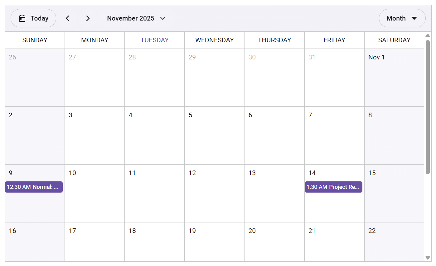
Here’s a practical example showcasing the Scheduler component:
import {
    DayView,
    WeekView,
    WorkWeekView,
    MonthView,
    Scheduler,
    EventSettings
} from '@syncfusion/react-scheduler';

export default function App() {
    const defaultData = [
        {
            Id: 1,
            Subject: 'Normal: Team Meeting',
            StartTime: new Date(2025, 10, 9, 0, 30),
            EndTime: new Date(2025, 10, 9, 2, 0),
            Location: 'Conference Room A',
            Description: 'Regular team status meeting.'
        },
        {
            Id: 2,
            Subject: 'Project Review',
            StartTime: new Date(2025, 10, 14, 1, 30),
            EndTime: new Date(2025, 10, 14, 3, 0),
            Location: 'Conference Room B',
            Description: 'Review project progress and discuss next steps.'
        }
    ];

    const eventSettings: EventSettings = { dataSource: defaultData };

    return (
        <Scheduler
                   height="34.375rem"
                   defaultView="Month"
                   eventSettings={eventSettings}
                   defaultSelectedDate={new Date(2025, 10, 11)}
               >
               <DayView />
               <WeekView />
               <WorkWeekView />
               <MonthView />
        </Scheduler>
    );
}
After running the code, you’ll see this Scheduler component:
Grid enhancements
Explore powerful grid enhancements to make data interaction more intuitive and efficient.
- Command column inline editing: Perform CRUD operations directly via action buttons in the grid.
- Popup editing with customizable templates: Conduct CRUD actions in internal or external forms via popups.
- Filter bar operator popup: Allow users to select and apply custom operators dynamically.
- Checkbox selection: Enable efficient multi-row selection using checkboxes.
Roadmap
Coming soon: DateTimePicker, AutoComplete, ListView, plus new themes like Bootstrap and Tailwind CSS.
FAQ
Q: Can I use EJ2 React and Pure React together?
A: Yes! EJ2 React and Pure React components can coexist without conflicts. Check the documentation for more insights.
Conclusion
Thank you for reading! Syncfusion Pure React components go beyond a simple upgrade; they enable cleaner, faster, and more scalable UI development through native architecture and hooks, reducing dependencies while boosting performance.
Start creating advanced UIs today.
- Explore the documentation.
- Try interactive demos.
- Download the latest version or start a 30-day free trial.
We’d love your feedback! You can share your thoughts in the comments or contact us through our support forum, support portal, or feedback portal for queries.


 No spam, just valuable updates.