
 Neelakandan Kannan
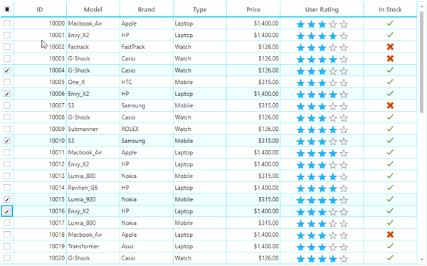
We are pleased to introduce checkbox selection support in our 2019 Volume 3 release for both the WPF and UWP DataGrid. This feature will help you select or deselect rows by interacting with checkboxes in a column.
In this blog, we are going to see how to use a checkbox selector column in a data grid.
Adding checkbox selector column
You can add a checkbox selector column to the DataGrid like any other column, and place this selector column anywhere in columns collection. You can use this selector column unbound, i.e. there is no need to have the property definition in the underlying ItemsSource.
<syncfusion:SfDataGrid x:Name="dataGrid"
                       AutoGenerateColumns="False"
                       SelectionMode="Multiple"
                       ItemsSource="{Binding Orders}">
    <syncfusion:SfDataGrid.Columns>
         <syncfusion:GridCheckBoxSelectorColumn MappingName="SelectorColumn"
                                                Width="30"/>
    </syncfusion:SfDataGrid.Columns>
</syncfusion:SfDataGrid>
Select all the rows by interacting with the checkbox in the column header.
Getting checked items
You can get the checked items through the DataGrid.SelectedItems property as selection and checkboxes are synchronized together.
Styling
In the WPF platform, you can customize the style of the checkboxes in record cells through the CellStyle property and the checkbox in the header through the HeaderStyle property.
The following example shows how to customize the checkboxes in record cells.
<syncfusion:SfDataGrid x:Name="dataGrid"
    AutoGenerateColumns="False"
    ItemsSource="{Binding Orders}">
        <syncfusion:SfDataGrid.Columns>
            <syncfusion:GridCheckBoxSelectorColumn MappingName="SelectorColumn"
                Width="30">
                <syncfusion:GridCheckBoxSelectorColumn.CellStyle>
                    <Style TargetType="syncfusion:GridCell">
                        <Style.Resources>
                            <Style TargetType="CheckBox">
                                <Setter Property="BorderBrush" Value="Red"/>
                            </Style>
                        </Style.Resources>
                    </Style>
                </syncfusion:GridCheckBoxSelectorColumn.CellStyle>
            </syncfusion:GridCheckBoxSelectorColumn>
        </syncfusion:SfDataGrid.Columns>
</syncfusion:SfDataGrid>
In the UWP platform, you can customize the checkbox feature by customizing its ControlTemplate.
<syncfusion:SfDataGrid x:Name="dataGrid"
----------------------
<Syncfusion:SfDataGrid.Resources>
<Style TargetType="CheckBox">
.................................
.................................
.................................
<Setter Property="Template">
<Setter.Value>
<ControlTemplate TargetType="CheckBox">
<Grid Background="{TemplateBinding Background}" BorderBrush="{TemplateBinding BorderBrush}"
BorderThickness="{TemplateBinding BorderThickness}">
<VisualStateManager.VisualStateGroups>
<VisualStateGroup x:Name="CombinedStates">
<VisualState x:Name="UncheckedNormal" >
<Storyboard>
<ObjectAnimationUsingKeyFrames Storyboard.TargetName="NormalRectangle"
Storyboard.TargetProperty="Stroke">
<DiscreteObjectKeyFrame KeyTime="0" Value="Red" />
</ObjectAnimationUsingKeyFrames>
</Storyboard>
</VisualState>
<VisualState x:Name="CheckedNormal">
<Storyboard>
<ObjectAnimationUsingKeyFrames Storyboard.TargetName="NormalRectangle"
Storyboard.TargetProperty="Fill">
<DiscreteObjectKeyFrame KeyTime="0" Value="Transparent" />
</ObjectAnimationUsingKeyFrames>
<ObjectAnimationUsingKeyFrames Storyboard.TargetName="NormalRectangle"
Storyboard.TargetProperty="Stroke">
<DiscreteObjectKeyFrame KeyTime="0" Value="Red" />
</ObjectAnimationUsingKeyFrames>
<ObjectAnimationUsingKeyFrames Storyboard.TargetName="CheckGlyph"
Storyboard.TargetProperty="Foreground">
<DiscreteObjectKeyFrame KeyTime="0" Value="Black" />
</ObjectAnimationUsingKeyFrames>
<DoubleAnimation Storyboard.TargetName="CheckGlyph"
Storyboard.TargetProperty="Opacity"
To="1" Duration="0" />
</Storyboard>
</VisualState>
<VisualState x:Name="IndeterminateNormal">
<Storyboard>
<ObjectAnimationUsingKeyFrames Storyboard.TargetName="NormalRectangle"
Storyboard.TargetProperty="Stroke">
<DiscreteObjectKeyFrame KeyTime="0" Value="Red" />
</ObjectAnimationUsingKeyFrames>
<ObjectAnimationUsingKeyFrames Storyboard.TargetName="NormalRectangle"
Storyboard.TargetProperty="Fill">
<DiscreteObjectKeyFrame KeyTime="0"
Value="{ThemeResource SystemControlHighlightTransparentBrush}" />
</ObjectAnimationUsingKeyFrames>
<ObjectAnimationUsingKeyFrames Storyboard.TargetName="CheckGlyph"
Storyboard.TargetProperty="Foreground">
<DiscreteObjectKeyFrame KeyTime="0" Value="Blue" />
</ObjectAnimationUsingKeyFrames>
<ObjectAnimationUsingKeyFrames Storyboard.TargetName="CheckGlyph"
Storyboard.TargetProperty="Glyph">
<DiscreteObjectKeyFrame KeyTime="0" Value="" />
</ObjectAnimationUsingKeyFrames>
<DoubleAnimation Storyboard.TargetName="CheckGlyph"
Storyboard.TargetProperty="Opacity"
To="1" Duration="0" />
</Storyboard>
</VisualState>
.................................
.................................
.................................
</VisualStateGroup>
</VisualStateManager.VisualStateGroups>
.................................
.................................
.................................
</Grid>
</ControlTemplate>
</Setter.Value>
</Setter>
</Style>
</Syncfusion:SfDataGrid.Resources>
</syncfusion:SfDataGrid>
Conclusion
I hope you now have a clear idea of these features and how to get started with checkbox selection in the DataGrid for WPF and UWP.
To learn more, check our UG documentation for both WPF and UWP platforms. You can download our 2019 Volume 3 release setup to check out these controls.
Check out the samples at these GitHub repositories to try these features.
WPF: https://github.com/syncfusion/wpf-demos/tree/master/DataGrid
UWP: https://github.com/syncfusion/uwp-demos/tree/master/SfDataGrid
If you have any questions about these controls, please let us know in the comments below. You can also contact us through our support forum, Direct-Trac, or Feedback Portal. We are happy to assist you!


 No spam, just valuable updates.
Comments (2)
Good thing you tested this feature extensively before publishing it…
Neither the Checkbox binding works, nor the SelectedItems binding…
Hi Fanourios Siskasis,
It seems you are trying to bind a model property to the checkbox-selector column. However, the GridCheckBoxSelectorColumn is an unbound column that is not bound to any properties from the underlying data source, and it allows users to select or deselect rows through CheckBox as well as binding selection through the selection API that is available.
Also, regarding SelectedItems binding, we couldn’t reproduce the issue and selection is working properly as per binding. You can refer to the below published KB for your requirements if you are missing something.
https://www.syncfusion.com/kb/3070/how-to-bind-the-selecteditems-property-of-sfdatagrid-to-viewmodel-property
Please have a look on this and revert us with details if you need further assistance for this.
Regards,
Neelakandan