We use cookies to give you the best experience on our website. If you continue to browse, then you agree to our privacy policy and cookie policy.


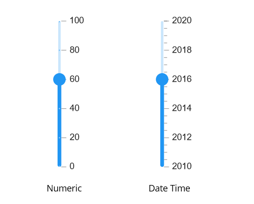
The .NET MAUI Slider is an interactive UI control that enables users to select a value from a specified range. It offers multiple customization features, including numeric and date-time labels, tick marks, dividers, and tooltips.
Easily get started with the .NET MAUI Slider using a few simple lines of XAML code example as demonstrated below. Also explore our .NET MAUI Slider Example that shows you how to render and configure the .NET MAUI Slider.
<sliders:SfSlider Minimum="0"
                Maximum="10"
                Value="5"
                ShowLabels="True"
                ShowTicks="True"
                ShowDividers="True"
                Interval="2"
                MinorTicksPerInterval="1">
    <sliders:SfSlider.Tooltip>
     <sliders:SliderTooltip />
    </sliders:SfSlider.Tooltip>
</sliders:SfSlider>Render intervals with precision. This slider supports setting intervals for both numbers and dates. For dates, intervals are supported in years through seconds.

The orientation of the .NET MAUI Slider can be set to vertical or horizontal, depending on the requirement. This flexibility allows for better integration of the slider.
Customize the labels easily. Change the format, render at specific intervals, and add prefixes and suffixes. Use built-in support for numeric and date types.


Render dividers in each interval to show the ranges accurately. Customize both the size and positioning of these dividers to enhance clarity and visual appeal.
Set both major and minor ticks in the axis. Use major ticks to show the intervals clearly and minor ticks to help choose values between two intervals easily.


Use tooltips to indicate the current selection during interaction. Customize the format, whole text, and visibility using built-in APIs.
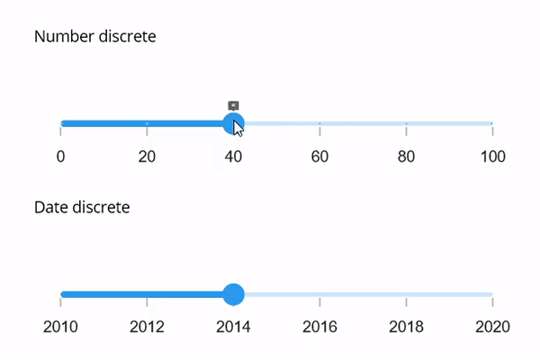
By specifying the StepSize, you can select discrete or continuous numeric or date values from the range of values.
The Syncfusion .NET MAUI Slider supports the following features:
You can find our .NET MAUI Slider demo, which demonstrates how to render and configure the Slider.
No, this is a commercial product and requires a paid license. However, a free community license is also available for companies and individuals whose organizations have less than $1 million USD in annual gross revenue, 5 or fewer developers, and 10 or fewer total employees.
A good place to start would be our comprehensive getting started documentation.


Greatness—it’s one thing to say you have it, but it means more when others recognize it. Syncfusion is proud to hold the following industry awards.


