We use cookies to give you the best experience on our website. If you continue to browse, then you agree to our privacy policy and cookie policy.


The .NET MAUI ComboBox control is a selection component that allows users to type a value or choose an option from a list of predefined options. It has many features, such as data binding, editing, searching, and button customization.
Users can select an item, or multiple items, from the list of options by tapping or clicking it.

Select a single item from the suggestion list. The selected item is displayed as the current selection in the ComboBox.
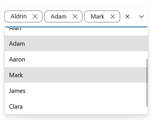
Select multiple items from the suggestion list and display them as tokens.
The ComboBox control supports editable and non-editable modes to choose items.
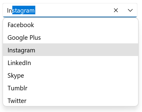
Edit the text in a text box. Suggestions will be shown in the dropdown list based on the input.

Items can be selected from the dropdown list, but the selected items cannot be edited.
The first item that fits the user input is highlighted in the dropdown list. Highlighting matching text in the ComboBox dropdown list makes it easy for users to identify and select the items they are looking for at a glance.

Display hints using placeholder text when no item is selected. A well-designed placeholder enhances the user experience by providing context and making the control more intuitive.

Data-binding support works for all popular data sources and displays data based on the display member path. It automatically generates items from a data-bound collection. The application can be designed in the MVVM pattern.

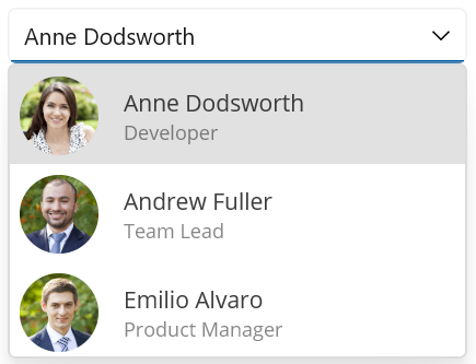
Dropdown list items can be customized with an image or custom control. This enhances the user experience and provides a more tailored and user-friendly application.


Greatness—it’s one thing to say you have it, but it means more when others recognize it. Syncfusion is proud to hold the following industry awards.


