
 Nijamudeen
We are pleased to introduce our new widget, the Date Range Picker, for the Flutter platform with our 2020 Volume 1 release. You can find the beta version of the Syncfusion Flutter date picker package in pub.dev.
The Syncfusion Flutter Date Range Picker is a lightweight widget that allows the users to easily select a single date, multiple dates, or a range of dates. It provides month, year, decade, and century view options to navigate quickly to the desired date. It supports minimum, maximum, and disabled dates to restrict the date selection.
Let’s now briefly see the features of the Date Range Picker, and then I’ll walk you through the steps to add one to your application. The following are the features of the Syncfusion Flutter Date Range Picker:
- Multiple calendar view modes
- Quick navigation
- Date selection
- Date selection range limits
- First day of the week customization
- Blackout dates
- Holiday and weekend highlighting
- Appearance customization
- Right to left (RTL) rendering
- Accessibility
- Globalization
Multiple calendar view modes
Display month, year, decade, and century views. Users can easily select and navigate among these built-in views. The widget supports programmatic navigation, too.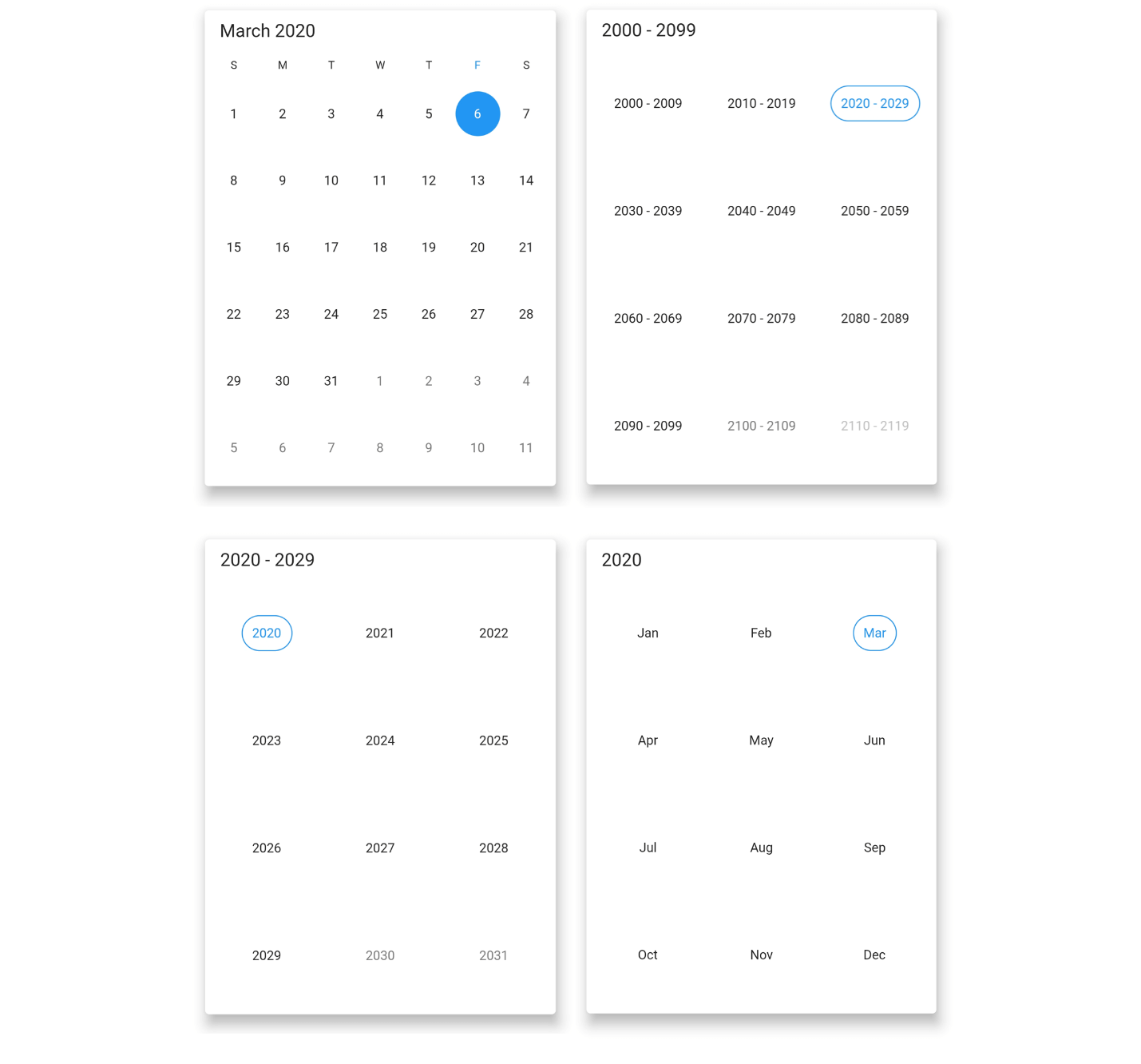
Quick navigation
You can navigate back and forth among the date picker views and the different view modes.
Date selection
You can select single, multiple, and a range of dates. The widget also supports programmatic selection.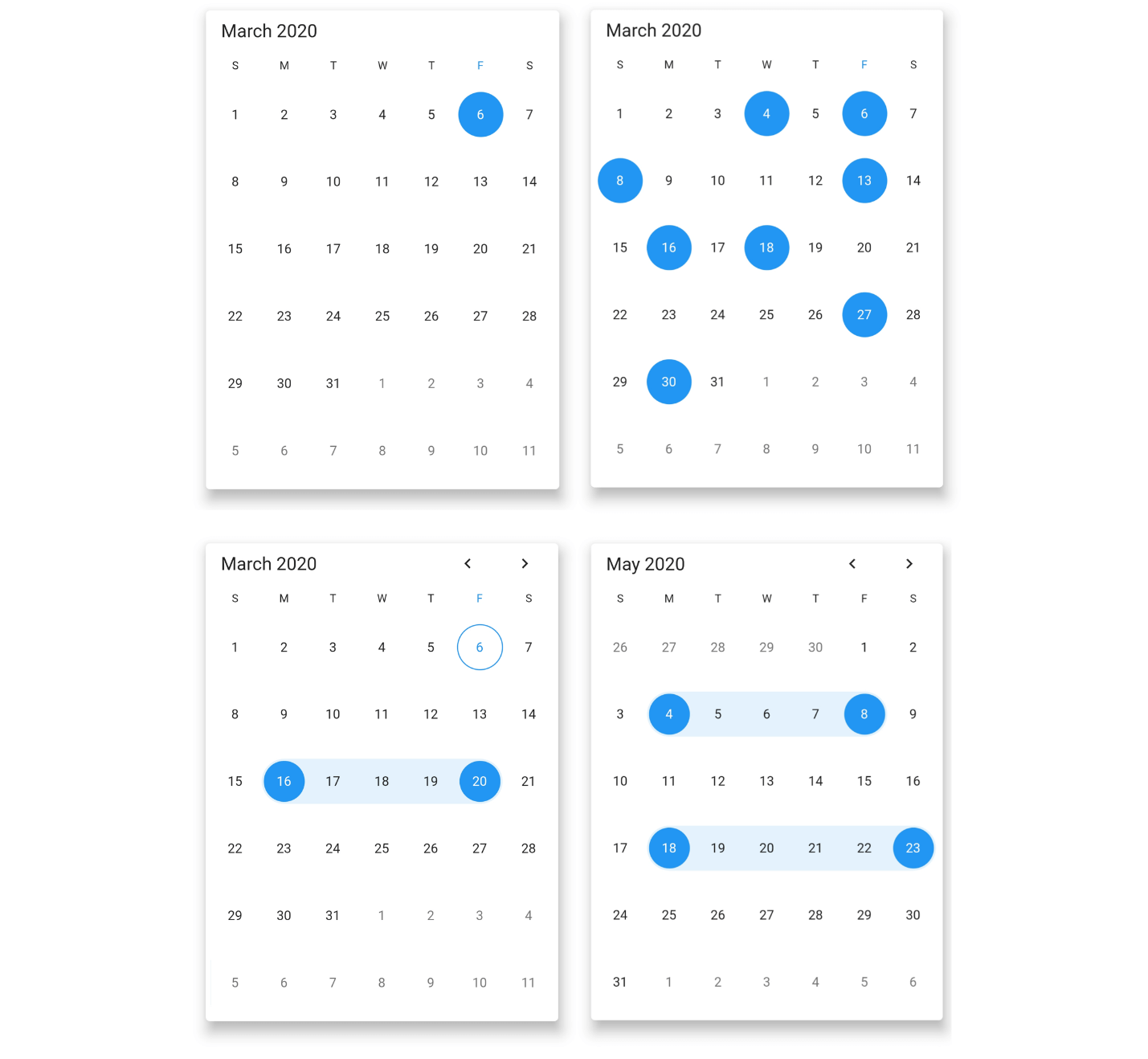
Limit the date selection range
This feature limits the date selection range to between a specific minimum and maximum date.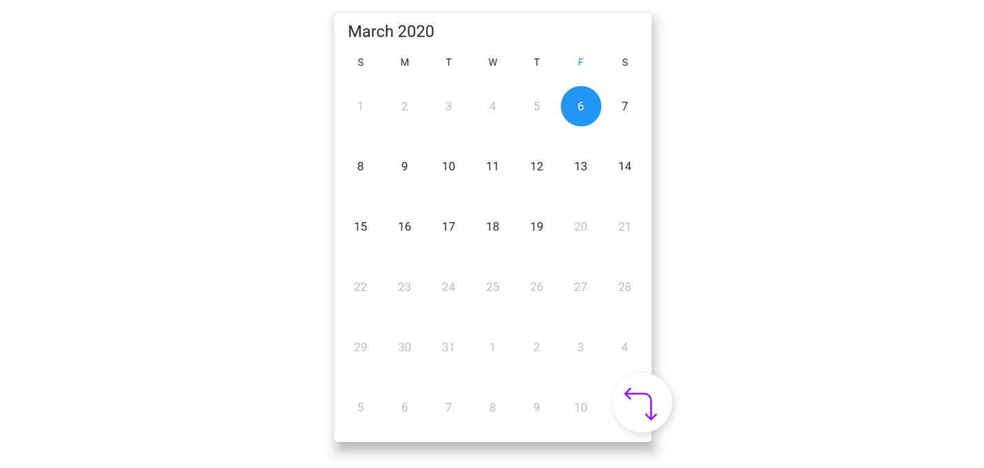
First day of week
You can customize the first day of the week as needed. By default, the first day is Sunday.
Blackout dates
You can disable any date in a calendar to make it inactive. You can also easily prevent the selection of weekends by disabling them.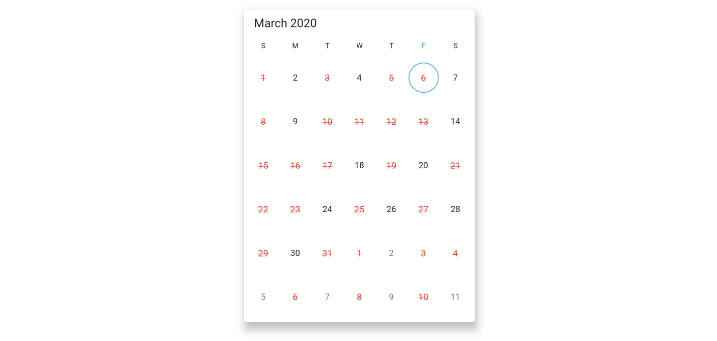
Highlight holidays and weekends
By using decoration in the Flutter Date Range Picker, you can highlight any date or every weekend in a month as special days.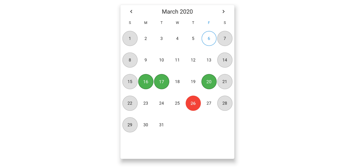
Appearance customization
You can change the look and feel of the Date Range Picker by customizing its default appearance and style using a theme and Flutter decorations.
Right to left (RTL) rendering
There is right-to-left direction support for users who are working in RTL languages like Hebrew and Arabic.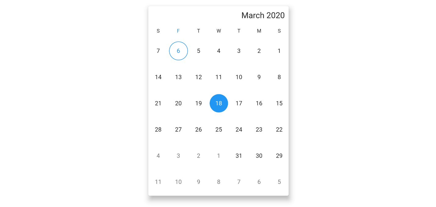
Accessibility
Screen readers have easy access to the Date Range Picker.
Globalization
Display the current date and time with global date and time formats.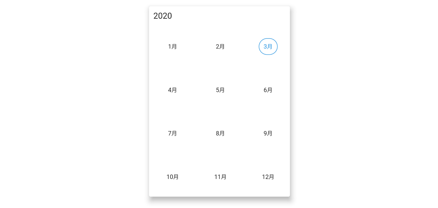
Add Flutter Date Range Picker to your app
This section explains the creation of a simple date range picker Flutter application to demonstrate the basic usage.
Add dependency
Add the Syncfusion Flutter datepicker dependency in your pub sec file.
syncfusion_flutter_datepicker: ^18.1.0.42-beta
Get packages
Run the following commands to get the required packages.
$ flutter pub get
Import package
Import the following package in your Dart code.
import 'package:syncfusion_flutter_datepicker/datepicker.dart';
Add a Date Range Picker to the widget tree
After importing the package, initialize SfDateRangePicker as a child of any widget, such as a container widget.
@override
Widget build(BuildContext context) {
  return Scaffold(
      body: Container(
    child: SfDateRangePicker(),
  ));
}
Change calendar views
The Date Range Picker widget provides four different types of views to display. One can be assigned to the widget constructor using the view property. By default, the view of the widget is month view, and the current date will be displayed initially for all the Date Range Picker views.
@override
Widget build(BuildContext context) {
return Scaffold(
      body: SfDateRangePicker(
      view: DateRangePickerView.year,
  ));
}
Change the first day of the week
The Date Range Picker widget will be rendered with Sunday as the first day of the week. You can customize it to any day using the `firstDayOfWeek` property. The following code example illustrates this.
@override
Widget build(BuildContext context) {
  return Scaffold(
      body: SfDateRangePicker(
    view: DateRangePickerView.month,
    monthViewSettings: DateRangePickerMonthViewSettings(firstDayOfWeek: 1),
  ));
}
Date selection
The selected date or range details can be obtained using the `onSelectionChanged` callback. The callback will return the `DateRangePickerSelectionChangedArgs`, which contains the selected date or range details.
void _onSelectionChanged(DateRangePickerSelectionChangedArgs args) {
  // TODO: implement your code here
}

@override
Widget build(BuildContext context) {
  return MaterialApp(
    home: Scaffold(
      body: Container(
        child: SfDateRangePicker(
          onSelectionChanged: _onSelectionChanged,
          selectionMode: DateRangePickerSelectionMode.range,
        ),
      ),
    ),
  );
}
Adding blackout dates
Disable any date in a calendar to make it inactive. Easily prevent the selection of any dates by disabling them. The following code example illustrates this.
@override
Widget build(BuildContext context) {
  return MaterialApp(
    home: Scaffold(
      body: SfDateRangePicker(
        controller: _pickerController,
        view: DateRangePickerView.month,
        monthViewSettings: DateRangePickerMonthViewSettings(
            blackoutDates: [
              DateTime.now().add((Duration(days: 2))),
              DateTime.now().add((Duration(days: 7))),
              DateTime.now().add((Duration(days: 11))),
              DateTime.now().add((Duration(days: 17)))
            ]),
      ),
    ),
  );
}
Explore Flutter examples and demos
You can check out many examples of Syncfusion’s Flutter widgets in this GitHub location. Additionally, take a look at our demo app in the Play Store and App Store.
If you want an in-depth learning experience on how to create a complete Flutter app, be sure to read Flutter Succinctly by Ed Freitas. It’s part of Syncfusion’s library of free technical ebooks.
Conclusion
In this blog post, we walked through our new Syncfusion Flutter Date Range Picker and its features, available with our 2020 Volume 1 release. Try this new control and share your feedback in the comments section.
Also, if you need a new widget in the Flutter framework, please let us know in the comments section. You can also contact us through our support forum, Direct-Trac, or feedback portal. As always, we are happy to assist you!


 No spam, just valuable updates.
Comments (12)
Hi,
very interesting this date picker. I wonder is it possible to select and and present a range programatically based on a given date picked by a user and let user pick a new dat from that range?
Based on the provided information we are unable to understand your requirement clearly. We suspect the requirement is to programmatically select the date ranges using DateRangePickerController. Please find the UG links for programmatic date selection and date restrictions (min and max dates),
UG link:
https://help.syncfusion.com/flutter/daterangepicker/date-navigations#programmatic-date-selection
https://help.syncfusion.com/flutter/daterangepicker/date-restrictions
Also please find the KB link for the minDate and maxDate,
KB link: https://www.syncfusion.com/kb/11329/how-to-restrict-date-range-picker-within-the-date-limit-in-flutter-date-range-picker
We hope that this helps you. Also, if possible can you please share your requirement clearly, it would be helpful for us to analyze and provide you a solution at the earliest.
It’s possible to change an already selected range?
Example: i have set my initial range from day 01 to day 10, but then i want to change it to day 04 to day 15. Is it possible to do this range change later on?
Yes, it is possible to change the selected range using the selected range property of DateRangePickerController. We have prepared the simple sample for changing the selected range using the `onPressed` callback of the button. Please find the sample for the same.
Sample link: https://www.syncfusion.com/downloads/support/directtrac/general/ze/flutter_selectedrange1144534767.zip
UG link:
https://help.syncfusion.com/flutter/daterangepicker/date-navigations#programmatic-date-selection
We hope that this helps you. Please let us know if you need further assistance.
This was amazing! Appreciate your work ?
I was looking same for time picker where the 24 hour clock is shown as same as calendar and we can select time.
Eg : From 9AM -11Am and 2PM – 4PM (multiple picker).
Any idea or suggestions!?
This is a Date range picker and we are not supporting a time picker along with this similar to framework widgets. Could you please share your requirement in detail, so that we can validate and consider adding a feature request for your requirement
Hi, is it possible to develop an calendar application without using any dependency or plugin?
any idea please suggest me.
Thank you.
@Nisha,
We are providing a calendar widget in Flutter. Please refer following Demo, FT, and UG.
Demo:
https://flutter.syncfusion.com/#/event-calendar/getting-started.
Feature tour:
https://www.syncfusion.com/flutter-widgets/flutter-calendar
User guide:
https://help.syncfusion.com/flutter/calendar/overview
If it’s not meeting your requirement, please share more details to update you with a possible solution.
Hello!
Is it possible to select all mondays or all saturdays by clicking on the column title? Or with a builder property?
Thank you!
Yes, it’s possible to achieve your requirement “select all Mondays or all Saturdays by clicking on the column title Or with a builder property?” by using a custom header. We have prepared a sample by adding a custom header and view header by setting the default header height to 0. Custom header added instead of default header and added clicked days to Select Dates.
We have attached the sample for your reference and you can download the same from the following location.
Sample link: https://www.syncfusion.com/downloads/support/directtrac/general/ze/header-customization-date-range-picker-flutter-master-271222432
Video link: https://www.syncfusion.com/downloads/support/directtrac/general/ze/ViewHeaderSelection302214263
We hope that this helps you. Please let us know if you need further assistance.
Hi,
Is it possible to show a tooltip on special dates?
Actually, I want the user to know about special dates, that’s why I want to show a tooltip on special dates.
@Gaurav,
As per the current implementation, there is no possibility to show the tooltip for any dates and special dates as well.
But you can differentiate by highlighting the special dates by using the specialDatesDecoration and specialDatesTextStyle properties. We have a UG for special dates customization. Please find the documentations from the following link.
UG links:
https://help.syncfusion.com/flutter/daterangepicker/customizations#month-cell-customization
https://help.syncfusion.com/flutter/daterangepicker/builders#cell-builder
Please find the KB documentation for special dates customization using month cell builder.
KB links:
https://support.syncfusion.com/kb/article/10750/how-to-customize-the-special-dates-using-builder-in-the-flutter-date-range-picker
For more details about special dates and its customization, please refer the following pub documentation link.
Pub link:
https://pub.dev/documentation/syncfusion_flutter_datepicker/latest/datepicker/DateRangePickerMonthViewSettings/specialDates.html