“How to build a dashboard” is a frequently asked question, and I figured I could put together the different options that Syncfusion provides here for building dashboard-type WPF applications.
First, let us define “dashboard.” In the context of WPF applications, a dashboard is a user interface that presents to the end-user meaningful high-level information (business critical, real-time, scientific, etc.) in an intuitive manner.
So to build a UI like this, you will first need some “core data-bound controls” that let you visualize your data and then some “presentation controls” that let you lay out the different “tiles” in the dashboard in a prioritized, visually pleasing manner.
Core Data Bound Controls
You might want to visualize your Relational (OLTP) or Multi-Dimensional (OLAP) data in the dashboards.
Relational (OLTP) data
Syncfusion WPF Studio comes with several data-bound controls that are ideal for visualizing your data in a dashboard. The most commonly used are:
- Grid
- Chart
- Gauges
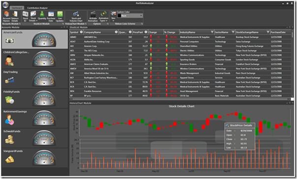
Dashboard built using the Grid, Chart and Gauges
Multi-Dimensional (OLAP) data
Syncfusion Business Intelligence Studio comes with the OLAP variants of the above controls that let you visualize OLAP data (from SSAS, for example) including dimensions, measures, KPIs, etc., using the following controls:
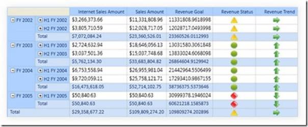
OlapGrid.
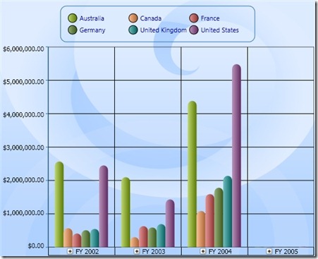
OlapChart
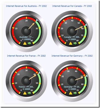
OlapGauges
Presentation Controls
You will then need some help presenting these core controls in a visually pleasing manner to the end-user. Essential Tools in our WPF Studio comes with several layout-defining controls that let you implement some common layout schemes.
- TileView – This is the most common layout used for dashboards. This is a control/framework that lets your end-users maximize/minimize “tiles” and move them around.
- Taskbar – This is the UI common in Windows and Office to help visualize content within collapsible panels.
- Docking Manager – Less commonly used, this lets you put together a dashboard that offers Visual Studio-like docking capabilities to your end-users.
(For more information browse to Essential Tools for WPF and search for the controls above)
Controls for Analysis
Besides the above, some dashboards would also require support for an “Excel-Like Pivot Table UI,” using which managers could perform slice-and-dice analysis of company performance, etc.
For this we provide two controls:
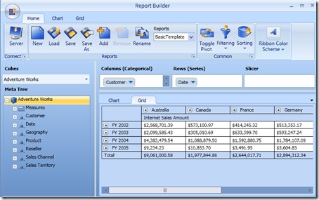
- OlapClient – Use this to perform slice-and-dice analysis on your multi-dimensional data.
Slice and Dice analysis on multi-dimensional data using OlapClient
- Excel-Like Pivot Grid – Use this to perform slice-and-dice analysis on your OLTP (relational) data. This will actually be released sometime this month (July 2010) as part of our 2010 Vol 3 Release.
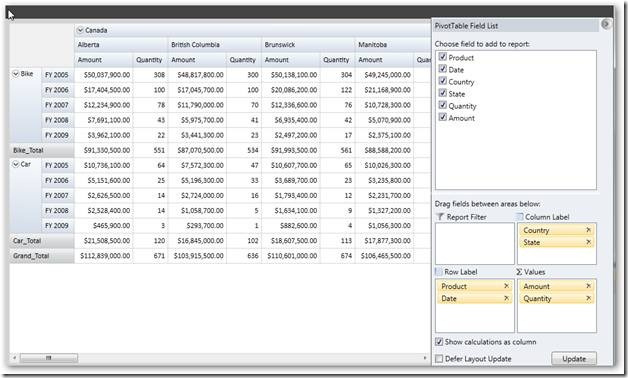
Excel Like Pivot Grid to perform Slice and Dice analysis on Relational data in WPF.

