
 Mageshyadav
The WPF skin manager feature helps you apply themes for both Syncfusion and framework controls. There are 22 built-in themes that can be applied using SfSkinManager for rich user interface experiences. Some of the built-in themes’ color derivations can be customized using Theme Studio.
With the 2020 Volume 3 release, you can customize the colors, fonts, and font families in WPF themes even at the application level via code using the skin manager.
Let’s customize a WPF theme at the application level without using Theme Studio.
Customize WPF themes
The following steps show you how to customize the themes at the application level using the skin manager:
Step 1: Create a sample application.
Create a new WPF project or use an existing application. Here, we have created a WPF application with the DataGrid control.
Refer to the following code example.
<Window xmlns="http://schemas.microsoft.com/winfx/2006/xaml/presentation"
        xmlns:x="http://schemas.microsoft.com/winfx/2006/xaml"
        xmlns:syncfusion="http://schemas.syncfusion.com/wpf"
        x:Class="WpfApplication1.MainWindow"
        Title="MainWindow" Height="350" Width="525">
    <Grid>
        <syncfusion:SfDataGrid  x:Name="dataGrid"/>
    </Grid>
</Window>
Step 2: Create and register custom theme settings.
Next, register the theme settings before setting a theme for a window or control. Each theme supported in Theme Studio has a theme settings class with the theme name as the prefix. For example, if MaterialDark is the theme name, then there will be a theme settings class named MaterialDarkThemeSettings. For a complete list of theme settings, please refer to this link.
- Initialize the MaterialDarkThemeSettings class and change the color and font properties available in that class as needed.
public partial class MainWindow : ChromelessWindow { public MainWindow() { MaterialDarkThemeSettings themeSettings = new MaterialDarkThemeSettings(); themeSettings.PrimaryBackground = new SolidColorBrush(Colors.Red); themeSettings.PrimaryForeground = new SolidColorBrush(Colors.AntiqueWhite); themeSettings.BodyFontSize = 15; themeSettings.HeaderFontSize = 18; themeSettings.SubHeaderFontSize = 17; themeSettings.TitleFontSize = 17; themeSettings.SubTitleFontSize = 16; themeSettings.FontFamily = new FontFamily("Callibri"); InitializeComponent(); } } - Next, register theme settings in the skin manager using the RegisterThemeSettings method, which accepts two parameters: theme name and theme settings instance.
public partial class MainWindow : ChromelessWindow
 {
   public MainWindow()
      {
         MaterialDarkThemeSettings themeSettings = new MaterialDarkThemeSettings();
         themeSettings.PrimaryBackground = new SolidColorBrush(Colors.Red);
         themeSettings.PrimaryForeground = new SolidColorBrush(Colors.AntiqueWhite);
         themeSettings.BodyFontSize = 15;
         themeSettings.HeaderFontSize = 18;
         themeSettings.SubHeaderFontSize = 17;
         themeSettings.TitleFontSize = 17;
         themeSettings.SubTitleFontSize = 16;
         themeSettings.FontFamily = new FontFamily("Callibri");
         SfSkinManager.RegisterThemeSettings("MaterialDark", themeSettings);
         InitializeComponent();
      }
 }
Step 3: Set the theme to your application.
Then, set the required theme to the created project for which the custom theme settings is registered.
public partial class MainWindow : ChromelessWindow
{
public MainWindow()
{
MaterialDarkThemeSettings materialDarkThemeSettings = new MaterialDarkThemeSettings();
materialDarkThemeSettings.PrimaryBackground = new SolidColorBrush(Colors.Red);
materialDarkThemeSettings.PrimaryForeground = new SolidColorBrush(Colors.AntiqueWhite);
materialDarkThemeSettings.BodyFontSize = 15;
materialDarkThemeSettings.HeaderFontSize = 18;
materialDarkThemeSettings.SubHeaderFontSize = 17;
materialDarkThemeSettings.TitleFontSize = 17;
materialDarkThemeSettings.SubTitleFontSize = 16;
materialDarkThemeSettings.FontFamily = new FontFamily("Callibri");
SfSkinManager.RegisterThemeSettings("MaterialDark", materialDarkThemeSettings);
SfSkinManager.SetTheme(this, new Theme("MaterialDark"));
InitializeComponent();
}
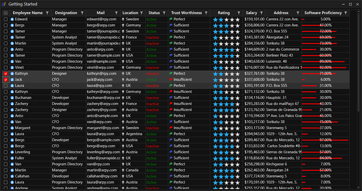
}After executing these steps, we will get an output with a customized theme like in the following screenshot.
References
Documentation link: https://help.syncfusion.com/wpf/themes/skin-manager
Demo link: https://github.com/SyncfusionExamples/customize-themes-using-theme-settings
Conclusion
I hope you now have a clear idea about customizing WPF theme colors and fonts at the application level using the skin manager. This feature will definitely save you time in achieving the customizations you require. You can download it in our 2020 Volume 3 release. You can check out all the new features in our release notes and on the What’s New page.
Now you can use the WPF skin manager and present your application with elegant and customized themes!
If you are not yet a Syncfusion customer, you can try our 30-day free trial to check out our available features.
If you wish to send us feedback or ask any questions, please use the comments section below. You can also contact us through our support forum, Direct-Trac, or feedback portal. We are always happy to assist you!


 No spam, just valuable updates.