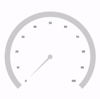
Flexible WPF Radial Gauge Control with Ranges, Ticks, and Annotations
- Display numerical values and ranges on a circular scale.
- Customize gauges to simulate tools like a speedometer, temperature monitor, or dashboard.
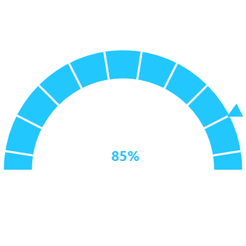
- Create half or quarter radial gauges to visualize them in a small area by modifying the start and end angles.
.NET 10 support now available
Trusted by the world’s leading companies

Overview
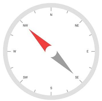
The WPF Radial Gauge, also known as a circular gauge, is a data visualization component that helps display numerical values on a circular scale. It has highly customizable features, such as scales, pointers, and ranges. Also, it offers the creation of speedometers, temperature monitors, dashboards, meter gauges, multi-axis clocks, modern activity gauges, direction compasses, etc.
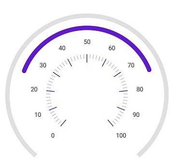
Gauge scales
The scale of the WPF Radial Gauge control is an easily customizable circular arc in which a set of values can be plotted based on business logic.

Labels customization
Customize the look and feel of the default labels using the font style, size, and color properties. You can also add prefix or suffix text to a label.
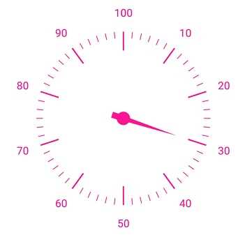
Ticks customization
Define your own style for minor and major ticks with the help of the size, color, and thickness properties.
Offset
To enhance readability, change the default scale position by setting the offset value for labels, ticks, and the rim.
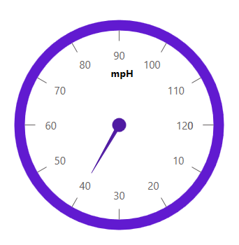
Rim
The rim is used to add a circular border to a gauge. You can change the default rim’s look to your own style.

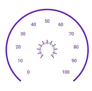
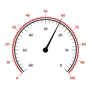
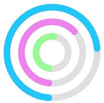
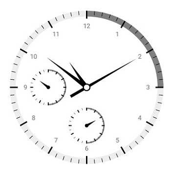
Multiple scales
Add multiple scales to the gauge to design it like a clock, dashboard, speedometer, etc.
Direction
Change the scale direction to clockwise or counterclockwise.
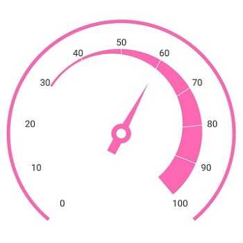
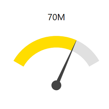
Gauge range
A range of the WPF Radial Gauge is a visual element that helps you quickly visualize where a value falls on a circular scale.
Range position
Change the range position to any place inside the gauge.
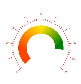
Gradient range color
Range colors vary gradually based on values, and give you a smooth color transition effect.

Range thickness
To enhance gauge usage and readability, range thickness can vary based on values.

Multiple ranges
The WPF Radial Gauge control allows you to add multiple ranges inside a scale to indicate color variation.
Needle pointer
Indicate a current value by using the highly customizable needle-type element.
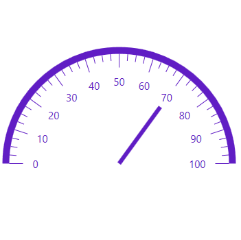
Pointer type
Change the needle pointer type to a rectangle or arrow to indicate or highlight values.
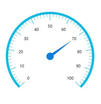
Pointer cap
A pointer cap is a rounded ball at the end of an arrow pointer that can be customized to enhance a pointer’s look.
Tail
A tail can be added to the knob for an extra element of style.
Multiple needle pointers
Add more than one needle pointer to a scale to indicate multiple values.
Range pointer
A range pointer is used to indicate the current value relative to the start value of a circular scale.
Pointer position
A range pointer can be changed or moved to any place inside the gauge.
Range cap
You can add a rounded range cap to the start, end, and both sides of the pointer. This support provides a rich styling experience for data visualization.
Multiple pointers
Multiple range pointers can be added inside the scale to indicate multiple progress activities.
Symbol pointer
The current value can be pointed out by using different types of marker pointers.
Pointer type
The symbol pointer type can be changed to built-in shapes such as a triangle, inverted triangle, square, or diamond to highlight the values.

Symbol pointer position
Symbol pointers can be changed or moved to any place inside the gauge.
Pointer interaction
Circular gauge provides an option to drag the pointer from one place to another. This support allows you to control the pointer by swipe gesture and change the value at runtime.

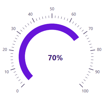
Annotations
Annotations display metadata about a circular gauge at any specific location in the plotting area.

Image annotations
Annotations provide options to add any image over the gauge control with respect to its offset position. You can add multiple images in a single control.
View annotations
You can add different views to the gauge control with respect to its offset position. You can also add multiple views in a single control.
Text annotations
You can add any text over the gauge control to enhance the readability. You can also add multiple text instances in a single control.
Pointer animation
The WPF Radial Gauge control provides a visually appealing way to view pointers with animated transitions for a certain time span. You can see smooth pointer transitions by moving the pointer from one place to another.
155+ WPF CONTROLS
ALL CONTROLS
SMART COMPONENTS
DATA VISUALIZATION
MODERN THEMES
LAYOUT
NAVIGATION
INPUT CONTROLS
BUTTON
BUSINESS INTELLIGENCE
DATA SCIENCE
MISCELLANEOUS
LISTS & DROPDOWNS
NOTIFICATION
FILE VIEWERS & EDITORS
CONVERSATIONAL UI
Build Document Workflows in WPF
Integrate a powerful PDF Viewer, rich DOCX Editor, and full‑featured Spreadsheet Editor into your WPF applications, alongside robust document processing libraries, to create smooth document experiences. Empower users to work with documents interactively while developers automate processing behind the scenes.
Our Customers Love Us
Having an excellent set of tools and a great support team, Syncfusion® reduces customers’ development time.Here are some of their experiences.

Excellent experience with Syncfusion!
Syncfusion is a product that makes life easier! I use it to create Blazor applications (server side and webassembly) and the controls speed up development a lot. Furthermore, if needed, it is possible to ask for direct support that is never long in coming!

Andrea Scarpante,

Sydea srl
The complete component set
It is the most complete component set available. Also very handy is the fact that there is a community edition, this gives me the opportunity to test thing at home without buying a separate license.

Johan Visser,

H and T Pawnbrokers
See Real Success Stories
Developers around the world trust Syncfusion’s Essential Studio to simplify complex projects and speed up delivery. With a vast library of UI controls, powerful SDKs, and reliable support, Essential Studio helps teams build enterprise-ready applications with confidence.
Read Our Customer StoriesIndustry
Software development
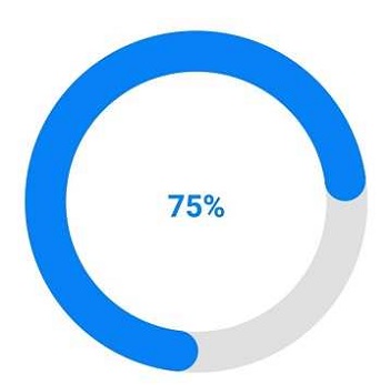
75% Cost reduction
50% Faster development
Industry
Utilities (oil and gas)
450+ hours saved
Streamlined processes and hours of development effort saved.
Advanced, flexible features
Empowered users through robust and versatile functionality.
Industry
Software and technology
1000+ of hours saved
Accelerated development with enterprise-ready UI components.
Efficient file management
Streamlined workflows with document libraries without building them from scratch.
Industry
Software and technology
2 Years of delay avoided
Two years of delays prevented with proactive planning.
On-time delivery
Projects delivered on schedule using trusted controls.
Industry
IT services and IT consulting
Improved performance
Large datasets handled with easy customization and quick debugging.
Highly customizable
Plug-and-play controls with quick template integration.
Industry
Professional services
Instant access
Quick availability of features and resources.
Reduced dependencies
Fewer dependencies for faster development.
Rated by users across the globe
Syncfusion WPF Resources
Learning
 Documentation
 Documentation


Awards
Greatness—it’s one thing to say you have it, but it means more when others recognize it. Syncfusion® is proud to hold the following industry awards.

