WinForms Diagram - Powerful, Feature-Rich Control
- Use an automatic layout algorithm for organizational charts and hierarchical trees.
- Create a flowchart, BPMN editor, floor planner app, and diagrams based on external data sources.
- Experience seamless interaction and advanced editing capabilities.
.NET 10 support now available
Trusted by the world’s leading companies

Overview
The WinForms Diagram is a feature-rich library for visualizing, creating, and editing interactive diagrams. It supports creating flowcharts, organizational charts, and network diagrams either through code or a visual interface.
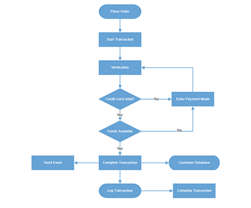
Flowcharts
The Diagram library provides all the standard flowchart shapes as ready-made objects to build flowcharts, making it is easy to add them to a diagram surface in a single call.

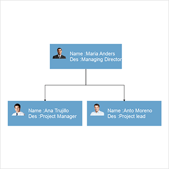
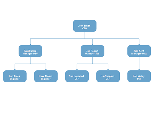
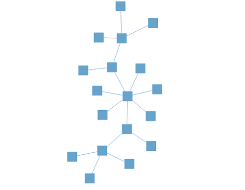
Organizational charts
Arrange parent and child node positions automatically with a built-in, automatic layout algorithm specifically made for organizational charts.
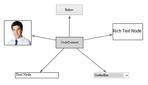
Nodes
Visualize any graphical object using nodes, which can be arranged and manipulated at the same time on a diagram page. They allow the following:
- Easily create and add custom shapes.
- Embed WinForms controls inside a node.
- Fully customize the appearance of a node with built-in dialog boxes.
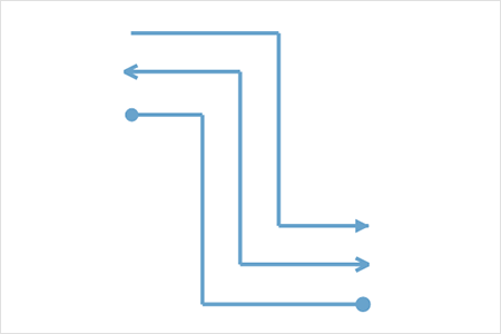
Connectors
A connector represents a relationship between two nodes. Some of the key features are listed below.
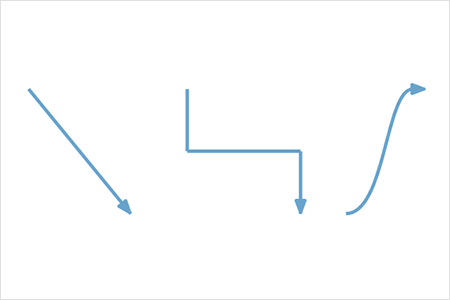
Types
The WinForms Diagram provides straight, orthogonal, polyline, and curved connector types. You can choose any of these based on the type of diagram or relationship between the connected nodes.

Bridging or line jumps
Use bridging (line jumps) to illustrate a connector’s route, making it easy to read where connectors overlap each other in a dense diagram.
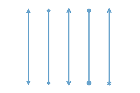
Arrowheads
Use different types of predefined arrowheads to illustrate flow direction in flowchart diagrams. You can also build your own custom arrowheads.
Appearance
Like nodes, the connectors’ look and feel can also be customized with built-in dialog boxes. The WinForms Diagram control provides a rich set of properties through which you can customize connector color, thickness, dash and dot appearance, rounded corners, and even decorators.

Ports (connection points)
Connect to specific places on a node through different types of ports or connecting points.
Labels
Additional information can be shown by adding text or labels on nodes and connectors.

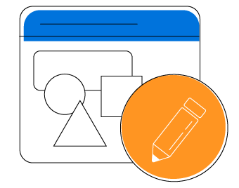
Edit
You can add and edit text at runtime and mark it read-only if it should not be edited. You can also customize the label appearance such font size, font color, and font family with the built-in editor dialog.
Multiple annotations
Add any number of labels and align them individually.
Alignment
Labels include sophisticated alignment options: place inside a node, outside a node, or at the source or target end of a connector. Automatically align when a node or connector moves.
Interactive features
Use interactive features to improve the editing experience of a diagram at runtime. Furthermore, you can easily edit a diagram with mouse, touchscreen, or keyboard interfaces.

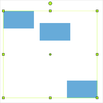
Select and drag
Select one or more nodes, connectors, or annotations and edit them using thumbs or handlers.

Resize
You can resize a node in eight different directions and lock a node’s aspect ratios to keep its shape. You can also resize multiple objects at the same time.


Undo and redo
Don’t worry when you edit by mistake—undo and redo commands help you easily correct recent changes.

Snap
Precisely align nodes, connectors, and annotations easily while dragging just by snapping to the nearest gridlines or objects.

Clipboard
Cut, copy, paste, or duplicate selected objects within and across diagrams.

Z-order
When multiple objects overlap, the z-order controls which object needs to be on top or at the bottom.
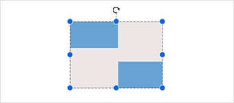
Grouping
You can combine multiple nodes into a group and then interact with them as a single object. Nested groups are also possible with our WinForms Diagram control.
Alignment
The WinForms diagram control has predefined alignment commands that enable you to align the selected objects nodes and connectors with respect to the selection boundary.
Spacing commands
Spacing commands enable you to place selected objects on the Diagram at equal intervals from each other.
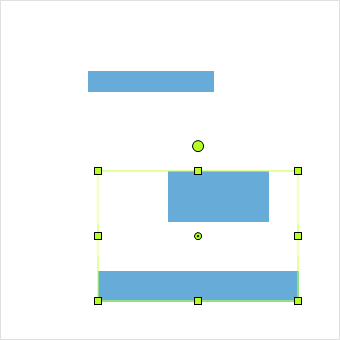
Sizing commands
Use sizing commands to equally size selected nodes with respect to the first selected object.
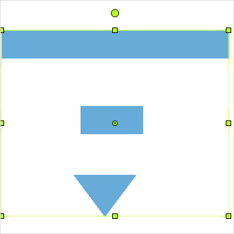
Align commands
All the nodes or connectors in the selection list can be aligned at the left, right, or center horizontally, or aligned at the top, bottom, or middle vertically with respect to the selection boundary.
Automatic layout
Use automatic layouts to arrange nodes automatically based on a predefined layout algorithm. The control features built-in hierarchical tree, radial tree, and symmetric layouts.


Rulers and measurement units
Rulers allows you to measure the distance of nodes or connectors from the origin of the page. The size and position of objects can be specified in different units such as pixels, inches, and centimeters.
Layers
A layer organizes graphical objects into a group that shares a common set of default properties, and more significantly, a z-order. You can add any number of layers to a diagram and move objects between layers.


Context menu
You can easily map frequently used commands to a context menu.

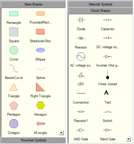
Symbol palette
The control includes a gallery of stencils, reusable symbols, and nodes that can be dragged onto the surface of a diagram.
Overview panel
The overview panel allows you to improve the navigation experience when exploring large diagrams. It displays a small preview of the full diagram page that allows users to zoom and pan within it.
Drawing tool
Draw all kinds of built-in nodes and connect them with connectors interactively by just clicking and dragging on the drawing area.
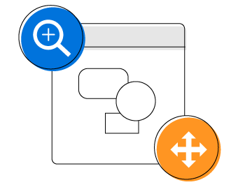
Zoom and pan tools
View a large diagram closely or assume a wider view by zooming in and out. Also, navigate from one region of a diagram to another by panning across it.

Data binding
Populate diagrams with nodes and connectors created and positioned based on data from data sources. In addition, data in any format can be easily converted, mapped, and consumed in the Diagram by setting a few properties, without having to write any code. The Diagram library supports loading data from a list or IEnumerable collection..
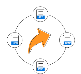
Exporting
You can export the Diagram to different image formats such as PNG, JPEG, and BMP.

Printing
The Diagram library supports printing with a print preview option. You can also customize the page size, orientation, and page margin, and fit diagrams to a single page.
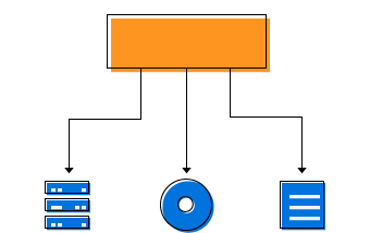
Serialization
Our WinForms Diagram control provides support to save your diagram state in both binary and SOAP formats, and load it back later for further editing using the serializer. It also supports serialization and deserialization of diagram (.edd) files.

Flexible architecture
Our WinForms Diagram control was designed to be a high-performance, easy-to-use, and easy-to-customize engine. Many of the classes and components in the library can be subclasses, so that users can extend and customize the library to meet their needs. The Diagram library, in fact, employs a model-view-controller (MVC) design to clearly separate data, presentation, and user interaction.
WinForms Diagram Code Example
Easily get started with the WinForms Diagram using a few simple lines of C# code example as demonstrated below. Also explore our WinForms Diagram Example that shows you how to render and configure the Diagram in WinForms.
using Syncfusion.Windows.Forms.Diagram;
using Syncfusion.Windows.Forms.Diagram.Controls;
using System;
using System.Data;
using System.Drawing;
using System.Windows.Forms;
using Rectangle = Syncfusion.Windows.Forms.Diagram.Rectangle;
namespace WindowsFormsApplication1
{
    public partial class Form1 : Form
    {
        private Diagram diagram;
        public Form1()
        {
            InitializeComponent();
            // Create a diagram instance
            diagram = new Diagram() { Model = new Model(), Dock = DockStyle.Fill };
            diagram.View.Grid.Visible = false;
            // Add the Diagram control to the Form
            this.Controls.Add(diagram);
            diagram.BeginUpdate();
            // Customize the appearance of the node
            Rectangle rect = new Rectangle(0, 0, 100, 50);
            rect.FillStyle.Color = Color.CornflowerBlue;
            diagram.Binding.DefaultNode = rect;
            PopulateDataSource();
            ConfigureAndUpdateLayout();
            diagram.EndUpdate();
        }
        private void PopulateDataSource()
        {
            DataTable table = new DataTable();
            table.Columns.Add("ID", typeof(string));
            table.Columns.Add("Title", typeof(string));
            table.Columns.Add("ParentID", typeof(string));
            table.Rows.Add("1", "John Smith", String.Empty);
            table.Rows.Add("2", "Joe Robert", "1");
            table.Rows.Add("3", "Jack Kent", "1");
            table.Rows.Add("4", "Ravi Kumar", "1");
            table.Rows.Add("5", "Sue Raymond", "2");
            table.Rows.Add("6", "Lisa simpson", "2");
            table.Rows.Add("7", "Bob Woley", "3");
            table.Rows.Add("8", "Ron Jones", "4");
            table.Rows.Add("9", "Dave Mason", "4");
            //Binding the Node column Name
            diagram.Binding.Id = "ID";
            //Binding the Parents Nodes column Name
            diagram.Binding.ParentId = "ParentID";
            //Binding the Label
            diagram.Binding.Label.Add("Title");
            // Binding the DataTable to the DataSource
            diagram.Binding.DataSource = table;
        }
        private void ConfigureAndUpdateLayout()
        {
            HierarchicLayoutManager hierarchicalLayout = new HierarchicLayoutManager(diagram.Model, 0, 40, 30);
            hierarchicalLayout.LeftMargin = 50;
            hierarchicalLayout.TopMargin = 50;
            diagram.LayoutManager = hierarchicalLayout;
            diagram.LayoutManager.UpdateLayout(null);
        }
    }
}
Not sure how to create your first WinForms Diagram? Our documentation can help.
I’d love to read it now130+ WINDOWS FORMS CONTROLS
ALL CONTROLS
CONVERSATIONAL UI
DATA VISUALIZATION
INPUT CONTROLS
NAVIGATION
DIALOGS & NOTIFICATION
LAYOUT
LISTS & DROPDOWN
CALENDAR
MISCELLANEOUS
FILE VIEWERS & EDITORS
BUTTONS
DATA SCIENCE
Build Document Workflows in WinForms
Integrate a powerful PDF Viewer and a full‑featured Spreadsheet Editor into your WinForms applications, alongside robust document processing libraries, to create smooth document experiences. Empower users to work with documents interactively while developers automate processing behind the scenes.
Frequently Asked Questions
Why should you choose Syncfusion WinForms Diagram?
Visualize, create, and edit interactive diagrams.
- Blazing fast load time, rich UI interactions and keyboard navigation.
Load a wide range of nodes with optimum performance.
Flowchart diagram support, many of built-in shapes, and flexible data binding.
- Easily arrange diagram components in layout such as Organization Chart, Radial tree, and Hierarchical Tree.
- Seamless export and printing capabilities.
- Touch-friendly for interacting with diagrams.
- Simple configuration and API.
Expansive learning resources such as demos and documentation to learn quickly and get started with WinForms Diagram.
Where can I find the Syncfusion WinForms Diagram demo?
You can find our WinForms Diagram demo on
GitHub location.
Can I download and utilize the Syncfusion WinForms Diagram for free?
No, this is a commercial product and requires a paid license. However, a free community license is also available for companies and individuals whose organizations have less than $1 million USD in annual gross revenue, 5 or fewer developers, and 10 or fewer total employees.
How do I get started with Syncfusion WinForms Diagram?
A good place to start would be our comprehensive getting started documentation.
Our Customers Love Us
Having an excellent set of tools and a great support team, Syncfusion® reduces customers’ development time.Here are some of their experiences.

It has more tools and support than its competitors
Syncfusion essential studio samples are really helpfull. Docking Manager, Diagram, Undo-Redo, Mapping, Themes

HALİT A,

Software Developer
Nice suite of components
A very complete set of components, that has an edge on other major vendors which offer components. A lot less code required to use and code samples for more complete components. Integrates well with other 3rd party components.

John A.
C# Developer (Contract)
See Real Success Stories
Developers around the world trust Syncfusion’s Essential Studio to simplify complex projects and speed up delivery. With a vast library of UI controls, powerful SDKs, and reliable support, Essential Studio helps teams build enterprise-ready applications with confidence.
Read Our Customer StoriesIndustry
Software development
75% Cost reduction
50% Faster development
Industry
Utilities (oil and gas)
450+ hours saved
Streamlined processes and hours of development effort saved.
Advanced, flexible features
Empowered users through robust and versatile functionality.
Industry
Software and technology
1000+ of hours saved
Accelerated development with enterprise-ready UI components.
Efficient file management
Streamlined workflows with document libraries without building them from scratch.
Industry
Software and technology
2 Years of delay avoided
Two years of delays prevented with proactive planning.
On-time delivery
Projects delivered on schedule using trusted controls.
Industry
IT services and IT consulting
Improved performance
Large datasets handled with easy customization and quick debugging.
Highly customizable
Plug-and-play controls with quick template integration.
Industry
Professional services
Instant access
Quick availability of features and resources.
Reduced dependencies
Fewer dependencies for faster development.
Rated by users across the globe
Syncfusion Windows Forms Resources
Learning
 Documentation
 Documentation


Awards
Greatness—it’s one thing to say you have it, but it means more when others recognize it. Syncfusion® is proud to hold the following industry awards.

