TL;DR: Microsoft 365’s latest icon update isn’t just a visual refresh, it’s a strategic shift. This blog explores how subtle design shifts reflect a deeper transformation in user experience, strategy, and AI integration.
“A well-designed icon is worth a thousand tooltips.”
As a UX designer, I’ve always been fascinated by icon refreshments. They’re often dismissed as simple cosmetic changes, but in my experience, they’re tiny windows into a company’s soul. They reveal shifts in strategy, philosophy, and user experience.
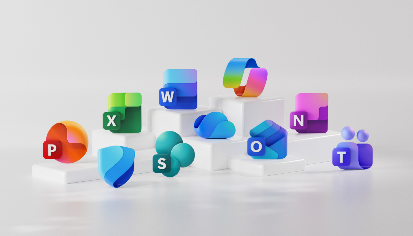
When I saw Microsoft’s latest update to the Microsoft 365 icons (Fluid forms and vibrant colors), it immediately caught my attention not just for its aesthetics, but for the deeper story it tells about product evolution in the age of AI.

Shifting from interface to intent
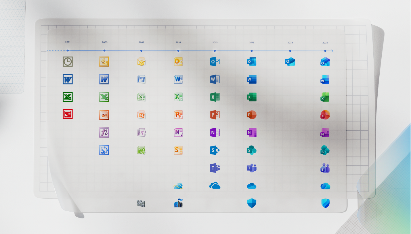
I remember the 2018 Office icons redesign. It was all about visual consistency, ensuring everything looked cohesive across all platforms. But the 2025 refresh feels different. It’s about signaling a shift in how we work.
Microsoft 365 is no longer just a bundle of apps. It’s becoming a single, intelligent ecosystem where Copilot helps your tasks flow smoothly. They don’t just say “we look alike,” they say “we work as one.”
Refer to the following image showcasing the evolution of Microsoft Office icons from the early 2000s to the latest 2025 refresh.

Design choices that speak volumes
Examining the changes through a designer’s lens, I found a few decisions particularly insightful. The approach of evolution, not revolution, is a smart one, aligning with core UX principles.
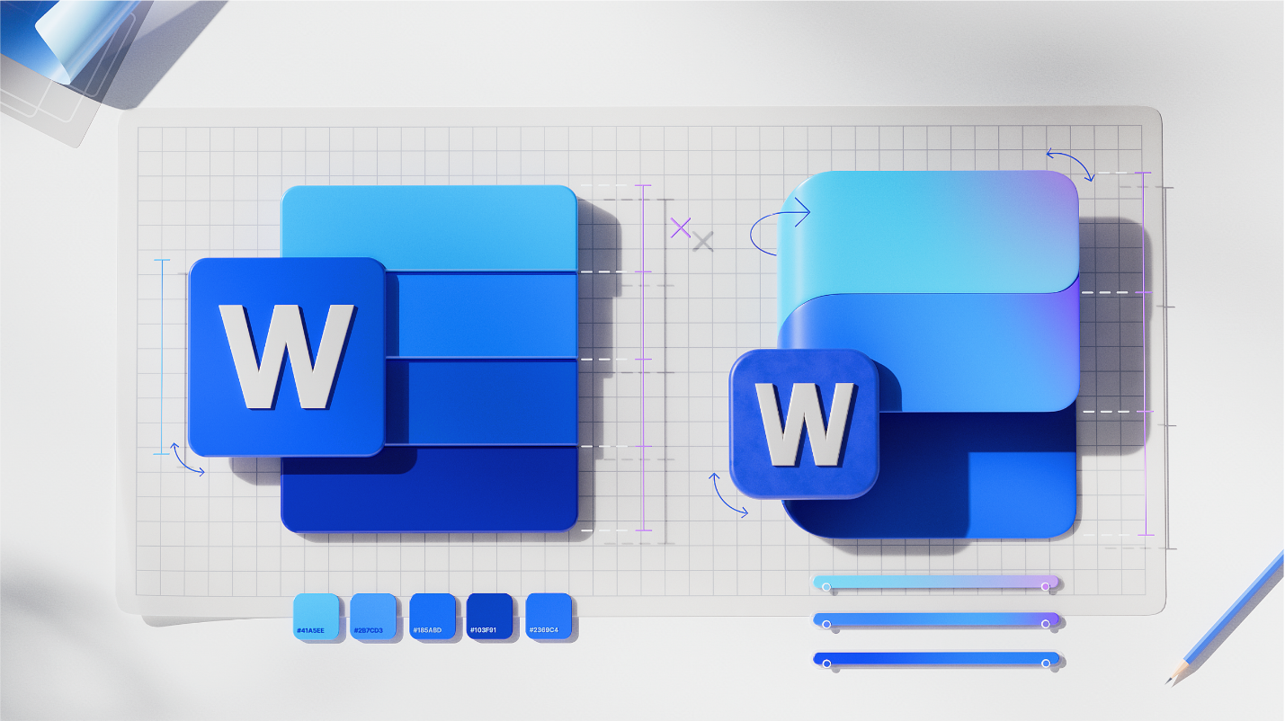
- Simplified shapes: Icons like Word now have fewer lines, making them easier to read and less mentally taxing.
- Fluid forms: Rounded edges and flowing shapes make the suite feel more approachable and collaborative.
- Vibrant gradients: These aren’t just visually appealing; they also enhance contrast and accessibility, making the icons more inclusive.
The Copilot clearly inspired the refresh. It’s the visual glue that ties everything together, signaling AI’s role as the connective tissue of the experience.

What designers can learn
Microsoft 365 icons refresh reminds me that design systems are living languages, not static rulebooks. Every pixel, icon, and motion cue we create carries the responsibility of expressing change, intent, and meaning. As the context around our users evolves —whether through technology, workflow, or mindset —our visuals should evolve accordingly.
Good design doesn’t just follow a product’s functionality; it helps shape how people perceive and trust that evolution. Icons may be small, but their collective voice tells users: Something new is happening here, and it’s built for you.
Key takeaways
- Iconography serves as a powerful indicator of a product’s underlying strategy and UX philosophy.
- Evolution beats revolution, especially when it comes to preserving user trust.
- Design should mirror the product’s truth, especially in an AI-first world.
- Simplicity and clarity go hand in hand with accessibility and impact.
Final thoughts
Microsoft 365 icons refresh isn’t just a design update; it’s a signal of what’s next. As designers, our job is to ensure that our visuals not only look good, but also feel right, tell the truth, and invite users into the future.


