We use cookies to give you the best experience on our website. If you continue to browse, then you agree to our privacy policy and cookie policy.


The Flutter Spark Charts widget is a tiny chart that helps present trends and variations associated with a measurement, such as average temperature or stock market activity in a simple, lightweight, and condensed manner.
There are four types of spark charts namely line, column, area, and win/loss, which are used to show data trends.

A line chart identifies the patterns and trends in data such as seasonal effects, large changes, and turning points over a period of time.

A column chart is designed to show different values of two or more subjects. Vertical bars can be used to represent different values.

An area chart is a line chart with the area between its points colored. This is primarily used when the magnitude of the trend is to be communicated rather than individual data values.

A win/loss chart is used to show whether each value is positive, negative, or zero to visualize a win/loss scenario, such as results in games.
A marker is used to highlight a data point in line and area chart and make these spark charts more readable.

The default marker color and its transparency can be customized.

The default size of a marker can be customized to enhance readability.
The color of key data points such as the first, last, high, and low points can be highlighted and customized to denote the data usage.
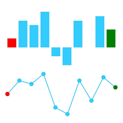
The color of the first and last points of a spark chart can be customized.
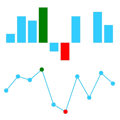
The color of the high and low points of a spark chart can be customized.
A range band is used to highlight a particular region in a spark chart to show the range of safe values. By setting the minimum and maximum ranges for range band, the outliers can be easily identified.

An axis of a Flutter Spark Chart can be configured and customized to show the origin of the data points.


Greatness—it’s one thing to say you have it, but it means more when others recognize it. Syncfusion is proud to hold the following industry awards.