Architecture Compatibility
Adopting a third-party Data Grid component for an enterprise application means it has to fit the existing architecture — the framework, build pipeline, deployment model, and organizational standards — without forcing changes to any of them. This page covers the compatibility of the Syncfusion® React Data Grid with frameworks, React versions, build tools, state management, SSR, micro-front-ends, browsers, module formats, CSS strategies, and testing infrastructure. Each section is accompanied by references to the corresponding, versioned documentation for deeper examination.
Framework and environment support
The Syncfusion React Data Grid integrates as a standard React component in all major deployment environments. The application can run as a Next.js App Router project, a Vite SPA, a Remix app, or inside a micro-front-end shell. The integration process is uniform across environments, with no environment‑specific configuration required for the component.
System requirements for all supported environments are documented.
React version compatibility
The Data Grid publishes a versioned React compatibility matrix with every release. This provides a documented reference that can be used for upgrade planning.
When upgrading React, keep @syncfusion packages at or above the mapped minimum version to remain supported. Based on the historical adoption pace (React 17 in 2020, React 18 in 2022, React 19 in 2024), Syncfusion has tracked each major, stable React release within approximately 6–12 months. This pattern is publicly reviewable in the release notes archive.
Build compatibility
The Data Grid installs as a standard npm package and works with the existing build setup without additional configuration or proprietary plugins. Only the feature modules the application imports are included in the production bundle; everything else is dropped at build time.
Bundle efficiency
The Data Grid ships with full tree-shaking support. Only the feature modules imported by the application are included in the production bundle. Bundle size numbers are versioned and published with every release.
The following interactive sample measures the bundle size for a specific feature combination. The table lists individual module weights for reference.
State management neutrality
The Data Grid has no opinion on how the application manages state. Data goes in as props, events come out — that is the entire contract. Redux, Zustand, TanStack Query, MobX, Jotai, Recoil, and React Context all work without conflict. The Data Grid does not require a global store, context provider, or proprietary data layer.
For a working integration example using Redux, see the React Data Grid Redux Service documentation.
SSR and server component integration
The Data Grid integrates with the Next.js App Router using documented client-component boundary patterns and server-driven data loading. It is compatible with Streaming SSR (React Suspense), ISR, and Edge Runtimes, with specific guidance published for each to prevent hydration errors in production.
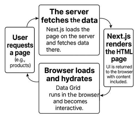
- Server-side paging is supported. Only the first page of data is sent in the initial HTML response, regardless of the total dataset size.
- Common hydration issues are avoided by placing the Data Grid inside a client component boundary — the documented pattern for App Router integration.
- For Streaming SSR (React Suspense), the Data Grid renders inside a Suspense boundary; initial data streams from the server without blocking the full page render.
- For ISR (Incremental Static Regeneration), the Data Grid hydrates correctly on ISR-regenerated pages; no Data Grid-specific handling required.
- Edge runtime compatible. The Data Grid has no Node.js-only runtime dependencies that would block Edge deployment.
Browser and runtime support
Syncfusion publishes a versioned browser compatibility matrix with every release. It covers all supported modern browsers, with details on accessibility, high contrast rendering, and legacy browser limitations.
Micro-frontend and Module Federation compatibility
In a micro-frontend architecture, loading the same component library multiple times across independent applications causes bundle duplication and version conflicts. The Data Grid supports Webpack Module Federation and Single-SPA, with a shared singleton configuration that ensures a single-instance loads across all micro-apps.
Package distribution and module support
Package distribution bundles software into reusable packages for easy sharing and installation, while a module format defines the syntax used to structure and import code across environments.
The full package structure is inspectable on the npm package page.
Theming and design system integration
The Data Grid theming is built on CSS custom properties, supporting enterprise CSS strategies including CSS Modules, Sass, design tokens, and Tailwind utility classes. The Data Grid’s theming system allows alignment with branding requirements without modifying source files:
- 22 built-in themes including Fluent 2, Material 3, Bootstrap 5.3, and Tailwind 3.
- Design token-ready via CSS variables; themes stay current across version upgrades without source patching.
- Theme Studio generates exportable SCSS/CSS that can be maintained independently within the project.
CI/CD and testing compatibility
The Data Grid works with all standard React testing tools without custom polyfills or separate test environments. Data Grid-dependent features can be included in CI/CD pipelines using the same test infrastructure the rest of the application already uses.