How To Change The Selection Color Of The Selected Item Based On Focus In A WPF Sftreeview


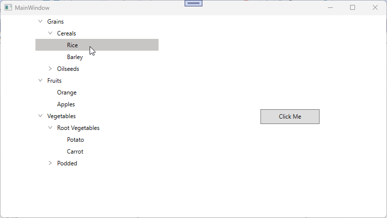
In WPF TreeView (SfTreeView), the selection background for the selected item can be set through the SelectionBackgroundColor property. To change the SelectionBackgroundColor for the SelectedItem in the SfTreeView for both focus and non-focus states can be achieved by defining styles with TargetType="SfTreeView". You can use Triggers to set the SelectionBackgroundColor based on the IsKeyboardFocusWithin property.
XAML
<Window.Resources>
    <BooleanToVisibilityConverter x:Key="boolToVisibilityConverter"/>

    <DataTemplate x:Key="busyIndicatorTemplate">
        <syncfusion:SfBusyIndicator x:Name="PART_BusyIndicator"
     IsBusy="True"
     AnimationType="DotCircle"
     ViewboxWidth="{TemplateBinding Width}"
     VerticalContentAlignment="Center"
     VerticalAlignment="Center">
        </syncfusion:SfBusyIndicator>
    </DataTemplate>

    <DataTemplate x:Key="startExpanderTemplate">
        <Grid x:Name="grid"
        Width="{TemplateBinding Width}"
        Background="Transparent">
            <Path x:Name="PART_CollapseCellPath"
            Width="6.061"
            Height="8.706"
            Data="M0.68398996,0 L6.2700001,4.9960007 0.66699173,10.007999 0,9.2629985 4.7700011,4.9960007 0.016998228,0.74499984 z"
            Stretch="Uniform"
            Fill="#6D6D6D" />
            <Path x:Name="PART_ExpanderCellPath"
            Width="8.706"
            Height="6.061"
            Data="M0.74499548,0 L5.0119957,4.7700001 9.2630047,0.017000169 10.008001,0.68400005 5.0119957,6.2700001 0,0.66699985 z"
            Stretch="Uniform"
            Fill="#6D6D6D"/>
        </Grid>
        <DataTemplate.Triggers>
            <DataTrigger Binding="{Binding IsExpanded}" Value="True">
                <Setter Property="Visibility" TargetName="PART_ExpanderCellPath" Value="Visible"/>
                <Setter Property="Visibility" TargetName="PART_CollapseCellPath" Value="Collapsed"/>
            </DataTrigger>
            <DataTrigger Binding="{Binding IsExpanded}" Value="False">
                <Setter Property="Visibility" TargetName="PART_ExpanderCellPath" Value="Collapsed"/>
                <Setter Property="Visibility" TargetName="PART_CollapseCellPath" Value="Visible"/>
            </DataTrigger>
        </DataTemplate.Triggers>
    </DataTemplate>

    <DataTemplate x:Key="endExpanderTemplate">
        <Grid x:Name="grid"
        Width="{TemplateBinding Width}"
        Background="Transparent" >
            <Path x:Name="PART_CollapseCellPath"
            Width="6.061"
            Height="8.706"
            Data="M5.6040074,0 L6.2710001,0.74499984 1.5000009,5.0119996 6.2529947,9.2629985 5.5860021,10.007999 0,5.0119996 z"
            Stretch="Uniform"
            Fill="#6D6D6D" />
            <Path x:Name="PART_ExpanderCellPath"
            Width="8.706"
            Height="6.061"
            Data="M0.74499548,0 L5.0119957,4.7700001 9.2630047,0.017000169 10.008001,0.68400005 5.0119957,6.2700001 0,0.66699985 z"
            Stretch="Uniform"
            Fill="#6D6D6D"/>
        </Grid>
        <DataTemplate.Triggers>
            <DataTrigger Binding="{Binding IsExpanded}" Value="True">
                <Setter Property="Visibility" TargetName="PART_ExpanderCellPath" Value="Visible"/>
                <Setter Property="Visibility" TargetName="PART_CollapseCellPath" Value="Collapsed"/>
            </DataTrigger>
            <DataTrigger Binding="{Binding IsExpanded}" Value="False">
                <Setter Property="Visibility" TargetName="PART_ExpanderCellPath" Value="Collapsed"/>
                <Setter Property="Visibility" TargetName="PART_CollapseCellPath" Value="Visible"/>
            </DataTrigger>
        </DataTemplate.Triggers>
    </DataTemplate>

    <Style TargetType="syncfusion:SfTreeView">
        <Setter Property="ScrollViewer.VerticalScrollBarVisibility" Value="Auto"/>
        <Setter Property="ScrollViewer.HorizontalScrollBarVisibility" Value="Disabled"/>
        <Setter Property="ExpanderTemplate" Value="{StaticResource startExpanderTemplate}"/>
        <Setter Property="Background" Value="Transparent"/>
        <Setter Property="SelectionBackgroundColor" Value="#D2DFF2"/>
        <Setter Property="SelectionForegroundColor" Value="#202020"/>
        <Setter Property="Template">
            <Setter.Value>
                <ControlTemplate TargetType="syncfusion:SfTreeView">
                    <Grid Background="{TemplateBinding Background}">
                        <Border Background="{TemplateBinding Background}"
                     BorderBrush="{TemplateBinding BorderBrush}"
                     BorderThickness="{TemplateBinding BorderThickness}"
                     SnapsToDevicePixels="True">
                            <ScrollViewer x:Name="PART_ScrollViewer"
                           Background="Transparent"
                           CanContentScroll="True"
                           IsTabStop="False"
                               FlowDirection="{TemplateBinding FlowDirection}"
                               HorizontalScrollBarVisibility="{TemplateBinding ScrollViewer.HorizontalScrollBarVisibility}"
                               IsDeferredScrollingEnabled="{TemplateBinding ScrollViewer.IsDeferredScrollingEnabled}"
                               PanningMode="{TemplateBinding ScrollViewer.PanningMode}"
                               PanningRatio="{TemplateBinding ScrollViewer.PanningRatio}"
                           VerticalScrollBarVisibility="{TemplateBinding ScrollViewer.VerticalScrollBarVisibility}">
                                <syncfusion:TreeNodeContainer x:Name="PART_TreeNodeContainer"
                                          HorizontalAlignment="Left"
                                          Background="Transparent"/>
                            </ScrollViewer>
                        </Border>
                    </Grid>
                    <ControlTemplate.Triggers>
                        <Trigger Property="ExpanderPosition" Value="End">
                            <Setter Property="ExpanderTemplate" Value="{StaticResource endExpanderTemplate}"/>
                        </Trigger>
                        <Trigger Property="IsKeyboardFocusWithin" Value="True">
                            <Setter Property="SelectionBackgroundColor" Value="RoyalBlue"/>
                        </Trigger>
                        <Trigger Property="IsKeyboardFocusWithin" Value="False">
                            <Setter Property="SelectionBackgroundColor" Value="LightBlue"/>
                        </Trigger>
                    </ControlTemplate.Triggers>
                </ControlTemplate>
            </Setter.Value>
        </Setter>
    </Style>
</Window.Resources>
Note: When using Triggers to apply SelectionBackgroundColor, avoid setting this property directly on the SfTreeView. A locally set value takes higher precedence in the WPF property architecture, which would override the trigger-based value and prevent the selection color from updating dynamically.
Take a moment to peruse the WPF TreeView - Selection documentation, to learn more about selection with examples.