How To Change The Hover Color Of The Selected Item In A WPF Sftreeview


hovercolor
nodes
selection
treeview
wpf
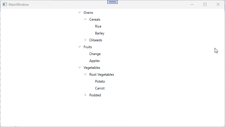
In WPF TreeView (SfTreeView), when the mouse is hovered on the items, it will be highlighted in gray color by default. To change the hover color depending on the SelectedItem can be achieved by defining styles for the items using TargetType="TreeViewItem". You can use a MultiDataTrigger to set the BackgroundColor of the PART_HoverBorder based on the IsSelectedItem property.
XAML
<Window.Resources>
<BooleanToVisibilityConverter x:Key="boolToVisibilityConverter"/>
<DataTemplate x:Key="busyIndicatorTemplate">
<syncfusion:SfBusyIndicator x:Name="PART_BusyIndicator"
IsBusy="True"
AnimationType="DotCircle"
ViewboxWidth="{TemplateBinding Width}"
VerticalContentAlignment="Center"
VerticalAlignment="Center">
</syncfusion:SfBusyIndicator>
</DataTemplate>
<DataTemplate x:Key="startExpanderTemplate">
<Grid x:Name="grid"
Width="{TemplateBinding Width}"
Background="Transparent">
<Path x:Name="PART_CollapseCellPath"
Width="6.061"
Height="8.706"
Data="M0.68398996,0 L6.2700001,4.9960007 0.66699173,10.007999 0,9.2629985 4.7700011,4.9960007 0.016998228,0.74499984 z"
Stretch="Uniform"
Fill="#6D6D6D" />
<Path x:Name="PART_ExpanderCellPath"
Width="8.706"
Height="6.061"
Data="M0.74499548,0 L5.0119957,4.7700001 9.2630047,0.017000169 10.008001,0.68400005 5.0119957,6.2700001 0,0.66699985 z"
Stretch="Uniform"
Fill="#6D6D6D"/>
</Grid>
<DataTemplate.Triggers>
<DataTrigger Binding="{Binding IsExpanded}" Value="True">
<Setter Property="Visibility" TargetName="PART_ExpanderCellPath" Value="Visible"/>
<Setter Property="Visibility" TargetName="PART_CollapseCellPath" Value="Collapsed"/>
</DataTrigger>
<DataTrigger Binding="{Binding IsExpanded}" Value="False">
<Setter Property="Visibility" TargetName="PART_ExpanderCellPath" Value="Collapsed"/>
<Setter Property="Visibility" TargetName="PART_CollapseCellPath" Value="Visible"/>
</DataTrigger>
</DataTemplate.Triggers>
</DataTemplate>
<DataTemplate x:Key="endExpanderTemplate">
<Grid x:Name="grid"
Width="{TemplateBinding Width}"
Background="Transparent" >
<Path x:Name="PART_CollapseCellPath"
Width="6.061"
Height="8.706"
Data="M5.6040074,0 L6.2710001,0.74499984 1.5000009,5.0119996 6.2529947,9.2629985 5.5860021,10.007999 0,5.0119996 z"
Stretch="Uniform"
Fill="#6D6D6D" />
<Path x:Name="PART_ExpanderCellPath"
Width="8.706"
Height="6.061"
Data="M0.74499548,0 L5.0119957,4.7700001 9.2630047,0.017000169 10.008001,0.68400005 5.0119957,6.2700001 0,0.66699985 z"
Stretch="Uniform"
Fill="#6D6D6D"/>
</Grid>
<DataTemplate.Triggers>
<DataTrigger Binding="{Binding IsExpanded}" Value="True">
<Setter Property="Visibility" TargetName="PART_ExpanderCellPath" Value="Visible"/>
<Setter Property="Visibility" TargetName="PART_CollapseCellPath" Value="Collapsed"/>
</DataTrigger>
<DataTrigger Binding="{Binding IsExpanded}" Value="False">
<Setter Property="Visibility" TargetName="PART_ExpanderCellPath" Value="Collapsed"/>
<Setter Property="Visibility" TargetName="PART_CollapseCellPath" Value="Visible"/>
</DataTrigger>
</DataTemplate.Triggers>
</DataTemplate>
<Style x:Name="TreeViewItem" TargetType="syncfusion:TreeViewItem">
<Setter Property="Background" Value="White"/>
<Setter Property="Template">
<Setter.Value>
<ControlTemplate TargetType="{x:Type syncfusion:TreeViewItem}">
<Grid x:Name="ROOT" Background="{TemplateBinding Background}">
<VisualStateManager.VisualStateGroups>
<VisualStateGroup x:Name="DropStates">
<VisualState x:Name="Normal"/>
<VisualState x:Name="DropAsChild">
<Storyboard>
<ObjectAnimationUsingKeyFrames BeginTime="00:00:00"
Duration="00:00:00"
Storyboard.TargetName="BorderContent"
Storyboard.TargetProperty="Background">
<DiscreteObjectKeyFrame KeyTime="00:00:00">
<DiscreteObjectKeyFrame.Value>
<SolidColorBrush Color="#D2DFF2" />
</DiscreteObjectKeyFrame.Value>
</DiscreteObjectKeyFrame>
</ObjectAnimationUsingKeyFrames>
<ObjectAnimationUsingKeyFrames BeginTime="00:00:00"
Duration="00:00:00"
Storyboard.TargetName="BorderContent"
Storyboard.TargetProperty="BorderBrush">
<DiscreteObjectKeyFrame KeyTime="00:00:00">
<DiscreteObjectKeyFrame.Value>
<SolidColorBrush Color="#2B579A"/>
</DiscreteObjectKeyFrame.Value>
</DiscreteObjectKeyFrame>
</ObjectAnimationUsingKeyFrames>
<ObjectAnimationUsingKeyFrames BeginTime="00:00:00"
Duration="00:00:00"
Storyboard.TargetName="BorderContent"
Storyboard.TargetProperty="BorderThickness">
<DiscreteObjectKeyFrame KeyTime="00:00:00">
<DiscreteObjectKeyFrame.Value>
<Thickness>1</Thickness>
</DiscreteObjectKeyFrame.Value>
</DiscreteObjectKeyFrame>
</ObjectAnimationUsingKeyFrames>
<ObjectAnimationUsingKeyFrames BeginTime="00:00:00"
Duration="00:00:00"
Storyboard.TargetName="PART_ExpanderView"
Storyboard.TargetProperty="Background">
<DiscreteObjectKeyFrame KeyTime="00:00:00">
<DiscreteObjectKeyFrame.Value>
<SolidColorBrush Color="#D2DFF2" />
</DiscreteObjectKeyFrame.Value>
</DiscreteObjectKeyFrame>
</ObjectAnimationUsingKeyFrames>
</Storyboard>
</VisualState>
</VisualStateGroup>
</VisualStateManager.VisualStateGroups>
<Grid.ColumnDefinitions>
<ColumnDefinition MaxWidth="{TemplateBinding IndentationWidth}"/>
<ColumnDefinition Width="Auto"/>
<ColumnDefinition Width="*"/>
<ColumnDefinition Width="Auto"/>
</Grid.ColumnDefinitions>
<Border x:Name="BorderContent"
BorderThickness="{TemplateBinding BorderThickness}"
BorderBrush="{TemplateBinding BorderBrush}"/>
<Border x:Name="PART_CurrentItemBorder" Visibility="Collapsed" />
<Border x:Name="PART_HoverBorder"
Visibility="Collapsed"
Margin="1"
Background="LightBlue"/>
<StackPanel x:Name="PART_IndentContainer"
Panel.ZIndex="0"
Orientation="Horizontal"
Grid.Column="0">
<Rectangle x:Name="PART_IndentLine"
StrokeDashArray="2,2"
HorizontalAlignment="Stretch"
Visibility="Hidden">
</Rectangle>
</StackPanel>
<Grid x:Name="PART_LineGrid"
Grid.Column="1"
Panel.ZIndex="0"
Width="{TemplateBinding ExpanderWidth}"
Visibility="Hidden">
<Rectangle x:Name="PART_HorizontalLine"
StrokeDashArray="2,2"
Margin="10,0,0,0"
Width="10"
VerticalAlignment="Center" />
<Rectangle x:Name="PART_VerticalLine"
StrokeDashArray="2,2"
HorizontalAlignment="Stretch"/>
</Grid>
<ContentControl x:Name="PART_ExpanderView"
Focusable="False"
Width="{TemplateBinding ExpanderWidth}"
Visibility="{Binding HasChildNodes, Converter={StaticResource boolToVisibilityConverter}}"
ContentTemplate="{TemplateBinding ExpanderTemplate}">
</ContentControl>
<syncfusion:TreeNodeView x:Name="PART_ContentView" Grid.Column="2"
Margin="4,0,4,0"
VerticalAlignment="Center"
Focusable="False"
ContentTemplate="{TemplateBinding ItemTemplate}"
>
</syncfusion:TreeNodeView>
<Border x:Name="PART_DragLine" Grid.ColumnSpan="3" Visibility="Collapsed" BorderBrush="#2B579A" />
</Grid>
<ControlTemplate.Triggers>
<Trigger Property="FullRowSelect" Value="True">
<Setter Property="Grid.Column" TargetName="BorderContent" Value="0"/>
<Setter Property="Grid.ColumnSpan" TargetName="BorderContent" Value="4"/>
<Setter Property="Grid.Column" TargetName="PART_CurrentItemBorder" Value="0"/>
<Setter Property="Grid.ColumnSpan" TargetName="PART_CurrentItemBorder" Value="4"/>
<Setter Property="Grid.Column" TargetName="PART_HoverBorder" Value="0"/>
<Setter Property="Grid.ColumnSpan" TargetName="PART_HoverBorder" Value="4"/>
</Trigger>
<MultiTrigger>
<MultiTrigger.Conditions>
<Condition Property="FullRowSelect" Value="False"/>
<Condition Property="ExpanderPosition" Value="Start"/>
</MultiTrigger.Conditions>
<Setter Property="Grid.Column" TargetName="BorderContent" Value="2"/>
<Setter Property="Grid.ColumnSpan" TargetName="BorderContent" Value="1"/>
<Setter Property="Grid.Column" TargetName="PART_CurrentItemBorder" Value="2"/>
<Setter Property="Grid.ColumnSpan" TargetName="PART_CurrentItemBorder" Value="1"/>
<Setter Property="Grid.Column" TargetName="PART_HoverBorder" Value="2"/>
<Setter Property="Grid.ColumnSpan" TargetName="PART_HoverBorder" Value="1"/>
</MultiTrigger>
<MultiTrigger>
<MultiTrigger.Conditions>
<Condition Property="FullRowSelect" Value="False"/>
<Condition Property="ExpanderPosition" Value="End"/>
</MultiTrigger.Conditions>
<Setter Property="Grid.Column" TargetName="BorderContent" Value="0"/>
<Setter Property="Grid.ColumnSpan" TargetName="BorderContent" Value="3"/>
<Setter Property="Grid.Column" TargetName="PART_CurrentItemBorder" Value="0"/>
<Setter Property="Grid.ColumnSpan" TargetName="PART_CurrentItemBorder" Value="3"/>
<Setter Property="Grid.Column" TargetName="PART_HoverBorder" Value="0"/>
<Setter Property="Grid.ColumnSpan" TargetName="PART_HoverBorder" Value="3"/>
</MultiTrigger>
<Trigger Property="ExpanderPosition" Value="Start">
<Setter Property="Grid.Column" TargetName="PART_ExpanderView" Value="1"/>
</Trigger>
<Trigger Property="ExpanderPosition" Value="End">
<Setter Property="Grid.Column" TargetName="PART_ExpanderView" Value="3"/>
</Trigger>
<Trigger Property="ShowLines" Value="True">
<Setter Property="Visibility" TargetName="PART_LineGrid" Value="Visible"/>
</Trigger>
<DataTrigger Binding="{Binding ShowExpanderAnimation}" Value="True">
<Setter Property="ContentTemplate" TargetName="PART_ExpanderView" Value="{StaticResource busyIndicatorTemplate}"/>
</DataTrigger>
<Trigger Property="IsEnabled" Value="False">
<Setter Property="Opacity" Value="0.3"/>
</Trigger>
<MultiDataTrigger>
<MultiDataTrigger.Conditions>
<Condition Binding="{Binding RelativeSource={RelativeSource Self},
Path=IsMouseOver}"
Value="True"/>
<Condition Binding="{Binding RelativeSource={RelativeSource Self},
Path=TreeViewItemInfo.IsSelectedItem}"
Value="True"/>
</MultiDataTrigger.Conditions>
<Setter TargetName="PART_HoverBorder" Property="Visibility" Value="Visible"/>
<Setter TargetName="PART_HoverBorder" Property="Background" Value="LightSeaGreen"/>
</MultiDataTrigger>
<MultiDataTrigger>
<MultiDataTrigger.Conditions>
<Condition Binding="{Binding RelativeSource={RelativeSource Self},
Path=IsMouseOver}"
Value="True"/>
<Condition Binding="{Binding RelativeSource={RelativeSource Self},
Path=TreeViewItemInfo.IsSelectedItem}"
Value="False"/>
</MultiDataTrigger.Conditions>
<Setter TargetName="PART_HoverBorder" Property="Visibility" Value="Visible"/>
<Setter TargetName="PART_HoverBorder" Property="Background" Value="Red"/>
</MultiDataTrigger>
</ControlTemplate.Triggers>
</ControlTemplate>
</Setter.Value>
</Setter>
</Style>
</Window.Resources>
Take a moment to peruse the WPF TreeView - Selection documentation, to learn more about selection with examples.