We use cookies to give you the best experience on our website. If you continue to browse, then you agree to our privacy policy and cookie policy.

The Xamarin.Forms DataGrid control allows you to customize the style of the control and its inner elements to adapt the control to the rest of your business application. Style inner elements such as cells, rows, columns, column headers, row headers, summary rows, load more view, borders, icons used in the DataGrid and much more.
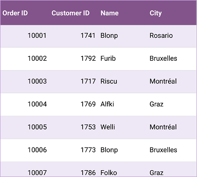
Customize the row style with alternate row colors for an elegant look and feel. Customize the alternation count in DataGrid control, as well as the style of a row based on data. You can prioritize the row style over the selected customization, vice versa, or show both customizations together.
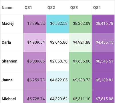
Customize a column style directly from the XAML without writing a single line of code for individual columns. Style columns from the code, as well. In addition, conditionally style the column cells based on data. You can prioritize the column style over the selected customization, vice versa, or show both customizations together.
Customize the appearance of a group caption row, group summary row, or table summary row easily by writing a custom style for DataGrid. Customize the background color, foreground color, font, font attributes, and more. Also customize the background color of the indent cells based on the type of row.
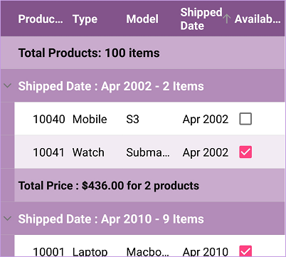
Set any custom template to cells using template selectors in a template column. Users can customize the style based on conditions. Customize the group caption rows and group summary rows conditionally based on data with the built-in caption summary template and group summary template support. Also customize the summaries for individual cells using a template in the DataGrid control.
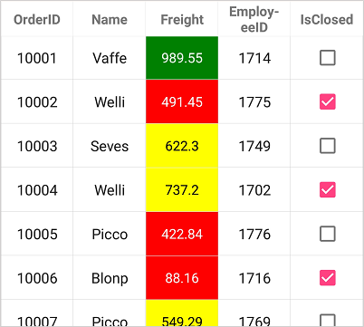
The Xamarin.Forms DataGrid control allows you to style the icons and indicators used in it just by writing a custom style for the control. Customize all the indicators and icons used in the DataGrid, such as:
The DataGrid lets you customize the grid borders with horizontal lines alone, vertical lines alone, both horizontal and vertical lines, or without borders. You can have different border colors for header cells and record cells. In addition, customize the border width of the grid cells and the header cells with separate values for a visually appealing look and feel. Customize the border color and border width for the current cell to keep track of the last row and cell interacted with in the DataGrid control.
 You are using an outdated version of Internet Explorer that may not display all features of this and other websites. Upgrade to Internet Explorer 8 or newer for a better experience.