We use cookies to give you the best experience on our website. If you continue to browse, then you agree to our privacy policy and cookie policy.

The DataGrid control provides support to group data against one or more columns. Users can display organized data in a hierarchical structure based on matching column values. Groups can be expanded or collapsed through interaction or programmatically. It is also possible to apply custom grouping logic to group data. Customizable indent columns will be created to visually represent the grouping levels when grouping more than one column. It is also possible to animate the expand and collapse icon in the caption row.
Group data by one or more columns programmatically with customizable templates. The DataGrid control also allows you to show or hide a column when grouped.

View the records of each group easily. An intuitive expand icon in group captions provides an easier way to expand or collapse groups. Users can also expand or collapse groups in code behind.


Group the data for columns based on the displayed text. Users can view the grouped data with the formatted text applied for values.

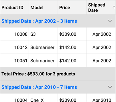
View summaries for columns in a group caption. You can also show the summary of records in a group.
Indent columns are the columns present to the left of the summary rows when grouping more than one column. The number of indent cells in each summary row will be determined by the level of that group. DataGrid provides support to customize the size and background color of the indent column to have an elegant look and feel. It is also possible to customize the background color of the indent cells based on the type of row in a Xamarin.Forms DataGrid control.

The Xamarin.Forms DataGrid loads two different icons for denoting the group expanded and collapsed state. However, it also provides extensive support to rotate the expander icon animatedly for denoting the collapsed status.

 You are using an outdated version of Internet Explorer that may not display all features of this and other websites. Upgrade to Internet Explorer 8 or newer for a better experience.