We use cookies to give you the best experience on our website. If you continue to browse, then you agree to our privacy policy and cookie policy.

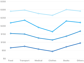
ChartSeries is the visual representation of data. SfChart offers many types of series ranging from line series to financial series (HiLo and Candle). Based on your requirement and specification, any type of Series can be added for data visualization.
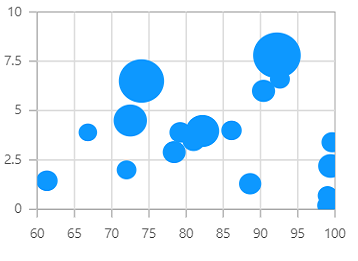
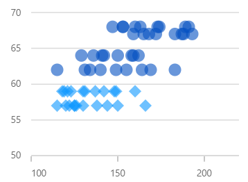
Visualize data with three numeric parameters. The size of the bubbles depends on the third parameter.
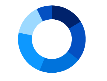
Like the pie chart, but with an open space at the center. Intended for comparing the contribution of each data point to the whole.
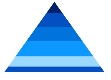
Represent hierarchies visually in a pyramid-like structure that shows proportions of the total.
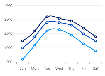
Like the area chart, but with the data points connected with a smooth line.
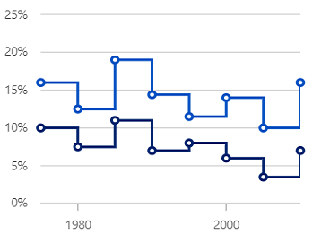
Data points are connected through vertical and horizontal lines to show step-like progress.
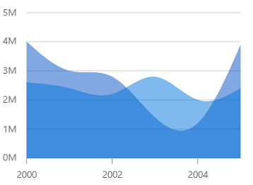
Like the step line chart, but with the areas connected with lines shaded.
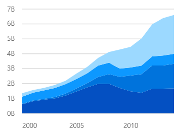
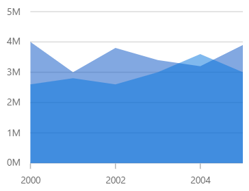
Like the area chart, but with the data points stacked on top of each other.
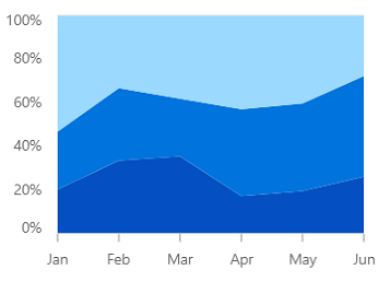
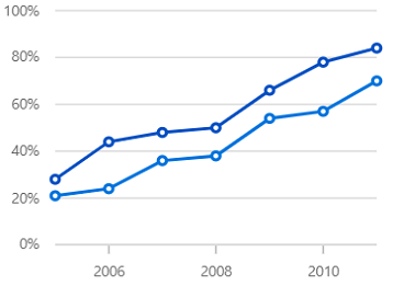
Shows the relative percentage of multiple data series in stacked areas. The cumulative proportion of each stacked area always totals 100%.
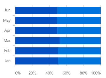
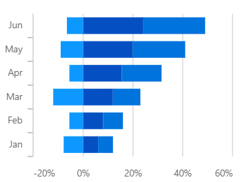
Shows the relative percentage of multiple data series in stacked bars. The cumulative proportion of each stacked bar always totals 100%.
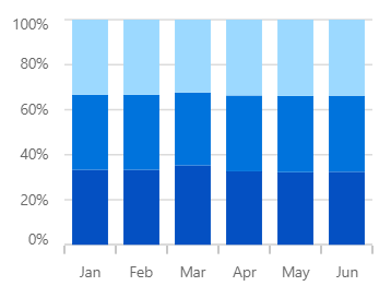
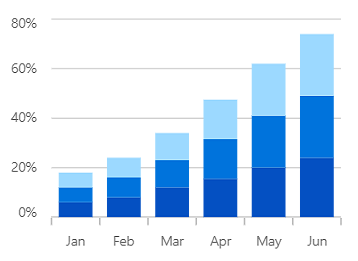
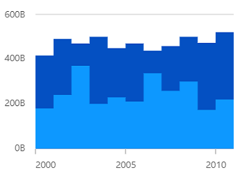
Shows the relative percentage of multiple data series in stacked columns. The cumulative proportion of each stacked column always totals 100%.
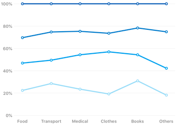
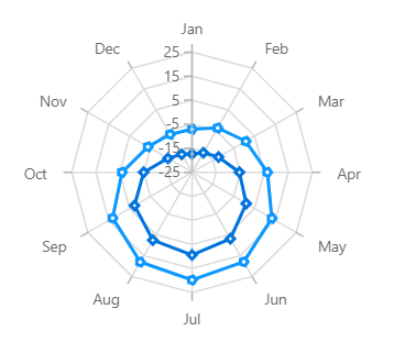
Shows the relative percentage of multiple data series in stacked lines. The cumulative proportion of each stacked line always totals 100%.
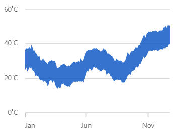
Shows variations in the data values for a given time. The area between the high and low range is filled.
Shows variations in the data values for a given time. The area between the high and low range is filled.

Shows variations in the data values for a given time. The area between the high and low range is filled.
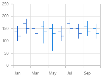
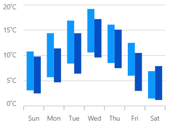
Used in the stock market to represent the high, low, open, close values of a stock.
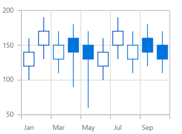
Used in the stock market to represent high, low, open, and close values of a stock.
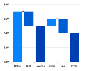
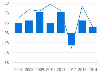
Explain gradual changes in the quantitative value of an entity that is subject to change by increments or decrements.
 You are using an outdated version of Internet Explorer that may not display all features of this and other websites. Upgrade to Internet Explorer 8 or newer for a better experience.