We use cookies to give you the best experience on our website. If you continue to browse, then you agree to our privacy policy and cookie policy.


The WinUI DataGrid control is used for efficiently displaying and manipulating tabular data. Its rich feature set includes functionalities like data binding, editing, sorting, filtering, grouping, and data virtualization. It has been optimized for working with millions of records, as well as handling high-frequency, real-time updates.

The WinUI DataGrid can load millions of records instantly.

The WinUI DataGrid supports data processing operations like sorting, filtering, grouping, summaries, and real-time updates that are handled efficiently using the PLINQ.
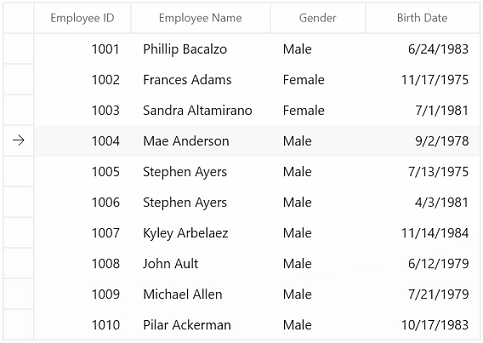
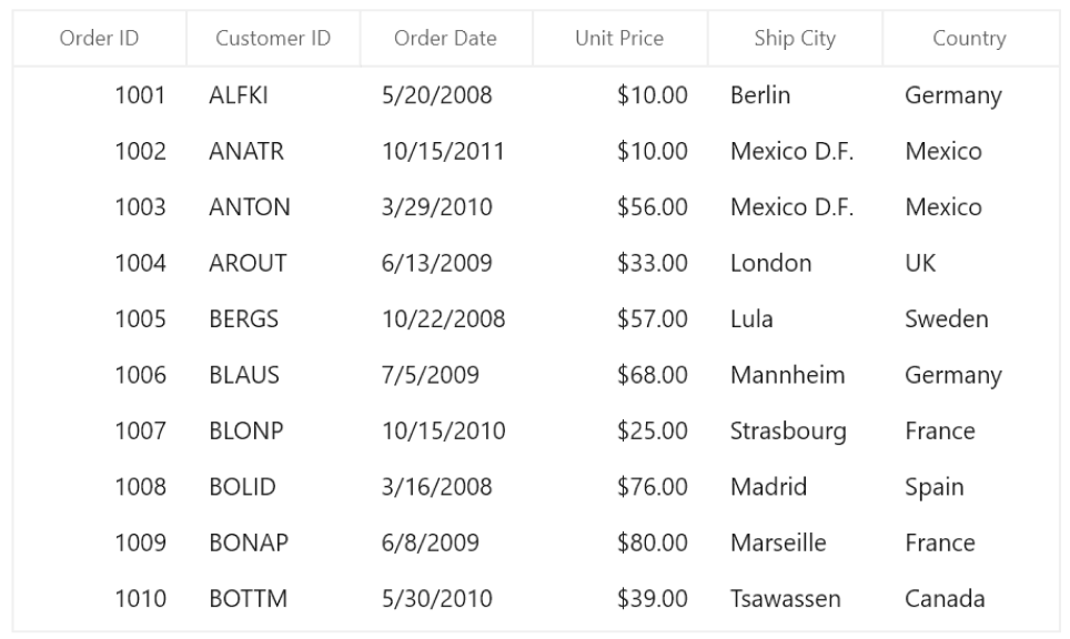
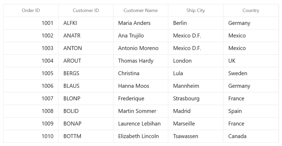
Data binding works out of the box for all popular data sources. It automatically generates columns for a data-bound collection. It even assigns appropriate column types for specific data types.


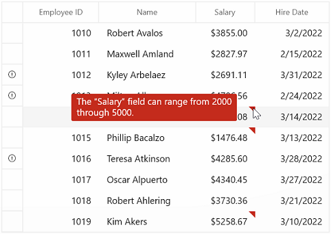
Validate cells and display error information based on the following validation types:
Also, it’s possible to use:
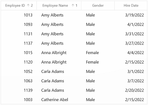
Sort data against one or more columns with multiple customization operations. You can also sort by caption summary values when the grid is grouped or by writing custom logic.

Group data by one or more columns either through mouse and touch interactivity in the group drop area or in code behind. Or group data with custom logic.
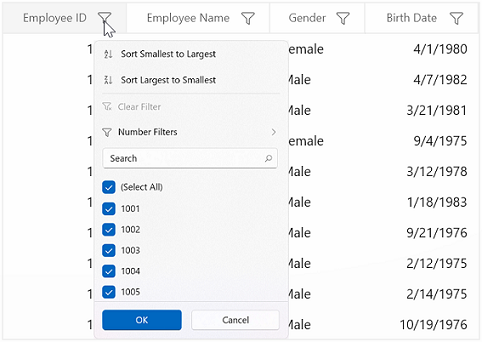
Filter data with the row filter or an intuitive, built-in, Excel-inspired filtering UI.

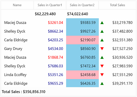
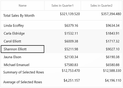
Calculate and display sum, min, max, average, count, and custom aggregates in a table or group. Display summaries with different summary types, such as:
The WinUI DataGrid control can handle high-frequency updates even under the most demanding scenarios where the data is sorted and grouped in real time. The summaries are calculated in an optimized way and the updated summary is displayed in real-time scenarios.

Add a new record in an underlying collection with a built-in row. Place the new row at the top or bottom, or stick it at the top. It’s also possible to place a newly added row at the top or bottom in a data grid.
Delete selected records in a data grid by pressing the Delete key. You can change it to another key instead of the default, too.
The WinUI DataGrid allows you to select rows or cells in a similar way to Excel for all keyboard navigations.

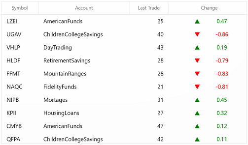
Customize the appearance of cells, rows, or columns based on data.
Users can adjust (auto fit) the row height based on the content of any column or certain columns to enhance the readability of content. It’s also possible to set the row height conditionally.

Users can freeze rows and columns at the top, bottom, left, and right positions, similar to in Excel. Horizontal and vertical scrolling can be performed, except on fixed columns and rows.
Display rows at the top and bottom of the grid with data that is not bound to the ItemsSource.

Stacked headers (column header span) allow users to show unbound header rows. They span the stacked header columns across multiple rows and columns.
Column width can be adjusted (auto fit) based on the content of any column or column header. All the columns can be fit within the viewport of the data grid.

A master-details view (nested grid view) can be represented through nested grids that can be expanded and collapsed. Functionalities like editing, sorting, filtering, and grouping are supported. Unlimited levels of nested grid relationships are allowed.
Create records on demand by automatically enabling data virtualization. Load millions of records of data instantly with virtualization enabled.
The appearance of the DataGrid and its inner elements (cells, rows, headers, summaries, etc.) can be customized using a variety of available properties and keys.


The appearance of a data grid and its inner elements, such as rows, cells, columns, headers, and summary rows, can be customized easily by using styles and templates.
The WinUI DataGrid control provides an entirely custom context menu to expose functionality on the user interface. Users can create context menus for different rows such as a record row, summary row, and group caption header, in an efficient manner.

The WinUI DataGrid allows you to perform clipboard operations such as cut, copy, and paste within the control and between other applications such as Notepad or Excel.

The WinUI DataGrid allows you to drag and drop the rows between datagrid and other controls such as ListView, SfTreeView, and SfTreeGrid. You can also select and drag multiple rows when the SelectionMode is multiple or extended.
Data in adjacent cells can be dynamically merged and shown in a single cell. By creating your own custom logic, you can merge data based on cell content.

DataGrid allows you to customize gridline visibility with the following options:
Serialize the WinUI DataGrid’s settings to XML format and load back (deserialization) to DataGrid using the built-in serialization options.
The WinUI DataGrid supports right-to-left (RTL) control rendering. Display text direction and layout from right to left.

Export the grid data to Microsoft Excel with a variety of appearance customization options. Exclude and include specific columns and rows, set custom row heights and column widths, and much more. You can further customize the exported Excel file using XlsIO.


Localize all the static default strings in the WinUI DataGrid to any supported language.
Easily get started with the WinUI DataGrid using a few simple lines of XAML and C# code example as demonstrated below. Also explore our WinUI DataGrid Example that shows you how to render and configure the DataGrid in WinUI.
<Page
    x:Class="GettingStarted.MainPage"
    xmlns="http://schemas.microsoft.com/winfx/2006/xaml/presentation"
    xmlns:x="http://schemas.microsoft.com/winfx/2006/xaml"
    xmlns:local="using:GettingStarted"
    xmlns:d="http://schemas.microsoft.com/expression/blend/2008"
    xmlns:mc="http://schemas.openxmlformats.org/markup-compatibility/2006"
    xmlns:dataGrid="using:Syncfusion.UI.Xaml.DataGrid"
    mc:Ignorable="d"
    Background="{ThemeResource ApplicationPageBackgroundThemeBrush}">
    <Grid x:Name="rootGrid">
    <dataGrid:SfDataGrid x:Name="sfDataGrid" />
    </Grid>
</Page>
using Syncfusion.UI.Xaml.DataGrid;
namespace GettingStarted
{
/// <summary>
/// An empty page that can be used on its own or navigated to within a Frame.
/// </summary>
public sealed partial class MainPage : Page
{
public MainPage()
{
this.InitializeComponent();
SfDataGrid sfDataGrid = new SfDataGrid();
rootGrid.Children.Add(sfDataGrid);
}
}
}You can find our WinUI DataGrid demo here.
No, this is a commercial product and requires a paid license. However, a free community license is also available for companies and individuals whose organizations have less than $1 million USD in annual gross revenue, 5 or fewer developers, and 10 or fewer total employees.
A good place to start would be our comprehensive getting started documentation.


Greatness—it’s one thing to say you have it, but it means more when others recognize it. Syncfusion is proud to hold the following industry awards.


