We use cookies to give you the best experience on our website. If you continue to browse, then you agree to our privacy policy and cookie policy.


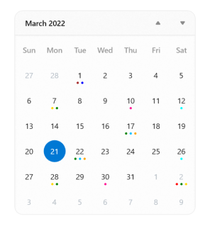
The WinUI Calendar controls provides simple and easy-to-use views to select one or more dates. It provides month, year, century, and decade views to select dates ranging between years with built-in navigation. It also includes formatting of days and dates, blackout dates, localization, and complete UI customization of dates.
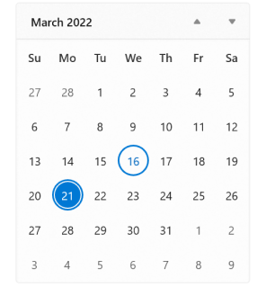
Users are allowed to select one or more dates. Selection can also be disabled.
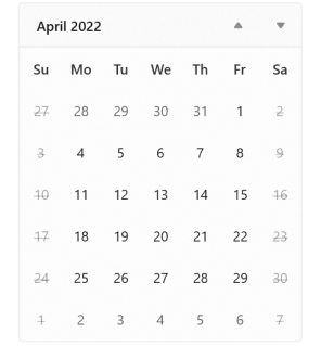
Prevent users from selecting a date in a particular range by specifying minimum and maximum dates.
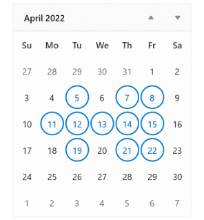
Prevent users from selecting specific dates (example: disable all weekends).

Select a date from a different year, decade, or century easily by navigating to year, decade, or century view.
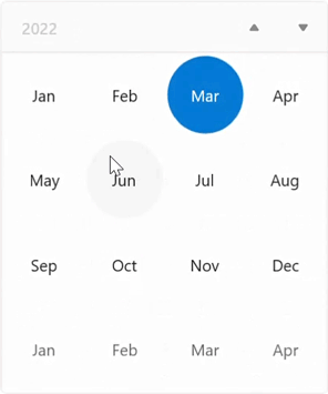
Restrict navigation within a minimum and maximum range. This will be useful when the date range is small and users do not want to show the century view. This can also be used as a month and year selector without selecting a date.
The WinUI Calendar control can be used across the globe by applying regional settings.
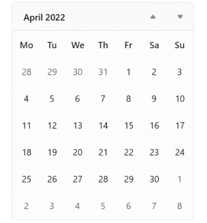
Sunday is shown as the first day of the week by default. However, this can be changed based on regional settings.
The WinUI Calendar allows different date formats for a day, month, or week name.
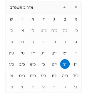
The WinUI Calendar control supports nine different calendars, including Gregorian, Julian, and Hebrew.

Render the content from right to left for Arabic or Hebrew calendars.
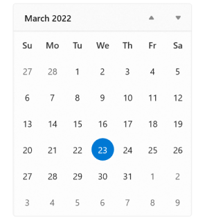
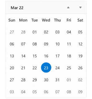
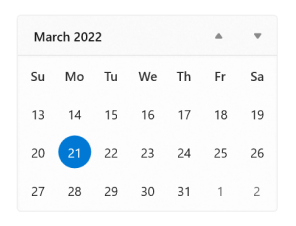
The WinUI Calendar control has different ways to highlight current and selected dates.
The WinUI Calendar automatically takes up the minimal space required. However, increase or decrease the number of weeks shown in a month view to reduce the space utilized by the Calendar.
Hide days or give them a blurry appearance if they are out of the current view’s scope.
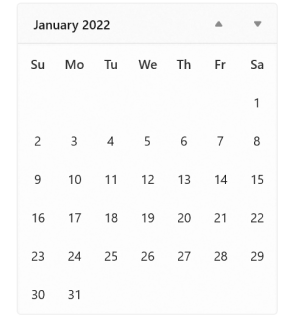
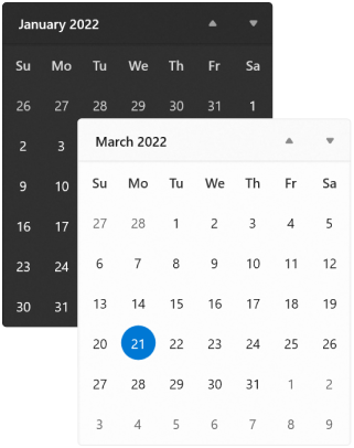
The WinUI Calendar control includes light and dark themes.
Customize the appearance of individual items using a custom template, style, and selector.
Easily get started with the WinUI Calendar using a few simple lines of XAML and C# code example as demonstrated below. Also explore our WinUI Calendar Example that shows you how to render and configure the Calendar in WinUI.
<Page
    x:Class="GettingStarted.MainPage"
    xmlns="http://schemas.microsoft.com/winfx/2006/xaml/presentation"
    xmlns:x="http://schemas.microsoft.com/winfx/2006/xaml"
    xmlns:local="using:GettingStarted"
    xmlns:d="http://schemas.microsoft.com/expression/blend/2008"
    xmlns:mc="http://schemas.openxmlformats.org/markup-compatibility/2006"
    xmlns:calendar="using:Syncfusion.UI.Xaml.Calendar"
    mc:Ignorable="d"
    Background="{ThemeResource ApplicationPageBackgroundThemeBrush}">
    <Grid Name="grid">
        <!--Adding Calendar control -->
        <calendar:SfCalendar Name="sfCalendar"/>
    </Grid>
</Page>
using Syncfusion.UI.Xaml.Calendar;
namespace GettingStarted
{
/// <summary>
/// An empty page that can be used on its own or navigated to within a Frame.
/// </summary>
public sealed partial class MainPage : Page
{
public MainPage()
{
this.InitializeComponent();
// Creating an instance of the Calendar control
SfCalendar sfCalendar = new SfCalendar();
grid.Children.Add(sfCalendar);
}
}
}You can find our WinUI Calendar demo here.
No, this is a commercial product and requires a paid license. However, a free community license is also available for companies and individuals whose organizations have less than $1 million USD in annual gross revenue, 5 or fewer developers, and 10 or fewer total employees.
A good place to start would be our comprehensive getting started documentation.


Greatness—it’s one thing to say you have it, but it means more when others recognize it. Syncfusion is proud to hold the following industry awards.


