We use cookies to give you the best experience on our website. If you continue to browse, then you agree to our privacy policy and cookie policy.

Accumulation charts are typically single-series charts that represent data as portions of 100%; they do not use any axes.
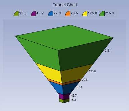
Funnel charts are a type of accumulation chart where the height of the funnel segment corresponds to a y-value of a point in a series. Funnel charts are often used to represent stages in a sales process and show the amount of potential revenue for each stage. Optionally, the y-value can also be made to represent the width of the segment instead of the height.

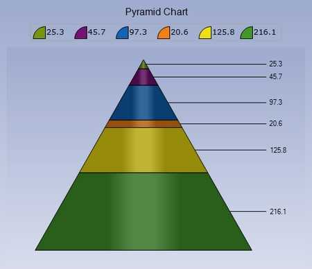
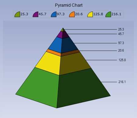
Pyramid charts are another type of accumulation chart with a triangular upper surface that converges at one point. Similar to a funnel chart, the height of a segment is proportional to the y-value of the corresponding point. Note that the base of the pyramid can be square or circular.
An area chart shades the area enclosed between the lines that join points on a series and the x-axis. Multiple series result in overlapped areas. This type of chart displays the trend of values over time or categories.

A range area chart is a variation of an area chart that lets you plot bands of data, such as Bollinger bands and weather patterns. Each point in the chart is specified by two y-values.
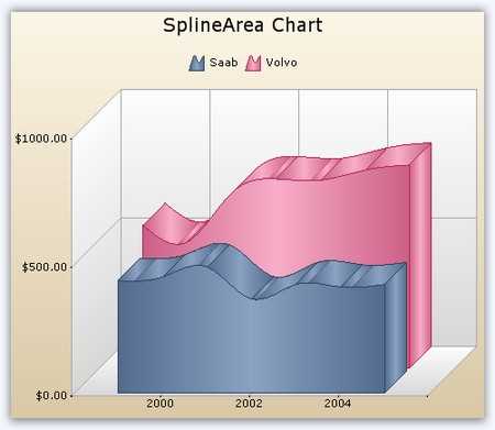
A spline area chart is an area chart with a smooth curve connecting its points.

Stacked area charts are area charts with y-values stacked over one another in series order. Chart data can be visualized as a sum of series parts while using this chart type.
The 100% stacked area chart displays multiple series of data as stacked areas, ensuring that the cumulative proportion of each stacked element always totals 100%. The y-axis will hence always be rendered with the range 0–100. This chart type is best suited for depicting the relative contribution of data points.


Step area charts are similar to regular area charts except that instead of a straight line tracing the shortest path between points, the values are connected by continuous vertical and horizontal lines forming a step-like progression.
A bar chart is the simplest and most versatile of all statistical diagrams. It compares values across categories and is ideal for highlighting the variations in an item value over time via horizontal bars. Points from adjacent series are drawn as bars next to each other.


Stacked bar charts are charts with y-values stacked over one another in the series order. Chart data can be visualized as the sum of series parts when using this kind of chart.
Stacked bar group charts allow users to group a series with another series using the group name in a stacked bar chart. This way the grouped series will be shown as a separate stacking.


The 100% stacked bar chart displays multiple series of data as stacked bars, ensuring that the cumulative proportion of each stacked element always totals 100%. Hence, the y-axis will always be rendered with the range 0–100. These types of charts are best suited for depicting the relative contribution of data points.
Frequently used in project management, a Gantt chart provides a graphical illustration of a schedule to help plan, coordinate, and track specific tasks in a project. Provides a graphical representation of the duration of tasks against the progression of time. Each task takes up one row.The expected time for each task is represented by a horizontal bar with left and right ends marking the beginning and completion date of a task. Another bar, usually rendered behind and wider than the first bar, is used to represent the progress information of the task. Tasks may run in a sequential, parallel, or overlapped fashion.

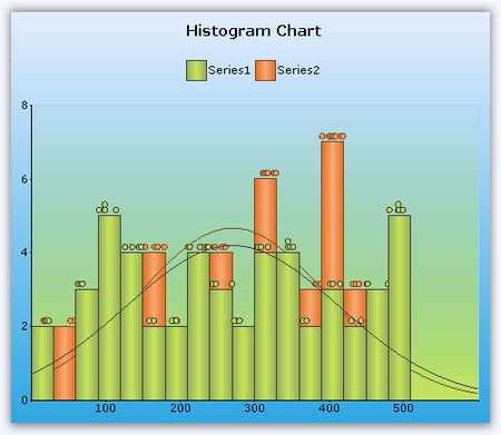
A histogram is a bar chart of a frequency distribution in which the widths of the bars are proportional to the classes into which the variables have been divided, and the heights of the bars are proportional to the class frequencies. The categories are usually specified as non-overlapping intervals of some variable. The categories must be adjacent. Additionally, the chart has the capability to draw a normal distribution curve.
A tornado chart is a bar chart that shows the variability of an output to several different inputs. Variability is displayed using relative lengths of bars across a range. A tornado chart is mainly used in sensitivity analysis. It shows how different random factors can influence a prognostic outcome.
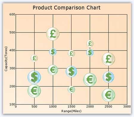
A bubble chart is an extension of the scatter chart, with each data point represented by a circular bubble and the area of the bubble rendered in proportion to the value of a third variable. A bubble chart is commonly used to represent financial data.
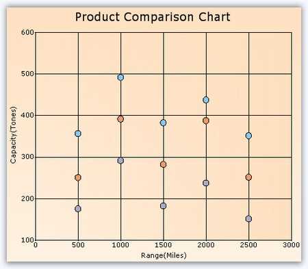
A simple plot of x- and y-values along the two axes can be created using scatter charts. The points are not joined together. The points can be highlighted using built-in shapes or custom images. Numerical data, both discrete and continuous, can be displayed. It is generally used to plot scientific data.
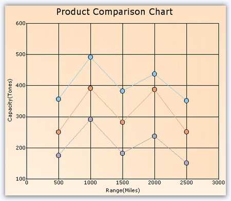
Connected scatter charts plot x- and y-values along the two axes where the points are connected using lines or splines. The points can be customized using shapes or images to make them easily identifiable.


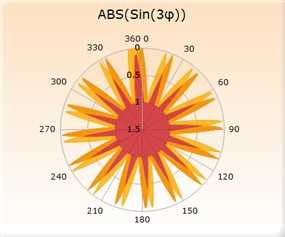
A polar chart is a circular graph in which data is displayed in terms of values and angles. It provides options to perform a visual comparison among several quantitative or qualitative aspects of a situation. Also, when charts are drawn for several situations using the same axes (poles), a visual comparison between the situations may be made.The x-value of the data point is used to set the angle. The y-value defines the distance from the center of the graph.
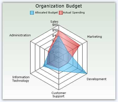
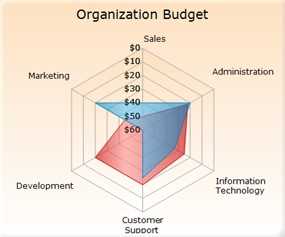
A radar chart is the clock face form of a line chart. It compares the aggregate values of a number of data series. Represents each data series as a line around a central point. Provides a graphical display of the differences between actual and ideal performance. Useful for defining performance and identifying strengths and weaknesses.
Essential Chart supports inversed radar and polar charts. This feature used to render the polar and radar charts in the clockwise direction.
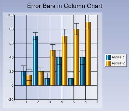
Column charts, where data points are displayed as vertical bars, are the most commonly used charts. They are similar to a bar chart except that the bars are vertical and not horizontal. These are used for comparing the frequency, count, total, or average of data in different categories. Ideal for showing the variations in the value of an item over time. Points from adjacent series are drawn as bars next to each other. They can be drawn in three modes: default width mode, fixed width mode, and relative width mode. Error bars are supported to indicate a degree of uncertainty in the plotted data through a bar showing an “error range.” There are plenty of symbol options available that can be rendered on error bars.


Data points from different series are rendered one over the other in a stacked column chart. They are very useful in indicating the cumulative effect of multiple series values.


Stacked column group charts allow users to group a series with another series using the group name in a stacked column chart. This way the grouped series will be shown as a separate stacking.
In a 100% stacked column chart, the cumulative proportion of each stacked element always totals 100%. This type of chart is great for visualizing the relative contribution of each series value in relation to the whole.


In a column range chart, there are two y-values to each data point, representing the high and low ranges as columns.
A combination chart uses two or more chart types to emphasize that a chart contains different kinds of information. Note the following: Only chart types that are compatible with each other may be combined in the same chart area. Combining different chart types on the same chart lets users display more complicated data.

The following charts are commonly used to visualize financial data such as stock prices.
A box-and-whisker chart represents data ranges as a combination of boxes and marks. A solid “box” is drawn whose top and bottom edges correspond to the quartiles of a data set, and the mark inside signifies the median value. Two “whiskers” are attached to the ends of a box to show the overall range of the data. Comparing several box-and-whisker chart series is useful for spotting distribution differences. It also supports specifying the values for whiskers as percentages. The ends of the whiskers are decided by the Series1.ConfigItems.BoxAndWhiskerItem.Percentile property.


The high and low values are represented by the wick of a candle in a candle chart. The candle represents the open and close values. The body of the candle is often colored conditionally based on whether the open value is lower than the close value.
As its name implies, high-low charts are used to visualize the high and low values of a stock during a day.


This chart indicates the high, low, open, and close values of a stock during a day. This helps visualize the range in which a stock traded during the day along with the open and close values.
A kagi chart consists of a series of vertical connected lines where the thickness and direction of those lines depends on price. Being independent of time, this chart is ideal for clearly visualizing price movements. Thick lines show that demand exceeds supply.As long as prices continue to move in the same direction, the vertical line keeps growing. If there is a reversal in price that exceeds a predetermined reversal amount, a new kagi line is drawn in a new column. When the line is orange, it indicates demand exceeds supply, and the market is in an up trend. When the line is blue, it indicates supply exceeds demand, and the market is trending down. The higher the bars go, the stronger the trend.


Point-and-figure charts are used to identify support levels, resistance levels, and chart patterns. The chart ignores the time factor and concentrates solely on movements in price. A column of X’s or O’s may take one day or several weeks to complete. By convention, the first X in a column is plotted one box above the last O in the previous column. The first O in a column is plotted one box below the highest X. The X’s represent an upward trend and the O’s represent a downward trend.
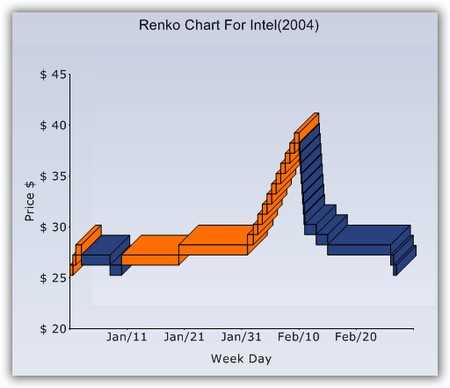
Renko charts are excellent for projecting support and resistance levels. Bricks are drawn equal in size for a known value. A brick is drawn in the direction of the prior move but only if prices move by a minimum amount. If prices change by a predetermined amount or more, a new brick is drawn. If prices change by less than a predetermined amount, the new price is ignored.

A three-line break chart is similar to a point-and-figure chart with the following additional features. It displays a series of vertical boxes (“lines”) that are based on changes in prices. It ignores time as a factor and depicts rising and falling lines of varying heights. Each new line occupies a new column. Using closing prices (or highs and lows) leads to drawing a new rising line if the previous high is exceeded, and a new falling line is drawn if the new closing price is less than the previous low.
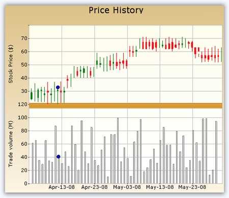
Stock and volume charts can be easily created using a line chart for the stock price (or a high-low-open-close chart as shown in the following image) and a column chart for the volume data. Essential Chart’s support for multiple axes makes it easy to create such charts. In the chart above, the moving average for the stock chart is calculated with a period of three days.
Line charts refer to charts whose data points are joined using straight or curved lines, 2D or 3D. They are ideal for representing time-dependent data, showing trends in data at equal intervals. Error bars, which are used to indicate a level of uncertainty in plotted data points, are also supported.


Spline charts are line charts with a smooth line connecting the data points.
Step line charts use horizontal and vertical lines to connect data points, resulting in a step-like progression.


A rotated spline chart is a spline chart rotated 90 degrees.
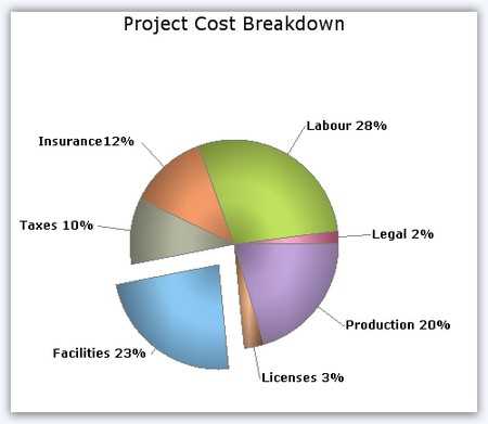
Pie charts are ideal for displaying proportional values, which are either in percentage or fractional format. They plot y-values in one series as fractional parts of a circle. The data-point value determines the portion of the pie that is taken up by the point. A pie chart displays only one data series at a time and can be used to display only nominal (categorical, qualitative) data. Each data series in a chart has a unique color or pattern and is represented in the chart legend, proportional to the sum of the items. It supports bevel, round, inside, outside, and custom chart types.
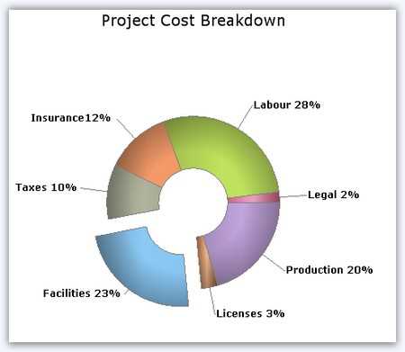
Doughnut charts are pie charts with a hole in the middle. The size of data in a doughnut chart corresponds to the doughnut coefficient, which determines the relationship between the inner and outer radii of the chart. The doughnut chart is best suited for presenting data in proportions.
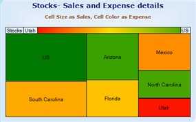
A heat map chart is a graphical representation of data where the values taken by a variable in a two-dimensional map are represented as colors.
 You are using an outdated version of Internet Explorer that may not display all features of this and other websites. Upgrade to Internet Explorer 8 or newer for a better experience.