We use cookies to give you the best experience on our website. If you continue to browse, then you agree to our privacy policy and cookie policy.


The JSP DataGrid is a high-performance and feature-rich control. It is used to display data from JSON or web services in a tabular format and have more features with an attractive UI. The DataGrid control’s rich feature set includes many functionalities: data binding with adaptors, editing, filtering, grouping, paging, freezing rows and columns, aggregating rows, and exporting to Excel, Word, and PDF formats.
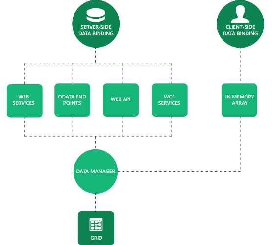
Data binding in grid is a powerful feature that is used to bind local JSON data and remote data, i.e. all RESTful services including OData web services. Further, it supports Essential JavaScript’s data manager binding which has a complete customization option for data processing.
Virtual scrolling makes grid more compatible for scenarios where huge data needs to be bound without paging layout. It uses on-demand loading for adding rows at the event of scrolling, thus improving the grid’s initial loading time by requesting only visible row data.
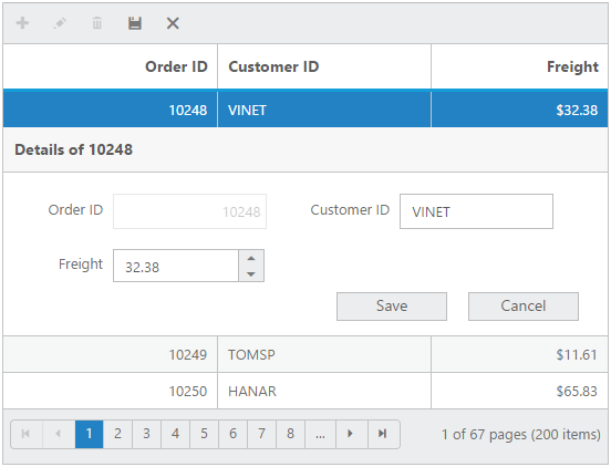
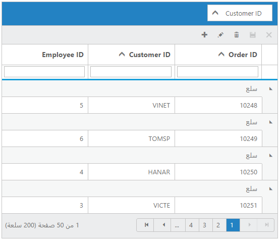
Grid provides full support for CRUD operations. Editing can be enabled and customized with simple property settings. There are several editing options available including different cell edit types and edit modes. Editing can be saved to database as a batch operation using Excel-like editing and as individual operations using dialog, inline, and external form editing options.
Aggregates for column values can be easily visualized using the summary feature of grid. The aggregates can be customized to display the value in Individual summary rows, individual group summary rows or in Group Caption row. Different aggregates supported are sum, average, min, max, count and custom.

All grid features are optimized for touch screen. This includes swipes for paging and scrolling, and tabs for selection, sorting, and filtering.

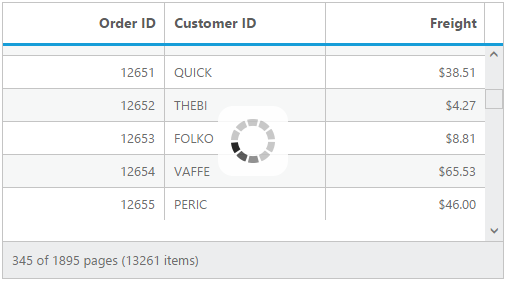
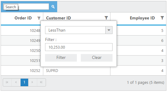
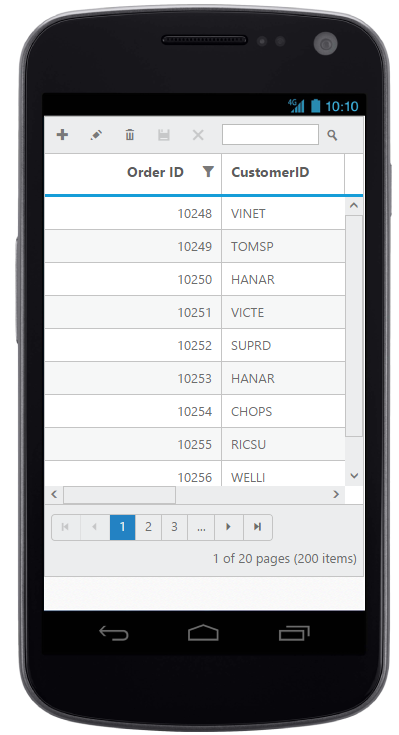
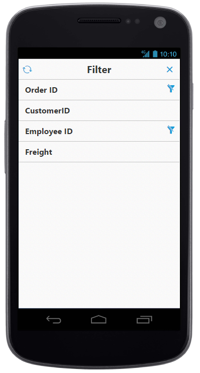
Data compaction can be done in grid using paging, filtering, and searching. For dynamic filtering of data, grid supports two different filter types: filter menus and filter bar. For paging, grid uses Essential JavaScript’s pager control for better layout and visualization, and this can be fully customized. For search, grid can be set to use an external search box or go through default toolbars.
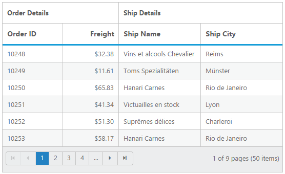
Grid columns can be set to freeze, resize, reorder, and show or hide at run time and initial load. These features are useful when visualizing the data that have large number of columns.


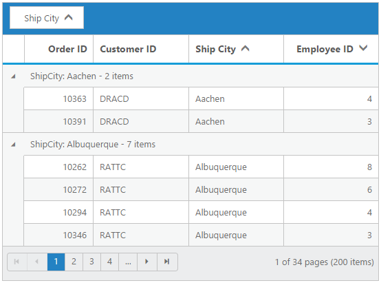
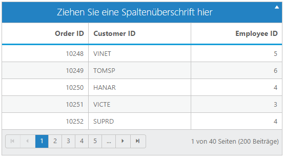
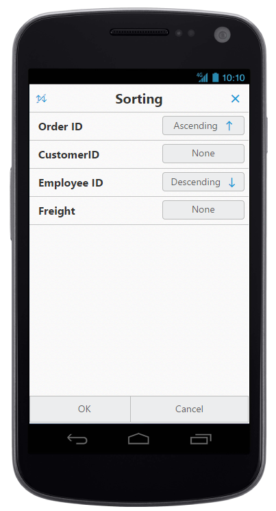
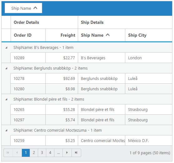
Grid supports grouping and sorting to help users visualize the data in an organized way. The data can be sorted or grouped in ascending or descending order. Also, grid provides support for multicolumn sorting and grouping. Sorting can be performed with simple header clicks and for multicolumn sorting, Ctrl + Click can be used. For grouping, an interactive drop area is available where columns can be dragged and dropped.
All grid control strings in the user interface can be localized as needed. The grid control also supports languages with right-to-left direction.
Templates can be used to create custom user experience in grid. Grid provides various template options, including header, column, row, details row, dialog edit, inline edit, and external edit.

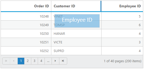
Selection enables users to select the rows displayed in grid. And based on the selection events, we can perform any desired actions. Two types of selection are available in grid: single and multiple. Single selection is used to select a row and multiple selection is used to select multiple rows.

Grid can be printed very easily by using the print grid feature. The print grid icon is available in the grid toolbar, by simply clicking the print icon to print the grid.

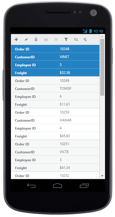
The adaptive feature allows the grid to adapt to the screen size. There is a normal view and a details view to give your users the best look and feel for your application. The filtering also changes in mobile view.The grid has a larger, more finger-friendly interface to define filter parameters.

Stacked header allows you to display header type information above the grid columns. There is no limit to the number of stacked headers. The data columns can still be grouped, sorted, and filtered.
Greatness—it’s one thing to say you have it, but it means more when others recognize it. Syncfusion is proud to hold the following industry awards.

