We use cookies to give you the best experience on our website. If you continue to browse, then you agree to our privacy policy and cookie policy. Image for the cookie policy date
Unfortunately, activation email could not send to your email. Please try again.
Syncfusion Feedback


Basic Charts

Line Chart

Line Chart

Visualize time-dependent data to show trends at equal intervals.

Column Chart

Column Chart

Compare values across categories by using vertical bars.

Area Chart

Area Chart

Like line charts, but the area below the line is filled.

Bar Chart

Bar Chart

Compare values across categories by using horizontal bars.


Spline charts

Spline Chart

Spline Chart

Connects the data points with a smooth line.

Spline Area Chart

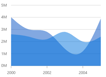
Spline Area Chart

Like the area chart, but with the data points connected with a smooth line.


Step charts

StepLine Chart

Step line Chart

Data points are connected through vertical and horizontal lines to show step-like progress.
Step Area Chart

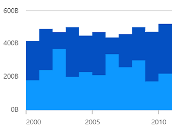
Step area Chart

Like the step line chart, but with the areas connected with lines shaded.

Stacked charts

Stacked line

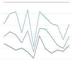
Stacked line

Like the line chart, but with the data points stacked on top of each other.

Stacked Bar

Stacked Bar

Plots data points on top of each other using horizontal bars.

Stacked Column

Stacked Column

Plots data points on top of each other using vertical bars.

Stacked Area

Stacked Area

Like the area chart, but with the data points stacked on top of each other.

percent Stacked line

100% Stacked line

Shows the relative percentage of multiple data series in stacked lines. The cumulative proportion of each stacked line always totals 100%.
percent Stacked Area

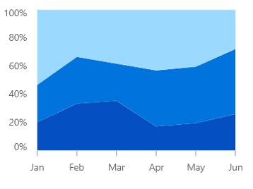
100% Stacked Area

Shows the relative percentage of multiple data series in stacked columns. The cumulative proportion of each stacked column always totals 100%.

percent Stacked Bar

100% Stacked Bar

Shows the relative percentage of multiple data series in stacked bars. The cumulative proportion of each stacked bar always totals 100%.
percent Stacked Bar

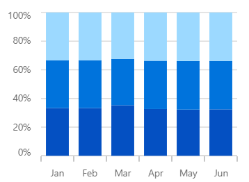
100% Stacked Column

Shows the relative percentage of multiple data series in stacked columns. The cumulative proportion of each stacked column always totals 100%.


Range charts

RangeArea Chart

Range area Chart

Shows variations in the data values for a given time. The area between the high and low range is filled.

Spline Range Area Chart

Spline range area Chart

Similar to the range area chart, except that the data points are connected by a smooth line.
RangeColumn Chart

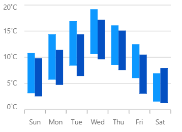
Range column Chart

Like the column chart, but shows the variations in the data values for a given time using vertical bars.
RangeStepArea Chart

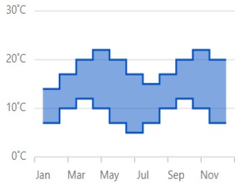
Range step area Chart

Similar to the range area chart, except that the data points are connected by a step line.


Correlation charts

Scatter

Scatter

Scatter plot or scatter chart plots data with two numeric parameters.

Bubble

Bubble

Visualize data with three numeric parameters. The bubble size depends on third parameter.
Combination Chart

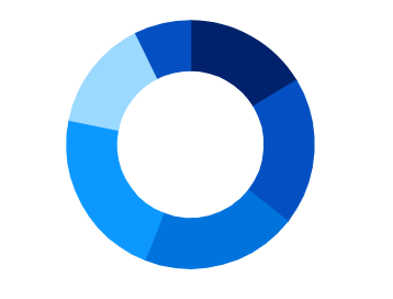
Combination Chart / Mixed chart

Combines two or more chart types in a single chart.


Circular charts

Pie Chart

Pie Chart

Displays proportions and percentages between different categories.

Donut Chart

Donut Chart

Similar to pie chart for data analysis, but with an open space at the center.

Triangular charts

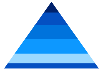
Pyramid Chart

Pyramid Chart

Represent hierarchies visually in a pyramid-like structure that shows proportions of the total.

Funnel Chart

Funnel Chart

Plots streamlined data to show various stages in a process.


Polar & Radar Charts

Polar Chart

Polar Chart

Visually compare several quantitative or qualitative aspects of a situation.

Radar Chart

Radar Chart

Visually compare several quantitative or qualitative aspects of a situation.


Financial Charts

Candle Chart

Candle Chart

Used in the stock market to represent the high, low, open, close values of a stock.

OHLC Chart

OHLC Chart

Used in the stock market to represent the high, low, open, close values of a stock.

HighLow Chart

HighLow Chart

Shows the high and low values of the stock over the given period of time.


Other Charts

Box and Whisker Chart

Box and Whisker Chart

Visualize a group of numerical data through its quartiles.

Histogram Chart

Histogram Chart

Plot the frequency of occurrences in a continuous data set.

Pareto Chart

Pareto Chart

Indicates the frequency of defects, as well as their cumulative impact.


85+ JAVASCRIPT UI CONTROLS

Scroll up icon

Warning Icon You are using an outdated version of Internet Explorer that may not display all features of this and other websites. Upgrade to Internet Explorer 8 or newer for a better experience.Close Icon

Live Chat Icon For mobile
Live Chat Icon