We use cookies to give you the best experience on our website. If you continue to browse, then you agree to our privacy policy and cookie policy.

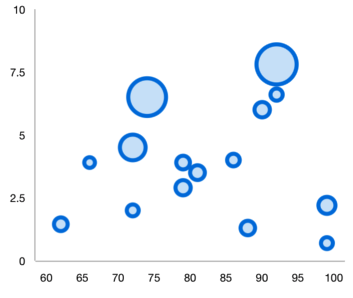
The Flutter Bubble chart visualizes data in 3 dimensions similar to scatter chart. The position and radius of a circle is determined based on X and Y and size values, respectively. You can create beautiful, animated, real-time and high-performance scatter chart that also supports the interactive features such as zooming and panning, trackball, crosshair, tooltip and selection.


Control the minimum and maximum radius of the overall bubble series.

Apply gradient colors to visualize data in different colors, improving the readability and appearance of the Flutter Bubble Chart.
Customize the color and border of the Flutter Bubble Chart using the built-in APIs to make it visually unique.
Easily get started with the Flutter Bubble Chart using a few simple lines of DART code example as demonstrated below,
import 'package:flutter/material.dart';
import 'package:syncfusion_flutter_charts/charts.dart';

void main() {
  return runApp(_ChartApp());
}

class _ChartApp extends StatelessWidget {
  @override
  Widget build(BuildContext context) {
    return MaterialApp(
      theme: ThemeData(primarySwatch: Colors.blue),
      home: _MyHomePage(),
    );
  }
}

class _MyHomePage extends StatefulWidget {
  // ignore: prefer_const_constructors_in_immutables
  _MyHomePage({Key? key}) : super(key: key);

  @override
  _MyHomePageState createState() => _MyHomePageState();
}

class _MyHomePageState extends State<_MyHomePage> {
  late List<_ChartData> data;
  late TooltipBehavior _tooltip;

  @override
  void initState() {
    data = [
      _ChartData('CHN', 12),
      _ChartData('GER', 15),
      _ChartData('RUS', 30),
      _ChartData('BRZ', 6.4),
      _ChartData('IND', 14)
    ];
    _tooltip = TooltipBehavior(enable: true);
    super.initState();
  }

  @override
  Widget build(BuildContext context) {
    return Scaffold(
        appBar: AppBar(
          title: const Text('Syncfusion Flutter chart'),
        ),
        body: SfCartesianChart(
            primaryXAxis: CategoryAxis(),
            primaryYAxis: NumericAxis(minimum: 0, maximum: 40, interval: 10),
            tooltipBehavior: _tooltip,
            series: <CartesianSeries<_ChartData, String>>[
              BubbleSeries<_ChartData, String>(
                  dataSource: data,
                  xValueMapper: (_ChartData data, _) => data.x,
                  yValueMapper: (_ChartData data, _) => data.y,
                  name: 'Gold',
                  color: Color.fromRGBO(8, 142, 255, 1))
            ]));
  }
}

class _ChartData {
  _ChartData(this.x, this.y);

  final String x;
  final double y;
}
 You are using an outdated version of Internet Explorer that may not display all features of this and other websites. Upgrade to Internet Explorer 8 or newer for a better experience.