Welcome to the Angular feedback portal. We’re happy you’re here! If you have feedback on how to improve the Angular, we’d love to hear it!
Thanks for joining our community and helping improve Syncfusion products!
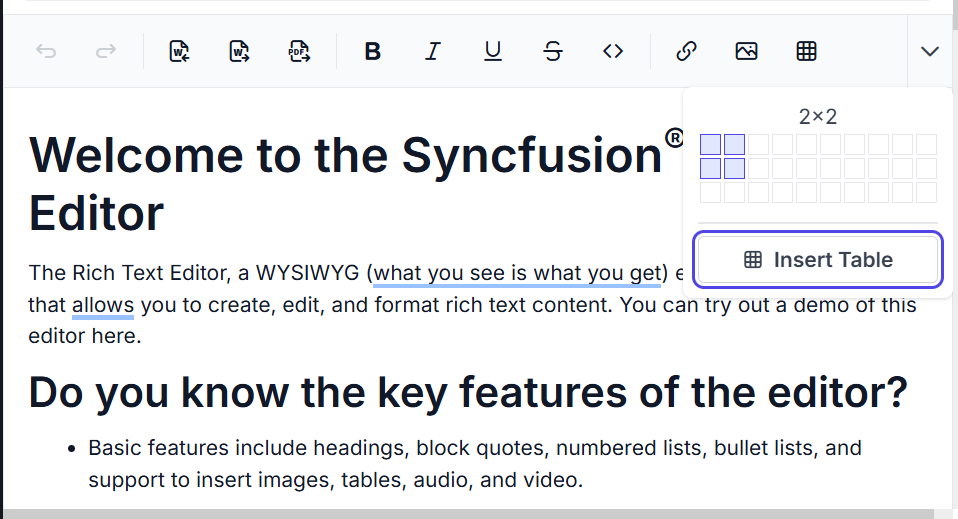
Description:
Currently, in the table row and column selection popup, the borders of unselected rows and columns lack sufficient contrast. The border color (#BDBDBD) against the background color (#FFFFFF) yields a contrast ratio of 1.9:1, which falls below accessibility standards. This low contrast may hinder users with low vision from effectively perceiving and interacting with the interface. To improve accessibility, the border color contrast should be enhanced to ensure better visibility against the surrounding background.
 Bold BI
 Bold Reports
 BoldDesk