Welcome to the Blazor feedback portal. We’re happy you’re here! If you have feedback on how to improve the Blazor, we’d love to hear it!
Thanks for joining our community and helping improve Syncfusion products!
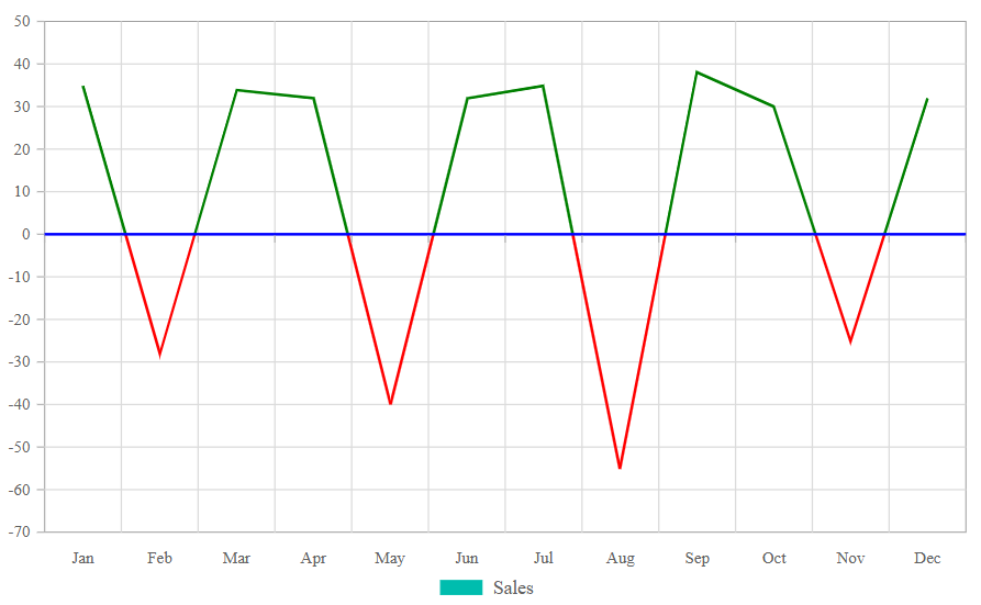
Currently, Blazor Pivot Chart does not support multi-colored line charts. To enhance data visualization, we need to provide support for dynamically changing line colors based on positive and negative values. This enhancement will improve trend analysis in financial and analytical reports by displaying positive values in one color (e.g., green) and negative values in another (e.g., red).
Refer to the screenshot below for reference.
 Bold BI
 Bold Reports
 BoldDesk