Welcome to the Blazor feedback portal. We’re happy you’re here! If you have feedback on how to improve the Blazor, we’d love to hear it!
Thanks for joining our community and helping improve Syncfusion products!
When dragging a record and attempting to drop it either below a parent or at the top position of the first child, the border suggestion appears the same in both cases. However, the functionality differs:
Despite these functional differences, the drop border suggestion looks identical, which can be confusing for users.
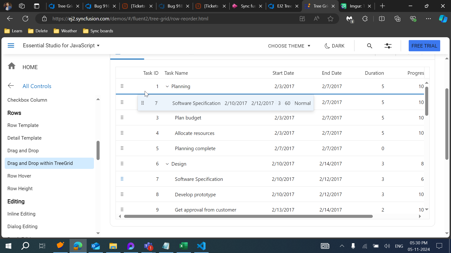
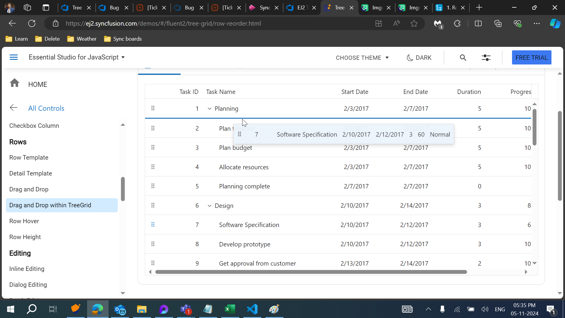
Current Output UI:
Currently if we drag over a below position of one parent row and above position of next child row, the drop indicator (blue border line) is same for both position. So user cannot differentiate whether its going to below position of first parent row and above position of next row
Below Position of Task ID 1:
Above position of Task ID 2:
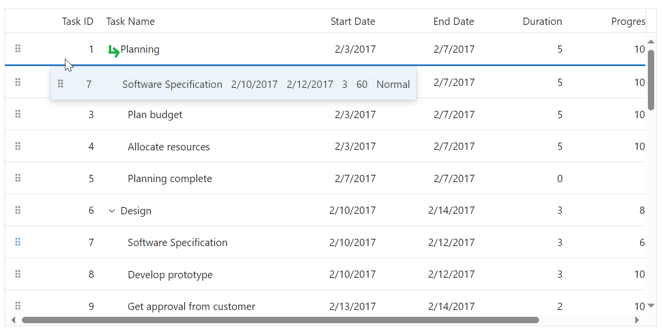
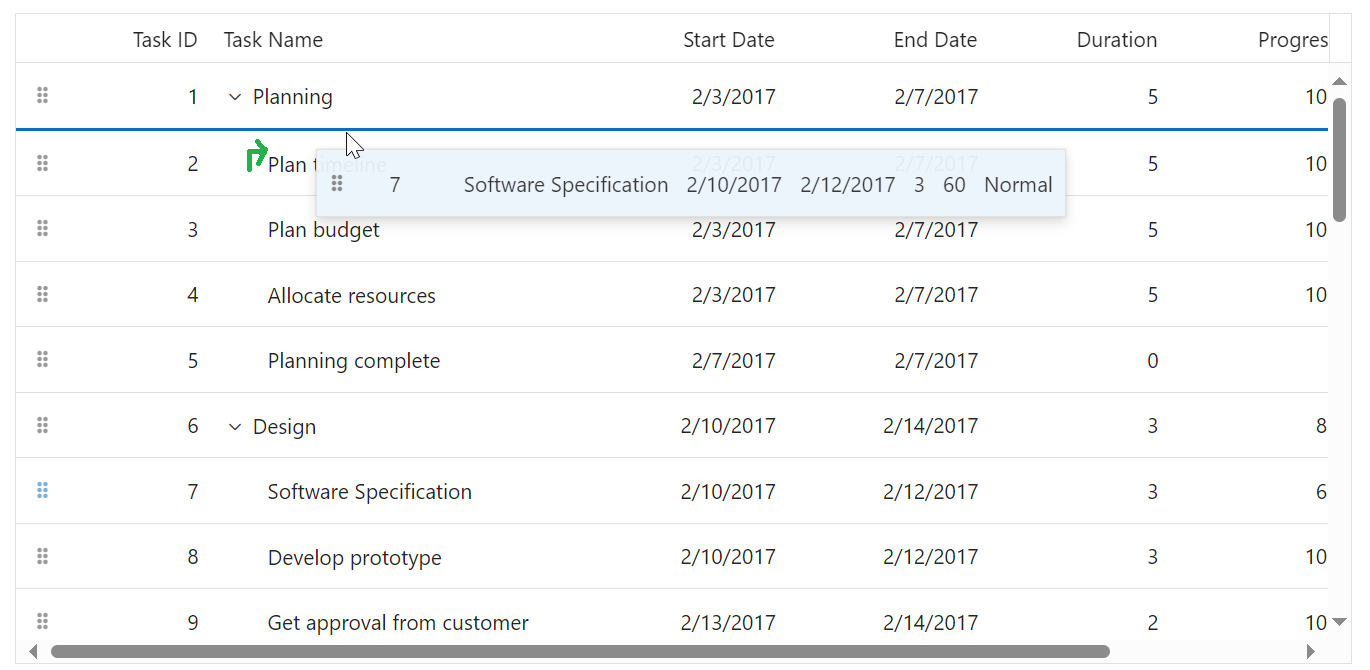
Expected output UI:
We plan to enhance the UI for drag-and-drop action by incorporating dynamic arrow icons (below arrow, above arrow, and right arrow for child drop) in tree cells to indicate hierarchy clearly while dragging a record over a row.

