Welcome to the Flutter feedback portal. We’re happy you’re here! If you have feedback on how to improve the Flutter, we’d love to hear it!
Thanks for joining our community and helping improve Syncfusion products!
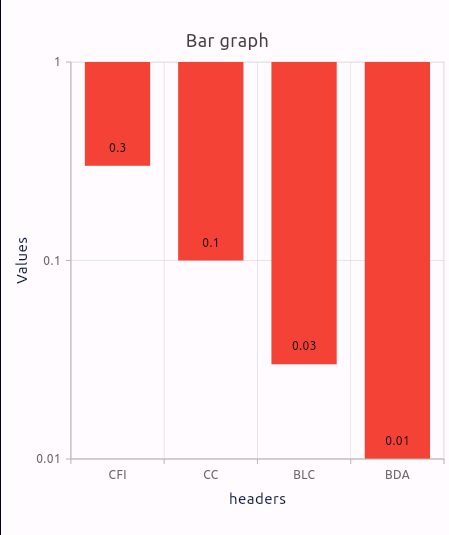
I am encountering an issue with inverted bars in my Syncfusion Flutter chart. When using a logarithmic y-axis and data values all less than 1, the bars appear to grow downwards instead of upwards. This is visually misleading and doesn't accurately represent my data.
Here's my code snippet:
class Values {
final String x;
final double y;
Values(this.x, this.y);
}
List<Values> getChartData() {
return [
Values('CFI', 0.3),
Values('CC', 0.1),
Values('BLC', 0.03),
Values('BDA', 0.01),
];
}
SfCartesianChart(
title: ChartTitle(text: "Bar Graph"),
primaryXAxis: const CategoryAxis(
title: AxisTitle(
text: 'Headers',
textStyle: TextStyle(color: Color.fromARGB(255, 4, 20, 63)),
),
),
primaryYAxis: const LogarithmicAxis(
title: AxisTitle(
text: 'Values',
textStyle: TextStyle(color: Color.fromARGB(255, 4, 20, 63)),
),
),
series: <CartesianSeries>[
ColumnSeries<Values, String>(
dataSource: getChartData(),
xValueMapper: (Values course, _) => course.x,
yValueMapper: (Values course, _) => course.y,
dataLabelSettings: DataLabelSettings(isVisible: true),
color: Color.fromARGB(255, 4, 20, 63),
pointColorMapper: (Values data, _) => data.y < 20 ? Colors.red : Color.fromARGB(255, 4, 20, 63),
),
],
)
This is the output from the code :
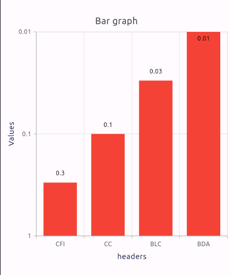
Initially, I tried setting the isInverted property of the logarithmic
axis in my Syncfusion Flutter chart to invert the bars. This
successfully flipped the bars, but it also inverted the y-axis itself.
Now, the y-axis displays values from highest to lowest, which isn't the
desired behavior.
When isInverted =true :
I noticed that values below 1 on the y-axis were plotted in an inverted
way. To fix this, I tried setting the minimum value of the logarithmic
axis to the lowest data point in my chart. However, this didn't resolve
the inverted bar issue.
 Bold BI
 Bold Reports
 BoldDesk