Welcome to the React feedback portal. We’re happy you’re here! If you have feedback on how to improve the React, we’d love to hear it!
Thanks for joining our community and helping improve Syncfusion products!
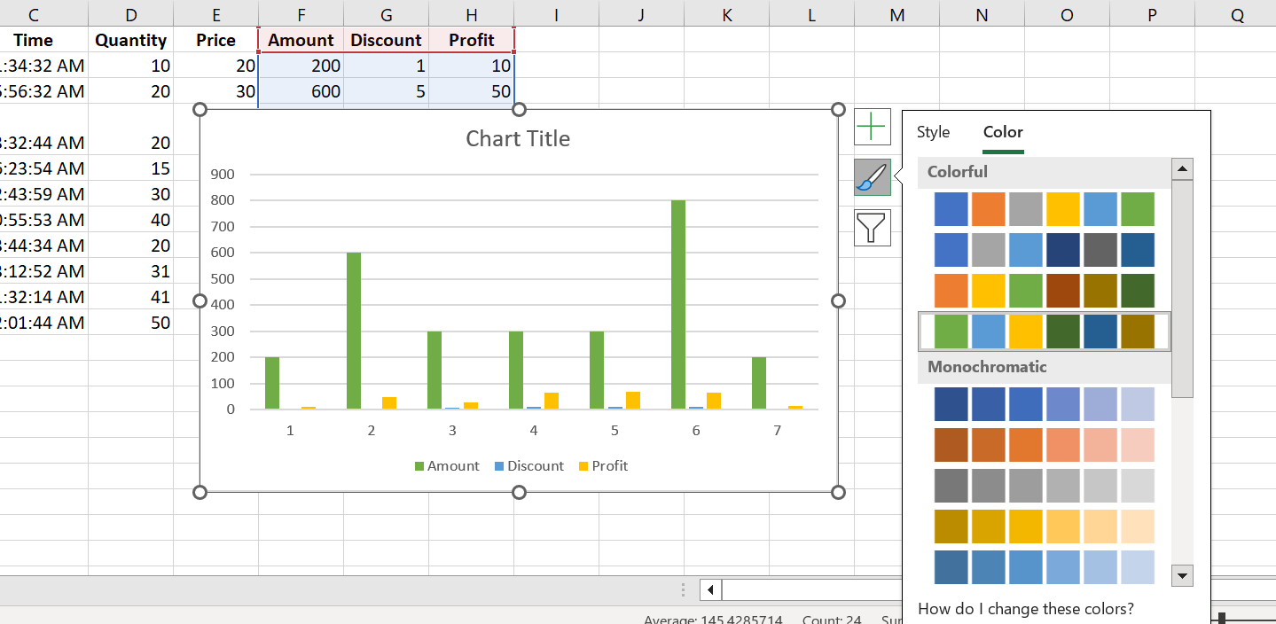
Need to provide formatting options for charts inserted in spreadsheet as like in MS Excel. Attached screenshots for reference.
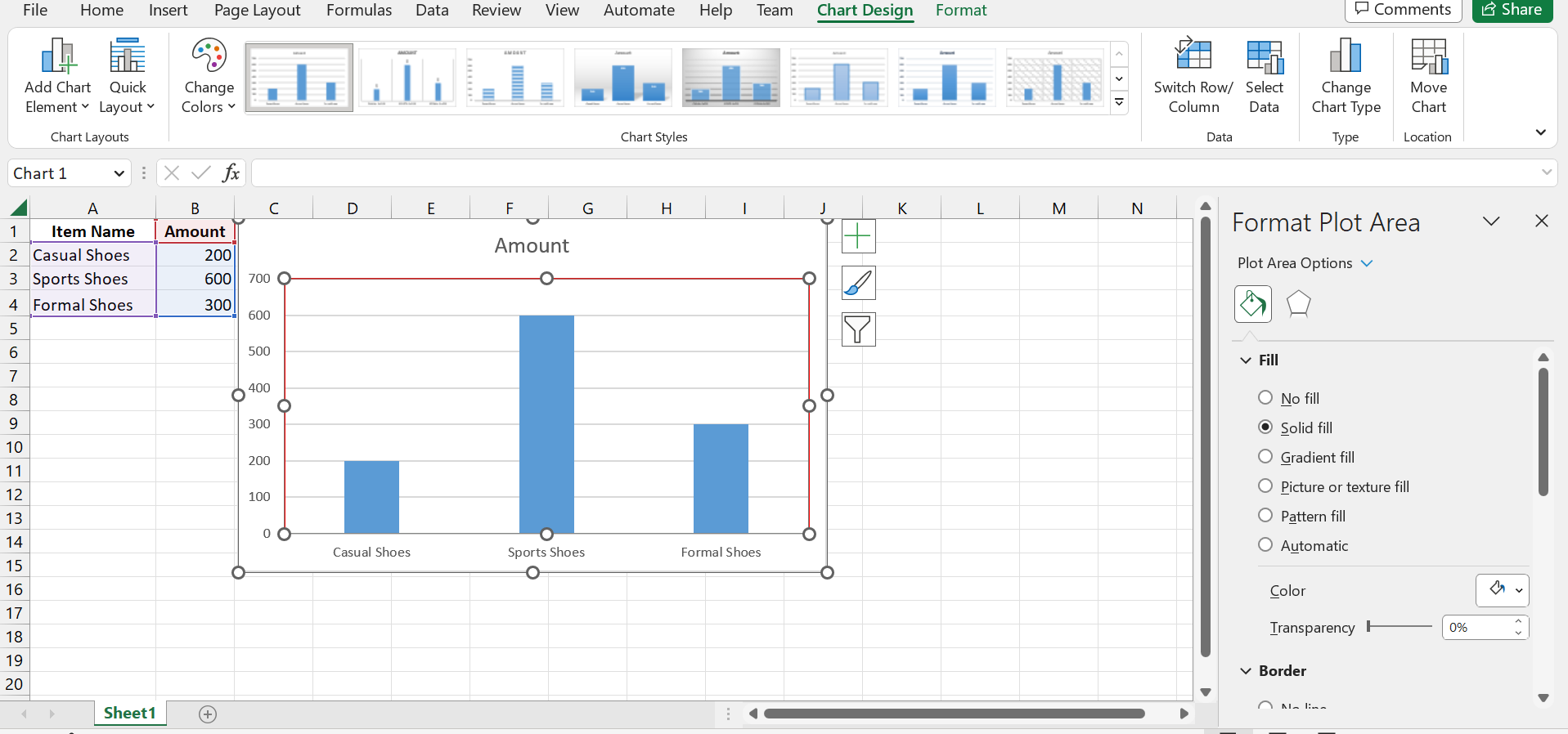
In MS Excel the user can be able to change the color, outline, type, design, layout, styles, etc... to the inserted chart. Same as have to provide support to spreadsheet control.
 Bold BI
 Bold Reports
 BoldDesk