Welcome to the Blazor feedback portal. We’re happy you’re here! If you have feedback on how to improve the Blazor, we’d love to hear it!
Thanks for joining our community and helping improve Syncfusion products!
Hi Syncfusion Team,
Issue #1:
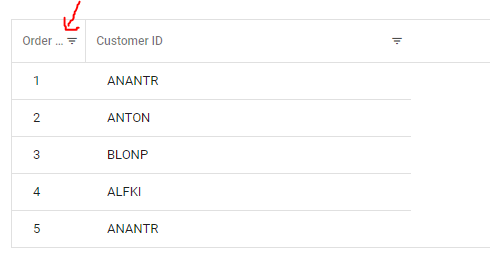
I have attached a sample project that I'll be referencing with screenshots to explain the issues I am having. I have a grid that has inline filtering on it, when a column is thinner the ellipsis occurs but there is a lot of extra white space between the ellipsis and inline filter icon as you can see here:

I reduced that padding to what I wanted by doing the following styles:
::deep .e-grid .e-gridheader .e-stackedheadercelldiv {
padding: 0 0.4em 0 .6em;
}
::deep .e-grid .e-detailheadercell,
::deep .e-grid .e-headercell,
::deep .e-grid .e-gridheader tr th:first-child,
::deep .e-grid .e-gridheader tr th:last-child {
padding: 0 10px 0;
}
::deep .e-grid .e-gridheader .e-sortfilter .e-fltr-icon .e-headercelldiv {
margin: -7px 7px -7px -7px;
}
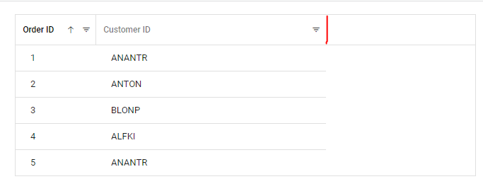
which gave me something like this which is what I wanted spacing wise between the ellipsis and inline filter:
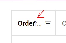
However the problem I am having is that when the grid has sorting enabled and the user goes to sort the ellipsis & word is overlapping the sorting arrow as you can see here:
I believe it should be dynamically accounting for the space this sorting arrow takes up when it appears instead of requiring a huge amount of extra white space in the header.
You can repro this through the same attached project, you'll notice that when the last column is resized that there is no right hand border where I would expect it to be...leading to a weird visual that makes things look broken. Where the red is..is where I would expect a border in the header.
but you can see here instead its blank:
 Bold BI
 Bold Reports
 BoldDesk