Welcome to the JavaScript feedback portal. We’re happy you’re here! If you have feedback on how to improve the JavaScript, we’d love to hear it!
Thanks for joining our community and helping improve Syncfusion products!
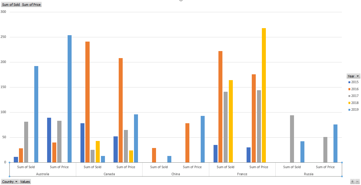
In the pivot table, we can render pivot chart based on the pivot report bound to it. But series with same members are plotted with different color when multiple axis enabled in Pivot Chart. So, we need to show series with same color based on series name. Refer the following screenshot.
 Bold BI
 Bold Reports
 BoldDesk