Welcome to the Blazor feedback portal. We’re happy you’re here! If you have feedback on how to improve the Blazor, we’d love to hear it!
Thanks for joining our community and helping improve Syncfusion products!
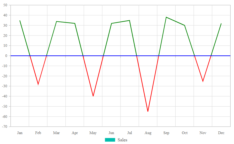
Feature Overview:
Enhance the Blazor Pivot Chart by adding support for the Multi-Colored Line chart type, which is already available in the Syncfusion Chart component. This feature will allow dynamic color changes in line charts based on data trends.
Current Behavior:
The Pivot Chart currently supports 19 types of charts but does not include the Multi-Colored Line chart.
Proposed Enhancement:
Introduce Multi-Colored Line Chart support in the Blazor Pivot Chart.
Dynamically change line colors based on positive and negative values to improve trend analysis in financial and analytical reports.
Positive values: Display in green (or any chosen color).
Negative values: Display in red (or any chosen color).
Benefits:
✅ Enhanced Data Visualization – Helps users easily differentiate between positive and negative trends.
✅ Better Trend Analysis – Useful for financial and analytical reports where color-coded trends improve readability.
✅ Consistency Across Components – Aligns Pivot Chart features with the existing Chart component.
Reference:
🔗 Online Demo of Multi-Colored Line Chart in Chart Component:
📌 A reference screenshot is attached for better clarity.
 Bold BI
 Bold Reports
 BoldDesk