Welcome to the Flutter feedback portal. We’re happy you’re here! If you have feedback on how to improve the Flutter, we’d love to hear it!
Thanks for joining our community and helping improve Syncfusion products!
Apologies for the long title, I'm not sure if there's an official name for this style of chart, or if that description is the most succinct way to describe this chart.
I would like to know if it's possible to achieve this with the current charts, or if it'd require a new chart type to be developed. Here are some image examples:
https://i.pinimg.com/564x/67/ee/f5/67eef54c84010e31c9ac7abbefde8cf8.jpg
How this is typically used is there is a smooth line, that is typically a rolling average of some kind, then the actual raw points that were used to calculate the average are plotted, and lines connect the smooth line to those points, either up or down.
Thanks!
-- Edit ---
Perhaps what I'm looking for is a new way to render a cartesian trendline chart?
 Bold BI
 Bold Reports
 BoldDesk
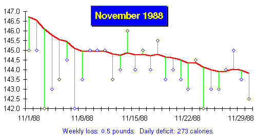