Welcome to the Angular feedback portal. We’re happy you’re here! If you have feedback on how to improve the Angular, we’d love to hear it!
Thanks for joining our community and helping improve Syncfusion products!
If most of the data in chart is in a smaller range and then there's one value that is extremely high, this results in the chart creating the axis with a higher interval. So most of the values in the chart are hardly visible.
Slackbitz: https://stackblitz.com/edit/angular-fyevxl?file=app.component.ts
Is there a way to change the interval based on the range of values, which looks something like: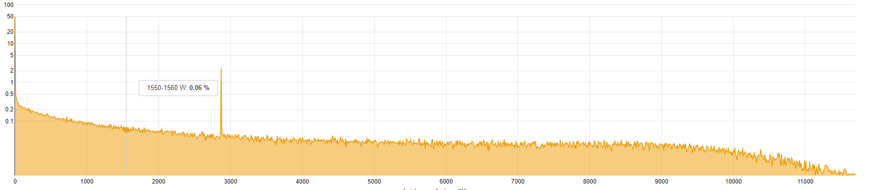
 Bold BI
 Bold Reports
 BoldDesk