---
title: "WPF Range Slider: A Complete Walkthrough"
published_at: "2020-11-16T10:00:50+00:00"
modified_at: "2026-02-10T09:53:49+00:00"
url: "https://www.syncfusion.com/blogs/post/wpf-range-slider-a-complete-walkthrough"
excerpt: "The WPF Range Slider is a lightweight but highly interactive UI component. It allows users to select a range of values or a single value. With the Essential Studio® 2020 Volume 3 release, you can now customize each element in..."
taxonomy_category:
- "Desktop"
- "Syncfusion"
- "UI"
- "WPF"
taxonomy_post_tag:
- "desktop"
- "Range Slider"
- "What's New"
- "WPF"
---
# WPF Range Slider: A Complete Walkthrough
[Paul Anderson](https://www.syncfusion.com/blogs/author/paulanderson)
The [WPF Range Slider](https://help.syncfusion.com/wpf/range-slider/overview)
is a lightweight but highly interactive UI component. It allows users to select a range of values or a single value.
With the [Essential Studio® 2020 Volume 3 release](https://www.syncfusion.com/forums/158306/essential-studio-2020-volume-3-release-v18-3-0-35-is-available-for-download)
, you can now customize each element in the control, and also display major and minor ticks in it.
The following key features are available in the WPF Range Slider component:
- [Ticks](#ticks)
- [Range Selection](#range-selection)
- [Labels](#labels)
- [Tooltips](#tooltips)
- [Customization](#customization)
Let’s now have a quick look at them!
## Ticks
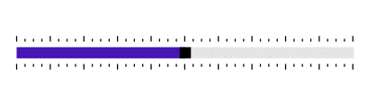
This feature allows you to set values for the major and minor ticks that can be positioned at the top, bottom, inside, or outside of the track bar based on the [TickPlacement](https://help.syncfusion.com/wpf/range-slider/ticks#tick-placement)
property. Major ticks can be used to show major intervals and minor ticks can be used to show the in-between intervals.
Refer to the following code example.
```
```
Ticks in Range Slider
## Range selection
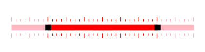
As one would expect, the Range Slider can be used as a slider to pick a value or to select a range between the minimum and maximum values defined. The colors in the control can be easily customized to differentiate the selected and not-selected parts of the slider.
Refer to the following code example.
```
```
Range Selection in Range Slider
## Labels
This feature allows you to easily customize [labels](https://help.syncfusion.com/wpf/range-slider/label-support)
that denote the values of the intervals.
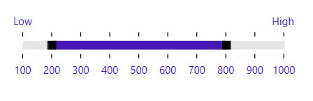
By default, labels are shown with the numeric values for the intervals.
You can customize the label format, render specific intervals, and add prefixes and suffixes to labels. You can also visualize values as text, such as low, medium, and high.
Refer to the following code example.
```
```
Labels in Range Slider
## Tooltips
The [tooltip](https://help.syncfusion.com/wpf/range-slider/thumb-tooltip)
feature allows you to clearly indicate the current value of the Range Slider while the user interacts with it. Tooltips are shown for both thumbs in the range selection mode. The color, and formats of the tooltip text can be customized.
Refer to the following code example.
```
```
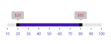
Tooltips in Range Slider
## Customization
Each element in the Range Slider can be customized using the associated properties, and custom styles can also be applied to them. In the following image, we have customized the track bar, tooltips, thumb shapes, ticks, and labels.
### Active track style
```
```
### Inactive track style
```
```
### Thumb style
```
```
### Tooltip style
```
```
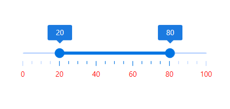
Custom Styled Range Slider
## Conclusion
In this blog, we showcased the key features in our [WPF Range Slider](https://www.syncfusion.com/wpf-ui-controls/range-slider)
control. The new customization and major and minor ticks features are available in our [Essential Studio® 2020 Volume 3 release](https://www.syncfusion.com/forums/158306/essential-studio-2020-volume-3-release-v18-3-0-35-is-available-for-download)
. Refer to our [documentation](https://help.syncfusion.com/wpf/range-slider/getting-started)
for more details about the control.
If you are not yet a Syncfusion customer, you can try our 30-day [free trial](https://www.syncfusion.com/downloads)
to check out the available features.
If you wish to send us feedback or would like to submit any questions, please feel free to post them in the comments section of this blog post. You can also contact us through our [support forums](https://www.syncfusion.com/forums)
, [feedback portal](https://www.syncfusion.com/feedback)
, or [Direct-Trac support system](https://www.syncfusion.com/support/directtrac/incidents)
. We are always happy to assist you!