---
title: "Visualize Global Temperature Anomalies with a Dynamic WPF HeatMap Chart"
published_at: "2025-04-30T13:55:17+00:00"
modified_at: "2025-06-09T12:13:30+00:00"
url: "https://www.syncfusion.com/blogs/post/wpf-heatmap-visualize-temp-anomalies"
excerpt: "Learn how to build a WPF HeatMap Chart to visualize climate trends through interactive data visualization."
taxonomy_category:
- "Chart"
- "Chart of the week"
- "Data Visualization"
- "HeatMap Chart"
- "WPF"
taxonomy_post_tag:
- "Charts"
- "Data Visualization"
- "HeatMap Chart"
- "Web Development"
- "WPF"
---
[Chart of the week](https://www.syncfusion.com/blogs/category/chart-of-the-week)
# Visualize Global Temperature Anomalies with a Dynamic WPF HeatMap Chart
[Sowndharya Selladurai](https://www.syncfusion.com/blogs/author/sowndharya-selladurai)
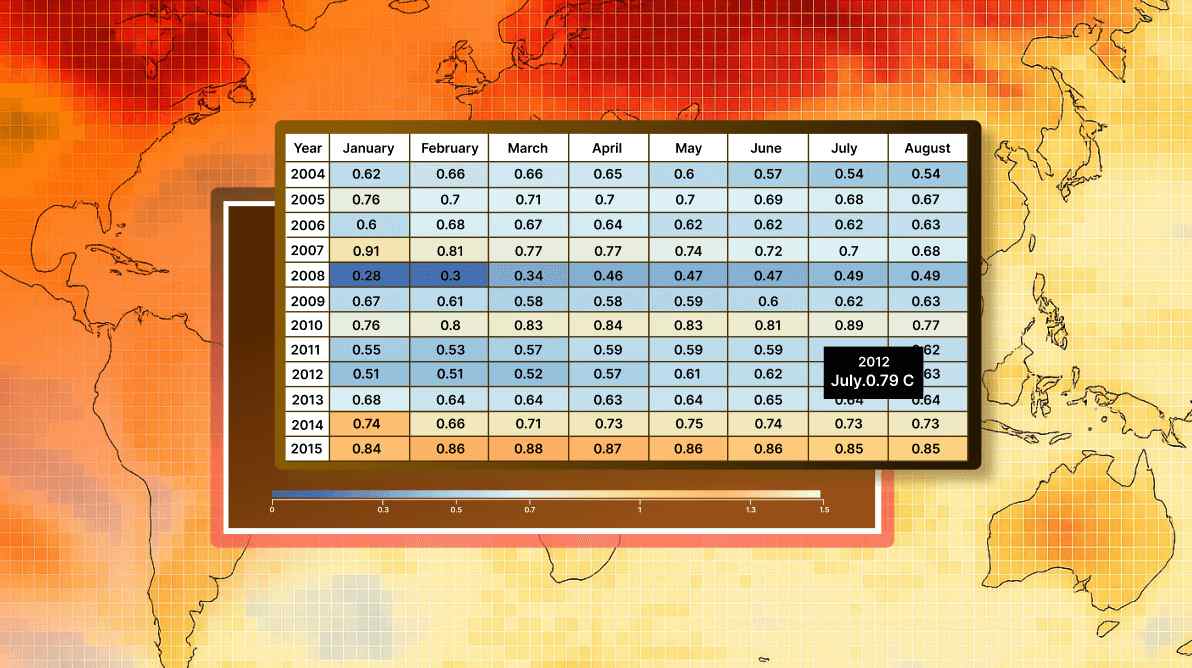
**TL;DR:** This blog provides a step-by-step tutorial on creating a WPF HeatMap Chart using Syncfusion controls to visualize global land and ocean temperature anomalies from 2004 to 2024. It explains how HeatMap Charts use color gradients to represent data intensity, making them ideal for trend analysis. The article covers preparing data from a CSV file, configuring the chart layout and data binding, and enhancing interactivity with color mapping, legends, and tooltips. It concludes by highlighting how this visualization aids in understanding long-term climate patterns.
Welcome to our **Chart of the Week** blog series!
Visualizing complex datasets effectively is essential for uncovering trends and insights. A **HeatMap Chart** is a powerful chart, representing data intensity using a [color gradient](https://help.syncfusion.com/wpf/heatmap/colormapping)
, making it ideal for analyzing large-scale variations across a two-dimensional space.
In this blog, we’ll explore how to create a **WPF HeatMap Chart** using the [Syncfusion® Heatmap](https://www.syncfusion.com/wpf-controls/heatmap)
control. We will also demonstrate how to customize tooltips to enhance user interaction, providing detailed insights when hovering over specific data points. Our dataset will focus on **global land and ocean average temperature anomalies from 2004 to 2024**, helping us observe climate trends over time.
## Overview of a HeatMap Chart
A [HeatMap](https://help.syncfusion.com/wpf/heatmap/getting-started)
Chart is a graphical representation where data points are color-coded based on their values. This visualization is particularly useful for:
- Analyzing long-term climate trends, financial fluctuations, and healthcare data.
- Quickly identifying patterns, outliers, and regional variations.
- Representing relationships between variables in a structured grid format.
## Enhancing user experience with custom tooltips
**Tooltips** provide additional context when users hover over specific data points. By customizing tooltips in [Syncfusion® WPF HeatMap](https://www.syncfusion.com/wpf-controls/heatmap)
, we can:
- Display **precise temperature anomaly values** for each year.
- Use **rich formatting** to enhance readability.
- Improve data interaction by presenting insights dynamically.
Let’s get started!
##  Step 1: Gathering the temperature anomaly dataset
Download global land and ocean temperature anomaly records (2004–2024) from [NOAA’s National Centers for Environmental Information (NCEI)](https://www.ncei.noaa.gov/access/monitoring/climate-at-a-glance/global/time-series/globe/tavg/land_ocean/ytd/0/2004-2024)
. Arrange the dataset in an Excel spreadsheet with columns for Year and Month-wise Temperature Anomaly (°C). Save the Excel file in CSV format for seamless integration into the WPF HeatMap Chart.
## Step 2: Preparing the data for the WPF HeatMap Chart
To visualize temperature anomalies effectively, we need to structure our dataset using a **Model** and a ** ViewModel**.
### Creating the temperature data model
Define a **TemperatureModel** class to represent yearly temperature anomalies for each month, as shown in the code below.
```
public class TemperatureModel
{
public string Year { get; set; }
public double Jan { get; set; }
public double Feb { get; set; }
public double Mar { get; set; }
public double April { get; set; }
public double May { get; set; }
public double June { get; set; }
public double July { get; set; }
public double Aug { get; set; }
public double Sep { get; set; }
public double Oct { get; set; }
public double Nov { get; set; }
public double Dec { get; set; }
public TemperatureModel(string year, double jan, double feb, double mar, double apr, double may, double june,
double july, double aug, double sep, double oct, double nov, double dec)
{
Year = year;
Jan = jan;
Feb = feb;
Mar = mar;
April = apr;
May = may;
June = june;
July = july;
Aug = aug;
Sep = sep;
Oct = oct;
Nov = nov;
Dec = dec;
}
}
```
### Creating a ViewModel to manage data
Define a **TemperatureViewModel** class to hold the collection of temperature records. This class will read data from a CSV file and populate an observable collection for binding to the HeatMap Chart.
Refer to the following code example.
```
public class TemperatureViewModel
{
public ObservableCollection TemperatureData { get; set; }
public TemperatureViewModel()
{
TemperatureData = new ObservableCollection();
ReadCSV();
}
private void ReadCSV()
{
Assembly executingAssembly = typeof(App).GetTypeInfo().Assembly;
Stream inputStream = executingAssembly.GetManifestResourceStream("HeatMapDemo.Data.TemperatureData.csv");
if (inputStream != null)
{
string line;
List lines = new List();
StreamReader reader = new StreamReader(inputStream);
while ((line = reader.ReadLine()) != null)
{
lines.Add(line);
}
lines.RemoveAt(0);
foreach (var dataPoint in lines)
{
var data = dataPoint.Split(',');
string year = data[0];
var monthlyTemperatures = data.Skip(1).Select(double.Parse).ToArray();
TemperatureData.Add(new TemperatureModel(
year,
monthlyTemperatures[0],
monthlyTemperatures[1],
monthlyTemperatures[2],
monthlyTemperatures[3],
monthlyTemperatures[4],
monthlyTemperatures[5],
monthlyTemperatures[6],
monthlyTemperatures[7],
monthlyTemperatures[8],
monthlyTemperatures[9],
monthlyTemperatures[10],
monthlyTemperatures[11]
));
}
}
}
}
```
## Step 3: Layout definition
Define a **layout** using a Border element. Inside the Border, we define a Grid to organize and position different UI components. The Border provides a ** stylized container** with a ** gray border, rounded corners, and a subtle background color** to enhance visual appeal.
Refer to the following code example.
```
```
## Step 4: Configuring the Syncfusion WPF HeatMap Chart
To configure the Syncfusion WPF HeatMap Chart, follow this [documentation](https://help.syncfusion.com/wpf/heatmap/getting-started)
.
```
```
## Step 5: Binding data to the HeatMap Chart
The **TemperatureViewModel** is set as the DataContext, and the temperature data is bind to the heatmap chart using the [ItemsSource](https://help.syncfusion.com/cr/wpf/Syncfusion.UI.Xaml.HeatMap.SfHeatMap.html#Syncfusion_UI_Xaml_HeatMap_SfHeatMap_ItemsSource)
property. The mapping of each month’s temperature is defined in the [Syncfusion® WPF HeatMap](https://www.syncfusion.com/wpf-controls/heatmap)
resource, linking the Year and each month’s data (e.g., January, February, etc.). The [ItemsMapping](https://help.syncfusion.com/cr/wpf/Syncfusion.UI.Xaml.HeatMap.SfHeatMap.html#Syncfusion_UI_Xaml_HeatMap_SfHeatMap_ItemsMapping)
property is used to bind the model to the HeatMap Chart.
Refer to the following code example.
```
```
## Step 6: Customizing HeatMap Chart appearance
In this step, we’ll focus on customizing the appearance of the heatmap chart based on the cell values to enhance the visualization.
### Color mapping
To improve the visual representation of data, we can map specific temperature values to a range of colors. Syncfusion WPF HeatMap Chart offers a [ColorMappingCollection](https://help.syncfusion.com/cr/wpf/Syncfusion.UI.Xaml.HeatMap.ColorMappingCollection.html)
that allows you to assign different colors to specific data values. We define a collection of color mappings where each value corresponds to a particular color. The values will then be reflected in the heatmap cells, making it easier to understand temperature anomalies.
Here’s a code example of a [ColorMappingCollection](https://help.syncfusion.com/cr/wpf/Syncfusion.UI.Xaml.HeatMap.ColorMappingCollection.html)
that defines colors based on temperature values, where lower values are represented with cooler colors and higher values with warmer colors.
```
```
## Step 7: Configuring a gradient legend for the HeatMap Chart
The [SfHeatMapLegend](https://help.syncfusion.com/cr/wpf/Syncfusion.UI.Xaml.HeatMap.SfHeatMapLegend.html)
control allows you to display a color legend beneath the heatmap. It maps the color values to a gradient scale, helping users understand what the colors in the heatmap represent. To configure the legend, set the [LegendMode](https://help.syncfusion.com/cr/wpf/Syncfusion.UI.Xaml.HeatMap.SfHeatMapLegend.html#Syncfusion_UI_Xaml_HeatMap_SfHeatMapLegend_LegendMode)
to Gradient and bind it to the defined [ColorMappingCollection](https://help.syncfusion.com/cr/wpf/Syncfusion.UI.Xaml.HeatMap.ColorMappingCollection.html)
. Additionally, we can customize the legend’s alignment and width properties to improve the layout.
Refer to the following code example.
```
```
## Step 8: Customizing the tooltip template
Define a custom tooltip resource that displays the year, month, and the temperature value in degrees Celsius. The tooltip is then assigned to the **HeatMapCell** through a style.
Refer to the following code example.
```
```
## Step 9: Customizing the HeatMap Chart title
Using Text Block, customize the title and description displayed, which makes the heatmap chart more informative and user-friendly, helping the audience quickly grasp the purpose and significance of the data presented.
Refer to the following code example.
```
```
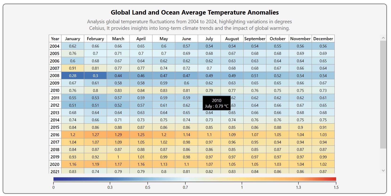
After executing these code examples, you will get the output that resembles the following image.

Creating a WPF HeatMap Chart to display global land and ocean temperature anomalies
## GitHub reference
For more details, refer to the complete sample on the [GitHub demo](https://github.com/SyncfusionExamples/Global-Land-and-Ocean-Average-Temperature-Anomalies-in-WPF-HeatMap.git)
.
## Conclusion
Thank you for reading! In this blog, we’ve walked through the process of creating a [WPF HeatMap Chart](https://www.syncfusion.com/wpf-controls/heatmap)
to visualize global land and ocean temperature anomalies from 2004 to 2024. We’ve covered customizing tooltips, adjusting heatmap chart colors based on data values, adding a custom legend, and more, enabling you to gain insights into climate trends using this powerful data visualization technique.
If you are an existing customer, you can download the new version of Essential Studio on the [License and Downloads](https://www.syncfusion.com/account)
page. If you are not a Syncfusion customer, try our 30-day [free trial](https://www.syncfusion.com/downloads)
to check out our incredible features.
You can also contact us through our [support forums](https://www.syncfusion.com/forums)
, [support portal](https://support.syncfusion.com/)
, or [feedback portal](https://www.syncfusion.com/feedback)
. We are always happy to assist you!
## Related Blogs
[Build an AI-Powered Air Quality Dashboard: Real-Time Analytics & Predictive Insights with WPF Spline Chart](https://www.syncfusion.com/blogs/post/air-quality-monitoring-with-wpf-chart)
[2025 Volume 1: Must-Know Updates in the Syncfusion Diagram Component](https://www.syncfusion.com/blogs/post/whats-new-in-diagram-2025-volume-1)
[Heikin-Ashi vs. Candlestick Charts: Which Is Better for Market Trend Analysis in WPF?](https://www.syncfusion.com/blogs/post/wpf-heikin-ashi-vs-candlestick-charts)
[Easily Build an AI-Powered Chat App Using WPF AI AssistView and OpenAI](https://www.syncfusion.com/blogs/post/build-smart-chat-in-wpf-ai-assistview)