
Syncfusion WinUI controls support light and dark themes. The WinUI DataGrid’s appearance can be further customized by changing the text color, font, font size, headers, and gridlines to match your application’s theme. Additionally, you can add custom styles for selected rows and cells to provide visual cues to the user.
In this blog, we will explore the appearance customization options in WinUI DataGrid by using the theme resource keys. With these keys, we can customize every element of the DataGrid.
We are going to see the appearance customizations possible with the following elements:
- DataRow
- HeaderRow
- StackedHeaderRow
- SelectionRow
- TableSummaryRow
- GroupSummaryRow
- CaptionSummaryRow
- GroupDropArea and GroupDropAreaItem
- AddNewRow
- Unbound Row
- Row Header
DataRow customization
We can customize the record row’s background and foreground. Use the SyncfusionDataGridRowControlForeground and SyncfusionDataGridRowControlBackground keys to customize the background and foreground. Refer to the following code snippet:
XAML
<dataGrid:SfDataGrid x:Name="sfDataGrid"
                     Width="623"
                     Height="360"
                     ColumnWidthMode="Auto"
                     AutoGenerateColumns="False"
                     ItemsSource="{Binding Orders}">
 <dataGrid:SfDataGrid.Resources>
  <SolidColorBrush x:Key="SyncfusionGridHeaderCellControlBackground" Color="DarkBlue"/>
  <SolidColorBrush x:Key="SyncfusionGridHeaderCellControlForeground" Color="LightPink"/>
 </dataGrid:SfDataGrid.Resources>
 <dataGrid:SfDataGrid.Columns>
  <dataGrid:GridTextColumn  MappingName="OrderID" HeaderText="Order ID" />
  <dataGrid:GridTextColumn  MappingName="CustomerID" HeaderText="Customer ID"/>
  <dataGrid:GridTextColumn  MappingName="CustomerName" HeaderText="Customer Name"/>
  <dataGrid:GridTextColumn  MappingName="ShipCity" HeaderText="Ship City"/>
  <dataGrid:GridTextColumn  MappingName="Country" HeaderText="Country"/>
 </dataGrid:SfDataGrid.Columns>
</dataGrid:SfDataGrid>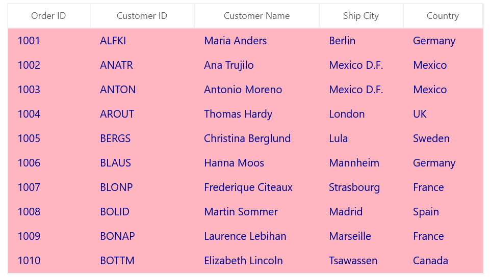
HeaderRow customization
Customize the HeaderRow using the keys SyncfusionGridHeaderCellControlBackground and SyncfusionGridHeaderCellControlForeground. Refer to the following code snippet:
XAML
<dataGrid:SfDataGrid x:Name="sfDataGrid"
                     Width="623"
                     Height="360"
                     ColumnWidthMode="Auto"
                     AutoGenerateColumns="False"
                     ItemsSource="{Binding Orders}">
 <dataGrid:SfDataGrid.Resources>
  <SolidColorBrush x:Key="SyncfusionGridHeaderCellControlBackground" Color="Red"/>
  <SolidColorBrush x:Key="SyncfusionGridHeaderCellControlForeground" Color="White"/>
 </dataGrid:SfDataGrid.Resources>
 <dataGrid:SfDataGrid.Columns>
  <dataGrid:GridTextColumn  MappingName="OrderID" HeaderText="Order ID" />
  <dataGrid:GridTextColumn  MappingName="CustomerID" HeaderText="Customer ID"/>
  <dataGrid:GridTextColumn  MappingName="CustomerName" HeaderText="Customer Name"/>
  <dataGrid:GridTextColumn  MappingName="ShipCity" HeaderText="Ship City"/>
  <dataGrid:GridTextColumn  MappingName="Country" HeaderText="Country"/>
 </dataGrid:SfDataGrid.Columns>
</dataGrid:SfDataGrid>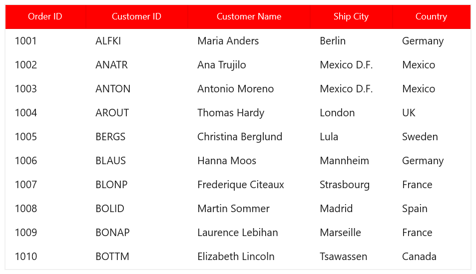
Selection color customization
You can customize the WinUI DataGrid’s selection colors and current cell border using the direct APIs SelectionBackground, SelectionForeground, CurrentCellBorderBrush, and CurrentCellBorderThickness. We can achieve the same customizations by using the SyncfusionDataGridRowSelectedBackground, SyncfusionDataGridRowSelectedForeground, SyncfusionDataGridCurrentCellBorderBrush, and SyncfusionDataGridCurrentCellBorderThickness keys as well. Refer to the following code snippet:
XAML
<dataGrid:SfDataGrid x:Name="sfDataGrid"
                     Width="623"
                     Height="360"
                     ColumnWidthMode="Auto"
                     AutoGenerateColumns="False"
                     ItemsSource="{Binding Orders}">
 <dataGrid:SfDataGrid.Resources>
  <SolidColorBrush x:Key="SyncfusionDataGridRowSelectedBackground" Color="DarkGray"/>
  <SolidColorBrush x:Key="SyncfusionDataGridRowSelectedForeground" Color="White"/>
  <SolidColorBrush x:Key="SyncfusionDataGridCurrentCellBorderBrush" Color="DarkBlue"/>
  <Thickness x:Key="SyncfusionDataGridCurrentCellBorderThickness">3</Thickness>
 </dataGrid:SfDataGrid.Resources>
 <dataGrid:SfDataGrid.Columns>
  <dataGrid:GridTextColumn  MappingName="OrderID" HeaderText="Order ID" />
  <dataGrid:GridTextColumn  MappingName="CustomerID" HeaderText="Customer ID"/>
  <dataGrid:GridTextColumn  MappingName="CustomerName" HeaderText="Customer Name"/>
  <dataGrid:GridTextColumn  MappingName="ShipCity" HeaderText="Ship City"/>
  <dataGrid:GridTextColumn  MappingName="Country" HeaderText="Country"/>
 </dataGrid:SfDataGrid.Columns>
</dataGrid:SfDataGrid>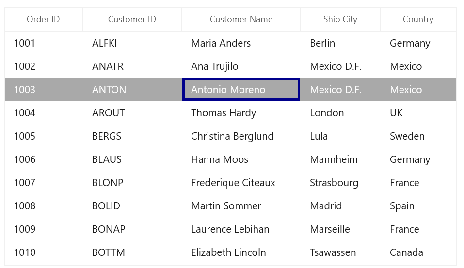
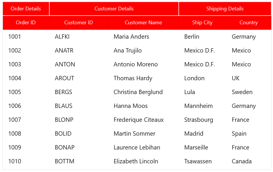
Stacked headers customization
Customize the stacked header style using the SyncfusionGridStackedHeaderCellControlBackground and SyncfusionGridStackedHeaderCellControlForeground keys.
XAML
<dataGrid:SfDataGrid x:Name="sfDataGrid"
                     Width="623"
                     Height="389"
                     ColumnWidthMode="Auto"
                     AutoGenerateColumns="False"
                     ItemsSource="{Binding Orders}">
 <dataGrid:SfDataGrid.StackedHeaderRows>
  <grid:StackedHeaderRow>
   <grid:StackedHeaderRow.StackedColumns>
    <grid:StackedColumn ChildColumns="OrderID" HeaderText="Order Details" />
    <grid:StackedColumn ChildColumns="CustomerID,CustomerName" HeaderText="Customer Details" />
    <grid:StackedColumn ChildColumns="ShipCity,Country" HeaderText="Shipping Details" />
   </grid:StackedHeaderRow.StackedColumns>
  </grid:StackedHeaderRow>
 </dataGrid:SfDataGrid.StackedHeaderRows>
 <dataGrid:SfDataGrid.Resources>
  <SolidColorBrush x:Key="SyncfusionGridStackedHeaderCellControlBackground" Color="Red"/>
  <SolidColorBrush x:Key="SyncfusionGridStackedHeaderCellControlForeground" Color="White"/>
  <SolidColorBrush x:Key="SyncfusionGridHeaderCellControlBackground" Color="Red"/>
  <SolidColorBrush x:Key="SyncfusionGridHeaderCellControlForeground" Color="White"/>
 </dataGrid:SfDataGrid.Resources>
 <dataGrid:SfDataGrid.Columns>
  <dataGrid:GridTextColumn  MappingName="OrderID" HeaderText="Order ID" />
  <dataGrid:GridTextColumn  MappingName="CustomerID" HeaderText="Customer ID”/>
  <dataGrid:GridTextColumn  MappingName="CustomerName" HeaderText="Customer Name"/>
  <dataGrid:GridTextColumn  MappingName="ShipCity" HeaderText="Ship City"/>
  <dataGrid:GridTextColumn  MappingName="Country" HeaderText="Country"/>
 </dataGrid:SfDataGrid.Columns>
</dataGrid:SfDataGrid>
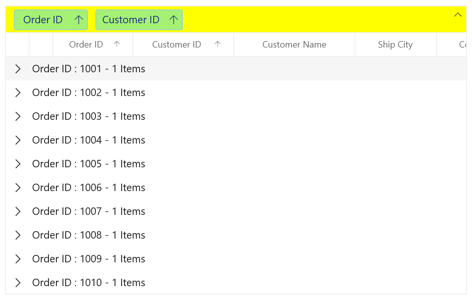
Group drop area customization
You can group column data by dragging and dropping columns in the group drop area. The group drop area and its items can be customized with the keys SyncfusionGroupDropAreaBackground, SyncfusionGroupDropAreaForeground, SyncfusionGroupDropAreaItemBackground, SyncfusionGroupDropAreaItemForeground, SyncfusionGroupDropAreaItemBorderBrush, SyncfusionDataGridGroupDropAreaItemIconFill, and SyncfusionDataGridGroupDropAreaItemSortIconFill. Refer to the following code snippet:
XAML
<dataGrid:SfDataGrid x:Name="sfDataGrid"
                     Width="623"
                     Height="389"
                     AllowGrouping="True"
                     ColumnWidthMode="Auto"
                     ShowGroupDropArea="True"
                     AutoGenerateColumns="False"
                     ItemsSource="{Binding Orders}">
 <dataGrid:SfDataGrid.Resources>
  <SolidColorBrush x:Key="SyncfusionGroupDropAreaBackground" Color="Yellow"/>
  <SolidColorBrush x:Key="SyncfusionGroupDropAreaForeground" Color="DarkGreen"/>
  <SolidColorBrush x:Key="SyncfusionGroupDropAreaItemBackground" Color="LightGreen"/>
  <SolidColorBrush x:Key="SyncfusionGroupDropAreaItemForeground" Color="DarkBlue"/>
  <SolidColorBrush x:Key="SyncfusionGroupDropAreaItemBorderBrush" Color="SkyBlue"/>
  <SolidColorBrush x:Key="SyncfusionDataGridGroupDropAreaItemIconFill" Color="DarkBlue"/>
  <SolidColorBrush x:Key="SyncfusionDataGridGroupDropAreaItemSortIconFill" Color="DarkBlue"/>
 </dataGrid:SfDataGrid.Resources>
 <dataGrid:SfDataGrid.Columns>
  <dataGrid:GridTextColumn MappingName="OrderID" HeaderText="Order ID" />
  <dataGrid:GridTextColumn MappingName="CustomerID" HeaderText="Customer ID"/>
  <dataGrid:GridTextColumn MappingName="CustomerName" HeaderText="Customer Name"/>
  <dataGrid:GridTextColumn MappingName="ShipCity" HeaderText="Ship City"/>
  <dataGrid:GridTextColumn MappingName="Country" HeaderText="Country"/>
 </dataGrid:SfDataGrid.Columns>
</dataGrid:SfDataGrid>
Summary customization
The WinUI DataGrid allows you to customize summary rows with keys. Summary rows display totals, averages, or other aggregate values for a group of rows in the DataGrid.
Caption summary
Customize the appearance of the caption summary rows by using the keys SyncfusionCaptionSummaryRowControlForeground, SyncfusionDataGridGroupExpanderIconFill, and SyncfusionDataGridGroupExpanderFontSize. Refer to the following code snippets:
XAML
<dataGrid:SfDataGrid x:Name="sfDataGrid"
                     Width="653"
                     Height="300"
                     ColumnWidthMode="Auto"
                     AllowGrouping="True"
                     ShowGroupDropArea="True"
                     AutoGenerateColumns="False"
                     ItemsSource="{Binding Orders}">
 <dataGrid:SfDataGrid.GroupColumnDescriptions>
  <dataGrid:GroupColumnDescription ColumnName="Country"/>
 </dataGrid:SfDataGrid.GroupColumnDescriptions>
 <dataGrid:SfDataGrid.Resources>
  <SolidColorBrush x:Key="SyncfusionCaptionSummaryRowControlForeground" Color="DarkBlue"/>
  <SolidColorBrush x:Key="SyncfusionDataGridGroupExpanderIconFill" Color="DarkBlue"/>
  <x:Double x:Key="SyncfusionDataGridGroupExpanderFontSize">12</x:Double>
 </dataGrid:SfDataGrid.Resources>
 <dataGrid:SfDataGrid.Columns>
  <dataGrid:GridTextColumn MappingName="OrderID" HeaderText="Order ID" />
  <dataGrid:GridTextColumn MappingName="CustomerID" HeaderText="Customer ID"/>
  <dataGrid:GridTextColumn MappingName="CustomerName" HeaderText="Customer Name"/>
  <dataGrid:GridTextColumn MappingName="ShipCity" HeaderText="Ship City"/>
  <dataGrid:GridTextColumn  MappingName="Country" HeaderText="Country"/>
 </dataGrid:SfDataGrid.Columns>
</dataGrid:SfDataGrid>
id>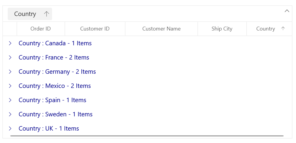
Group summary customization
Customize the appearance of the group summary rows by using the keys SyncfusionGroupSummaryRowControlBackground and SyncfusionGroupSummaryRowControlForeground.
XAML
<dataGrid:SfDataGrid x:Name="sfDataGrid"
                     Width="653"
                     Height="430"
                     ColumnWidthMode="Auto"
                     AllowGrouping="True"
                     ShowGroupDropArea="True"
                     AutoGenerateColumns="False"
                     ItemsSource="{Binding Orders}">
 <dataGrid:SfDataGrid.GroupColumnDescriptions>
  <dataGrid:GroupColumnDescription ColumnName="Country"/>
 </dataGrid:SfDataGrid.GroupColumnDescriptions>
 <dataGrid:SfDataGrid.GroupSummaryRows>
  <dataGrid:GridSummaryRow ShowSummaryInRow="False">
   <dataGrid:GridSummaryRow.SummaryColumns>
    <dataGrid:GridSummaryColumn Name="OrderCount"
                                Format="'Count – {Count:d}'"
                                MappingName="Country"
                                SummaryType="CountAggregate" />
   </dataGrid:GridSummaryRow.SummaryColumns>
  </dataGrid:GridSummaryRow>
 </dataGrid:SfDataGrid.GroupSummaryRows>
 <dataGrid:SfDataGrid.Resources>
  <SolidColorBrush x:Key="SyncfusionGroupSummaryRowControlBackground" Color="Pink"/>
  <SolidColorBrush x:Key="SyncfusionGroupSummaryRowControlForeground" Color="DarkBlue"/>
 </dataGrid:SfDataGrid.Resources>
 <dataGrid:SfDataGrid.Columns>
  <dataGrid:GridTextColumn MappingName="OrderID" HeaderText="Order ID" />
  <dataGrid:GridTextColumn MappingName="CustomerID" HeaderText="Customer ID"/>
  <dataGrid:GridTextColumn MappingName="CustomerName" HeaderText="Customer Name"/>
  <dataGrid:GridTextColumn MappingName="ShipCity" HeaderText="Ship City"/>
  <dataGrid:GridTextColumn  MappingName="Country" HeaderText="Country"/>
 </dataGrid:SfDataGrid.Columns>
</dataGrid:SfDataGrid>
id>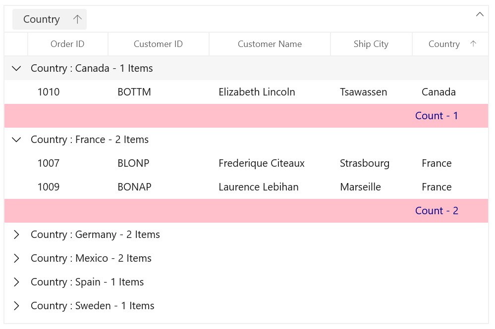
Table summary customization
Customize the table summary rows using the SyncfusionTableSummaryRowControlBackground and SyncfusionTableSummaryRowControlForeground keys.
XAML
<dataGrid:SfDataGrid x:Name="sfDataGrid"
                      Width="620"
                      Height="410"
                      ColumnWidthMode="Auto"
                      AllowGrouping="True"
                      ShowGroupDropArea="True"
                      AutoGenerateColumns="False"
                      ItemsSource="{Binding Orders}">
 <dataGrid:SfDataGrid.TableSummaryRows>
  <dataGrid:GridTableSummaryRow ShowSummaryInRow="True" Title="Total Product Count: {OrderCount}">
   <dataGrid:GridSummaryRow.SummaryColumns>
    <dataGrid:GridSummaryColumn Name="OrderCount"
                                Format="'{Count:d}'"
                                MappingName="OrderID"
                                SummaryType="CountAggregate" />
   </dataGrid:GridSummaryRow.SummaryColumns>
  </dataGrid:GridTableSummaryRow>
 </dataGrid:SfDataGrid.TableSummaryRows>
 <dataGrid:SfDataGrid.Resources>
  <SolidColorBrush x:Key="SyncfusionTableSummaryRowControlBackground" Color="LightBlue"/>
  <SolidColorBrush x:Key="SyncfusionTableSummaryRowControlForeground" Color="HotPink"/>
 </dataGrid:SfDataGrid.Resources>
 <dataGrid:SfDataGrid.Columns>
  <dataGrid:GridTextColumn MappingName="OrderID" HeaderText="Order ID" />
  <dataGrid:GridTextColumn MappingName="CustomerID" HeaderText="Customer ID"/>
  <dataGrid:GridTextColumn MappingName="CustomerName" HeaderText="Customer Name"/>
  <dataGrid:GridTextColumn MappingName="ShipCity" HeaderText="Ship City"/>
  <dataGrid:GridTextColumn  MappingName="Country" HeaderText="Country"/>
 </dataGrid:SfDataGrid.Columns>
</dataGrid:SfDataGrid>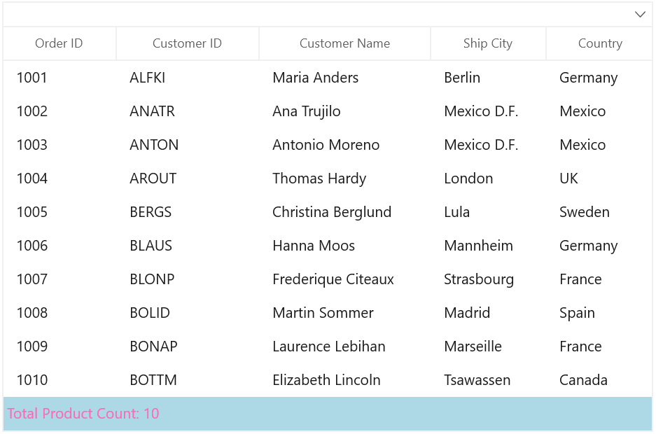
AddNewRow customization
The WinUI DataGrid allows you to add new rows at runtime by using the AddNewRowPosition property. You can customize the appearance of the add new row area by using the SyncfusionAddNewRowControlBackground and SyncfusionAddNewRowControlForeground keys.
XAML
<dataGrid:SfDataGrid x:Name="sfDataGrid"
                     Width="620"
                     Height="390"
                     ColumnWidthMode="Auto"
                     AddNewRowPosition="Top"
                     AutoGenerateColumns="False"
                     ItemsSource="{Binding Orders}">
 <dataGrid:SfDataGrid.Resources>
  <SolidColorBrush x:Key="SyncfusionAddNewRowControlBackground" Color="LightGreen"/>
  <SolidColorBrush x:Key="SyncfusionAddNewRowControlForeground" Color="DeepPink"/>
 </dataGrid:SfDataGrid.Resources>
 <dataGrid:SfDataGrid.Columns>
  <dataGrid:GridTextColumn MappingName="OrderID" HeaderText="Order ID" />
  <dataGrid:GridTextColumn MappingName="CustomerID" HeaderText="Customer ID"/>
  <dataGrid:GridTextColumn MappingName="CustomerName" HeaderText="Customer Name"/>
  <dataGrid:GridTextColumn MappingName="ShipCity" HeaderText="Ship City"/>
  <dataGrid:GridTextColumn MappingName="Country" HeaderText="Country"/>
 </dataGrid:SfDataGrid.Columns>
</dataGrid:SfDataGrid>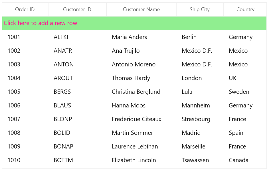
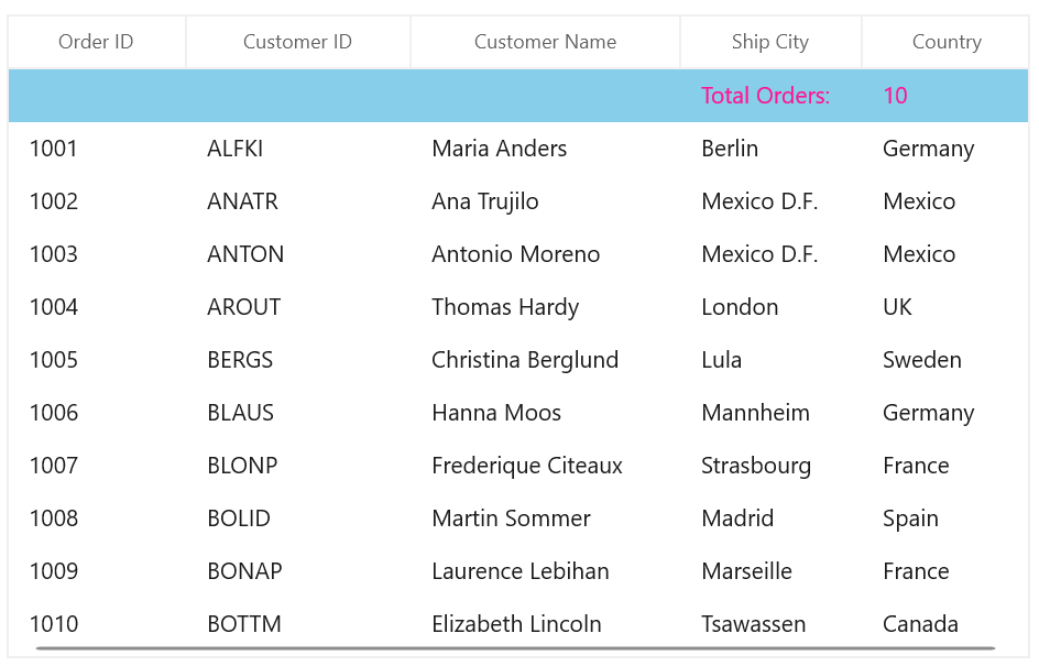
Unbound row customization
Unbound rows in the DataGrid refer to rows not bound to any data source or model. These rows can be used to display additional information to the user. You can customize their appearance by using the SyncfusionUnboundRowControlBackground and SyncfusionUnboundRowControlForeground keys.
XAML
<dataGrid:SfDataGrid x:Name="sfDataGrid"
                      Width="620"
                      Height="390"
                      ColumnWidthMode="Auto"
                      AutoGenerateColumns="False"
                      ItemsSource="{Binding Orders}">
 <dataGrid:SfDataGrid.UnboundRows>
  <dataGrid:GridUnboundRow Position="Top"/>
 </dataGrid:SfDataGrid.UnboundRows>
 <dataGrid:SfDataGrid.Resources>
  <SolidColorBrush x:Key="SyncfusionUnboundRowControlBackground" Color="SkyBlue"/>
  <SolidColorBrush x:Key="SyncfusionUnboundRowControlForeground" Color="DeepPink"/>
 </dataGrid:SfDataGrid.Resources>
 <dataGrid:SfDataGrid.Columns>
  <dataGrid:GridTextColumn MappingName="OrderID" HeaderText="Order ID" />
  <dataGrid:GridTextColumn MappingName="CustomerID" HeaderText="Customer ID"/>
  <dataGrid:GridTextColumn MappingName="CustomerName" HeaderText="Customer Name"/>
  <dataGrid:GridTextColumn MappingName="ShipCity" HeaderText="Ship City"/>
  <dataGrid:GridTextColumn  MappingName="Country" HeaderText="Country"/>
 </dataGrid:SfDataGrid.Columns>
</dataGrid:SfDataGrid>
C#
this.sfDataGrid.QueryUnboundRow += SfDataGrid_QueryUnboundRow;

private void SfDataGrid_QueryUnboundRow(object sender, GridUnboundRowEventsArgs e)
{
    if (e.UnboundAction == UnboundActions.QueryData)
    {
        if (e.RowColumnIndex.ColumnIndex == 3)
        {
            e.Value = “Total Orders:”;
            e.Handled= true;
        }
        else if (e.RowColumnIndex.ColumnIndex == 4)
        {
            e.Value = (this.sfDataGrid.View.Records.Count).ToString();
            e.Handled= true;
        }
    }
}
Row header customization
In the WinUI DataGrid, a row header is a column that displays a unique identifier for each row in the grid. By default, the row header column displays icons based on the row type. You can customize these icons’ colors and the row header color by using the keys SyncfusionGridRowHeaderCellBackground, SyncfusionGridRowHeaderIndentCellBackground, and SyncfusionDataGridRowHeaderCellCurrentRowIconFill.
XAML
<dataGrid:SfDataGrid x:Name="sfDataGrid"
                     Width="650"
                     Height="350"
                     ColumnWidthMode="Auto"
                     ShowRowHeader="True"
                     AutoGenerateColumns="False"
                     ItemsSource="{Binding Orders}">
 <dataGrid:SfDataGrid.Resources>
  <SolidColorBrush x:Key="SyncfusionGridRowHeaderCellBackground" Color="Gray"/>
  <SolidColorBrush x:Key="SyncfusionGridRowHeaderIndentCellBackground" Color="Gray"/>
  <SolidColorBrush x:Key="SyncfusionDataGridRowHeaderCellCurrentRowIconFill" Color="White"/>
 </dataGrid:SfDataGrid.Resources>
 <dataGrid:SfDataGrid.Columns>
  <dataGrid:GridTextColumn MappingName="OrderID" HeaderText="Order ID" />
  <dataGrid:GridTextColumn MappingName="CustomerID" HeaderText="Customer ID”/>
  <dataGrid:GridTextColumn MappingName="CustomerName" HeaderText="Customer Name"/>
  <dataGrid:GridTextColumn MappingName="ShipCity" HeaderText="Ship City"/>
  <dataGrid:GridTextColumn MappingName="Country" HeaderText="Country"/>
 </dataGrid:SfDataGrid.Columns>
</dataGrid:SfDataGrid>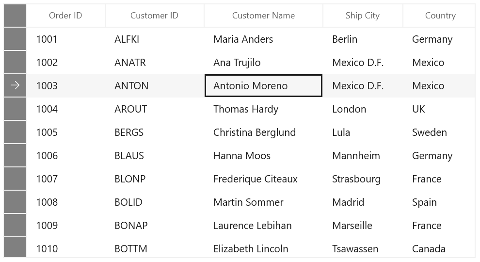
References
For more details, refer to the WinUI DataGrid theme resource files and our customization demo on GitHub.
Conclusion
Thanks for reading! In this blog, we learned about how easily we can customize the appearance of the Syncfusion WinUI DataGrid elements. Customizing the DataGrid elements with keys can greatly enhance the user experience and improve the readability of data. Try this feature and share your experience with it in the comment section below.
For current Syncfusion customers, the newest version of Essential Studio is available from the license and downloads page. If you are not a customer, try our 30-day free trial to check out these features. If you have questions, contact us through our support forums, feedback portal, or support portal. We are always happy to assist you!