---
title: "What’s New in 2018 Volume 3: Xamarin Chart Updates"
published_at: "2018-10-15T11:00:15+00:00"
modified_at: "2025-03-20T12:06:07+00:00"
url: "https://www.syncfusion.com/blogs/post/whats-new-in-2018-volume-3-xamarin-chart-updates"
excerpt: "Every release, we include new features for our components by considering feature requests from our customers. We hope these additions help make your development easier and simpler. In this article, we are excited to share some of the new, popularly..."
taxonomy_category:
- "Desktop"
- "Development"
- "Essential Studio"
- "Mobile"
- "Xamarin"
taxonomy_post_tag:
- "Chart"
- "Charting"
- "Charts"
- "SfChart"
- "What's New"
- "Xamarin"
- "Xamarin.Forms"
---
# What’s New in 2018 Volume 3: Xamarin Chart Updates
[Prabakaran Ramasamy](https://www.syncfusion.com/blogs/author/prabakaranr)

Every release, we include new features for our components by considering feature requests from our customers. We hope these additions help make your development easier and simpler. In this article, we are excited to share some of the new, popularly requested features that are included in the [Chart component for Xamarin](https://www.syncfusion.com/xamarin-ui-controls/charts)
in the 2018 Volume 3 release. These are:
- Stacked doughnut chart
- Histogram
- Axis label wrapping
- Preview support in storyboard in Xamarin.iOS
Let’s walk through each feature with example code snippets and outputs.
**Stacked doughnut chart**
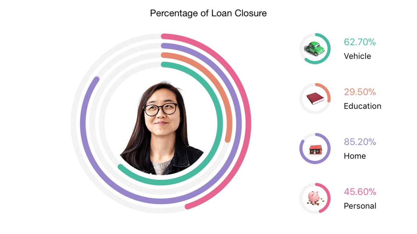
The stacked doughnut chart type is a special type of doughnut chart. It is typically used to visualize data in a set of concentric circles. The configuration of a stacked doughnut chart is similar to a standard doughnut chart; we have to initialize an instance of **DoughnutSeries** and add it to the ** Series** collection property of ** SfChart**, and then set the ** IsStackedDoughnut** property to ** true**. The following code snippet and screenshot show how to initialize and configure the stacked doughnut chart and how it appears.
```
```
Refer to the following user guide to learn about the options available to customize the stacked doughnut chart: [Stacked doughnut chart documentation.](https://help.syncfusion.com/xamarin/charts/charttypes#stacked-doughnut)
**Histogram**
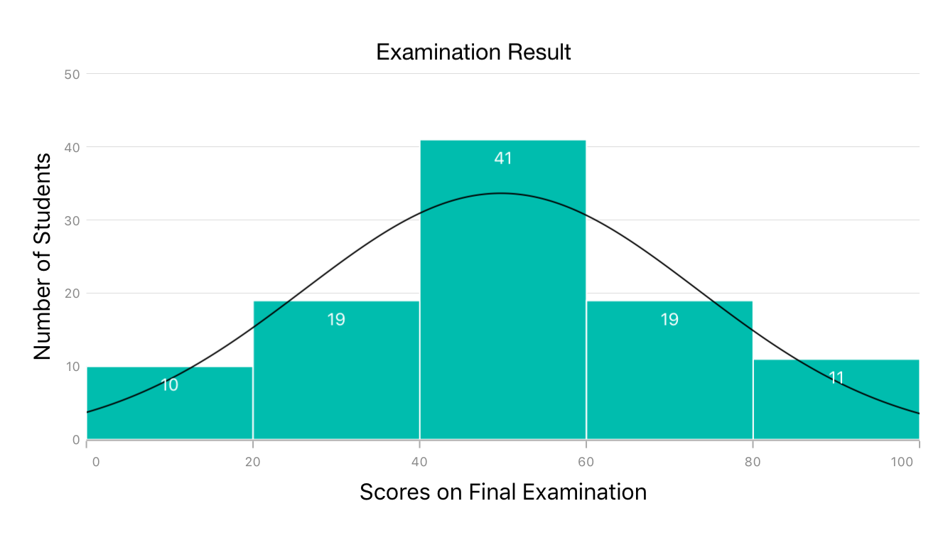
A histogram is a type of chart that is widely used to represent the distribution of numerical data. The appearance of a histogram is similar to a bar chart, since both charts visualize data using rectangles. However, where a bar chart represents categorical data and compares different categories, a histogram shows the frequency of distribution in the individual bars for each range. The following example shows the configuration of a histogram and its final appearance.
```
```
Refer to the following user guide to learn more about configuring a histogram: [Histogram documentation](https://help.syncfusion.com/xamarin/charts/charttypes#histogram-chart)
.
**Axis label wrapping**
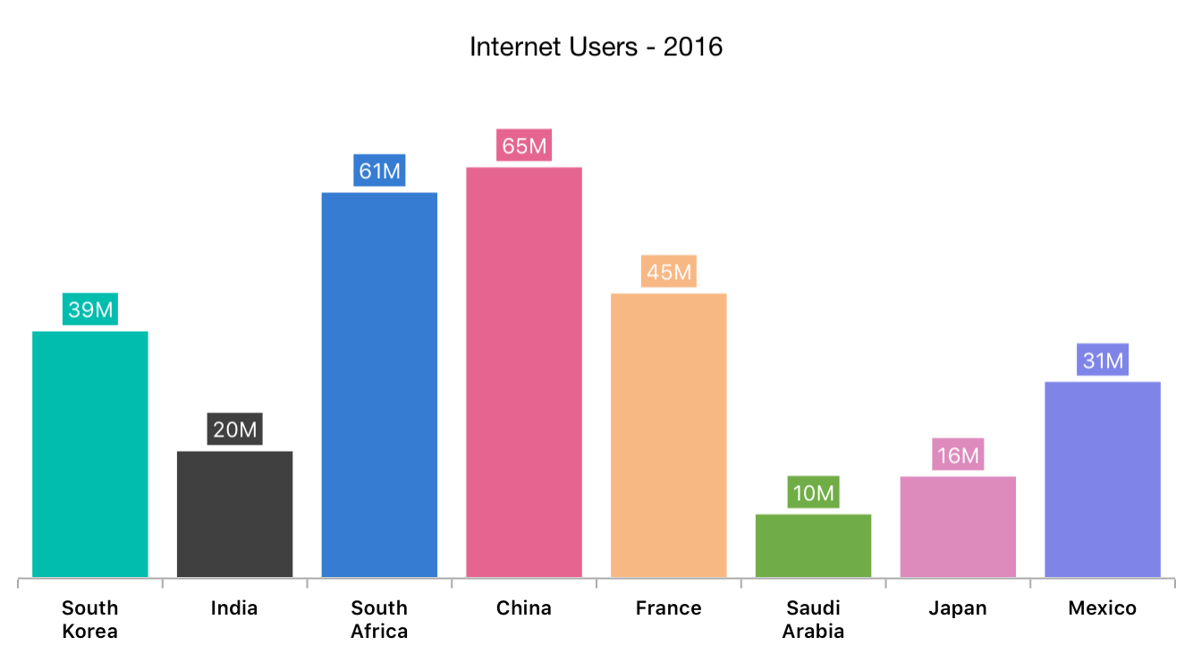
Axis labels with lengthy text can collide with each other. To overcome this problem, we have introduced support for wrapping labels that collide to new lines. This feature can be enabled by setting the **LabelsIntersectAction** property of ** ChartAxis** to ** Wrap**. Alternately, the maximum width of the label can be restricted using the ** MaxWidth** property of ** ChartAxisLabelStyle**.
```
```
Refer to the following user guide to make use of axis label wrap support: [Wrap axis labels documentation.](https://help.syncfusion.com/xamarin/charts/axis#smart-axis-labels)
**Preview support in storyboard view in Xamarin.iOS**
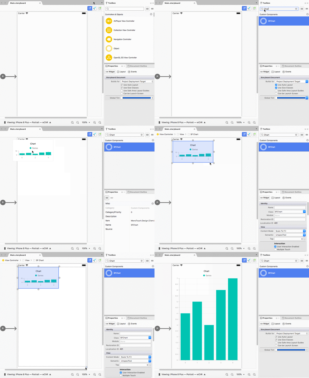
Preview the appearance of a chart in the storyboard view of the Xamarin.iOS to reduce the layout design time and perfectly build your layout without deploying the app on a device or emulator for every change in your layout. Even though preview support helps you build the chart layout faster, the data source for the chart should be configured from the view controller by accessing the chart object.
**And more**
This is not a complete list of all the Xamarin chart features added in 2018 Volume 3. We have made a few more [minor improvements](https://www.syncfusion.com/products/whatsnew/xamarin-forms)
, such as dotted line support for polar and radar charts, background color customization support for the chart area, support to get the data point collection that falls within a given rectangular area, and some bug fixes. Download our 2018 Volume 3 release of Essential Studio® for Xamarin from the following link:
.
We hope that you will enjoy these new chart features. Check the full [release notes](https://help.syncfusion.com/xamarin/release-notes/v16.3.0.21?type=all#sfchart)
for more details, browse complete example code in [GitHub](https://github.com/syncfusion/xamarin-demos/tree/master/Forms/Chart)
, and explore the chart examples available on [Google Play](https://play.google.com/store/apps/details?id=com.syncfusion.samplebrowser)
and the [Microsoft Store](https://www.microsoft.com/en-us/p/syncfusion-essential-studio-for-xamarin/9nn069tldzf4#activetab=pivot:overviewtab)
.
If you have any questions or require clarification, let us know in the comments section below. You can also contact us through our [support forum](https://www.syncfusion.com/forums)
or [Direct-Trac](https://www.syncfusion.com/support/directtrac/)
.
*Want to learn more? Check out these other posts and free resources:*
- [Blog Post] [How to Build a Xamarin App: Master Guide from Intro to Resources](https://blog.syncfusion.com/post/how-to-build-a-xamarin-app-master-guide-from-intro-to-features.aspx)
- [Blog Post] [What’s New in 2018 Volume 3: Xamarin.Forms Maps Updates](https://blog.syncfusion.com/post/whats-new-in-2018-volume-3-xamarin-forms-maps-updates.aspx)
- [Ebook] *[Xamarin.Forms Succinctly](https://www.syncfusion.com/ebooks/xamarin-forms-succinctly)*
- [Ebook] *[Xamarin.Forms for macOS Succintly](https://www.syncfusion.com/ebooks/xamarin_forms_for_mac_os_succinctly)*